There’s something deeply personal about a bedroom — it’s the first thing you see in the morning and the last thing you see at night, and when the colors feel right, the whole room wraps around you like a exhale. The best bedroom color schemes do more than look beautiful; they set a mood, calm a racing mind, and make even the most ordinary Tuesday feel a little more intentional. Whether you’re craving something warm and cocoon-like or fresh and serene, the right palette can completely transform how a space feels to live in. Here are 27 bedroom color scheme ideas worth saving — and building your dream retreat around.
Why Bedroom Color Schemes Work So Well
Color is the single most powerful tool in a bedroom’s design arsenal — and it costs less than new furniture. Unlike the living room or kitchen, the bedroom is a space primarily experienced in low light, in a relaxed state, which means colors read differently here. Warm tones feel more enveloping, cool tones feel more restful, and earthy neutrals create that grounding quality that makes you genuinely want to stay.
What makes bedroom color palettes so endlessly compelling right now is the cultural shift toward intentional rest. People are treating their bedrooms less like storage rooms with a bed and more like personal sanctuaries — and color is the fastest way to signal that shift. Pinterest has seen consistent growth in searches for “moody bedroom,” “warm neutral bedroom,” and “sage green bedroom” over the past three years, reflecting this deeper desire.
The materials and textures that anchor these palettes matter enormously: linen bedding in dusty rose, velvet headboards in deep teal, whitewashed wood in warm cream, or rattan accents against terracotta walls. These combinations work because they layer visual weight thoughtfully.
Even small bedrooms benefit hugely from a considered color scheme. A deep, moody wall color in a compact room doesn’t shrink it — it makes it feel deliberate and jewel-box intimate rather than accidentally small.
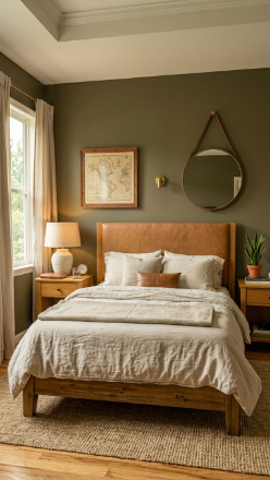
Warm Greige Walls with Ivory Linen Layers
Vibe sentence: This palette feels like cashmere — quiet, warm, and so effortlessly put-together that guests always ask if you hired a designer.
What makes it work: Greige (the perfect gray-beige hybrid) reads as neither cold nor stark — it gives walls enough warmth to feel cozy without the heaviness of a true brown. Layering ivory, cream, and caramel textiles in the same temperature range creates tonal depth without any jarring contrast, which is exactly what a restful bedroom needs.
How to achieve it: Paint walls in a warm greige like Benjamin Moore’s “Pale Oak” or Sherwin-Williams’ “Accessible Beige,” then build your bedding in the same warm family — linen duvet in natural ivory, knit throw in oat, velvet pillow in camel.
💡 Add a single aged brass lamp on each nightstand — under $50 each at thrift stores or TJ Maxx — and the whole palette instantly elevates.
Dusty Blue and Warm White for a Serene Escape
Vibe sentence: Dusty blue and warm white together feel like a long, deep breath — calm and unhurried in the best possible way.
What makes it work: Dusty blue sits in that perfect sweet spot between blue and gray, meaning it never feels cold or institutional the way a bright blue might. Paired with warm white (not stark white), the contrast is soft enough to feel restful rather than graphic, making it ideal for spaces where you actually need to wind down.
How to achieve it: Choose a dusty blue with warm undertones — try Farrow & Ball’s “Mizzle” or Benjamin Moore’s “Blue Mist” — and pair with warm white trim in “Chantilly Lace” to keep the whole scheme cohesive without going cool.
Deep Terracotta Walls with Natural Linen and Rattan
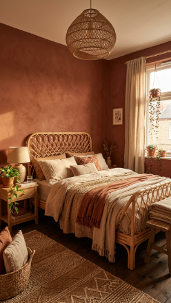
Vibe sentence: Terracotta walls create a room that feels like it belongs in a Moroccan riad — warm, grounding, and deeply sensory.
What makes it work: Terracotta is an earthy, clay-based hue that has built-in warmth without reading as aggressive or bold — it wraps a room rather than demanding attention. Natural linen bedding and rattan furniture echo the organic, handmade quality of the color, creating a palette that feels intentionally imperfect and alive.
How to achieve it: Look for terracotta paint with red-orange undertones (not pink-leaning ones) — Behr’s “Fired Brick” or Clare’s “Hot Sauce” are excellent starting points. Then commit to natural textiles only: no synthetics, no shiny finishes.
💡 A simple rattan headboard from Amazon or IKEA’s Sinnerlig range transforms even a builder-grade bedroom into a warm, earthy retreat for under $150.
Sage Green Walls with Cream and Warm Wood Tones
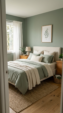
Vibe sentence: Sage green feels like bringing the outdoors in — quiet, living, and effortlessly calming.
What makes it work: Sage green is nature’s neutral: it has enough color to feel intentional but enough gray in it to work as a background rather than a statement wall. Warm wood tones in honey oak or walnut ground the palette and prevent it from feeling overly cool or “spa-clinical.”
How to achieve it: Paint with a muted, gray-based sage like Sherwin-Williams’ “Sage” or Annie Sloan’s “Antibes Green” diluted — avoid yellow-leaning greens, which can look harsh by lamplight. Add warm oak or walnut nightstands to anchor the palette with organic warmth.
Moody Midnight Blue with Soft Gold Accents
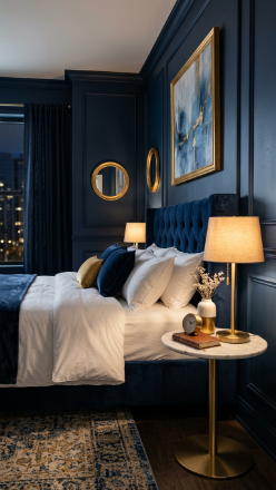
Vibe sentence: A midnight blue bedroom feels like sleeping inside a luxury hotel suite — grown-up, dramatic, and completely cocooning.
What makes it work: Dark walls in a bedroom create a “jewel box” effect — the room contracts visually in the best way, making everything inside it feel more precious and intentional. Soft gold accents provide the warm counterpoint that prevents the darkness from feeling cold or oppressive.
How to achieve it: Use a true blue-black like Benjamin Moore’s “Hale Navy” or Farrow & Ball’s “Stiffkey Blue,” and introduce gold through hardware, lamp bases, and picture frames rather than textiles — metal accents catch light in a way fabric doesn’t.
💡 Swap standard white light bulbs for warm-toned Edison bulbs (2700K) — dramatically changes how a dark bedroom feels without touching the paint.
Warm Blush and Antique White for Romantic Softness
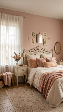
Vibe sentence: Warm blush walls wrapped around antique white furniture create the bedroom equivalent of a Jane Austen novel — dreamy, warm, and unmistakably romantic.
What makes it work: Blush pink reads as a warm neutral when it has peach or terracotta undertones rather than cool pink ones, which is why it pairs so beautifully with antique white and ivory — all three sit in the same warm family and create a tonal, luminous effect.
How to achieve it: Seek blush paint with warm (not lavender) undertones — try Clare’s “Take A Hint” or Benjamin Moore’s “Mellow Rose.” Pair with antique white furniture rather than bright white to keep the palette warm and cohesive rather than clinical.
Charcoal Gray with Mustard Yellow Accents
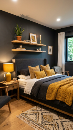
Vibe sentence: Charcoal and mustard is the design equivalent of dark jeans and a bold sweater — grounded, confident, and surprisingly warm.
What makes it work: Charcoal walls create a sophisticated, modern base that makes mustard accents pop without feeling childish — the warm yellow literally glows against the dark neutral, drawing the eye and adding visual energy.
How to achieve it: Keep the charcoal matte (never satin in a bedroom — matte absorbs light more softly) and introduce mustard through layerable textiles: one throw blanket, two cushions, and one lamp shade is all you need to commit to the palette without it overwhelming the space.
Warm White Walls with Black Iron and Walnut
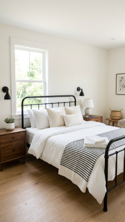
Vibe sentence: Warm white with black iron and walnut hits that perfect modern-farmhouse sweet spot — effortlessly fresh but never cold.
What makes it work: Three-material combinations (warm white, dark metal, warm wood) create automatic visual balance — the eye has light, dark, and warm tones to move between, which makes a simple room feel considered and complete.
How to achieve it: Use a warm white with yellow undertones, not cool gray-white — Benjamin Moore’s “White Dove” is the gold standard. Black iron bed frames are widely available at every budget (IKEA’s Sagstua is excellent under $200).
💡 Add one live-edge walnut shelf above the bed instead of artwork — it’s architectural, warm, and works as decor without costing what a painting would.
Lavender Gray Walls with Silver and White Bedding
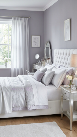
Vibe sentence: Lavender-gray walls exist in a dreamy in-between space — not quite gray, not quite purple — and the result is like sleeping inside a cloudy sky.
What makes it work: Lavender gray is a masterclass in subtle color — it reads as a sophisticated neutral in daylight but hints at violet by lamplight, giving the room a gentle color shift throughout the day. Silver accents amplify this quality by reflecting both cool and warm tones depending on the light.
How to achieve it: Choose a gray with clear purple (not blue) undertones — Sherwin-Williams’ “Dreamy” or Farrow & Ball’s “Brassica” lightened two shades. Avoid adding warm wood tones here — stay in the silver-white-lavender family for full effect.
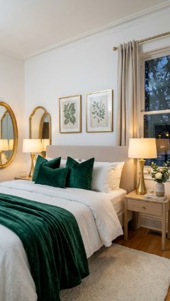
Forest Green Velvet Headboard Against Cream Walls
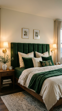
Vibe sentence: A forest green velvet headboard against cream walls is one of those design decisions that looks expensive, considered, and impossibly lush.
What makes it work: An oversized headboard in a deep, saturated color acts as the room’s anchor — it does the work that a feature wall would do, but with the added luxury of texture. Cream walls keep the backdrop neutral and warm so the green headboard can fully dominate.
How to achieve it: Look for headboards with deep button-tufting in bottle green or forest green velvet — the pile texture catches light and adds dimension. Keep the rest of the room understated: cream, ivory, brass only.
💡 Most headboard vendors on Etsy will custom-make an oversized velvet headboard to size — often cheaper than retail and in exact colors.
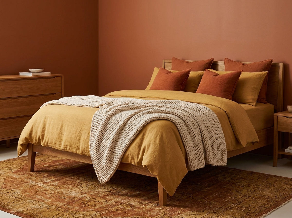
Warm Ochre Walls with Natural Jute and Linen
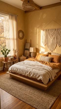
Vibe sentence: Ochre is sunshine distilled into a wall color — warm, golden, and so full of energy that the room practically hums.
What makes it work: Ochre reads as both earthy and luminous simultaneously — it has the groundedness of mustard but the brightness of gold, which makes it remarkably versatile in bedrooms that get natural light. Natural fibers like jute and linen echo the organic, warm quality of the pigment.
How to achieve it: Use an ochre that leans warm and orange rather than green — Annie Sloan’s “Arles” or Farrow & Ball’s “India Yellow” (diluted for walls) are classic choices. Layer texture with a jute rug, linen bedding, and at least one woven wall accent.
Deep Burgundy Walls with Warm Bronze and Cream
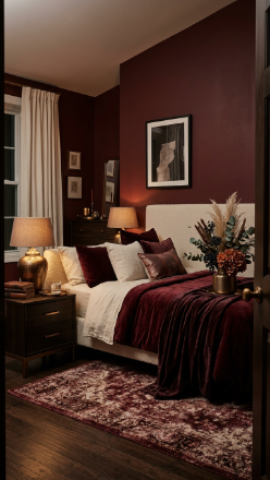
Vibe sentence: Deep burgundy walls make a bedroom feel like the inside of a very good wine cellar — rich, indulgent, and irresistibly intimate.
What makes it work: Burgundy is a neutral masquerading as a bold choice — it has enough brown in it to feel warm and grounding rather than aggressive. Cream and warm bronze provide the contrast needed to stop it from reading as dark rather than rich.
How to achieve it: Choose burgundy with brown undertones rather than blue ones — Farrow & Ball’s “Rectory Red” or Benjamin Moore’s “Cabernet” are ideal. Keep at least 40% of the room in cream or ivory to maintain the warmth-to-depth ratio.
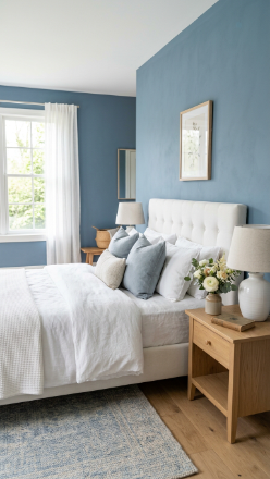
Powder Blue and Soft White for a Cloud-Like Bedroom
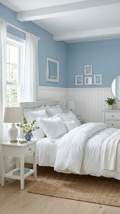
Vibe sentence: Powder blue and white together feel like climbing into a cloud — light, fresh, and so softly cheerful that mornings become a pleasure.
What makes it work: The combination of a soft wall color with white architectural detail (wainscoting or shiplap) creates visual structure that stops the palette from feeling flat or one-dimensional. The white below grounds the blue above, and the whole room gains architectural character.
How to achieve it: Paint above the chair rail line in powder blue (Benjamin Moore’s “Breath of Fresh Air” is a beloved classic) and below in a warm white. Full-room powder blue can feel cold in low light — the two-tone approach prevents that.
💡 Add beadboard wainscoting panels from your local hardware store (they cut to size) — a weekend project that instantly adds cottage character.
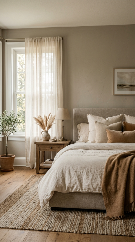
Warm Mushroom Taupe with Ivory and Eucalyptus
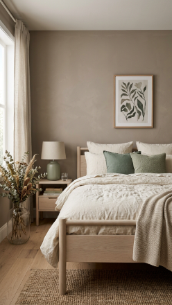
Vibe sentence: Mushroom taupe is the color of wellness retreats and boutique hotels — quiet, clean, and deeply calming without being empty.
What makes it work: Taupe with pink-gray undertones (mushroom) is naturally flattering in warm and cool light, which makes it one of the most reliable bedroom neutrals available. Ivory and eucalyptus accent it from either side of the warm-cool spectrum without clashing.
How to achieve it: Look for taupe paints labeled “mushroom” or “greige” with pink undertones — Sherwin-Williams’ “Accessible Beige” and “Agreeable Gray” are the industry standards. Add muted eucalyptus green through cushion covers and dried botanicals, not paint.
Slate Blue-Gray with Copper and Warm White
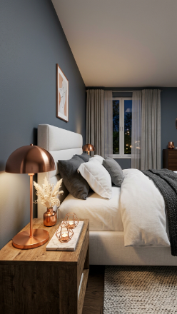
Vibe sentence: Slate blue-gray walls with copper accents feel like the adult version of cool — understated but with a warmth that creeps in and makes you linger.
What makes it work: Slate blue-gray is moody without committing to full drama — it’s cool-toned but not cold, which makes copper’s warmth feel like a revelation by contrast. The interplay between cool walls and warm metallic accents creates exactly the kind of visual tension that makes a room feel designed rather than assembled.
How to achieve it: Try Farrow & Ball’s “Inchyra Blue” or Sherwin-Williams’ “Misty” for the walls. Source copper accents deliberately — a single lamp, a small vase, a tray — rather than wholesale copper overload.
Cream and Caramel Tones for Ultimate Warmth
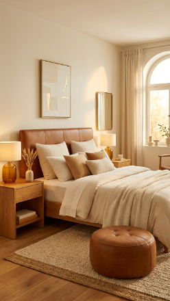
Vibe sentence: An all-cream-and-caramel bedroom is like wrapping yourself in the warmest cashmere coat — it’s tonal, intentional, and impossible to leave.
What makes it work: Tonal decorating (staying within the same color family but varying depth and material) creates rooms that feel cohesive and curated without the work of color-matching. Texture carries all the visual interest — the difference between a matte cream wall and a sheen caramel leather headboard is dramatic enough to make the room feel rich.
How to achieve it: Start with a warm cream base like Benjamin Moore’s “Creamy White” and build every piece within the caramel-ivory-biscuit spectrum. Vary material finish (matte, leather, linen, wood) to ensure the eye has contrast to travel between.
💡 A caramel leather or faux leather headboard is available at every price point — even IKEA and Amazon have convincing versions under $100.
Deep Teal Walls with Bright White and Natural Wood
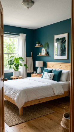
Vibe sentence: Deep teal walls with bright white bedding and pine wood feel like a weekend at a boutique coastal hotel — bold enough to be exciting, balanced enough to sleep in.
What makes it work: Teal is a rare wall color that reads as both cool and warm simultaneously — it has the depth of blue and the life of green, and bright white bedding acts like a reset button that keeps the whole scheme from becoming too heavy.
How to achieve it: Choose teal that leans slightly green rather than blue for warmer results — Benjamin Moore’s “Teal Ocean” or Behr’s “Cracked Pepper” (a blue-green hybrid) work well. Anchor with light pine or natural wood rather than dark stain, which can make the room feel cave-like.
Dusty Rose and Warm Gray: A Modern Romantic
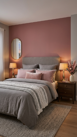
Vibe sentence: Dusty rose and warm gray is the refined, grown-up version of pink — romantic without the sweetness overload.
What makes it work: Dusty rose reads as a sophisticated neutral rather than a candy-pink when paired with warm gray — the gray cools the pink just enough and the pink warms the gray just enough, and the result is a palette in perfect equilibrium. Brushed gold bridges the two tones beautifully.
How to achieve it: Use dusty rose on a single accent wall behind the bed only — Clare’s “Take A Hint” or Sherwin-Williams’ “Romance” are excellent shades. Keep the remaining three walls in warm gray to prevent the pink from overwhelming the space.
Muted Olive Green with Tan Leather and Cream
Vibe sentence: Muted olive green with tan leather and cream is the bedroom equivalent of a well-worn leather journal — warm, substantive, and quietly confident.
What makes it work: Olive green contains both brown and yellow, which makes it uniquely compatible with leather tones — tan and olive are both drawn from the same earthy, organic spectrum. This palette reads as unisex and mature, making it one of the best choices for a shared bedroom.
How to achieve it: Seek olive greens with obvious khaki-brown undertones (not bright grass green) — Farrow & Ball’s “Mizzle” or Sherwin-Williams’ “Oakmoss” are ideal. A tan leather headboard from a vintage or secondhand furniture store adds character that new pieces rarely replicate.
Bright White Walls with Emerald Green and Gold
Vibe sentence: White walls with emerald green and gold accents feel like a celebration in progress — clean, bright, and secretly glamorous.
What makes it work: Jewel-tone accents against white walls create maximum visual pop with minimum commitment — the white keeps the space feeling fresh and spacious while the emerald and gold provide all the drama. This approach works especially well in smaller bedrooms where full dark walls would feel overwhelming.
How to achieve it: Buy two emerald green velvet cushion covers, one gold-framed mirror, and one gold lamp — under $150 total — and you’ve instantly transformed a plain white bedroom into something magazine-ready.
💡 Green velvet cushion covers are available in abundance from H&M Home and IKEA’s seasonal ranges — stock up when they’re in season.
Blush Pink Ceiling with White Walls Below
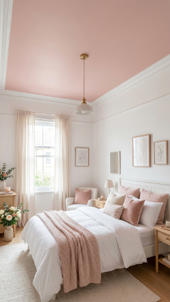
Vibe sentence: A blush-painted ceiling bathes the entire room in a warm rose-toned glow — it’s subtle, surprising, and one of the most romantic tricks in interior design.
What makes it work: The ceiling is the one surface your eye drifts to as you fall asleep, so painting it a warm, soft color fundamentally changes how the room feels after dark. A blush ceiling reflects warm pink light downward even during the day, making the whole room feel like it’s lit from within.
How to achieve it: Use the same blush paint from your accessories (or go one shade lighter) on the ceiling only, keeping walls white. Benjamin Moore’s “Pale Pink Satin” at half-strength makes an exceptional ceiling blush.
Warm Rust and Cream with Vintage Brass
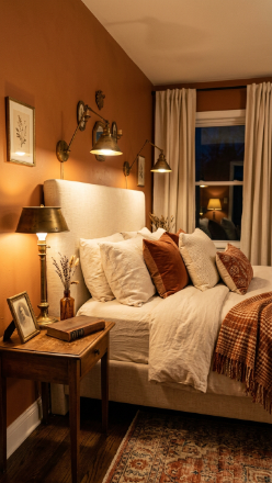
Vibe sentence: Warm rust walls with vintage brass and cream linen feel like stepping into a 1970s design revival — warm, nostalgic, and deeply cozy.
What makes it work: Rust orange has enormous warmth and energy without the aggression of pure red or the harshness of bright orange — it’s the color of autumn leaves and fired clay, both of which feel instinctively comfortable and cozy. Vintage brass echoes the warm red tones of the wall and amplifies them.
How to achieve it: Try Clare’s “Rust Belt” or Behr’s “Autumn Blaze” for a true warm rust wall. Source vintage brass lamps at thrift stores or estate sales — the imperfect, aged patina of real brass beats new lacquered brass every time.
Pale Yellow Walls with Crisp White and Rattan Accents
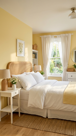
Vibe sentence: Pale yellow walls in a bedroom feel like waking up to perpetual sunshine — warm, optimistic, and gently energizing without ever being overwhelming.
What makes it work: Pale yellow in a bedroom doesn’t read as loud or childish when it’s muted and chalky rather than primary — it becomes a warm, tonal neutral that makes the room feel luminous. Crisp white bedding provides the clean counterpoint that keeps the palette feeling fresh rather than heavy.
How to achieve it: Choose a yellow that borders on cream — Farrow & Ball’s “Citron” at half-strength or Benjamin Moore’s “Pale Moon” are both gentle enough for a restful bedroom. Avoid pure, high-chroma yellows, which will feel energizing rather than calming.
💡 Yellow reads most beautifully in north-facing rooms that lack natural light — it compensates for the cool blue daylight and makes the room feel warmer than it is.
Warm Chocolate Brown with Warm White and Ivory

Vibe sentence: Chocolate brown walls wrap a bedroom in the deepest, most enveloping warmth — like a hug from the architecture itself.
What makes it work: Brown is having a major design renaissance because it pairs with virtually every other color, has built-in warmth, and creates that “cocooning” effect that’s central to the slow living aesthetic. White and ivory bedding against deep brown walls creates one of the most striking contrasts in bedroom design — bold but never harsh.
How to achieve it: Choose warm brown with red undertones rather than gray ones — Farrow & Ball’s “Mahogany” or Benjamin Moore’s “Chocolate Truffle” are classic choices. Keep all furniture and bedding in the white-ivory-cream range to avoid the room feeling cave-dark.
Soft Lavender Walls with White Furniture and Gold
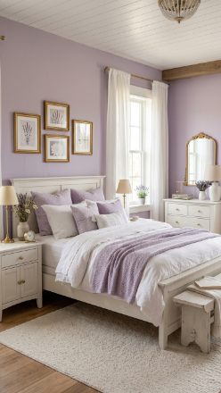
Vibe sentence: Soft lavender walls are the color of early evening light — calm, delicately romantic, and surprisingly easy to live with day after day.
What makes it work: Lavender reads as a softer, more versatile alternative to blue — it shares blue’s calming properties but adds a warmth that pure blue lacks. White furniture prevents it from feeling saccharine, and gold hardware adds just enough glamour to elevate the palette beyond a child’s room.
How to achieve it: Choose lavender that leans cool and chalky rather than warm-pink — Sherwin-Williams’ “Dreamy” or Behr’s “Ethereal Mood” are excellent starting points. White-painted furniture (especially carved or turned-leg pieces) gives the room a romantic French cottage quality.
Putty Gray-Pink with Natural Oak and White
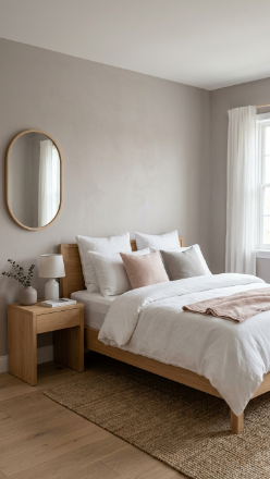
Vibe sentence: Putty gray-pink is the color of high-end Scandinavian interiors — so quietly beautiful that you almost can’t explain why it works, but it always does.
What makes it work: Putty has just enough pink warmth to feel inviting and just enough gray coolness to feel sophisticated — it’s the perfect bridge between masculine minimalism and feminine warmth. Natural oak furniture sits beautifully against it because both share warm, organic undertones.
How to achieve it: Look for paints described as “putty,” “greige,” or “warm gray with pink undertones” — Farrow & Ball’s “Elephant’s Breath” or Little Greene’s “Bone” sit precisely in this zone. Pair with light oak or natural ash furniture for best results.
Moody Plum with Cream and Aged Brass
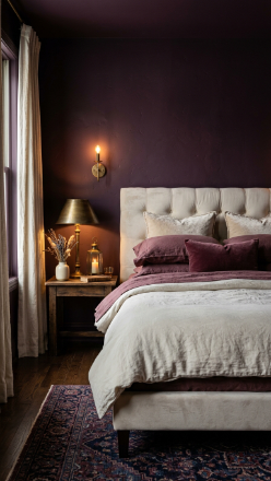
Vibe sentence: Deep plum walls with cream and aged brass create a bedroom that feels like the inside of a jewel box — intimate, layered, and unforgettably dramatic.
What makes it work: Plum is the most complex of all the jewel tones — it contains red, blue, and warm earthy undertones simultaneously, which makes it surprisingly adaptable. Cream bedding and aged brass create warmth that prevents the depth from feeling oppressive, keeping the room intimate rather than gothic.
How to achieve it: Choose plum that leans warm (red-brown undertones) rather than cold blue-violet — Farrow & Ball’s “Pelt” is the definitive choice. Aged or unlacquered brass (not polished) is critical — the warmth of its patina is what makes the palette sing.
How to Start Your Bedroom Color Scheme Transformation
Begin with paint — it’s the highest-impact, lowest-cost change you can make, and everything else follows from it. Before choosing a color, spend a full day noticing how light moves through your bedroom: north-facing rooms need warm colors, south-facing rooms can handle cooler tones, and east-facing rooms glow in the morning but feel flat by evening.
The most common mistake is choosing paint from a 2-inch chip under fluorescent store lighting. Always order peel-and-stick paint samples (Samplize is excellent) and live with them for 48 hours, viewing them morning and evening before committing.
For a budget-friendly entry point, start with paint plus new bedding — these two changes alone account for roughly 80% of a bedroom’s visual transformation. You don’t need new furniture; you need the right color on the walls and the right textiles on the bed.
Realistically, a full bedroom color scheme transformation — paint, bedding, and a few key accents — can be achieved for $300–$600 and a single weekend. The results are not gradual: when a bedroom color scheme clicks, it clicks completely, and the room becomes somewhere you actually want to spend time.
Frequently Asked Questions
What is the most relaxing bedroom color for better sleep?
Soft, muted colors with warm or neutral undertones consistently rank highest for promoting relaxation: dusty blue, sage green, warm greige, and lavender gray all share a quality of visual quietness that helps the nervous system wind down. Avoid bright whites with cool blue undertones (often labeled “bright white” or “cool white”), which can feel activating rather than calming under artificial light. Research in color psychology suggests that low-saturation, mid-value colors — neither too dark nor too light — are most effective for restful environments. Benjamin Moore’s “Pale Oak” or Sherwin-Williams’ “Agreeable Gray” are among the most reliably recommended choices in this category.
How do I choose a bedroom color scheme without expensive mistakes?
The key is testing before committing: use peel-and-stick paint samples from Samplize or large painted cardboard swatches and view them at different times of day and under your actual bedroom lighting (not the store). Start with your largest fixed element — usually the bed frame or flooring — and choose a wall color that complements it rather than fights it. Warm wood floors and frames pair best with warm wall tones (greige, sage, terracotta); cool gray or white furniture pairs with blue, lavender, and cool neutral walls. Keep your first attempt to one accent wall if you’re nervous about full commitment.
Can dark bedroom color schemes work in small rooms?
Yes — and often more successfully than pale colors in a small bedroom. The common assumption that dark colors shrink a space is largely a myth in the context of bedrooms: dark walls make a small room feel deliberately intimate and “jewel-box” rather than accidentally small. The key is keeping bedding and textiles light (ivory, cream, white) to prevent the room from feeling cave-like, and ensuring you have at least one window providing natural light. Deep teal, midnight navy, and forest green all work beautifully in compact bedrooms when balanced with pale bedding and warm metallic accents.
What bedroom color schemes are trending right now?
The dominant trends in 2024–2026 center around warm, earthy organic palettes — terracotta with linen and rattan, warm chocolate brown with ivory, and mushroom taupe with sage accents are among the most searched bedroom color combinations on Pinterest currently. Simultaneously, there’s a strong parallel trend for jewel-tone moody bedrooms: deep teal, plum, and midnight blue with aged brass are consistently popular. Both movements share an underlying preference for warmth, texture, and intentional imperfection over the clean, cool, all-gray minimalism that dominated the previous decade.
Do bedroom color schemes need to match the rest of the house?
Bedrooms are the one space in a home where departing from the rest of the house’s palette is not only acceptable but often desirable — a bedroom should feel like a distinct retreat, not an extension of the living room. The only coherence needed is between the bedroom’s internal elements: wall color, bedding, furniture, and accessories should speak to each other within the room. If your home is predominantly neutral throughout, a bedroom in deep teal or warm terracotta actually enhances the overall experience by creating a destination that feels distinct and special.
Ready to Create Your Dream Bedroom Color Scheme?
You’ve just explored 27 bedroom color schemes ranging from the softest pale lavender to the moodiest midnight plum — and the most important thing to know is that none of them are wrong, only more or less right for your space, light, and sleep needs. Save the schemes that made you stop scrolling, and then go do one thing: order paint samples. That single action moves you from browsing to building, and a bedroom color transformation you’ll genuinely love is closer than you think. The right bedroom color scheme doesn’t just change how a room looks — it changes how you feel inside it, morning and night, every single day.