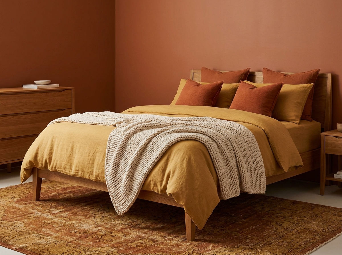
There’s a particular kind of magic that happens when the right wallpaper meets a bedroom — the room stops being a place you sleep in and becomes a place you dream in. Bedroom wallpaper transforms walls from flat, neutral surfaces into deeply personal statements of atmosphere, character, and beauty, wrapping the most intimate room in your home in something that feels entirely, unmistakably yours. Whether you’re drawn to the hushed drama of a moody floral, the quiet sophistication of a textured grasscloth, or the dreamy softness of a watercolor print, the right wallpaper changes everything. These 27 beautiful boudoir wallpaper designs span every style, scale, and sensibility — from the maximalist to the barely-there. Here are 27 ideas worth saving.
Why Bedroom Wallpaper Works So Well
A bedroom is the one room in the home where the usual decorating rules loosen their grip. You don’t need it to function for guests, to impress visitors, or to suit anyone’s tastes but your own — which makes it the perfect canvas for wallpaper that feels genuinely bold, personal, and enveloping. The best bedroom wallpaper ideas don’t just decorate a wall; they establish the entire emotional register of the room before a single piece of furniture arrives.
What makes wallpaper particularly powerful in a bedroom is scale and repetition. A pattern that might feel overwhelming in a kitchen or hallway settles into something meditative in a bedroom, where the eye returns to it slowly — first thing in the morning, last thing at night — discovering new details over time. This is why large-scale botanicals, maximalist chinoiserie, and dramatic murals tend to feel more at home in a bedroom than anywhere else in the house.
Current wallpaper trends in bedroom design are moving decisively toward depth and texture. Grasscloth, linen-weave, and fabric-backed papers are surging on Pinterest alongside moody, saturated florals and hand-painted mural designs that reference traditional Eastern and European decorative arts. The through-line is a rejection of the flat, printed accent wall in favor of wallpaper that has physical presence — something you want to reach out and touch.
Even a single feature wall behind the bed delivers transformative results without committing every surface to pattern. The headboard wall is the most high-impact position in a bedroom — it frames the bed like a theatrical backdrop, makes the furniture arrangement feel purposeful, and is the first thing you see upon entering the room.
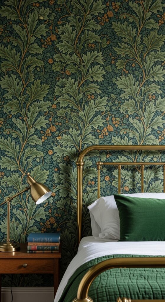
1. Oversized Botanical Floral in Deep Jewel Tones
Vibe: Sleeping inside a Victorian greenhouse at midnight — lush, shadowy, and completely, gloriously excessive.
What makes it work: Large-scale botanicals on a near-black background create depth and immersion that lighter colorways simply cannot replicate — the room appears to dissolve into the pattern rather than simply displaying it. The jewel tones absorb and reflect lamplight differently throughout the evening, making the wallpaper appear almost luminous by bedside light.
How to achieve it: Look for wallpaper with a pattern repeat of at least 600mm for genuinely large-scale botanical impact — smaller repeats read as busy rather than dramatic. Choose a matte or soft-sheen finish rather than high gloss, which can look cheap in rich colorways. Pair exclusively with warm metal accents — unlacquered brass or antique gold — to complement the warmth of the jewel tones.
💡 Applying this paper to only the headboard wall gives you 80% of the drama at 25% of the cost and commitment.
2. Soft Watercolor Blush Peony Print

Vibe: Waking up inside a watercolor painting — soft-edged, flower-filled, and tenderly beautiful.
What makes it work: Watercolor-style florals succeed where photorealistic prints sometimes feel static — the deliberate looseness and visible brushwork give the wallpaper an artistic, hand-made quality that elevates it from surface covering to genuine wall art. Blush peonies on warm white create maximum softness without the saccharine quality of bright pink, thanks to the muted, grey-inflected tones of watercolor pigment.
How to achieve it: Choose wallpapers with an unpasted or paste-the-wall construction for easier pattern matching on large blooms. For a truly cohesive look, repeat the wallpaper’s blush tones in just one or two soft furnishings — a throw or a pair of cushions — and keep everything else in cream and natural linen to avoid over-pinking the room.
3. Grasscloth Weave Wallpaper in Warm Wheat
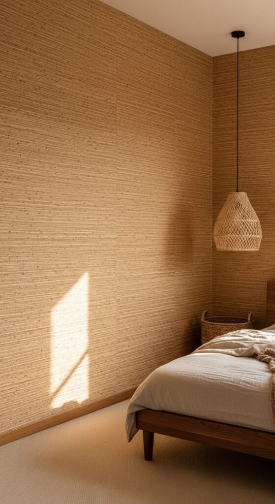
Vibe: Wrapped in warmth and natural texture — a room that feels like a deep breath of warm, unhurried air.
What makes it work: Grasscloth wallpaper delivers something printed papers cannot — genuine tactile texture that changes appearance dramatically depending on light direction, angle, and time of day. The natural fiber variation between panels creates a subtle, organic tonal shift across the wall surface that reads as handcrafted depth rather than inconsistency.
How to achieve it: Grasscloth requires professional installation — the seams are visible by design, and incorrect paste application or misaligned seams will show permanently. Budget for a professional paperhanger and factor in 10–15% extra material for pattern and seam management. Avoid grasscloth in high-humidity rooms or on walls with moisture issues, as natural fibers will swell and warp.
💡 Faux grasscloth vinyl wallpapers from brands like Graham & Brown deliver the texture aesthetic with far easier installation and moisture resistance.
4. Moody Midnight Blue Geometric Pattern
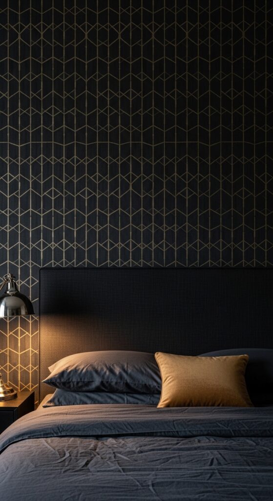
Vibe: A private club for one — precisely ordered, richly toned, and charged with quiet authority.
What makes it work: Gold geometric lines on a deep, dark background create a wallpaper that reads as both structured and luxurious — the geometry provides intellectual rigor while the gold adds warmth and glamour. The slight sheen differential between the matte ground and semi-metallic pattern creates a sophisticated visual depth that reads differently in natural daylight versus lamp light.
How to achieve it: The key to making dark geometric wallpaper work is keeping furniture and soft furnishings in deep, tonal colors rather than contrasting with white or cream — this allows the wallpaper to establish the room’s atmosphere rather than fighting for attention. Choose bedding in charcoal, navy, or dark forest tones to let the wall dominate beautifully.
5. Chinese Chinoiserie Birds and Blossom
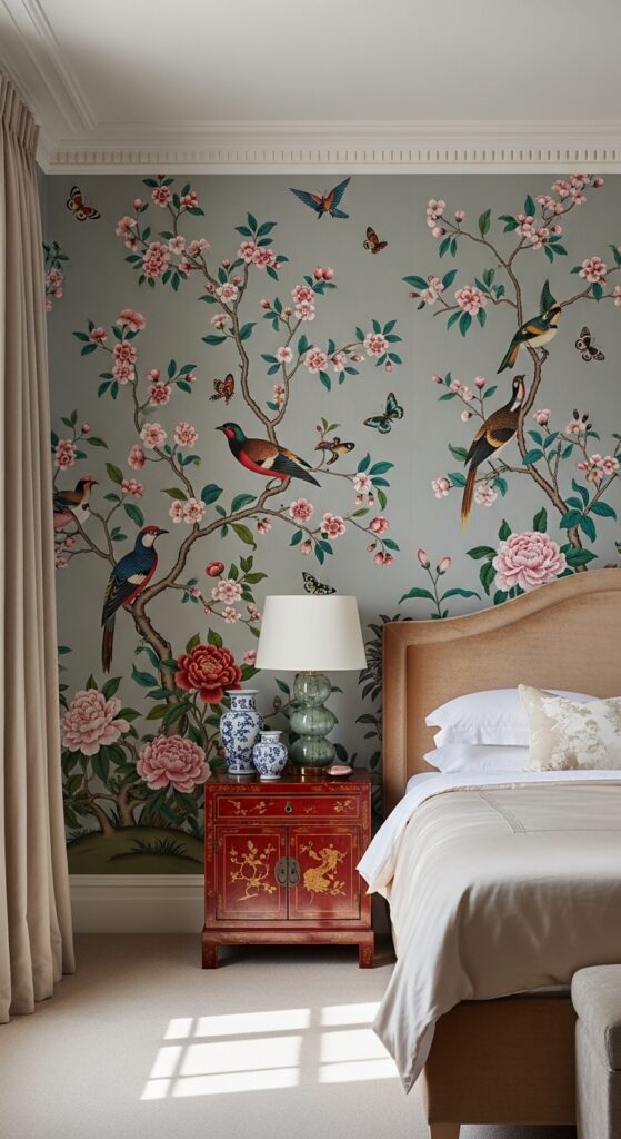
Vibe: A room borrowed from a grand English country house — layered with centuries of taste and the finest Eastern decorative arts.
What makes it work: Chinoiserie wallpaper has endured for three centuries precisely because the illustrative style — detailed, exotic, and narrative-rich — never becomes visually familiar. Each wall panel tells a different story, and the sheer density of detail rewards long, slow looking. The pale background keeps the room luminous rather than enclosed, making chinoiserie one of the few maximalist wallpaper styles that works on all four walls without becoming oppressive.
How to achieve it: Traditional chinoiserie wallpapers are sold in scenic or panel formats — buy the full room set rather than a pattern repeat to get the intended design across all four walls. De Gournay, Fromental, and Zoffany produce exceptional examples; more affordable versions are available from Cole & Son and Graham & Brown. Apply to all four walls — chinoiserie is one style that genuinely improves when it surrounds you completely.
6. Neutral Linen-Texture Abstract Wallpaper
Vibe: Beautifully nothing and everything — the kind of sophisticated non-pattern that takes years to understand and a lifetime to stop appreciating.
What makes it work: Abstract texture wallpapers occupy a sophisticated middle ground between plain paint and patterned paper — they add the visual interest and warmth of wallpaper without the commitment of a recognizable pattern. The barely-there design allows the wall to shift subtly in different lighting conditions, reading almost flat in diffuse light and richly textured in directional sun.
How to achieve it: Look for wallpapers described as “abstract,” “painterly,” or “movement” in warm greige, stone, or putty colorways — many are produced on a non-woven substrate for easy hanging and removal. This style pairs particularly well with natural textures throughout the room — linen, jute, rattan, and undressed timber all complement the organic quality of the paper.
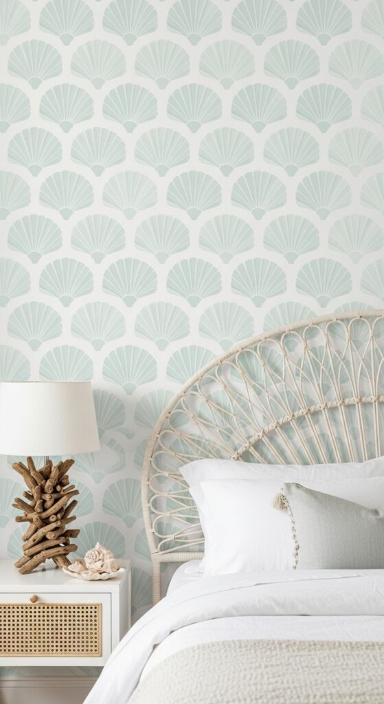
7. Art Deco Fan and Shell Repeat in Blush and Gold
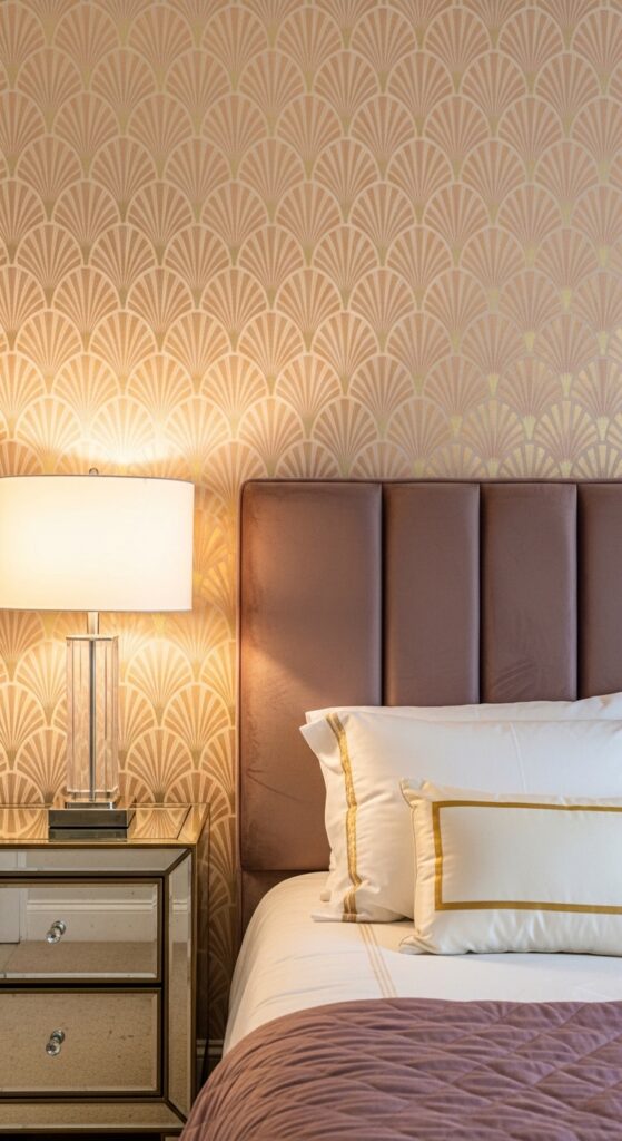
Vibe: A 1930s Hollywood dressing room — glamorous, precise, and dripping in warm gold at every edge.
What makes it work: Art Deco pattern’s defining quality is the combination of geometric precision with organic forms — the fan and shell motifs are based on natural shapes but rendered with mathematical exactness, creating a pattern that is simultaneously elegant and architectural. Gold metallic printing on a warm-toned ground activates the pattern under lamplight in a way that daytime photographs never fully capture.
How to achieve it: The gold elements in art deco wallpapers are almost always printed rather than foiled — genuine metallic foil wallpapers are significantly more expensive but deliver extraordinary reflective depth that standard metallic ink cannot match. Pair exclusively with warm metals — antique brass, polished gold, champagne — rather than cool silver or chrome, which fights the warmth of the gold tones.
💡 A single feature wall in art deco paper paired with plain blush walls on three sides achieves the glamour without the cost or visual weight of a full four-wall treatment.
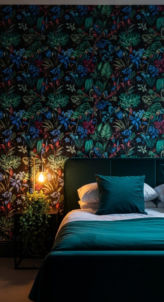
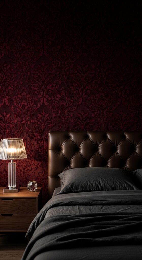
8. Dramatic Dark Floral on Black Background

Vibe: Dark romance at full volume — a wall that belongs in a Gothic novel and makes every bedside lamp feel like a candle.
What makes it work: Deep-toned florals on a black background achieve an almost three-dimensional quality — flowers appear to float forward from the dark ground, giving the wall genuine visual depth. The dark background also makes smaller bedrooms feel more intimate and considered rather than cramped, which is counterintuitive but remarkably consistent in practice.
How to achieve it: Balance a black-ground floral wall with bedding in the lightest possible tone — ivory, white, or the palest blush — to create a breathing contrast that prevents the room from feeling cave-like. Keep the remaining three walls in a very deep version of one of the floral tones (deep charcoal, soft black, or dark greige) rather than switching to white, which would create jarring contrast.
9. Soft Stripe Wallpaper in Dusty Blue and White

Vibe: A New England beach cottage bedroom — crisp, timeless, and endlessly restful.
What makes it work: Vertical stripe wallpaper is one of interior design’s most reliable visual tricks — the continuous vertical lines draw the eye upward, making ceilings appear higher and rooms feel taller than their actual dimensions. Dusty, grayed-down blue avoids the corporate, candy-stripe quality of bright primaries while retaining all the visual crispness of a striped paper.
How to achieve it: Stripe wallpaper requires perfectly plumb installation — even a fraction of a degree off-vertical will become visible across a full wall of stripes. Use a laser level rather than a spirit level, and always start from the room’s most visible corner rather than the door wall. Choose stripes wider than 50mm; narrower stripes read as busy and can cause visual vibration.
10. William Morris Inspired Acanthus Leaf Pattern
Vibe: A Victorian library transplanted into a bedroom — intellectual, verdant, and brimming with botanical richness.
What makes it work: William Morris-derived patterns are among the few historical repeats that feel genuinely contemporary rather than nostalgic when used today, because the hand-drawn quality, rich botanical detail, and natural color palette align precisely with current interest in craft, sustainability, and biophilic design. The dense, layered leaf forms reward close inspection in a way that digitally printed patterns rarely do.
How to achieve it: Original Morris & Co. wallpapers are authentic to the Arts and Crafts tradition and available in heritage colorways. More affordable interpretations from Sanderson, Colefax and Fowler, and smaller independent studios capture the same aesthetic at lower price points. Pair with natural materials exclusively — brass, dark stained oak, wool, and velvet all complement the earthy richness of the palette.
11. Pink Maximalist Vintage Rose Damask
Vibe: Unabashedly, joyfully feminine — the bedroom that makes no apologies and every right choice.
What makes it work: Damask wallpaper derives its visual richness from the tonal interplay of pattern and ground in very similar colors — the distinction between the rose motif and the blush ground is subtle enough that the room reads as an enveloping, tonal color experience rather than a busy pattern. This makes maximalist damask far more livable than its ornate appearance suggests.
How to achieve it: The all-over four-wall approach works exceptionally well with tonal damask because the self-similar pattern creates a cocoon effect rather than a spotlight — your eye moves evenly around the room. Keep furniture in pale, tonal colors within the same palette, and avoid introducing contrasting colors that would break the immersive tonal envelope.
12. Tropical Palm Leaf Print on Cream Background
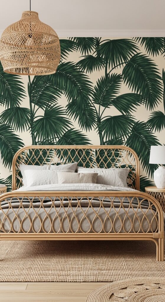
Vibe: A Bali resort transplanted behind your headboard — lush, relaxed, and permanently on holiday.
What makes it work: Large palm leaves work in a bedroom because their bold, sculptural form is immediately calming rather than busy — the eye reads “jungle” rather than “pattern,” and the green-on-cream colorway has the same soothing quality as looking into a garden through a window. The cream background keeps the room light and airy despite the large dark-green scale.
How to achieve it: Center the wallpaper pattern precisely behind the bed — the central axis of the pattern repeat should align with the center of the headboard wall for a balanced, intentional look. Pair with natural, organic materials only — rattan, linen, jute, and white ceramics — and avoid introducing any industrial or contemporary elements that would clash with the botanical spirit of the paper.
💡 Peel-and-stick tropical wallpapers from Chasing Paper and Tempaper are renter-friendly and can be repositioned during installation.
13. Soft Sage Green Floral Trellis Wallpaper
Vibe: Waking up inside an English cottage garden in June — gentle, green, and perfectly unhurried.
What makes it work: Floral trellis patterns succeed in bedrooms because the geometric trellis structure provides organizational order while the organic floral infill provides warmth and life — you get the sophistication of a geometric pattern alongside the intimacy of a botanical one. Sage green is the most universally flattering green for bedrooms because its grey undertone keeps it calming rather than stimulating.
How to achieve it: This is one of the few wallpaper styles that works beautifully on all four walls including the ceiling — wrapping the full room including the ceiling in a fine-scale trellis paper creates the feeling of sleeping inside a garden bower. Use a consistent border strip at the ceiling-wall junction for a tailored finish.
14. Panoramic Forest Mural Wallpaper
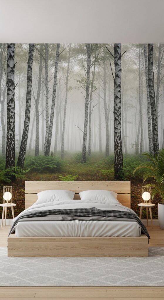
Vibe: Waking up inside the most beautiful, misty morning forest — completely transportive and permanently restful.
What makes it work: Panoramic mural wallpapers remove the visual boundary of the bedroom wall entirely, replacing it with an implied depth of landscape that makes the room feel boundless. Birch forest imagery is particularly effective because the vertical white trunks function as natural vertical stripes, visually heightening the room while the horizontal mist layers add a calming sense of depth.
How to achieve it: Panoramic murals are custom-printed to your exact wall dimensions, so accurate measurement (width and height including skirting and any recess details) is essential before ordering. Most mural suppliers offer free digital proofs showing the mural scaled to your wall — always request this before ordering. Install on a single wall only; murals lose their transportive power when multiple walls compete.
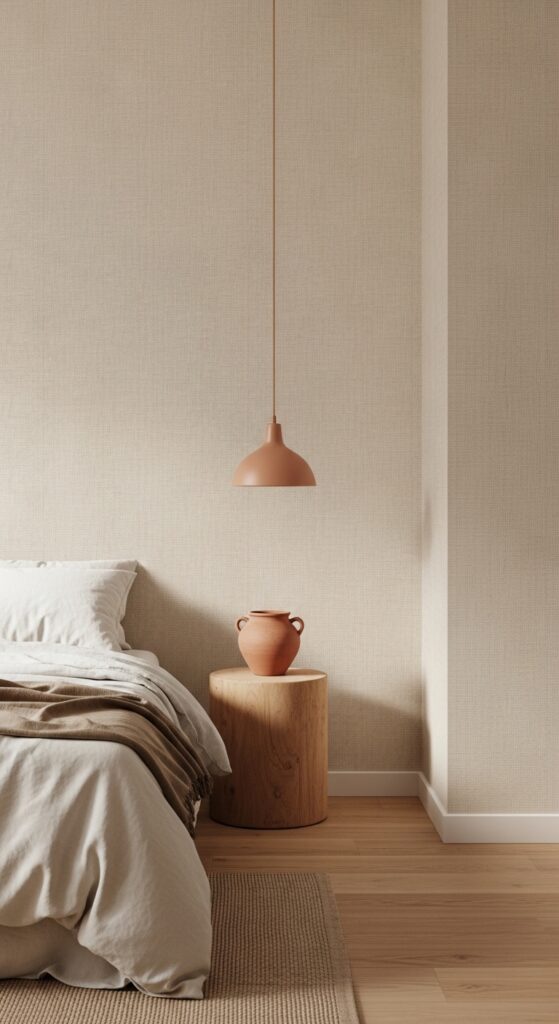
15. Textured Linen-Look Cream Wallpaper
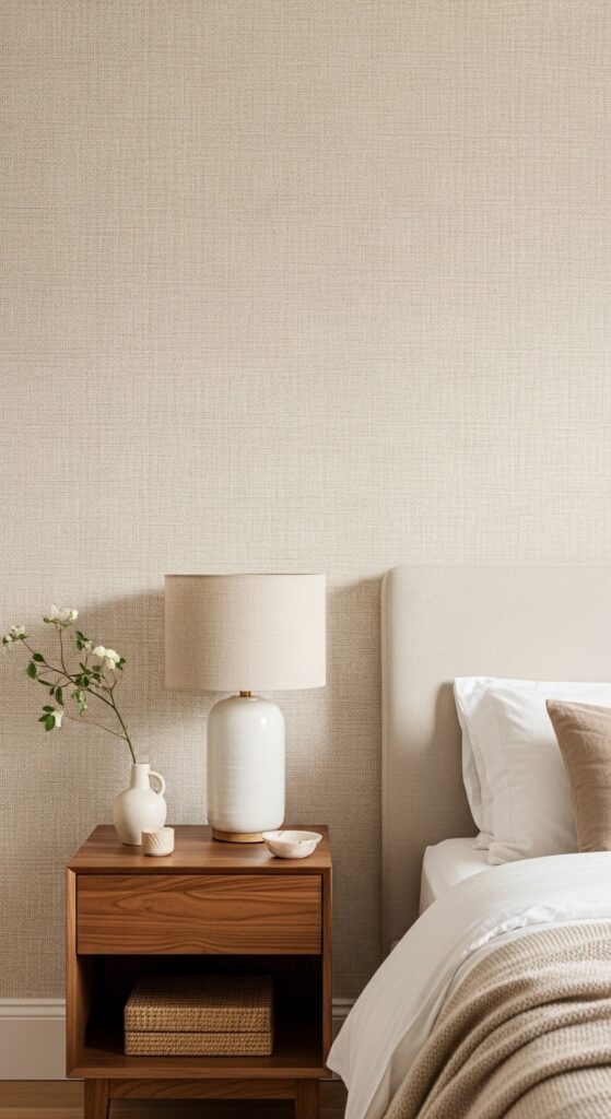
Vibe: Restraint as the ultimate luxury — a room where the texture itself is the statement, and it is more than enough.
What makes it work: Linen-texture wallpaper elevates a neutral bedroom in precisely the way that flat paint cannot — the visible weave structure catches light and changes appearance throughout the day, providing constant visual interest without any pattern or color distraction. It functions like wrapped fabric around the room, adding acoustic softness and visual warmth simultaneously.
How to achieve it: Apply linen-texture wallpaper to all four walls including behind furniture — the all-over texture treatment reads as an intentional material choice rather than a pattern, so it works without the feature-wall restriction of more graphic papers. Ensure walls are perfectly smooth before application — linen texture papers are unforgiving over bumpy or poorly prepared surfaces.
16. Hand-Painted Indigo Shibori Abstract Pattern
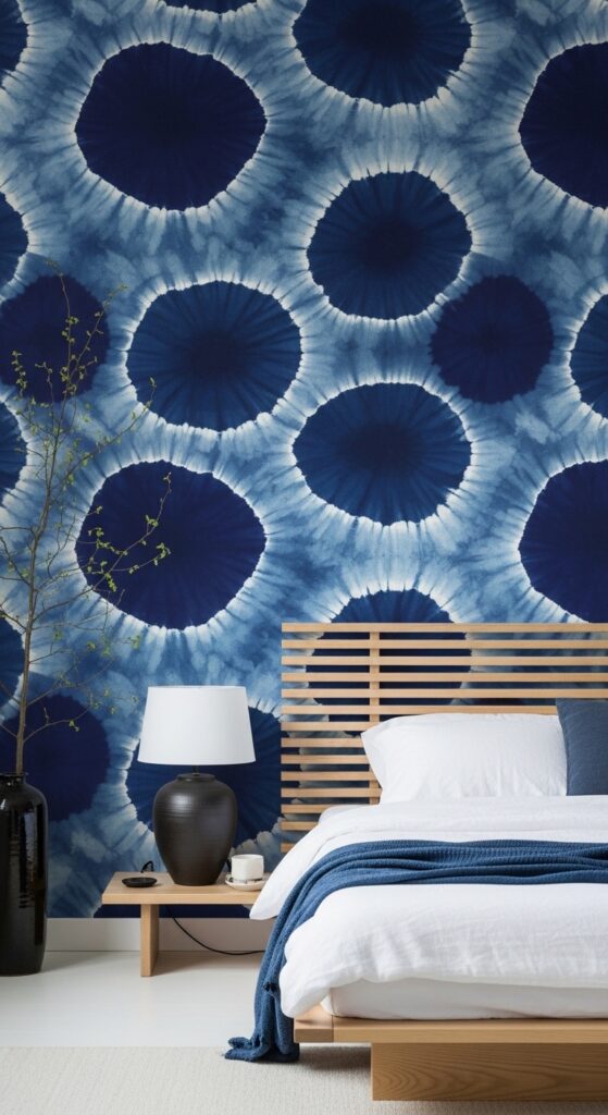
Vibe: The quiet meditative beauty of Japanese craft brought to the bedroom wall — imperfect, unhurried, and impossibly calming.
What makes it work: Shibori-inspired wallpaper captures a visual quality unique in the wallpaper world — the deliberate irregularity and organic form of resist-dye pattern that looks different in every section of the repeat. The indigo-on-white colorway is one of design’s most enduring and universally calming combinations, rooted in centuries of Japanese and global textile tradition.
How to achieve it: Choose a paper with a large enough pattern scale that the shibori forms read as clouds or abstract shapes rather than small spots — the scale should be at least 300–400mm across each major form for the most calming, expansive effect. Pair exclusively with natural, minimalist materials — pale oak, white linen, dark ceramic — and avoid any decorative accessories that would compete with the pattern’s artisan quality.
17. Whimsical Star and Moon Pattern in Navy
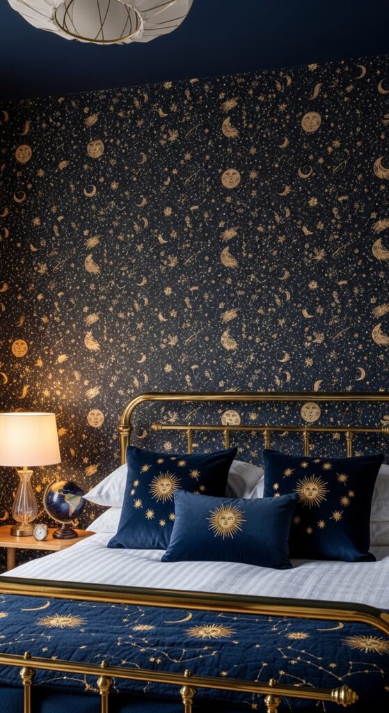
Vibe: Sleeping under the night sky, every single night — cozy, celestial, and absolutely enchanting.
What makes it work: Dense small-scale celestial patterns work in bedrooms precisely because they are best enjoyed from the horizontal position — lying in bed looking at a ceiling or headboard wall covered in tiny stars and moons has an inherently dreamy, intimate quality that encourages the mental transition into sleep. The small scale of individual motifs means the overall impression reads as texture rather than busy pattern.
How to achieve it: Apply this style of all-over small-scale pattern to the headboard wall and ceiling only — extending it across all four walls pushes the celestial effect from intimate into oppressive. A navy painted ceiling with the same wallpaper on the headboard wall creates a beautifully cohesive constellation room that works for both adults and children.
18. Raised Flock Velvet Pattern Wallpaper in Burgundy
Vibe: A room dressed for the opera — dark, deeply luxurious, and uncompromisingly opulent.
What makes it work: Flock wallpaper is unique in interior surfaces because it has genuine tactile depth — the raised velvet pile creates a pattern visible by both sight and touch, with the direction of the pile creating a subtle sheen shift as the viewing angle changes. In a tonal, self-colored colorway (pattern and ground in the same deep burgundy), the effect is richly sophisticated rather than theatrical.
How to achieve it: Handle flock wallpaper with extreme care during installation — the velvet pile is irreversibly flattened by paste, seam rollers, or careless handling. Always fold flock paper face-to-face rather than rolling it, and avoid any contact between paste and the pile face. Professional installation is strongly recommended. Avoid in high-traffic or humid bedroom environments.
19. Retro Mushroom and Botanical Print
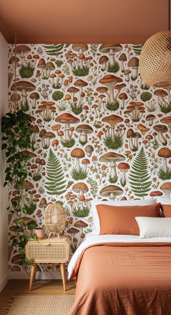
Vibe: A forest floor brought indoors — joyful, earthy, and completely unlike anything else in a wallpaper collection.
What makes it work: Mushroom and woodland botanical prints tap into the current cultural fascination with foraging, mycology, and the natural world, giving a bedroom that feeling of organic connection that has been one of Pinterest’s most consistent interior trends since 2022. The illustrated, vintage-naturalist style ensures the pattern reads as sophisticated rather than novelty.
How to achieve it: Pair woodland botanical wallpaper with warm, earthy soft furnishings — terracotta linen, ochre cotton, natural jute, and ceramic accessories in earth tones. Avoid any contemporary metallics or cool-toned elements, which would clash with the paper’s warm, foraged-from-nature quality. A terracotta or warm ochre painted ceiling takes the look from feature wall to fully committed room concept.
💡 Society6 and Redbubble offer smaller-run illustrated wallpaper designs from independent artists, often at significantly lower prices than mainstream wallpaper brands.
20. Ombre Gradient Wallpaper from Deep to Pale
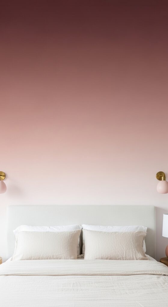
Vibe: Waking up inside a sunset — the whole wall a single, slow, beautiful transition from deep to pale.
What makes it work: Ombre gradient wallpapers place the darkest, most saturated tone at the ceiling, which has a deeply counterintuitive but remarkably effective design consequence — by visually weighting the ceiling, the room paradoxically appears more grounded and intimate rather than heavier. The fade to pale at floor level keeps the room feeling light and spacious despite the deep ceiling tone.
How to achieve it: Ombre wallpapers are digitally printed to order in standard widths — measure your wall height precisely, as the gradient’s position is fixed within the paper’s printed length. The most critical installation step is matching the gradient transition perfectly at every seam, which requires careful horizontal alignment at a consistent reference height across every drop.
21. Terracotta Abstract Brush-Mark Wallpaper
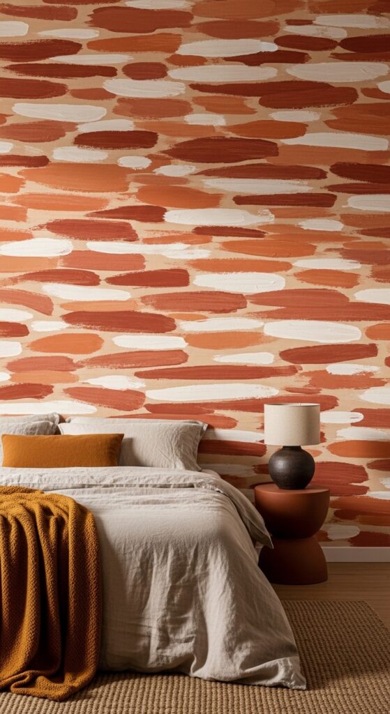
Vibe: Like sleeping inside an abstract expressionist painting — warm, gestural, and deeply alive.
What makes it work: Abstract brush-mark wallpaper mimics the texture and movement of genuine painted plaster or encaustic artwork, bringing an artisan quality to the wall that pattern-based papers lack. Terracotta and rust tones have exceptional warmth in natural and lamp light, making the room feel substantially more intimate and welcoming than cool-toned walls.
How to achieve it: Use all four walls rather than a feature wall for abstract brush-mark papers — the pattern’s intentional irregularity means seams are far less visible than with geometric or repeat-pattern wallpapers, making an all-over application both more achievable and more impactful. Pair with raw, unfinished natural textures — raw linen, unfired ceramic, undressed timber — for a cohesive organic aesthetic.
22. Elegant Scallop Shell Repeat in Pale Aqua
Vibe: A bedroom that woke up to the sound of the sea — light, clean, and delicately beautiful.
What makes it work: The scallop shell motif has an art-historical lineage stretching from Botticelli to art deco architecture, giving it a cultural depth that prevents it from reading as purely decorative or beachy. Rendered in pale aqua on white, the pattern captures coastal freshness without resorting to nautical clichés — no anchors, no ropes, no lighthouses.
How to achieve it: Keep the coastal palette restrained and sophisticated — pale aqua, white, driftwood, and sea glass tones only, with no saturated navy or primary colors that would push the room toward a themed rather than designed aesthetic. Introduce natural textures (rattan, driftwood, linen) rather than specifically maritime objects for an elevated coastal result.
23. Embossed Anaglypta Paintable Wallpaper in White
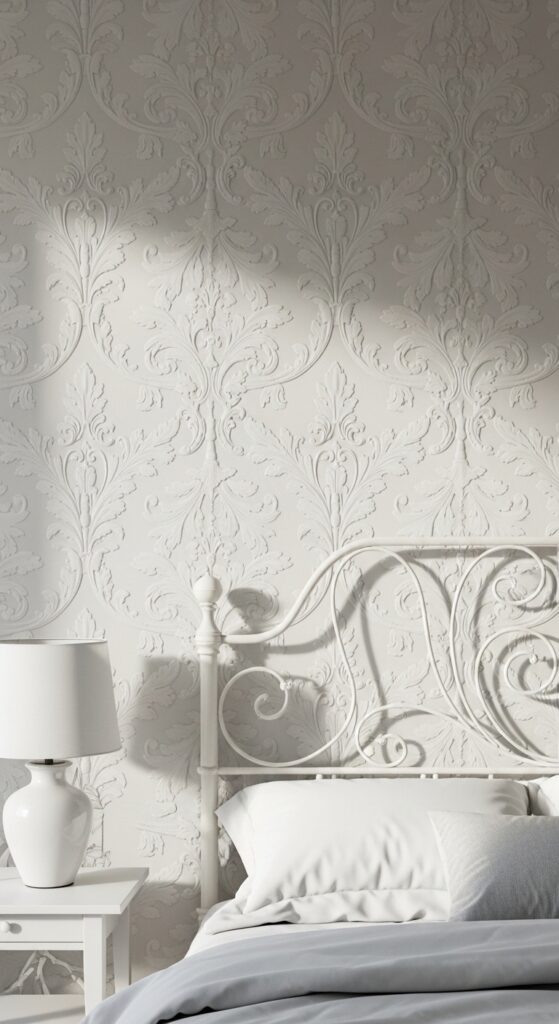
Vibe: The quiet majesty of Victorian craftsmanship — a pattern so disciplined it speaks only in shadow.
What makes it work: Paintable embossed wallpaper occupies a unique position between wallpaper and architectural plasterwork — the raised pattern introduces genuine three-dimensional texture to the wall surface while the all-white painting unifies it with the room’s architecture rather than treating it as a decorative element. The pattern reveals and conceals itself as light changes throughout the day, providing visual interest that is entirely dependent on light quality.
How to achieve it: Apply at least two coats of paint after hanging — the first coat often highlights installation imperfections, which a second coat corrects. Use a roller with a medium nap (10–12mm) to ensure paint reaches into the recesses without flooding the raised pattern. Avoid high-gloss paints, which flatten the relief effect; eggshell or satin provides the best balance of durability and shadow definition.
24. Warm Terracotta and Cream Tile-Inspired Pattern
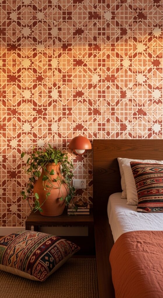
Vibe: Marrakech filtered through a design-forward lens — geometric, warm, and deeply satisfying to look at.
What makes it work: Tile-pattern wallpaper brings the visual appeal of expensive encaustic cement tiles to a vertical surface — you get the pattern-richness of a globally inspired geometric print with the practical simplicity of wallpaper installation. The warm terracotta and cream palette roots the Moroccan-influenced pattern in an earthy, natural color story that reads as contemporary rather than costumey.
How to achieve it: The precise geometric repeat of tile-pattern wallpaper demands extremely careful horizontal and vertical alignment during installation — even a millimeter of skew becomes visible across a full wall of tight geometric repeat. Use a laser level to establish a perfectly horizontal start line, and hang from the center of the most visible wall section outward to ensure the pattern centers correctly.
25. Painterly Abstract Landscape Wallpaper
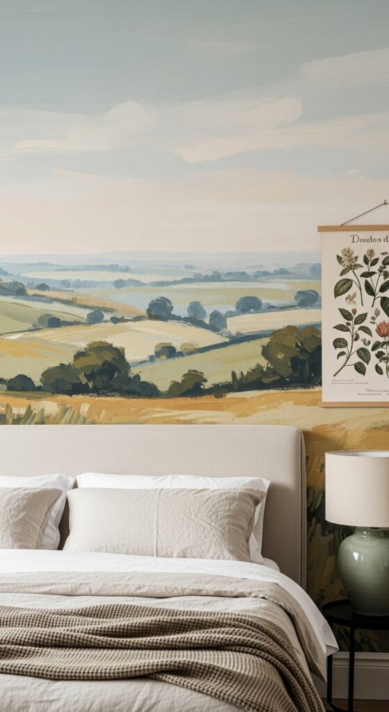
Vibe: A painting you can sleep inside — broad, quiet, and wide as an unhurried landscape.
What makes it work: Abstract landscape wallpapers bridge the gap between mural and pattern — the landscape reference gives the composition a natural horizon line that is deeply restful to the eye (research consistently shows that natural landscape views reduce cortisol levels), while the abstract treatment keeps it as art rather than a literal scene. The soft, muted palette prevents any single color from dominating.
How to achieve it: Treat painterly abstract landscape wallpapers as you would a piece of art — position the horizon line at eye level from the bed’s height for the most immersive effect. This typically means calculating the wallpaper’s compositional horizon position and then adjusting how high on the wall you hang the paper to place the horizon at 700–800mm above mattress height.
💡 Many independent wallpaper designers on Anthropologie Home and Minted offer abstract landscape designs at considerably lower cost than established wallpaper houses.
26. Jewel-Tone Peacock Feather Pattern
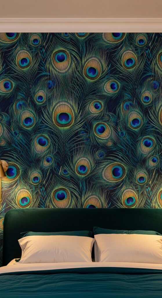
Vibe: The most spectacular single wall in the house — impossibly beautiful, deeply glamorous, and entirely worth the commitment.
What makes it work: Peacock feather patterns are one of wallpaper’s all-time great designs because the natural form of the feather eye — a perfect circle of graduating color surrounded by radiating barbs — is already one of nature’s most complex and beautiful geometric compositions. The jewel-tone colorway leverages the peacock feather’s natural palette without imitation, resulting in a pattern that reads as both exotic and designed.
How to achieve it: Restrict the peacock feather paper to the headboard wall only — this pattern is so visually commanding that it needs the rest of the room as breathing space. Balance with ivory or warm white on the remaining three walls and bedding in the deepest tone from the wallpaper palette — teal or sapphire velvet creates a seamlessly sophisticated connection between wall and bed.
27. Soft Lavender Botanical Herb Garden Print
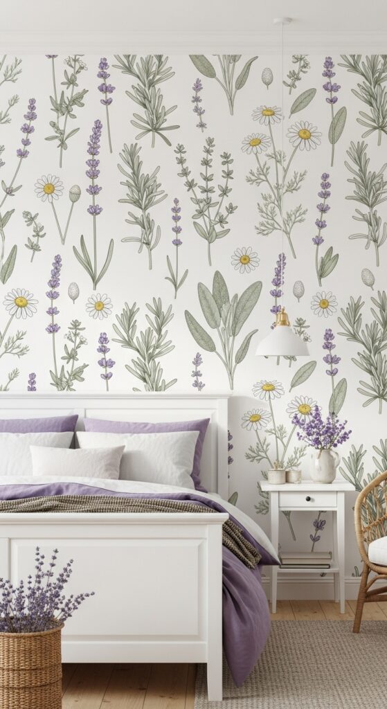
Vibe: A bedroom that smells of lavender even in the imagination — tender, restorative, and completely at peace.
What makes it work: Botanical herb prints carry a particularly restful quality because the plants depicted — lavender, chamomile, rosemary — are all strongly associated with calm, sleep, and wellbeing, creating a psychological as well as visual effect. The fine-line botanical illustration style has an inherent delicacy and precision that elevates it above generic floral prints, referencing the tradition of scientific botanical drawing.
How to achieve it: The all-four-walls approach works beautifully with a fine-scale botanical print on a white ground — the delicate scale ensures it reads as texture rather than overwhelming pattern. Pair with soft purple, lavender, and sage linen bedding to echo the wallpaper tones in soft furnishings. A white-painted ceiling extends the light, airy quality of the white ground upward, completing the garden-room feeling.
How to Start Your Bedroom Wallpaper Transformation
Begin with a sample — always, without exception. Wallpaper samples viewed in the room you intend to paper will reveal color shifts and pattern scale that no digital image or showroom display can predict. Pin or blu-tack a large sample (minimum A3 size) to the intended wall and observe it at different times of day and under your bedroom’s specific lighting conditions for at least 24 hours before ordering. This single step prevents the most common and costly wallpaper mistake: ordering a paper that looks entirely different in situ than it did in the catalog.
Decide early whether you want a feature wall or a full room treatment — the answer affects how much paper you need and significantly changes the room’s atmosphere. A single headboard feature wall delivers immediate drama at lower cost and commitment; an all-four-walls treatment creates the enveloping, immersive quality that only wallpaper at full scale can produce. Both are valid, but they create fundamentally different rooms.
For budget planning, factor in professional installation costs from the beginning rather than as an afterthought — high-quality wallpapers are expensive to purchase, and attempting a DIY hang on a premium paper without experience is a high-risk strategy. Professional paperhangers typically charge $30–60 per drop (one vertical panel length), and a standard bedroom headboard wall requires four to six drops.
Timeline-wise, allow one to two weeks from order to delivery for most wallpaper suppliers, and factor in one full day for a professional to hang a bedroom feature wall. Clear and clean the walls thoroughly before the hanger arrives — filling holes and sanding down imperfections takes as long as the hanging itself.
Frequently Asked Questions
Is wallpaper in a bedroom a good idea?
Bedroom wallpaper is arguably the single most impactful design change you can make to a sleeping space. Because the bedroom is viewed primarily from the relaxed, horizontal position and at close range over long periods, wallpaper’s pattern detail, texture, and color depth are experienced more intimately than in any other room in the house. Unlike a living room where the focus is outward — television, conversation, activity — a bedroom’s focus is the room itself, making the walls the primary experience. Wallpaper excels in this context in ways that paint simply cannot replicate.
How do I choose the right wallpaper scale for my bedroom?
Pattern scale should relate to room scale — small bedrooms typically suit either very fine-scale patterns (which read as texture rather than pattern) or very large-scale designs (which have fewer repeats and create breathing space between motifs). Mid-scale patterns — those with a 100–300mm repeat — can feel busy in smaller rooms. Large pattern repeats (600mm and above) suit large rooms and high-ceilinged spaces where the pattern has room to expand. In a standard bedroom, apply the feature wall rule: use a large-scale pattern on one wall, and the scale question becomes much simpler.
What is the easiest wallpaper to hang in a bedroom?
Non-woven paste-the-wall wallpapers are the most accessible for DIY installation — the paste is applied directly to the wall rather than the paper, which eliminates the soaking and booking time required for traditional papers. Non-woven papers are also more dimensionally stable (they don’t expand with moisture) and can typically be removed cleanly in one piece years later. Avoid vinyl-coated papers for bedrooms — while durable, they are less breathable and can trap moisture against the wall in a room that experiences sleeping humidity nightly.
How do I match bedroom wallpaper to existing furniture?
The most reliable approach is to identify the dominant undertone in your existing furniture — whether it reads warm (yellow, red, or orange undertones) or cool (blue, green, or grey undertones) — and choose a wallpaper whose background color shares that same undertone direction. Warm wood furniture pairs naturally with warm-toned wallpapers in ochre, terracotta, blush, and warm white; cool grey or painted furniture pairs with dusty blue, sage, lavender, or grey-toned backgrounds. A clashing undertone between wallpaper and furniture is the most common cause of a room that looks “off” despite individual elements being individually beautiful.
Can I use peel-and-stick wallpaper for a full bedroom treatment?
Peel-and-stick wallpapers have improved enormously in quality, with premium brands now offering designs indistinguishable in appearance from traditionally hung papers. They work very well for feature walls and are the obvious choice for renters. For full room treatments, choose a brand with a reputation for strong adhesion and clean removal — Tempaper, Chasing Paper, and Wallshoppe are among the most reliable. Apply only to perfectly smooth, clean walls — any surface imperfection, existing paint sheen, or wall texture will compromise adhesion. Seams on peel-and-stick papers are typically more visible than traditional wallpaper, which is the primary limitation for full room applications.
Ready to Create Your Dream Boudoir Space?
These 27 bedroom wallpaper ideas cover every aesthetic, every commitment level, and every budget — from a single peel-and-stick feature panel to a hand-painted chinoiserie room wrap. The boudoir you’ve been imagining is genuinely within reach, and it begins with the single, simple act of ordering a sample and pinning it to the wall. Save your favorites from these 27 beautiful designs, return to them at different times of day, and trust the one your eye keeps going back to. That instinct is almost always right.
A great bedroom wallpaper doesn’t need to be perfect for the room — it needs to be perfect for you. One wall, one pattern, one beautiful decision is all it takes to transform a bedroom from a place you sleep into a place you truly love to be.