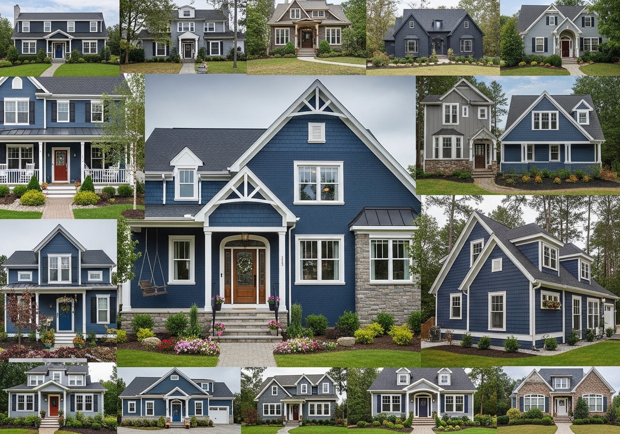
There is something undeniably commanding about a dark blue house — the way it holds the light differently at every hour, the way it sits in a landscape like it was always meant to be exactly there. Navy, midnight, slate, indigo, denim — the dark blue family is vast and endlessly interesting, offering a depth and sophistication that no other exterior color can quite replicate. Whether you’re repainting a craftsman bungalow, reimagining a farmhouse facade, or planning a brand-new build, these 27 dark blue house exterior ideas will show you exactly what’s possible when you commit to this stunning, timeless color. Let’s explore every one of them.
Why Dark Blue Works So Well on House Exteriors
Dark blue is one of the rare exterior colors that achieves something genuinely difficult in architecture: it reads as both bold and restrained at the same time. Where a bright red or a vivid yellow shouts for attention, dark blue commands it quietly — it draws the eye without demanding anything from the viewer. That quality makes it extraordinarily versatile across architectural styles, from colonial and craftsman to modern farmhouse and contemporary.
The color science behind dark blue’s exterior success is straightforward. Dark hues visually recede, which makes a house appear more grounded and connected to its landscape rather than sitting on top of it. Paired with white trim, dark blue creates one of the most classically satisfying contrasts in all of residential design — crisp, legible, and timelessly elegant. Paired with black trim instead, it enters dramatically modern territory without losing warmth.
What makes dark blue particularly compelling right now is its compatibility with the natural materials trending across architecture and design. Dark blue siding against cedar shingles, board and batten, or rough stone reads as deeply intentional — a color chosen for someone who understands how materials and tones interact. It photographs beautifully in all seasons: striking against snow in winter, lush against greenery in summer, dramatic against bare trees in autumn.
Perhaps most importantly for homeowners considering the commitment, dark blue is one of the most forgiving exterior colors to live with long-term. It doesn’t show dust and weathering the way pale colors do, it doesn’t fade into the landscape the way grey can, and it works with nearly every roof color — from charcoal shingles to warm terracotta to aged copper.
27 Dark Blue House Exterior Ideas
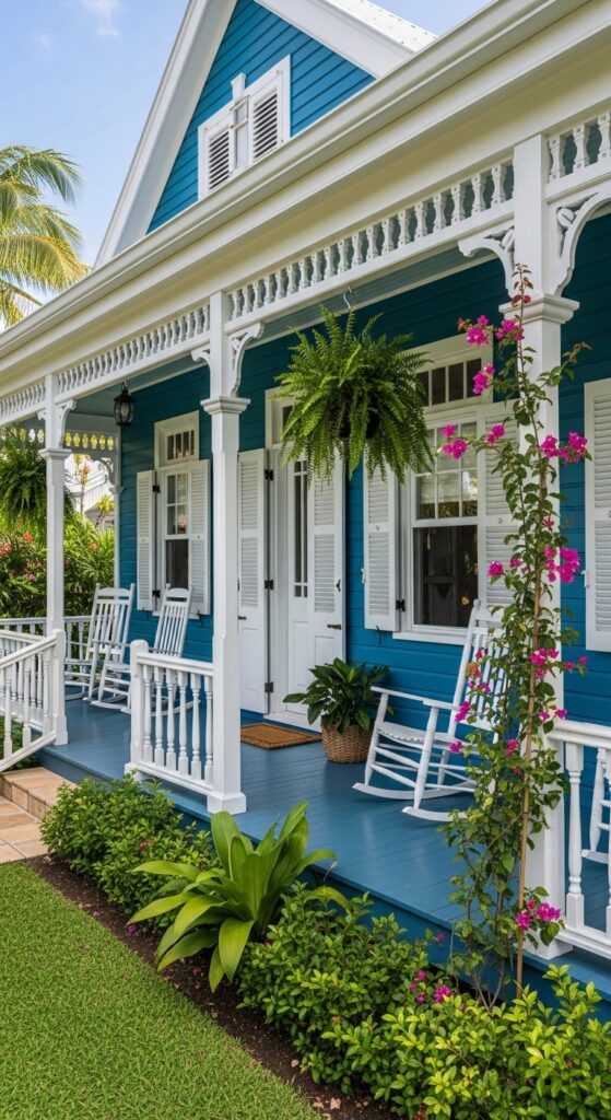
1. Navy Blue Craftsman with Crisp White Trim and a Red Front Door
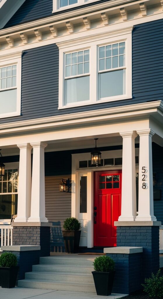
Vibe: Timeless, confident, and warmly American — the kind of house that looks like it’s been here for a hundred years and plans to stay another hundred.
What makes it work: The classic navy-white-red combination is one of the most enduring in residential design, with the red door providing a single high-energy accent that keeps the predominantly dark facade from feeling heavy. The wide white trim on craftsman detailing gives the eye a crisp architectural outline to follow.
How to achieve it: Benjamin Moore “Hale Navy” or Sherwin-Williams “Naval” are the two most-cited navy exterior colors by designers — both read as deep, clean navy without veering purple or green. Pair with pure bright white trim (not cream) for maximum contrast, and choose a semi-gloss finish for door and trim to catch light.
💡 A single quart of glossy red paint on a front door costs under $30 and transforms the entire curb appeal story.
2. Midnight Blue Board and Batten Farmhouse with Black Windows
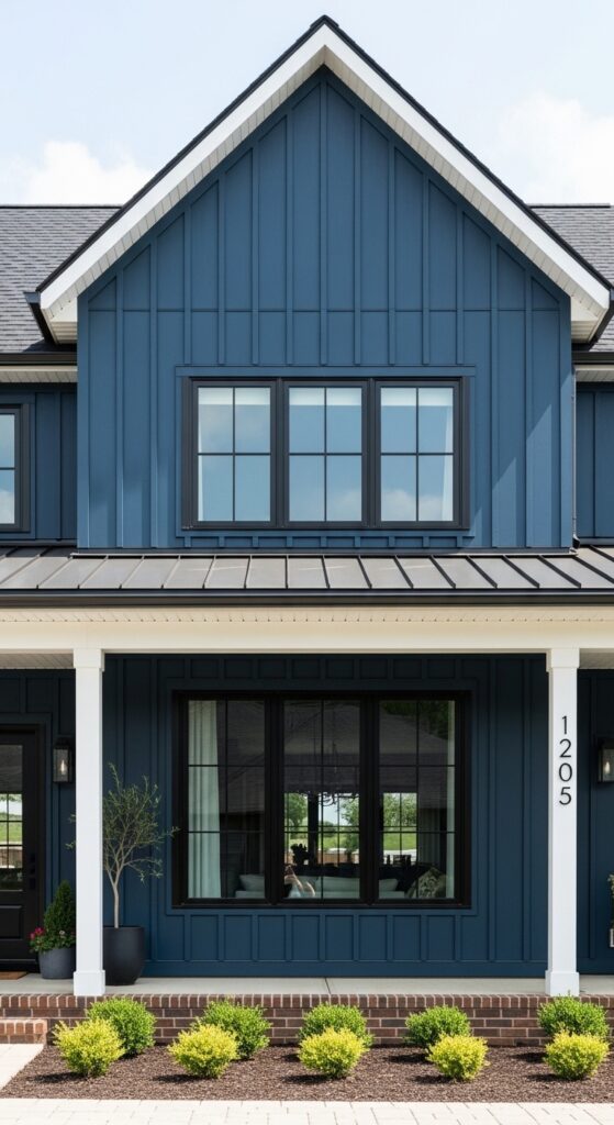
Vibe: Dramatically modern and architecturally sharp — a farmhouse that has shed every ounce of sentimentality and replaced it with pure intention.
What makes it work: Midnight blue board and batten with black window frames is one of the most pinned exterior combinations on Pinterest precisely because it reads as both contemporary and rooted. The vertical lines of board and batten draw the eye upward, adding perceived height, while the black frames unify windows into a graphic, modern grid.
How to achieve it: Sherwin-Williams “Inkwell” or Benjamin Moore “Newburyport Blue” at full depth give a true midnight blue that reads as nearly black in low light but reveals its blue character in daylight. Specify matte or flat exterior finish — it absorbs light beautifully on board and batten.
3. Slate Blue Victorian with Ornate White Gingerbread Trim
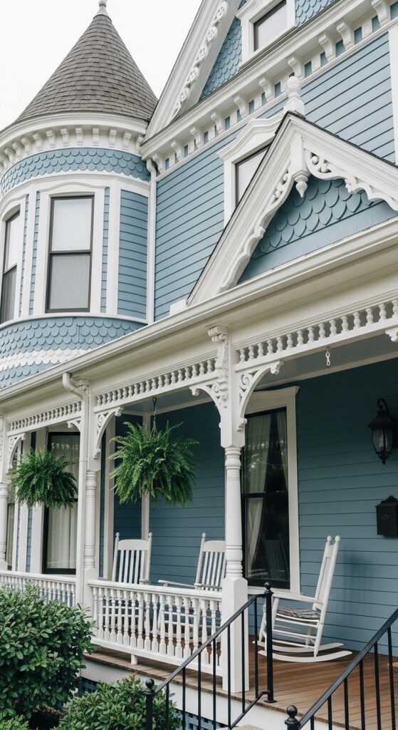
Vibe: Storybook, intricate, and completely captivating — a house that invites you to look more closely at every detail.
What makes it work: Slate blue — softer and slightly greyer than true navy — is perfect for Victorian homes because it doesn’t compete with the ornate white woodwork. The color recedes gently, allowing the gingerbread trim, brackets, and patterned shingles to read as the visual feature they’re meant to be.
How to achieve it: Farrow & Ball “Oval Room Blue” or Benjamin Moore “Newburyport Blue” at 75% depth produce a beautiful slate blue for Victorian facades. Use three paint colors on a Victorian — body, trim, and accent (shutters or door) — to properly articulate the architectural complexity.
4. Dark Denim Blue Ranch with White Shutters and Warm Wood Accents
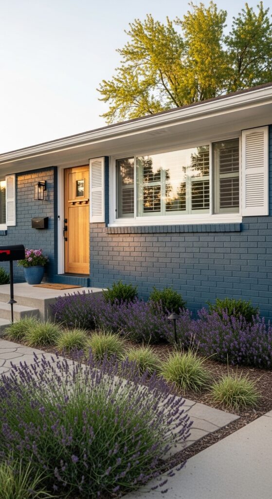
Vibe: Unpretentious, grounded, and quietly gorgeous — a ranch that wears its color like a perfectly broken-in denim jacket.
What makes it work: A dark denim blue on a low ranch profile prevents the horizontal form from disappearing into the landscape. White shutters frame each window emphatically, adding vertical accents that break up the long facade, while a natural wood door brings warmth that stops the combination from feeling too cool or corporate.
How to achieve it: Benjamin Moore “Van Deusen Blue” or Behr “Blueprint” work beautifully on ranch homes — both have a subtle warmth that keeps denim blue from reading as grey. Pair with cedar or mahogany stained doors and black or oil-rubbed bronze hardware for a cohesive natural warmth.
💡 Replacing builder-grade shutters with wide panel shutters in white adds instant architectural definition for under $200.
5. Deep Blue Colonial with Black Shutters and a Fanlight Entry
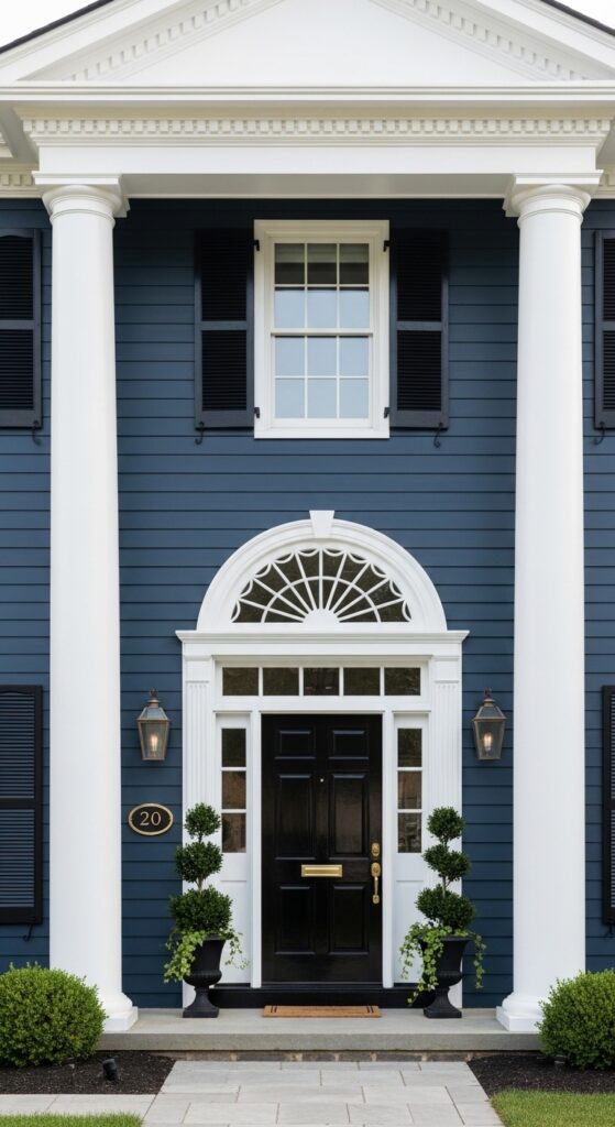
Vibe: Formal, symmetrical, and quietly powerful — a house that announces itself without raising its voice.
What makes it work: The colonial’s natural symmetry is powerfully reinforced by the dark blue body, which frames the white entry portico like a picture frame. Black shutters — rather than the more common white — modernize the traditional colonial and create a layered depth: navy body, black shutters, white trim, black door.
How to achieve it: Shutters must be sized correctly to look authentic — each shutter should appear wide enough to cover its window if closed. Mount them directly against the window frame, not with a gap, for a proper traditional appearance. Sherwin-Williams “Anchors Aweigh” gives a rich deep navy with excellent exterior durability.
6. Indigo Blue Cottage with a Climbing Rose and Stone Path
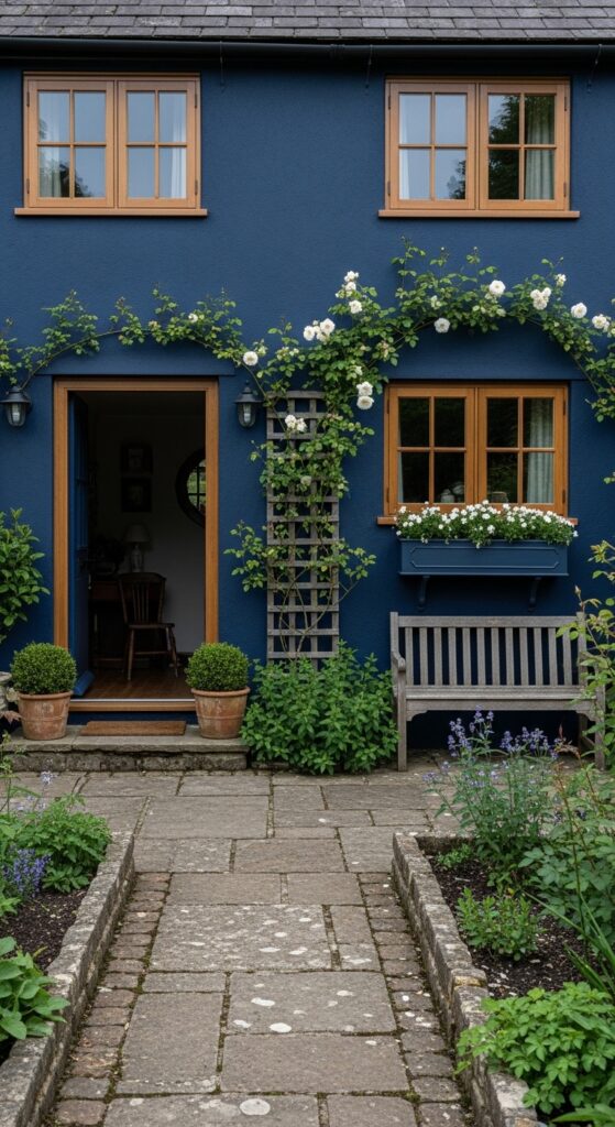
Vibe: Like something from the pages of a beloved novel — deeply romantic, overgrown in the best possible way, and entirely irresistible.
What makes it work: Indigo blue’s purple undertone creates an extraordinary contrast with white flowering plants — roses, wisteria, or white window box blooms all appear more luminous against the deep blue background than they would against any other color. The stone path and cottage planting complete a composition that feels centuries old.
How to achieve it: Farrow & Ball “Hague Blue” is the definitive indigo cottage exterior color — it has the depth of navy with a slight violet warmth that reads beautifully against stone and aged timber. Pair with unpainted timber window frames and stone or slate roof tiles for authenticity.
💡 A single climbing rose planted at a front entrance costs under $25 and transforms a facade within two growing seasons.
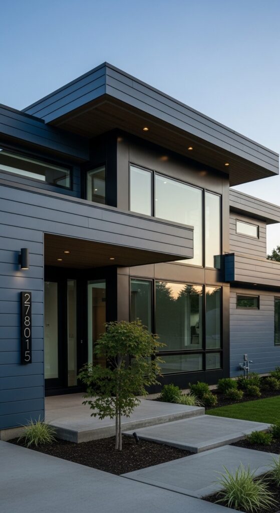
7. Modern Minimalist Dark Blue with Flat Roof and Horizontal Lines
Vibe: Architectural and uncompromising — a house that looks like it was designed on a drawing board by someone who loves every line.
What makes it work: On a modern flat-roof form, dark blue horizontal cladding reinforces the building’s strong horizontal geometry without the visual weight that black or charcoal would bring. The color retains warmth even in its darkest value, preventing the house from reading as monochromatic or cold against the sky.
How to achieve it: Specify dark blue powder-coated metal panels or dark blue fiber cement cladding in a horizontal profile. James Hardie’s “Night Blue” or “Cobalt Blue” in the ColorPlus finish offers exceptional fade resistance and a clean, factory-applied color specifically formulated for long-term exterior performance.
8. Navy Blue Brick House with Ivy and Aged Copper Details
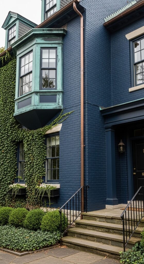
Vibe: Old, earned, and deeply distinguished — a house that has accumulated character the way great things do, slowly and without effort.
What makes it work: Navy blue painted brick has an entirely different texture and quality than painted smooth siding — the mortar lines create a subtle grid that catches light and shadow, giving the color enormous depth. Aged copper details against dark navy is one of the most luxurious material combinations in traditional residential architecture.
How to achieve it: Painting brick requires a masonry primer and 100% acrylic exterior paint — never use standard latex without primer, as it will peel within two seasons. Benjamin Moore “Hale Navy” in a flat exterior masonry finish is the most consistent performer on painted brick surfaces.
9. Blue-Black House with a Warm Timber Frame Entry Porch
Vibe: The house equivalent of a perfectly tailored dark suit with a warm, open-collared shirt — serious and welcoming simultaneously.
What makes it work: Blue-black — a color with just enough blue to distinguish it from true black — creates extraordinary contrast against warm natural timber. The stone foundation grounds the house in materiality, while the timber porch frame creates a zone of warmth that softens an otherwise dramatically dark exterior.
How to achieve it: Sherwin-Williams “Tricorn Black” has significant blue undertones that classify it functionally as blue-black outdoors. Farrow & Ball “Railings” is the premium alternative — a shade with naval blue depth that reads nearly black in shadow but reveals its true character in direct light.
10. Dusty Steel Blue Cape Cod with White Picket Fence
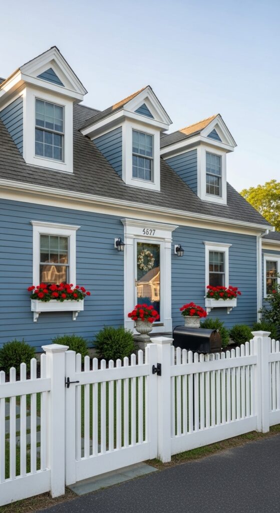
Vibe: Like a memory of the best summer you ever had — the house at the end of the lane that everyone in the neighborhood loves.
What makes it work: Dusty steel blue — softer and slightly greyer than pure navy — suits the Cape Cod’s modest, welcoming character perfectly. It’s strong enough to read clearly against green lawns and blue skies, but soft enough to feel approachable rather than dramatic. Red geraniums pop against it with extraordinary vibrancy.
How to achieve it: Benjamin Moore “Newburyport Blue” or Sherwin-Williams “Quietude” offer the soft, slightly weathered steel blue that Cape Cods carry so well. Pair with bright white trim and red, white, or yellow flowering window boxes — all three colors create classic contrast against this shade.
11. Dark Blue Stucco Mediterranean with Terracotta Roof Tiles
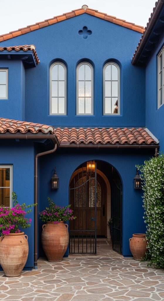
Vibe: Transported — this house belongs on a Moroccan hillside or an Andalusian street, and it knows it.
What makes it work: The combination of deep blue stucco and terracotta roof tiles is one of the most powerful color stories in Mediterranean architecture, drawing on centuries of North African and Southern European building tradition. The blue deepens and cools the terracotta’s warmth into something balanced and visually arresting.
How to achieve it: For existing stucco, use an elastomeric exterior paint — it expands and contracts with temperature changes without cracking. Behr Premium Plus Ultra in “Starless Night” or Benjamin Moore “Prussian Blue” both produce a rich deep blue on stucco that resists fading in intense sunlight.
💡 Adding large terracotta urns with trailing bougainvillea at an entry costs under $80 and instantly reinforces a Mediterranean color story.
12. Navy Blue Shingle-Style Home with a Wraparound Porch
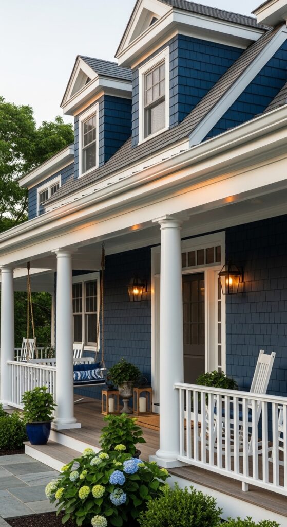
Vibe: Grand but deeply comfortable — the house you’d drive an hour out of your way to see every time you visited the coast.
What makes it work: Cedar shingles painted navy have a dimensional texture that flat siding cannot replicate — each shingle’s individual edge catches light differently, creating a surface that is never flat or dull. On a shingle-style house, navy blue reads as the natural evolution of the traditional stained cedar shingle, simply at its most saturated.
How to achieve it: Cedar shingles should be primed with an oil-based wood primer before painting — this prevents tannin bleed-through that can discolor paint within the first season. Use a high-quality 100% acrylic exterior paint in a flat or low-sheen finish to allow the shingle texture to remain the visual feature.
13. Dark Blue Exterior with a Bright Yellow Front Door
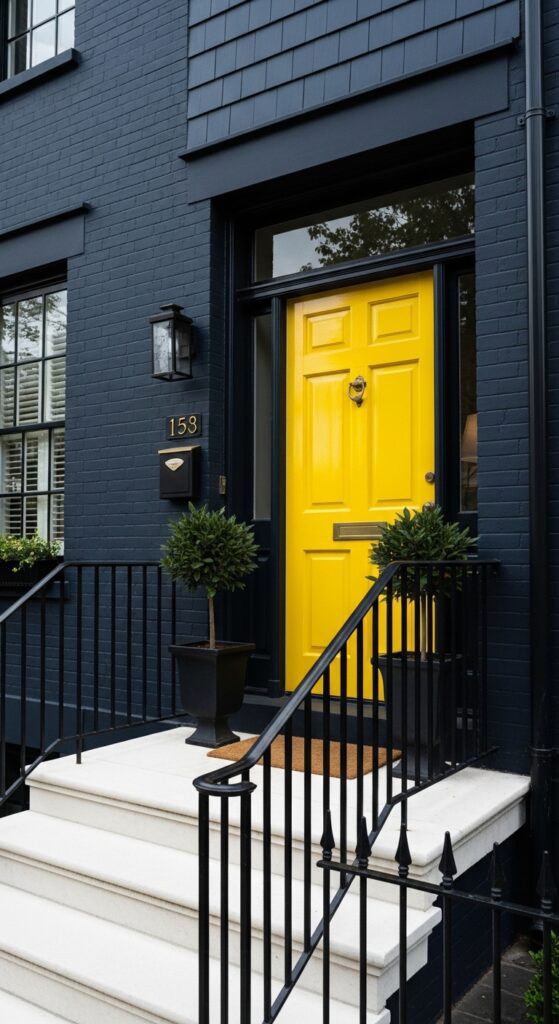
Vibe: Serious and joyful at the same time — a house that takes its architecture seriously but wants you to smile when you arrive.
What makes it work: Yellow and navy are direct complements on the color wheel, which is why this combination has such extraordinary visual energy. The dark navy body makes the yellow door appear even more saturated and vivid — a single color accent that carries the weight of the entire curb appeal story.
How to achieve it: Choose a high-gloss finish for the yellow door — it reflects light and emphasizes the vibrancy of the color. Benjamin Moore “Sun-Kissed Yellow” or Farrow & Ball “Babouche” are both proven high-performing yellow door colors that read as warm and welcoming rather than harsh.
14. Dark Blue Log Home with Stone Chimney and Forest Setting
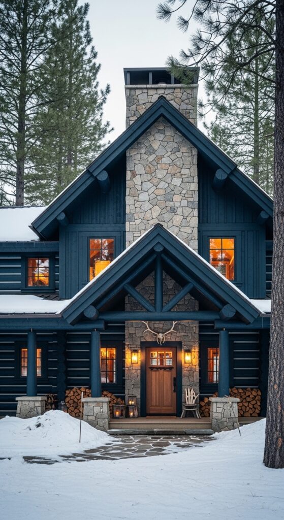
Vibe: Primal and deeply romantic — a house at the edge of a wilderness that glows from within against the cold.
What makes it work: Dark blue log stain is one of the most visually powerful choices for forest-set homes because it references the deep blue-grey of shadow under pine canopy, making the house feel genuinely native to its landscape rather than placed within it.
How to achieve it: Use a penetrating log stain rather than film-forming paint on log homes — it allows moisture movement through the wood without peeling. Sashco’s “Capture” or Sansin’s “Timber Shield” in deep navy tones are designed specifically for log construction and provide UV protection that standard paint cannot.
15. Powder Blue Craftsman Bungalow with a Green Lawn and White Porch
Vibe: Cheerful, welcoming, and impossibly charming — the craftsman bungalow in its most beloved, sun-warmed form.
What makes it work: Powder blue is the lightest member of the dark blue family — and on a craftsman bungalow’s generous horizontal profile, it produces a softly nautical, historically resonant look. The wide white trim on tapered columns and window surrounds catches light emphatically, giving the facade a clean, confident articulation.
How to achieve it: Benjamin Moore “Wedgewood Gray” or Sherwin-Williams “Watery” produce a beautiful powder blue that shifts between blue and grey depending on the light — especially effective on craftsman homes where the warm stone pier bases provide grounding contrast.
💡 Painting porch ceilings in “haint blue” — a pale blue-green — is a traditional craftsman touch that costs one extra quart of paint.
16. Inky Blue-Green House with Copper Gutters and Aged Patina
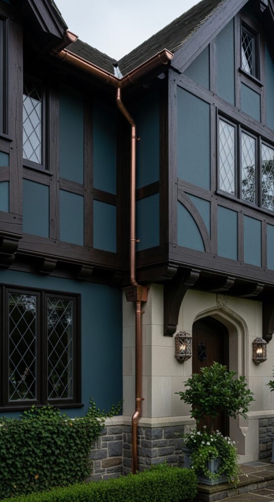
Vibe: Mysterious, aged, and luxuriously dark — the house at the end of the lane that everyone slows down to look at.
What makes it work: Blue-green occupies the border between navy and forest green, and against the warm brown of half-timber framing it creates an extraordinarily rich, complex combination. Copper gutters develop verdigris over time — the natural green patina becomes its own design accent that reinforces the blue-green body color.
How to achieve it: Farrow & Ball “Inchyra Blue” is the closest named paint color to this difficult-to-describe shade — a blue that is also unmistakably green, with depth that reads as almost black in shadow. It requires premium exterior paint for longevity; never use interior paint on this style of Tudor stucco infill.
17. Dark Navy with Bold Contrasting White Garage Doors
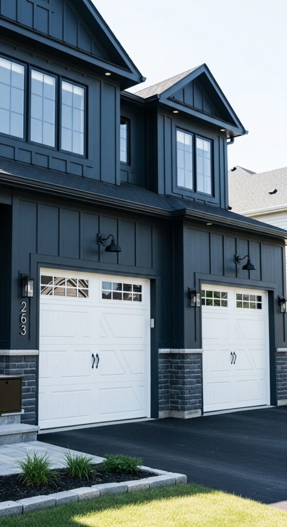
Vibe: Crisp, graphic, and modern — a house whose bold contrast stops you mid-scroll every single time.
What makes it work: In many suburban homes, the garage doors occupy the largest single visual area on the facade. Making them bright white against a dark navy body creates a powerful, deliberate graphic contrast that prevents the large dark mass from feeling oppressive and provides a visual anchor the eye immediately finds satisfying.
How to achieve it: Clopay and Amarr both offer carriage-house style garage doors with factory-applied paint in bright white. Specify four-panel or six-panel carriage door designs — the horizontal rail lines echo the window grid and create a cohesive visual language across the facade.
18. Dark Blue Saltbox Colonial with a Weathervane and Stone Wall
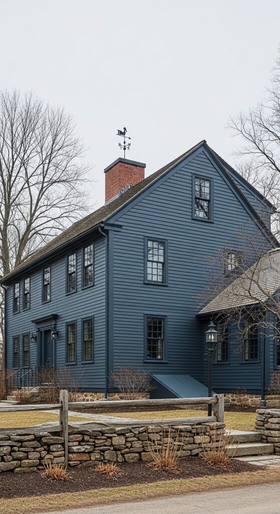
Vibe: Austere, historic, and completely authentic — a house that looks like it has witnessed three hundred years of American seasons.
What makes it work: The saltbox’s asymmetric silhouette is one of the most distinctive in American residential architecture, and a dark blue-grey body emphasizes that dramatic roofline by ensuring the color doesn’t distract from the form. Against bare winter trees and a stone wall, this combination achieves a stark beauty that warmer palettes never could.
How to achieve it: Farrow & Ball “Stiffkey Blue” or Benjamin Moore “Polo Blue” both produce the dark blue-grey needed to honor a saltbox’s historic character. Avoid any paint with obvious purple undertones — they read as anachronistic on colonial-era architectural forms.
19. Deep Blue Exterior with a Bright White Fence and Lavender Border
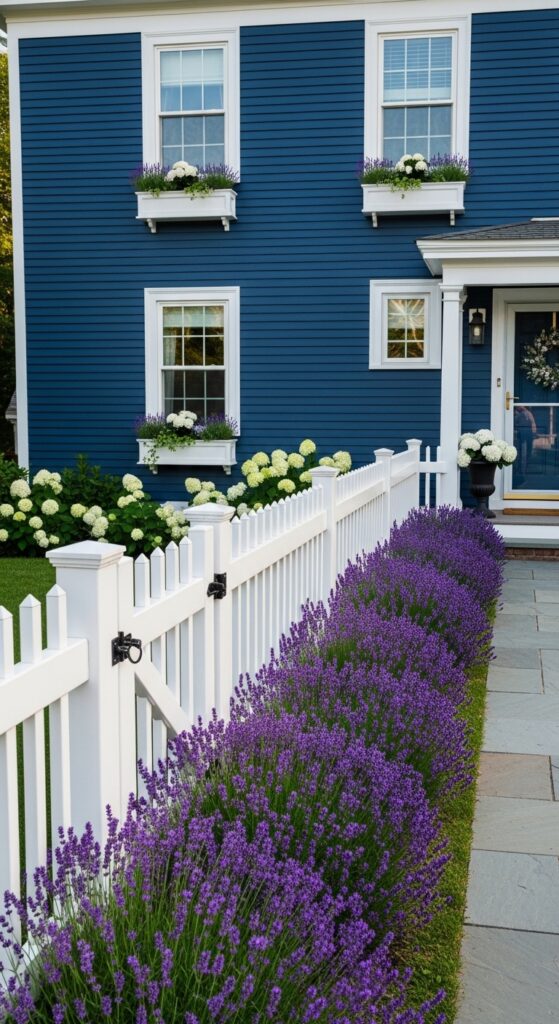
Vibe: Like the visual equivalent of a summer afternoon — fragrant, blooming, and warmly beautiful in every direction.
What makes it work: Lavender planted along a white fence against a deep blue house creates a layered color story of extraordinary harmony — blue, white, and purple are naturally related tones that build on each other. The white fence prevents the lavender from being lost against the dark wall behind it, giving the border a crisp frame.
How to achieve it: Plant English lavender (Lavandula angustifolia) along the fence line in a single continuous row — mass planting is far more impactful than individual specimens. In colder climates, Munstead and Hidcote varieties are most cold-hardy and will return reliably each season.
20. Coastal Navy Blue Beach House on Stilts with White Railings
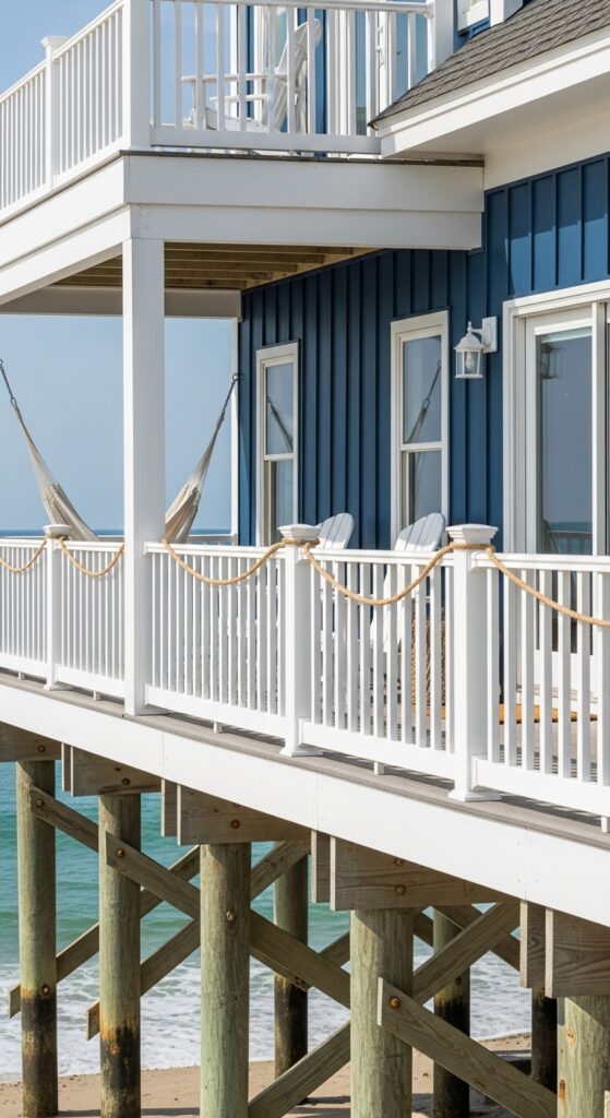
Vibe: Free, wind-touched, and salt-aired — a navy beach house that belongs to the coast as completely as the lighthouse down the shore.
What makes it work: Navy blue on a coastal house references the sea itself — a color that never fights with its setting because it’s pulled directly from it. The white railings and deck create a clean nautical vocabulary that reads as classic and intentional, while the weathered grey pilings below anchor the house to the beach’s natural material palette.
How to achieve it: Coastal environments are harsh on exterior paint — salt air, UV, and humidity demand a premium product. Sherwin-Williams Duration or Benjamin Moore Aura in “Hale Navy” are formulated for exterior durability and specifically recommended for coastal climates. Apply to primed surfaces only and plan for recoating every 7–10 years.
💡 Painting exposed stilt bases in white rather than leaving them weathered grey unifies the house’s color story from ground to roofline.
21. Muted Denim Blue with a Warm Natural Stone Base
Vibe: Grounded, layered, and deeply material — a house built with a visible respect for the difference between things made by hand and things made by machine.
What makes it work: The contrast between cool denim blue siding and warm natural stone base creates a material conversation that gives the house genuine architectural depth. The stone base reads as load-bearing and permanent; the denim siding above reads as lighter and more contemporary — it’s a visual narrative about how the house is built.
How to achieve it: The transition line between stone and siding should occur at a natural architectural break — a water table, a floor line, or a ledger board. This makes the material change look deliberate rather than arbitrary. Specify a 1-inch projection in the trim board at this junction to create a shadow line that emphasizes the detail.
22. Dark Blue Farmhouse with Red Barn and Coordinated Outbuildings
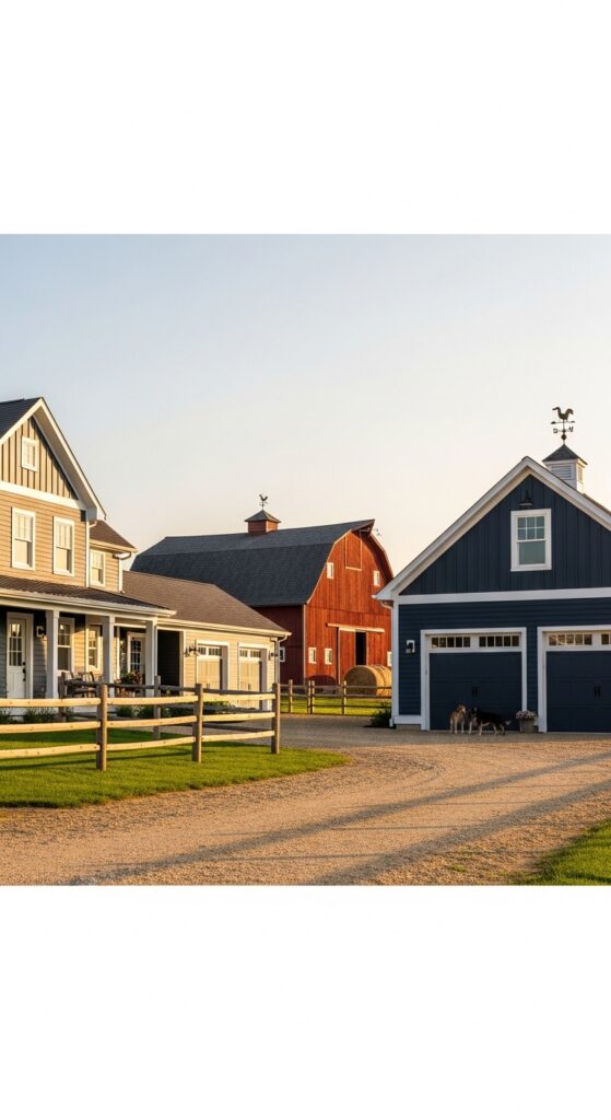
Vibe: Quintessentially American pastoral — a farm that looks like it was painted by someone who understood that color is how a place announces its values.
What makes it work: Coordinating outbuildings, garages, and farm structures in the same dark blue as the main house creates a unified, intentional property aesthetic that is rare and deeply satisfying. The traditional red barn provides a single accent color that pulls the whole composition together without requiring any additional complexity.
How to achieve it: Use the same paint formula on all structures — consistency of color is the defining quality of a well-coordinated property. Extend the white trim treatment to barn doors and window frames on outbuildings. Simple repetition of two colors — navy and white — across all structures creates the most cohesive result.
23. Charcoal Navy with a Dramatic Arched Entry and Overgrown Wisteria
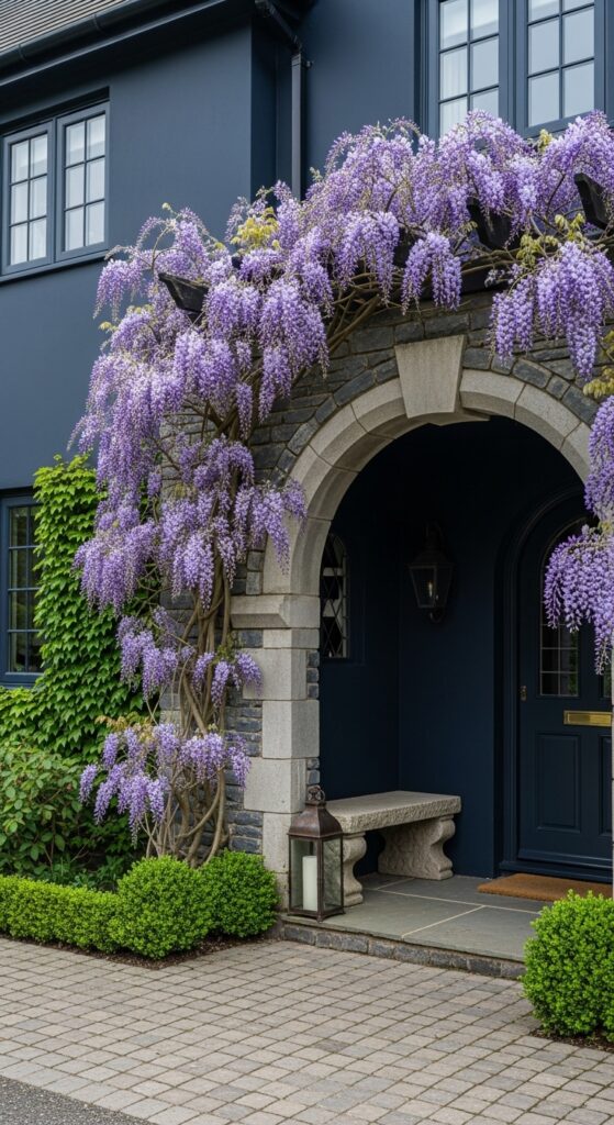
Vibe: European, theatrical, and impossibly romantic — a house that looks like it was dreamed up in a particularly beautiful mood.
What makes it work: Purple wisteria cascading over a dark charcoal navy wall creates a color combination of extraordinary drama — the purple blooms appear almost luminous against the dark background, and the stone arch frames the entry like a stage. This is a house that transforms completely between seasons, and is spectacular in all of them.
How to achieve it: Wisteria requires a robust support structure — install a heavy timber or steel arbor over the arch before planting, as mature wisteria can weigh several hundred pounds. Japanese wisteria (Wisteria floribunda) offers the longest, most dramatic flower clusters and the most vigorous coverage over a masonry arch.
24. Navy Blue Tiny Home or ADU with Smart Space-Maximizing Design
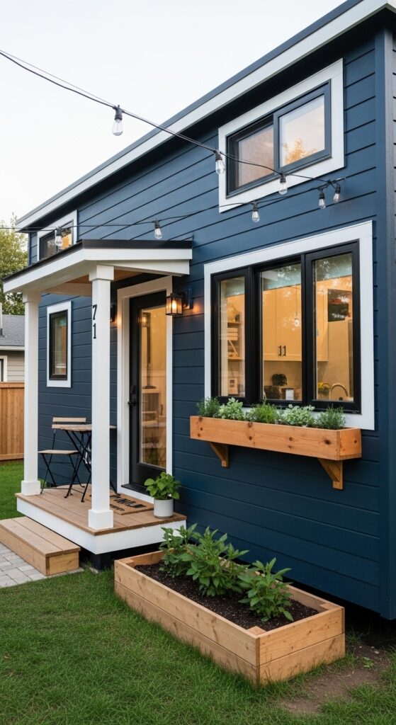
Vibe: Proof that scale has nothing to do with beauty — a tiny home that punches so far above its square footage it’s almost unfair.
What makes it work: Dark navy on a small structure is counterintuitively successful — rather than shrinking an already small form, it gives the tiny home a density and presence that makes it look deliberate and intentional rather than merely compact. Black windows at this scale add graphic precision that elevates the entire composition.
How to achieve it: On a tiny home or ADU, every material choice is amplified by scale — use the best quality trim paint and door hardware available, since these details are far more visible on a small structure than on a full-size house. A window box with continuous planting immediately adds warmth and domesticity.
💡 A single window box with seasonal plantings is proportionally more impactful on a tiny home than on any other structure.
25. Rich Blue-Teal House Inspired by Caribbean Color Traditions
Vibe: Warm, vibrant, and celebrating color with the confidence of a tradition that’s been doing it right for centuries.
What makes it work: Caribbean architectural tradition has always understood that deep, saturated color on a house exterior reads differently in strong tropical light — the intensity of the sun requires the intensity of the color to balance it. Blue-teal’s particular warmth makes it ideal for houses in strong sun climates where cooler navies can appear washed out.
How to achieve it: Benjamin Moore “Bimini Blue” or Sherwin-Williams “Reflecting Pool” produce a beautiful blue-teal that references Caribbean tradition while reading as sophisticated rather than kitschy. Pair with pure white trim and at least one flowering climbing plant — bougainvillea or mandevilla — in a contrasting warm tone.
26. Dark Blue Exterior with a Living Green Wall or Dense Climbing Plants
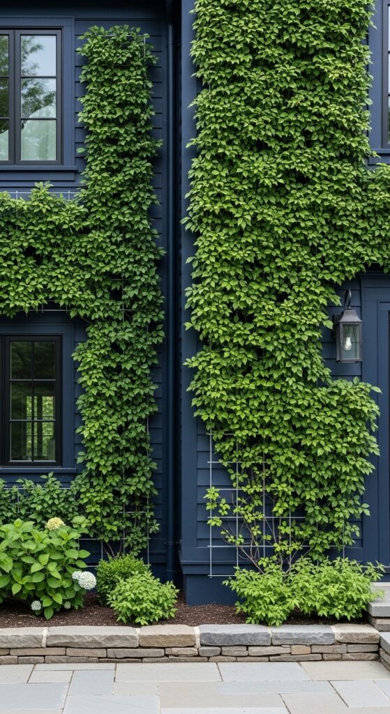
Vibe: Where architecture ends and nature begins is no longer entirely clear — and that’s exactly the point.
What makes it work: Green climbing plants against dark navy create one of the most visually striking and photographically stunning exterior combinations possible. The deep blue wall makes the green appear more saturated and luminous than it would against any lighter background — a phenomenon known as simultaneous contrast.
How to achieve it: Virginia creeper and climbing hydrangea are the most reliable self-adhering climbers for dark-painted surfaces. Install a galvanized wire trellis system to protect the paint surface and allow air circulation — this prevents moisture damage behind the plants and significantly extends the life of the exterior finish.
27. Midnight Navy House with Dramatic Landscape Lighting at Night
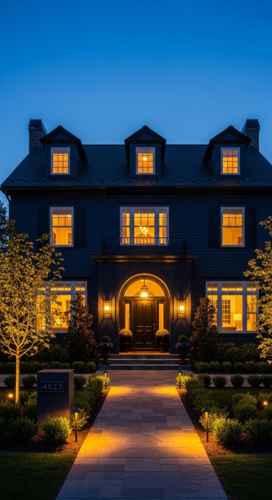
Vibe: The most beautiful version of a house that was already beautiful — the moment when architecture and light become something close to theater.
What makes it work: Dark exterior colors have a unique relationship with exterior lighting — where a white house reflects all available light at night, a navy house absorbs ambient light and only reveals itself where lighting is directed. This means well-placed uplighting creates far more dramatic results on a dark house than on a light one, turning the facade into a lit canvas.
How to achieve it: Place in-ground uplights 18–24 inches from the facade, angled at 30–45 degrees. Use warm white LED fixtures at 2700K color temperature — the warm tone flatters dark blue paint far better than cool white light, which can make navy read as grey or black at night. Focus secondary lights on architectural features: columns, dormers, or arched entries.
💡 Landscape lighting adds perceived value to a property and is one of the highest-return exterior investments by cost.
How to Start Your Dark Blue House Exterior Transformation
The single most important first step before committing to any dark blue exterior is sampling at scale. A 2-inch paint chip is almost useless for dark colors — the tiny sample reads completely differently than the same color spread across an entire facade. Purchase large sample pots and paint two-foot square patches on multiple sides of your house, then observe them over three days at different times — morning, noon, golden hour, and overcast. Only then commit.
From there, the sequence matters. Always determine your trim color and door color before finalizing the body color — dark blue works with many trim and accent combinations, but each one tells a different story. White trim says classic and coastal. Black trim says modern and graphic. Warm natural wood or stone says organic and grounded. Choose the story first, then source the colors to tell it.
The most common mistake homeowners make with dark exteriors is using too many colors. Dark blue at its most powerful is a two-color story: body and trim. A third accent color — a door, shutters, or planting — should be chosen to complete, not complicate. More than three colors on a dark exterior tends toward visual noise.
Budget-wise, a full exterior repaint on a standard two-story home typically runs $3,500–$8,000 professionally, or $600–$1,500 in materials for a confident DIY project. The quality of paint matters more on dark colors than any other — premium products like Benjamin Moore Aura Exterior or Sherwin-Williams Duration maintain their depth and saturation significantly longer than budget alternatives.
Frequently Asked Questions
What is the best dark blue paint color for a house exterior?
The three most consistently recommended dark blue exterior paints by professional designers are Benjamin Moore “Hale Navy,” Sherwin-Williams “Naval,” and Farrow & Ball “Hague Blue.” Hale Navy is a true, clean navy with no strong undertones, making it the most versatile choice across architectural styles. Naval leans slightly warmer and performs especially well in strong sunlight. Hague Blue has a rich indigo depth with slight green undertones that give it exceptional complexity on traditional home styles. Always sample outdoors in your actual light conditions before committing.
Does a dark blue exterior make a house look smaller?
Contrary to common belief, dark colors don’t necessarily make a house look smaller — they change how the house reads in its landscape, not its apparent size. A dark blue house appears more grounded and visually unified, which can actually make it look more substantial and purposeful. If maintaining perceived size is important, use white or light-colored trim generously, which creates crisp definition and ensures the architectural outline remains highly legible against the dark body color.
What roof color goes best with a dark blue house exterior?
Dark blue house exteriors are among the most roof-color-versatile options in residential design. Charcoal or black shingles create the most dramatic, modern result. Medium grey shingles produce a classic, balanced combination. Weathered wood-tone shingles add warmth that softens the overall look. Terracotta or clay-colored tiles introduce a Mediterranean character. The one roof color that typically clashes with dark navy is bright red — it creates an overly festive combination that most designers avoid.
How long does dark exterior paint last compared to light colors?
Dark exterior paint colors — including deep navy and midnight blue — absorb more UV radiation than light colors, which means they can fade faster if lower-quality paint is used. However, premium 100% acrylic exterior paints like Benjamin Moore Aura, Sherwin-Williams Duration, or Farrow & Ball Exterior formulations contain UV inhibitors specifically designed to protect dark pigments, and will maintain their color for 10–15 years with proper surface preparation. The key is never skipping primer on raw or previously unpainted surfaces, as adhesion failure causes far more early paint problems than fading.
What trim color works best with a dark blue house?
Crisp bright white is the most classic and widely used trim color with dark blue exteriors — it creates maximum contrast and suits traditional architectural styles beautifully. For a more modern look, matte black trim works extraordinarily well with midnight blue and blue-black body colors, creating a graphic, monochromatic elegance. Warm off-white or cream trim softens the contrast and adds a more relaxed, coastal character. Natural wood trim — cedar, mahogany, or Douglas fir — introduces organic warmth that suits craftsman, farmhouse, and contemporary styles equally well.
Ready to Create Your Dream Dark Blue House Exterior?
You now have 27 stunning dark blue exterior ideas spanning every architectural style, every shade of the blue family, and every kind of home — from grand colonials to tiny homes, coastal beach houses to forested cabins, modern flat-roofs to romantic Victorian cottages. Save your favorites, pin the combinations that made you stop and look twice, and remember that your house’s entire curb appeal story can change with a single, confident color decision. Dark blue doesn’t hedge. It doesn’t apologize. It simply makes a statement that lasts — and so will yours.