There’s a particular thrill in pulling up to a house that stops you mid-step — one where the color, the trim, the front door, and the landscaping have all been considered together into something that feels completely, unmistakably right. Exterior color schemes with genuine curb appeal do exactly that: they turn a building into a home with a personality, a presence, and a story worth noticing from the street. The good news is that the principles behind those transformations are learnable, repeatable, and far more accessible than most homeowners realize. Whether you’re planning a full repaint or simply dreaming about what’s possible, these 30 best exterior color schemes for curb appeal are here to inspire every step of that journey. Let’s explore every one of them.
Why Exterior Color Schemes for Curb Appeal Work So Well
The power of a great exterior color scheme lies in its ability to do something no landscaping or architectural detail alone can achieve — it gives a home an emotional tone before anyone steps through the door. Color communicates warmth, confidence, elegance, or playfulness instantly and from a distance, which is why it remains the single highest-impact curb appeal investment available to homeowners.
The most successful exterior palettes work on a three-part system: a body color (the dominant tone covering the largest surface area), a trim color (window frames, fascia boards, and cornices that define architectural edges), and an accent color (the front door, shutters, or porch details that create a focal point). When these three elements are chosen with intentional contrast and tonal harmony, the result reads as polished and considered from fifty feet away.
Material context matters enormously. Warm-toned brick, natural stone, cedar shingles, or stucco all shift the way paint colors read in daylight — a color that looks perfect on a chip may need adjustment once the existing material tones are factored in. The most enduring exterior palettes account for this interaction, choosing colors that work with the existing material rather than fighting it.
Pinterest searches for “exterior house color ideas” and “curb appeal transformations” surge consistently in late winter and early spring, when homeowners begin planning renovation projects. The trend is moving firmly toward palette sophistication — away from the safe beige middle and toward colors with genuine character: warm greiges, deep forest greens, soft black, aged terracotta, and complex whites that shift in different lights. These are palettes built for longevity, not just the moment.
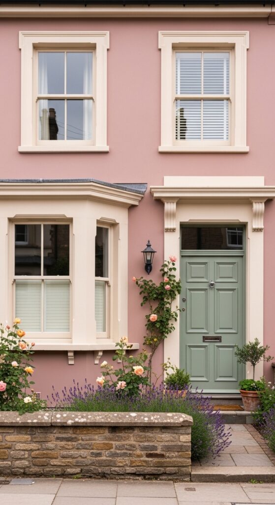
Classic White with Black Trim and Red Door
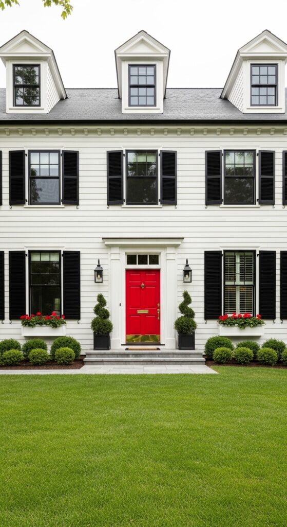
Vibe sentence: This is the exterior color scheme that’s been getting it right for two hundred years — and it has absolutely no intention of stopping.
What makes it work: The high contrast between warm white siding and glossy black trim is inherently graphic and legible from the street, giving the home a precision that reads as confident and well-maintained. The red door provides the critical third focal point — pulling the eye to the entry and creating the welcoming punctuation the scheme requires. Brass hardware warms what could otherwise be a cold contrast.
How to achieve it: Use a warm white like Benjamin Moore’s “White Dove” (OC-17) rather than a pure bright white — pure whites can look clinical on older homes. Specify high-gloss black for all trim for maximum contrast. Choose a red door in the lacquered Chinese red family — Benjamin Moore’s “Caliente” (AF-290) is a reliable choice that photographs beautifully.
💡 Painting just the front door and trim before committing to a full exterior repaint lets you test the palette for a fraction of the investment.
Deep Forest Green with Cream Trim
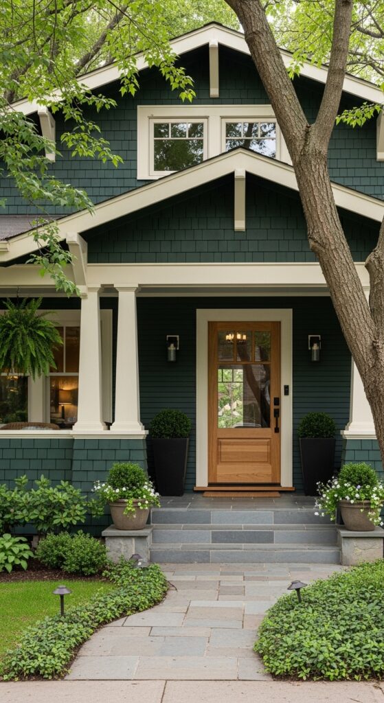
Vibe sentence: Deep forest green on a craftsman bungalow looks like the house has been there forever and plans to stay — rooted, confident, and quietly magnificent.
What makes it work: Forest green works with natural surroundings rather than competing with them, borrowing depth from tree canopies and garden foliage to create a palette that feels organically complete. The cream trim provides sufficient contrast to define architectural edges clearly without the harshness of pure white against such a dark body color.
How to achieve it: Look for forest greens with blue-grey undertones rather than yellow-green ones for the most sophisticated result — Farrow & Ball’s “Studio Green” (93) or Sherwin-Williams’ “Rookwood Dark Green” (SW 2719) both perform beautifully on exterior clapboard. Pair with an off-white or warm cream trim, not a bright white, to maintain tonal harmony.
💡 Deep greens hide minor surface imperfections and weathering far better than light colors — a practical bonus for older homes.
Soft Black with White Trim and Olive Door
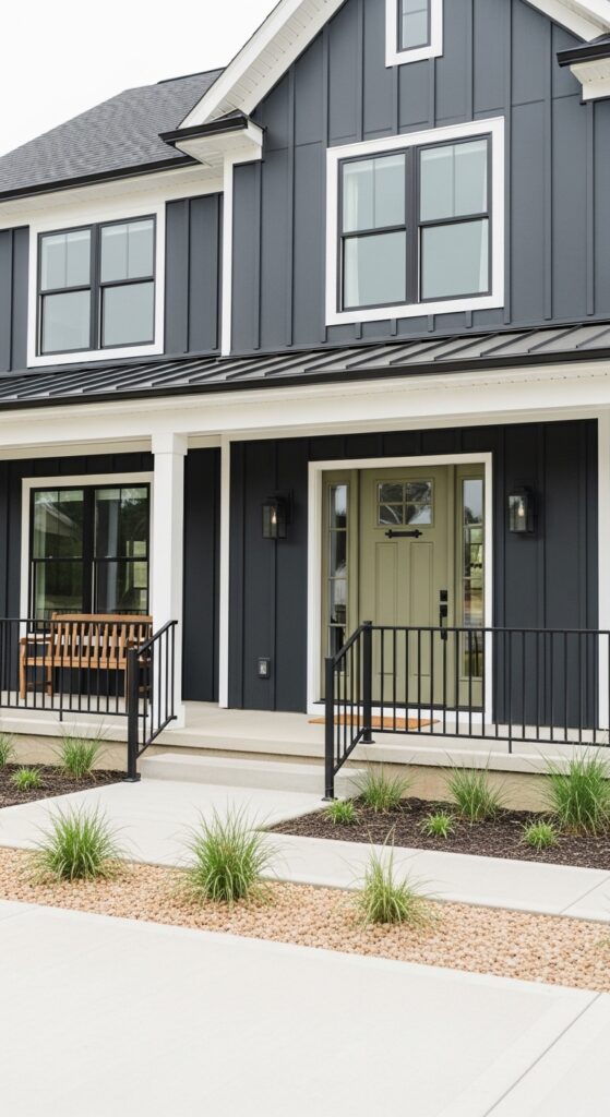
Vibe sentence: Soft black on a modern farmhouse isn’t dark — it’s definitive, and there’s a crucial difference.
What makes it work: Off-black (a black with subtle warm or grey undertones) reads as deeply sophisticated without the harshness of true black, which can look flat and absorb too much heat on large siding surfaces. The white trim provides architectural clarity, while the muted olive door introduces an unexpected earthy note that softens the scheme without undermining its drama.
How to achieve it: Choose an off-black with warm undertones: Sherwin-Williams’ “Tricorn Black” (SW 6258) or Benjamin Moore’s “Black Beauty” (2128-10) both have the depth without the starkness of true black. Specify the door color in a desaturated, khaki-toned olive — not bright sage — to maintain the palette’s sophisticated restraint.
Warm Greige with White Trim and Navy Door
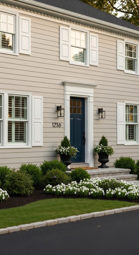
Vibe sentence: Warm greige is the exterior equivalent of a well-cut neutral suit — endlessly versatile, never wrong, and elevated by the right accessories.
What makes it work: Greige sits in the productive tension between warm beige and cool grey, meaning it reads differently at different times of day and in different light conditions — always interesting, never jarring. The navy door provides a saturated color anchor without the risk of a trendy choice that dates the scheme within a few years.
How to achieve it: The difference between a sophisticated greige and a muddy one is entirely in the undertone — look for greiges with pink or taupe undertones (not green) for the warmest results. Benjamin Moore’s “Revere Pewter” (HC-172) is a classic starting point. Test any greige at a large scale on the actual siding before committing — they shift considerably between the chip and the wall.
💡 Greige is the single most universally flattering exterior body color for resale value — it appeals broadly without boring anyone.
Pale Blue with White Trim and Yellow Door
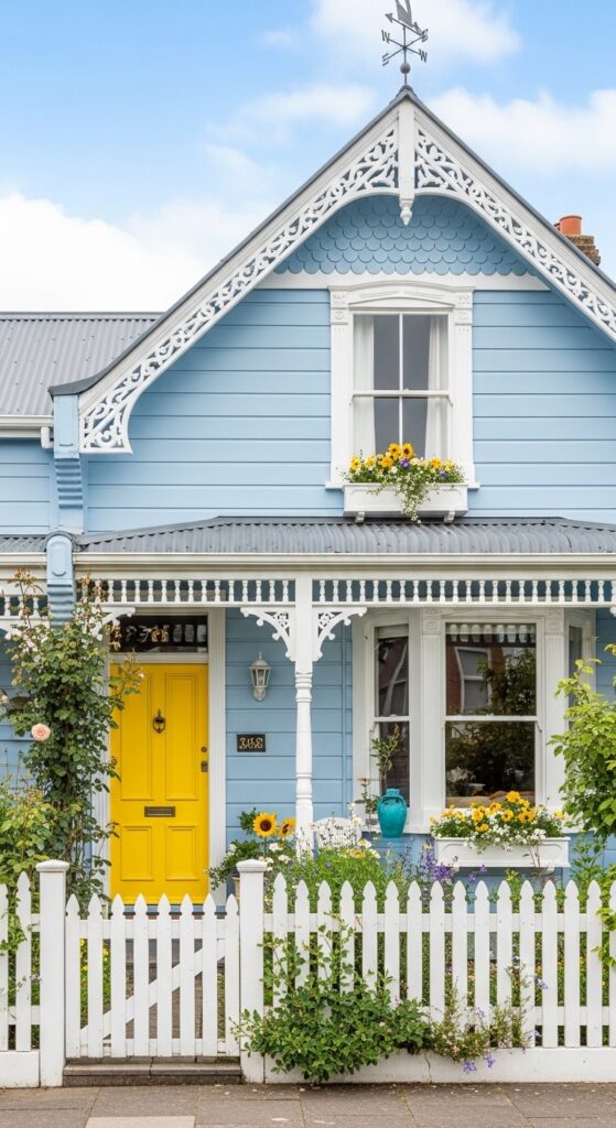
Vibe sentence: This is the house from a childhood storybook — and discovering it on a real street feels like an unreasonably delightful surprise.
What makes it work: Complementary colors — blue and yellow — on an exterior create vibrant energy without visual conflict. The white trim acts as the mediating neutral that prevents the combination from tipping into childishness, maintaining elegance while allowing the playfulness to register fully. Victorian architectural detailing amplifies the charm when painted in contrasting tones.
How to achieve it: Keep the blue firmly in the soft, muted, powder territory — not sky blue and never turquoise. Benjamin Moore’s “Iceberg” (2122-50) is a beautiful starting point. The yellow door should be warm and saturated but not neon — look for the golden, sunflower tone of Farrow & Ball’s “Babouche” (223).
Terracotta with Cream Trim and Sage Shutters
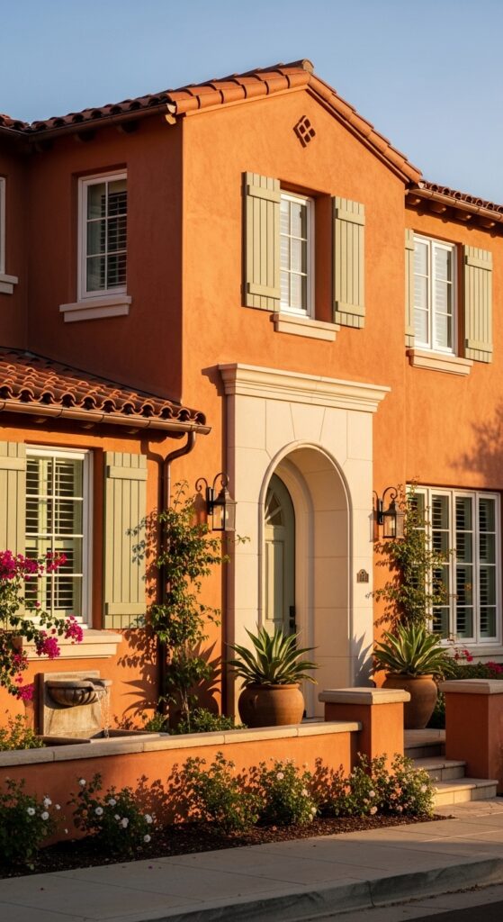
Vibe sentence: Terracotta stucco in afternoon sun looks like the house is literally glowing from within — warm, ancient, and genuinely beautiful.
What makes it work: Terracotta’s warm mineral tones are in perfect harmony with clay roof tiles, Mediterranean plantings, and natural stone — everything in this palette comes from the same earthen family, which is why it feels so cohesive. Sage green shutters provide the one cool-toned note that prevents the scheme from feeling overwhelming on a large facade.
How to achieve it: Terracotta stucco works best with texture — a smooth render loses the warmth that a slightly coarser finish catches in raking light. Sage shutters should read as genuinely muted and desaturated — closer to dusty eucalyptus than garden-bright green. Sherwin-Williams’ “Dried Thyme” (SW 6186) is an ideal shutter tone against terracotta.
Charcoal Grey with Warm Wood Accents
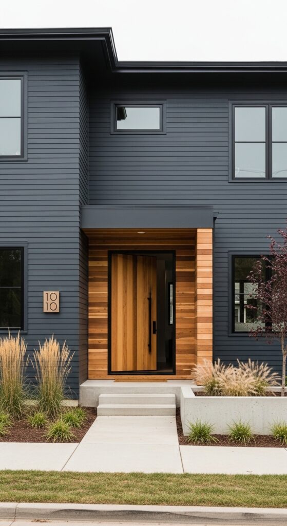
Vibe sentence: Charcoal grey and natural cedar together create the exterior equivalent of a modern architect’s sketch — pure line, pure contrast, pure intention.
What makes it work: The contrast between the cool, dark charcoal siding and the warm, honey-toned cedar wood creates a material dialogue that reads as luxurious and considered. Black window frames define the facade’s geometry with precision. The absence of a traditional “door color” — replaced by natural wood — signals architectural confidence.
How to achieve it: Use charcoal with cool blue-grey undertones rather than brown-grey ones against cedar — Sherwin-Williams’ “Peppercorn” (SW 7674) is a reliable workhorse. Seal natural cedar with a UV-protective oil finish to prevent greying — the warm wood tone is the scheme’s entire warmth source and must be maintained.
💡 Even a single cedar wood panel element — a front door, a entry surround — can introduce this material contrast on an otherwise painted exterior.
Navy Blue Shingles with White Trim and Copper Accents
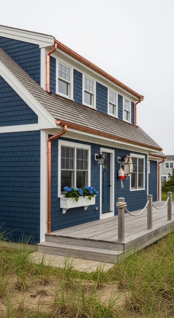
Vibe sentence: Navy shingles with copper gutters is the coastal exterior palette that makes every passing neighbor slow their walk — it’s that beautiful.
What makes it work: The combination of deep navy and aged copper patina is particularly extraordinary — the blue-green of weathered copper harmonizes with navy in a way that feels simultaneously traditional and unexpected. Shingle siding in deep colors creates rich shadow depth that flat board siding cannot, making the color appear to shift through the day.
How to achieve it: Benjamin Moore’s “Hale Navy” (HC-154) is the benchmark navy for shingle exteriors — it has enough grey to prevent it from reading as primary-color blue in full sun. If budget allows, install real copper gutters and downspouts; their patina develops over two to three years into the most beautiful accent color money doesn’t need to buy.
Sage Green with Brick and White Trim
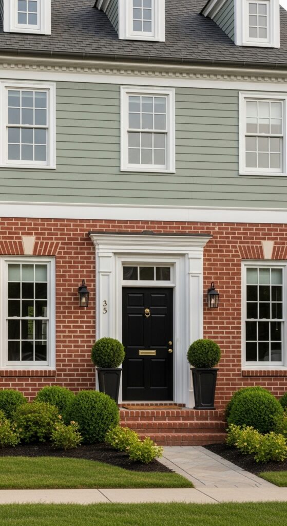
Vibe sentence: Sage green painted siding above warm brick is one of those combinations that looks as though it was always meant to be — and maybe it was.
What makes it work: Sage green’s olive-grey tones directly complement warm red-orange brick, sitting opposite it on the color wheel in a relationship that feels instinctively harmonious. The white trim serves as a clean boundary between the two materials, preventing the palette from feeling heavy or muddled at the transition point.
How to achieve it: Choose a sage that reads grey-green rather than bright green — the grey component is what harmonizes with brick rather than clashing with it. Farrow & Ball’s “Mizzle” (266) or Benjamin Moore’s “Rosemary Sprig” (456) are both strong candidates. Test extensively against the actual brick color, as brick tones vary widely from orange-red to purple-red.
Pale Yellow with White Trim and Teal Door
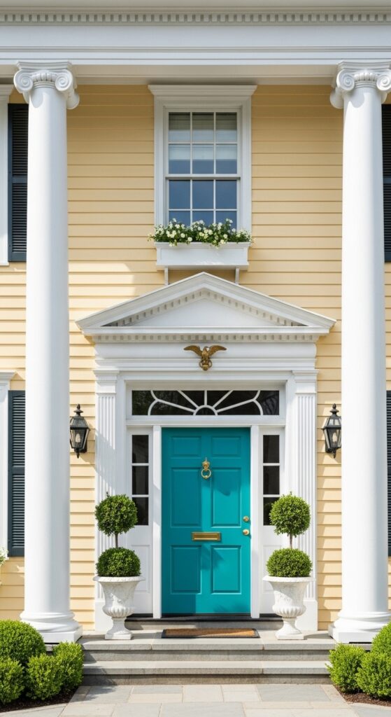
Vibe sentence: Pale yellow with a teal door is the exterior color scheme that radiates welcome from half a block away — impossible to approach without smiling.
What makes it work: Yellow and teal are complementary enough to create visual energy while sharing enough warmth to avoid conflict. The formal symmetry of Georgian architecture provides the structural discipline that allows these relatively expressive colors to register as elegant rather than casual. White columns and trim are the essential frame that keeps everything legible.
How to achieve it: The yellow must stay firmly in the warm, creamy butter range — never too bright or lemony. Sherwin-Williams’ “Restrained Gold” (SW 6129) is a refined starting point. The teal should lean towards the blue side of teal rather than green — Benjamin Moore’s “Beau Green” (461) has the right lacquer-friendly depth.
Slate Blue-Grey with White Trim and Black Door
Vibe sentence: Slate blue-grey on a Cape Cod is the color of sea mist and old silver — it makes a modest house feel like it has lived a beautiful life.
What makes it work: Slate blue-grey has a chameleon quality — shifting between blue, grey, and even slightly green depending on the light, which gives the home a gentle visual animation through the day. Hydrangeas in blue-purple tones planted in the foreground create a natural echo of the siding color that feels planned without being contrived.
How to achieve it: Benjamin Moore’s “Smoke” (2122-40) or Farrow & Ball’s “Borrowed Light” (235) both capture the elusive slate quality — complex without being definably any single color. White shutters rather than black contribute to the softer, less contrasted mood that distinguishes this palette from more dramatic schemes.
💡 Plant blue or purple hydrangeas in your foundation border to echo a slate blue-grey exterior — a natural paint chip that lives in the garden.
Warm Ochre with Brown Trim and Rust Door
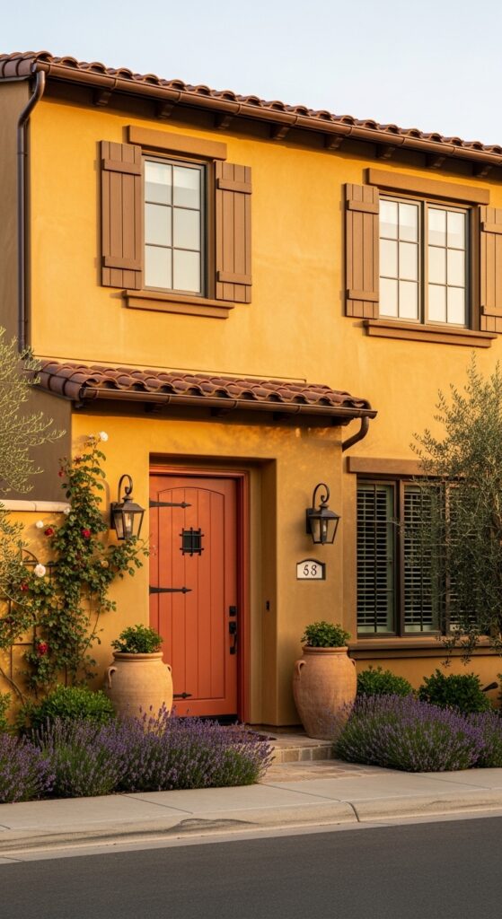
Vibe sentence: A golden ochre stucco home in afternoon light doesn’t just look warm — it radiates it, like a small piece of Tuscany relocated to your street.
What makes it work: Ochre, rust, and brown are an entirely earth-toned palette drawn from the same mineral family — the scheme has an intrinsic harmony because no color fights for dominance. All three tones warm further in late afternoon light, creating an exterior that appears to glow from the inside out at the most photogenic time of day.
How to achieve it: Ochre stucco should sit in the golden-amber range rather than veering toward lime-yellow — Benjamin Moore’s “Golden Straw” (2152-40) captures the right Tuscan warmth. Use dark brown trim in a matte finish on shutters; gloss here would read as too polished for the earthy palette. The rust door benefits from iron hardware in an aged black finish.
Pale Lavender with White Trim and Purple Door
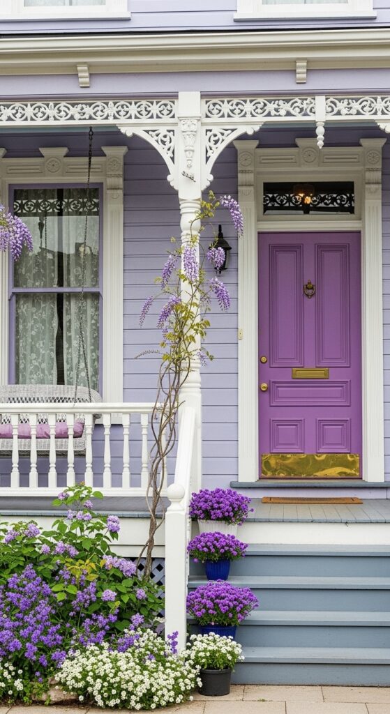
Vibe sentence: Pale lavender on a Victorian home is a color choice that takes absolute conviction — and delivers absolute magic in return.
What makes it work: Victorian architecture’s elaborate ornamental trim was specifically designed to showcase multiple colors, and lavender with white trim exploits this perfectly. The tonal progression from pale lavender siding to deeper purple door creates depth through the facade — your eye moves gradually from light at the edges to richness at the center.
How to achieve it: The lavender body color must be genuinely pale — almost grey-lavender — or the effect tips from sophisticated to sweet. Sherwin-Williams’ “Wisteria” (SW 6834) is a reliable, complex lavender that reads as architectural rather than juvenile. The door should step up at least two tones in saturation from the body color to create the intended depth.
Classic Red with White Trim and Black Shutters
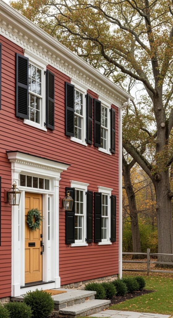
Vibe sentence: A red colonial home in autumn light looks like it was painted by someone who understood history — because in New England, they probably were.
What makes it work: Brick red siding on clapboard is a palette with genuine historical authority in American architecture — it references the iron oxide pigments used in colonial period paints and carries that association forward with dignity. Black shutters provide the crisp graphic contrast that prevents the red from feeling heavy or oppressive on a large facade.
How to achieve it: Use a warm, muted brick red rather than a bright fire-engine red — the historical authenticity lives in the muddiness, not the brightness. Benjamin Moore’s “Hancock Moore Red” (HC-49) or Farrow & Ball’s “Rectory Red” (217) both capture the right period tone. Black shutters should be operable if architectural integrity matters to you.
Coastal White with Driftwood Grey and Seafoam Accents
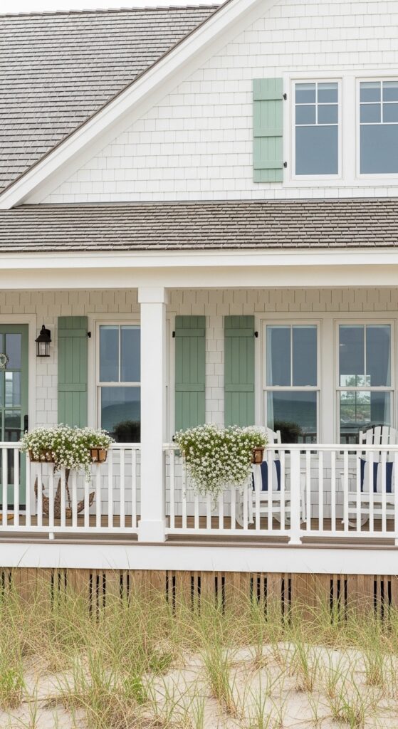
Vibe sentence: White and seafoam on a coastal cottage is the exterior palette that smells like salt air even when you’re looking at a photograph of it.
What makes it work: Seafoam green at low saturation mirrors the color of shallow ocean water in sunlight — it’s a coastal reference so literal it almost feels like cheating, except it works perfectly. Driftwood grey roofing provides the weathered, natural material tone that anchors the scheme in its coastal context without introducing anything artificially decorative.
How to achieve it: Seafoam trim should be genuinely muted — barely-there green rather than mint. Sherwin-Williams’ “Pewter Green” (SW 6208) or Benjamin Moore’s “Sea Salt” (2123-40) both have the right quality. White siding in a coastal context benefits from a slight warm or cream undertone — pure bright white can look institutional against a grey sky.
💡 A single seafoam-painted front door achieves the coastal palette instantly on any white house, with no additional repainting required.
Deep Burgundy with Sandstone Trim and Copper Door
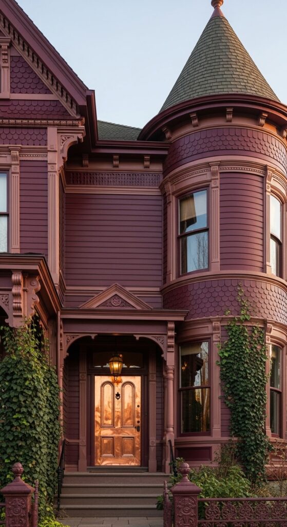
Vibe sentence: Deep burgundy on a Victorian with a copper door is not a color scheme — it’s a declaration, and it makes the most magnificent kind of statement.
What makes it work: Burgundy’s red-purple depth absorbs and reflects warm light in a way that makes Victorian ornamental detail particularly legible — every shadow and projection becomes a visible design feature. Sandstone trim (rather than the more common white) keeps the palette warm throughout, avoiding any coldness that bright white would introduce against such a saturated body color.
How to achieve it: Use Benjamin Moore’s “Dark Burgundy” (2083-20) or a similar wine-deep tone with purple rather than orange undertones — orange-red burgundy reads as brick rather than jewel. A genuine copper door (available from specialty door suppliers) will develop its patina over years into an increasingly beautiful accent.
Stone Grey with White Trim and Chartreuse Door
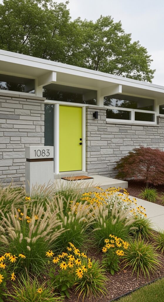
Vibe sentence: A chartreuse door on a stone grey ranch house is the exterior equivalent of a pocket square — a small confident gesture that transforms the entire presentation.
What makes it work: Cool stone grey is the ideal backdrop for an accent color statement precisely because it suppresses rather than competes — the chartreuse door reads with maximum saturation against it. Mid-century ranch architecture’s horizontal lines benefit from a single strong vertical focal point, and a colored door is the simplest way to provide one.
How to achieve it: The grey must have genuinely cool, neutral undertones to allow chartreuse to pop without visual conflict — Benjamin Moore’s “Stonington Gray” (HC-170) or Sherwin-Williams’ “Mindful Gray” (SW 7016) both work. Chartreuse door tone: Farrow & Ball’s “Yellowcake” (279) has the right vibrancy without tipping into neon territory.
Dusty Rose with Ivory Trim and Sage Door
Vibe sentence: Dusty rose on an Edwardian home with sage green at the door is the kind of exterior color scheme you pin, then go back to three weeks later still thinking about.
What makes it work: Dusty rose — desaturated, aged-looking pink — works on older architecture because it references the faded pigments of genuinely antique buildings, giving the home an air of lived-in grace rather than fresh paint. Sage green sits in the opposite tonal position on the warm-cool spectrum, providing just enough contrast at the entry to create focus without disrupting the softness.
How to achieve it: The rose must be genuinely dusty — a grey-pink, not a pastel pink. Farrow & Ball’s “Setting Plaster” (231) or “Peignoir” (286) both have the faded-fresco quality this scheme requires. The sage door should echo the garden planting — Rosa plants in apricot-pink tones planted either side of the entry will reinforce the entire palette naturally.
Dark Olive Green with Black Trim and Terracotta Door
Vibe sentence: Dark olive green with black trim and a terracotta door is the earthy, sophisticated exterior palette that makes you want to live a slower, more beautiful life.
What makes it work: Dark olive — a green with significant brown and grey mixed in — shares tonal DNA with terracotta, stone, and aged wood, which is why these elements harmonize so naturally. Black trim on a dark body color creates a more subtle contrast than black on white, adding architectural definition without drama, which suits the grounded mood perfectly.
How to achieve it: Look for an olive green with notably brown-grey undertones rather than bright yellow-green ones — Farrow & Ball’s “Hook’s Green” (80) or Benjamin Moore’s “Dried Oregano” (497) both have the right earthy depth. The terracotta door should have orange-warmth, not red-warmth — closer to fired clay than brick.
💡 Black trim on a dark body color is a more forgiving choice than black on white — minor paint overlaps are nearly invisible, making DIY painting much more achievable.
Crisp White with Pale Blue Shutters and Gold Door
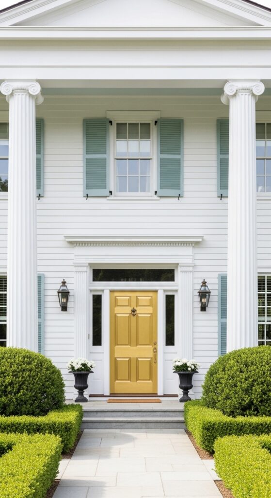
Vibe sentence: A gold lacquered door on a white Greek Revival home is the architectural equivalent of a firm, confident handshake — and it makes the house unforgettable.
What makes it work: The pale blue shutters are a classical reference — this color combination has roots in both Scandinavian and American colonial traditions, giving the scheme historical credibility. The gold door is the bold modern update that prevents the palette from feeling purely nostalgic, bridging tradition and contemporary confidence elegantly.
How to achieve it: The blue shutters must be genuinely pale and grey-shifted — not primary blue. Benjamin Moore’s “Wedgewood Gray” (HC-146) has the right classical reserve. For the gold door, Farrow & Ball’s “Giallo” (74) achieves a sophisticated lacquer quality; apply with a small foam roller for maximum sheen.
Moody Dark Blue with White Trim and Blush Door
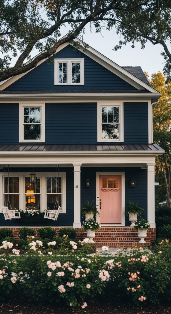
Vibe sentence: Deep indigo blue with a blush door is the combination that makes people walk past twice just to make sure they actually saw what they thought they saw.
What makes it work: The unexpected softness of a blush door against such a dramatic dark blue facade creates a tension between bold and gentle that’s genuinely arresting. It’s a pairing with no historical precedent — it’s entirely contemporary — which gives the home a distinctive individuality that more conventional schemes cannot match.
How to achieve it: The indigo body color needs depth without blackness — Sherwin-Williams’ “In the Navy” (SW 9178) or Farrow & Ball’s “Stiffkey Blue” (281) have the right blue-depth balance. The blush door must be genuinely pink — not peach, not salmon — to maintain the romance of the contrast. Farrow & Ball’s “Nancy’s Blushes” (278) achieves exactly the right tone.
Natural Cedar Shingles with White Trim and Navy Door
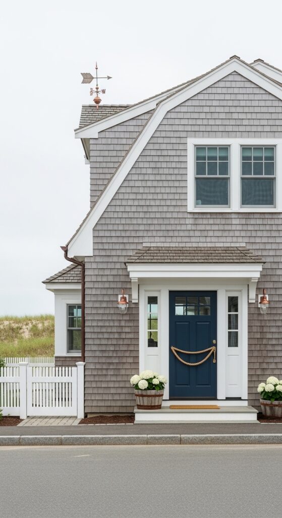
Vibe sentence: Natural weathered cedar shingles are proof that the most beautiful exterior color is sometimes not a paint color at all — it’s just time doing its work.
What makes it work: Weathered cedar develops a complex silver-grey tone with genuine depth and variation that no single paint color can replicate. The white trim and navy door provide the architectural definition and focal point that allow the natural material to read as intentional rather than simply unmaintained. The rope door pull completes the coastal narrative.
How to achieve it: If starting with fresh cedar, allow natural weathering rather than painting — the silver-grey develops within two to three years in exposed conditions. If impatient, a diluted grey wood stain in silver tone accelerates the effect. Protect white trim with a high-quality exterior paint to maintain the crisp contrast against the naturally darkening cedar.
Warm Caramel with White Trim and Teal Shutters
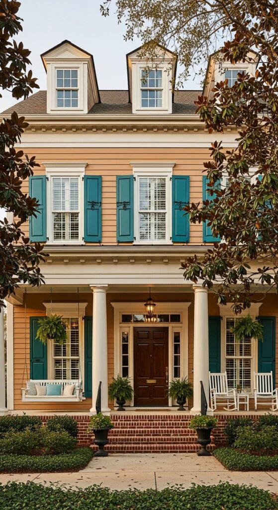
Vibe sentence: Caramel siding with teal shutters on a Southern colonial porch is the exterior combination that makes you want to sit down, slow down, and stay.
What makes it work: Warm caramel undertones in the siding color harmonize beautifully with the golden tones of afternoon Southern light, making the house appear to literally warm up as the day progresses. Teal shutters provide a cool, jewel-toned contrast that energizes the warm palette without competing with the all-important white columns.
How to achieve it: Caramel siding should sit in the warm tan-amber range — Sherwin-Williams’ “Antique White” (SW 6119) or Benjamin Moore’s “Navajo White” (OC-95) both have the right golden undertone. Teal shutters in a slightly darkened, sophisticated teal — closer to Benjamin Moore’s “Teal Ocean” (2058-30) than bright peacock — read as intentional and architectural.
💡 Painting just the shutters in a new accent color is the fastest single-day curb appeal transformation available — shutters can be removed, painted, and rehung without scaffolding.
Deep Plum with Stone and Cream Trim
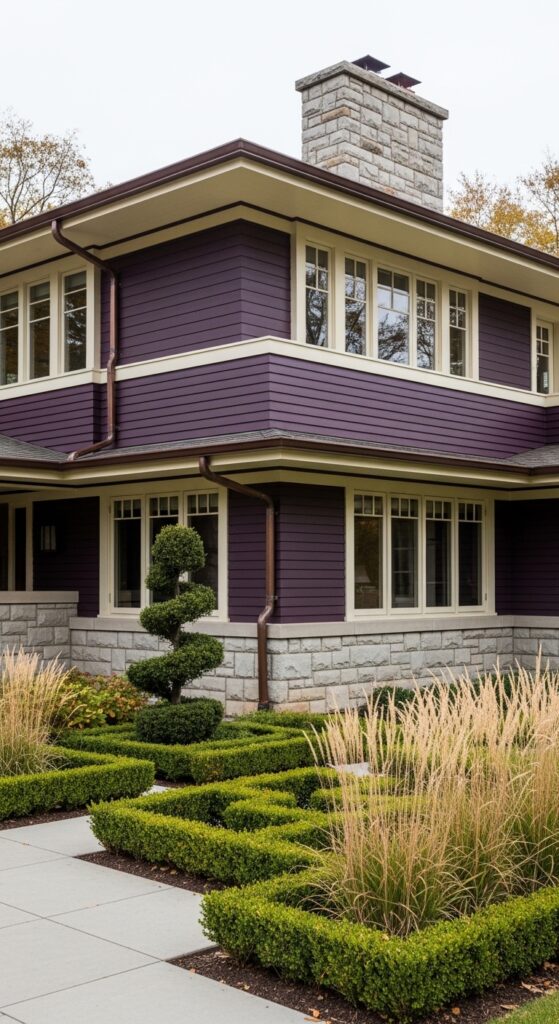
Vibe sentence: Deep plum on Prairie-style architecture is what happens when a house decides to be art — confidently, deliberately, and without apology.
What makes it work: Prairie architecture’s horizontal emphasis and broad overhanging rooflines create the geometry that supports a strong, unconventional body color beautifully — the architectural bones carry the weight of the statement. Deep plum with cream trim references natural prairie landscapes — the purple of twilight wildflowers against pale autumn grasses.
How to achieve it: Deep plum for exteriors needs blue-purple undertones rather than red-purple — Sherwin-Williams’ “Baroque Plum” (SW 6285) sits in the right range. Cream trim in broad bands (a Prairie design characteristic) — rather than narrow white trim — is structurally important to the style. Use a cream with warm yellow undertones to prevent the combination from reading as cold.
Pale Grey with Blush Pink Trim and Copper Accents
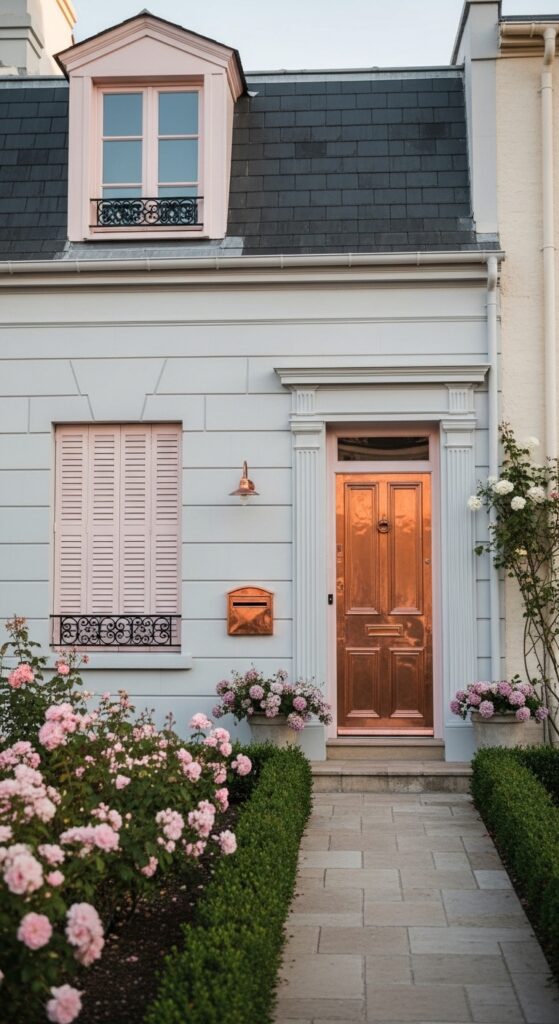
Vibe sentence: Pale grey render with blush pink trim and copper at the door is the exterior palette that makes you whisper “bon sang” and reach for your phone.
What makes it work: Blush pink trim on grey render is a genuinely Parisian combination — the color of the city’s iron balconies, rendered façades, and window boxes combined into a single exterior scheme. Copper adds warmth and material luxury that painted finishes cannot provide, and its tones bridge the warm blush and cool grey elegantly.
How to achieve it: The grey render must be pale and cool — warm grey will fight the blush trim. Farrow & Ball’s “Pavilion Gray” (242) or “Moles Breath” (276) both have the cool sophistication required. Blush trim: Farrow & Ball’s “Peignoir” (286) is the benchmark — barely pink, barely grey, entirely exquisite.
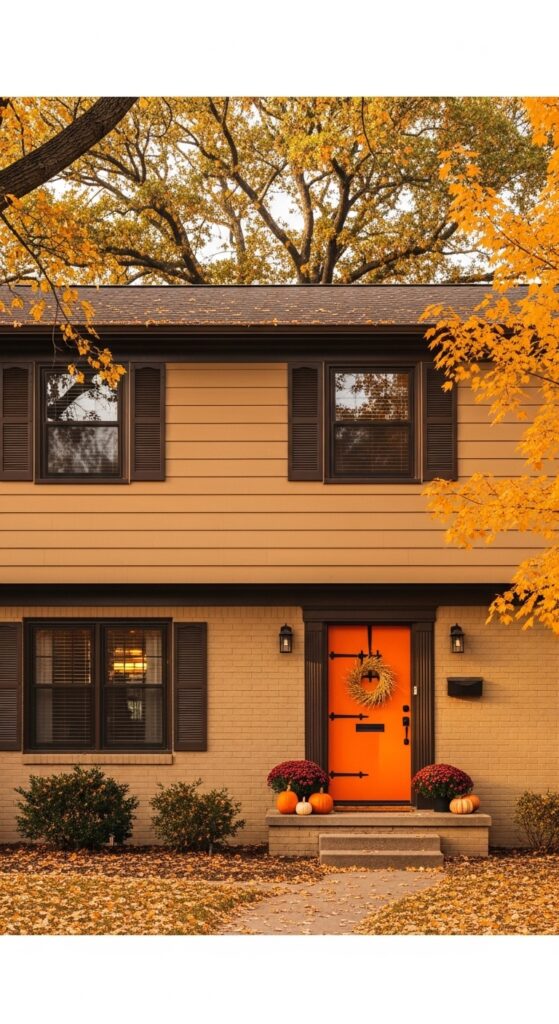
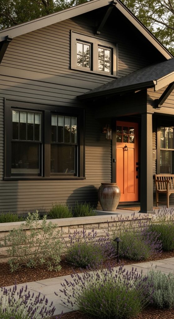
Classic Tan with Dark Brown Trim and Orange Door
Vibe sentence: Tan siding, dark brown trim, and an orange door in autumn light — this is the exterior palette that looks like it was designed by the season itself.
What makes it work: The warm tan-brown-orange combination is drawn from autumn’s own color palette, which means the house and its seasonal landscape become a single unified visual statement during fall. This tonal relationship — all colors from the same warm family — creates a harmonious scheme with no visual tension between house and surroundings.
How to achieve it: Tan body color should stay on the warm, golden side of neutral — Benjamin Moore’s “Lenox Tan” (HC-44) is reliably warm without tipping into yellow. The orange door must be genuinely orange, not red-orange — Sherwin-Williams’ “Copper Harbor” (SW 6631) has the right pumpkin-spice warmth for this palette.
Fresh White with Bright Coral Shutters and Door
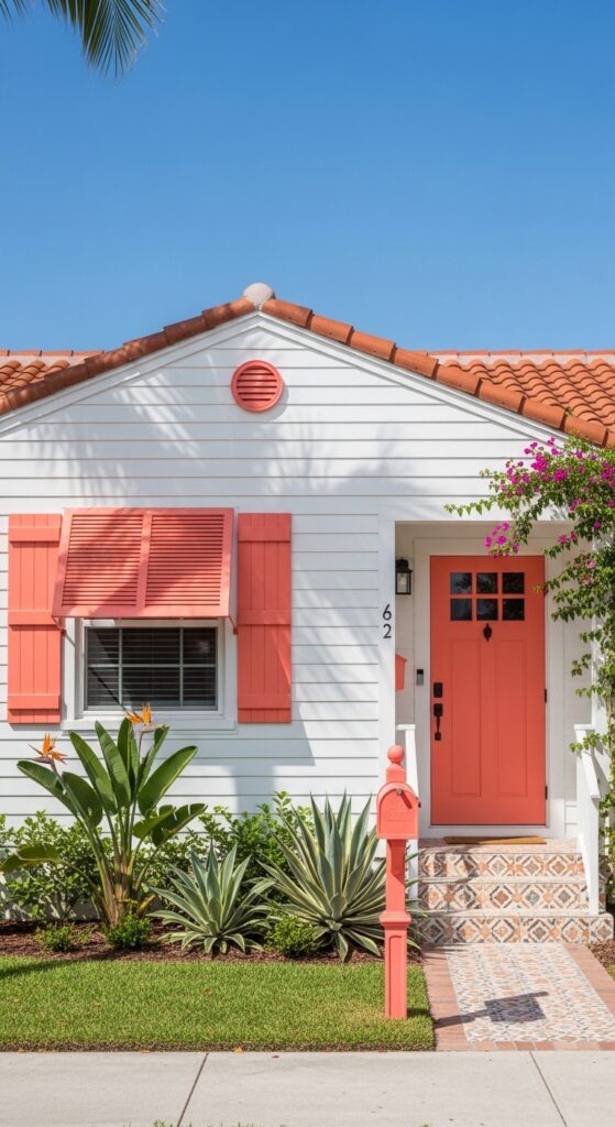
Vibe sentence: White and coral in strong sunlight is the exterior palette that radiates an energy you can feel from twenty houses away — it belongs in the sun and knows it.
What makes it work: Strong sunlight bleaches pale colors and enriches saturated ones — which is exactly why bright white and vibrant coral look their absolute best in tropical or high-sun climates. The terracotta roof tile is the third element that ties the scheme to its warm-climate context, completing a palette that couldn’t exist anywhere north of the thirty-fifth parallel.
How to achieve it: Coral shutters and doors should match precisely — use the same paint on both. The right coral tone sits between pink and orange: Sherwin-Williams’ “Coral Reef” (SW 6606) or Benjamin Moore’s “Calypso Orange” (2016-30) both have the right sun-saturated warmth. Keep the white siding genuinely bright — this is one scheme where warm white reads as dingy rather than sophisticated.
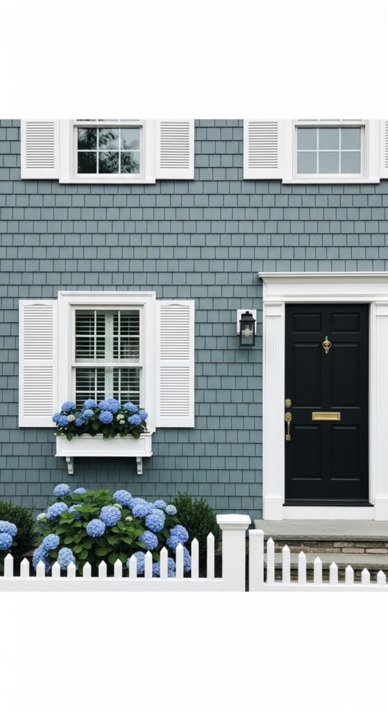
Weathered Blue-Grey with White Trim and Yellow Door
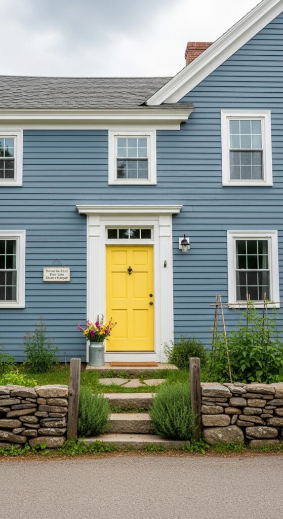
Vibe sentence: A lemon yellow door on weathered blue-grey clapboard is exactly the kind of unexpected cheerful detail that makes a hardworking New England farmhouse feel like a love letter to the land.
What makes it work: Blue and yellow are complementary on the color wheel, meaning they enhance each other’s intensity when placed in proximity. On a modest farmhouse, the yellow door functions as a visual anchor — the single moment of brightness on a deliberately understated facade that makes the whole composition sing.
How to achieve it: The blue-grey body color should be genuinely dusty and low-saturation — Farrow & Ball’s “Pigeon” (25) or Benjamin Moore’s “Newburyport Blue” (HC-155) both have the right weathered quality. The yellow door should be warm and slightly golden — avoid cool lemon tones and look instead for the butter-yellow quality of Sherwin-Williams’ “Decisive Yellow” (SW 6902).
Chocolate Brown with Cream Trim and Turquoise Door
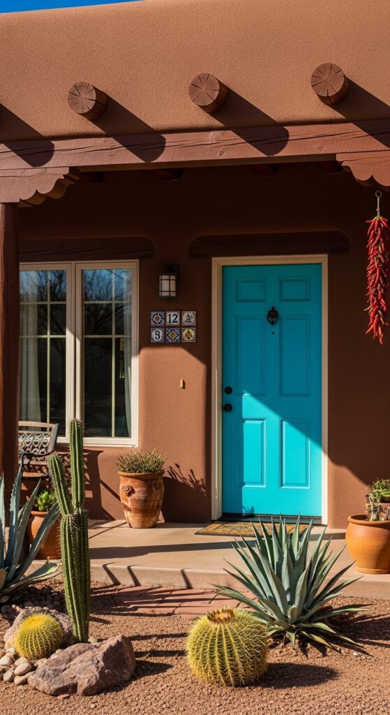
Vibe sentence: Chocolate brown adobe with a turquoise door is the exterior color scheme of the American Southwest — ancient, joyful, and absolutely confident in its own identity.
What makes it work: Turquoise has been the traditional accent color of Southwestern and Native American architecture for centuries — against deep brown earth tones, it creates a vivid complementary contrast with genuine cultural and historical resonance. The cream trim softens the transition between dark brown and bright turquoise, preventing the scheme from feeling overwhelming.
How to achieve it: Adobe brown stucco should have red-brown undertones rather than grey-brown — Benjamin Moore’s “Barley Corn” (1044) or “Aged Leather” (1165) both capture the earthen quality. The turquoise door must be genuinely vibrant — not dusty or sage — to read against the dark background. Sherwin-Williams’ “Cay” (SW 6789) has the right Caribbean-meets-desert brightness.
💡 A turquoise door is one of the most photographed curb appeal elements on Pinterest — a single door change can transform an ordinary brown stucco home into a neighborhood landmark.
Soft Black with Warm Wood and Brass Accents
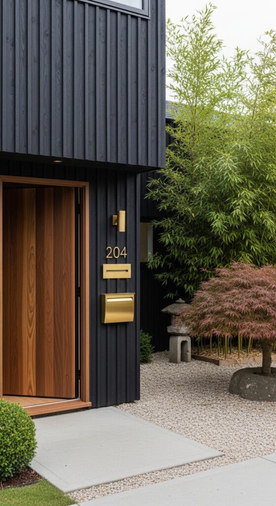
Vibe sentence: This is the exterior that makes every other house on the street look like it’s still figuring itself out.
What makes it work: Japanese architectural sensibility — minimal material palette, deliberate use of natural materials, absolute restraint in ornament — produces exteriors of remarkable serenity. Soft black as a background color functions like a photographic backdrop: it removes visual noise entirely, allowing every natural material detail — the walnut grain, the brass plate, the bamboo shadow — to register with maximum clarity.
How to achieve it: Vertical board siding (rather than horizontal) is important for this aesthetic — it references Japanese timber construction traditions and creates a different shadow play than standard clapboard. Specify a truly matte finish for the black — any sheen reads as modern-industrial rather than Japandi. Brass details should be unlacquered so they develop a warm patina naturally over time.
Sage Green with Exposed Brick and White Trim
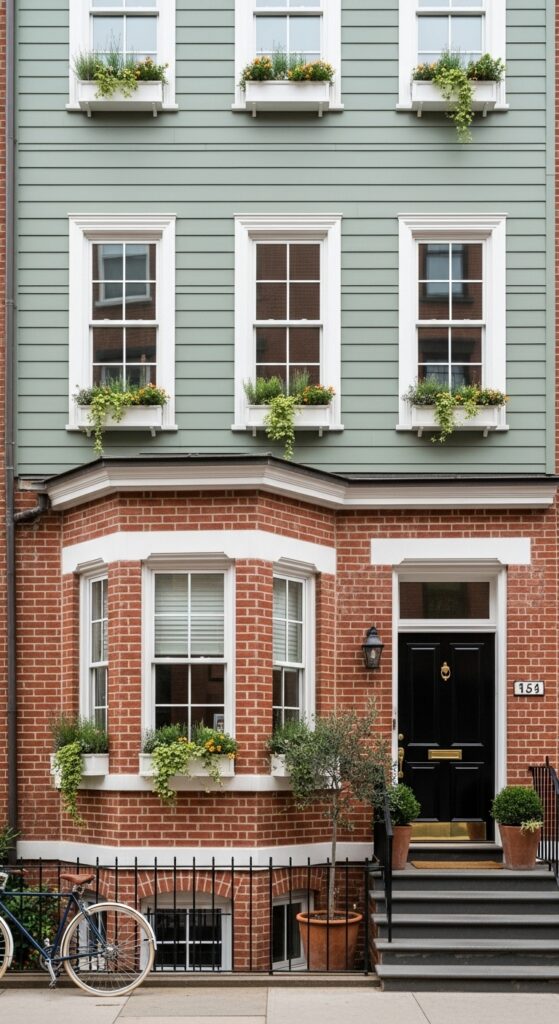
Vibe sentence: Sage green paint meeting exposed brick on a townhouse is the urban curb appeal story that has spent the last three years absolutely dominating Pinterest — and it deserves every single re-pin.
What makes it work: The contrast between painted sage green and raw exposed brick creates a material richness that purely painted facades simply cannot achieve. White trim running continuously across both materials unifies them into a single scheme — without that unifying element, the combination would simply look unfinished rather than intentional.
How to achieve it: Sage green should have grey-green undertones for the best pairing with warm red brick — Farrow & Ball’s “Mizzle” (266) or Sherwin-Williams’ “Privilege Green” (SW 6193) both have the right earthy greyness. Ensure the white trim color on both the brick section and the painted section is identical — even small white variations read as discordant from the street.
How to Start Your Exterior Color Scheme Transformation
Begin with what you can’t change: your roof color, your brick or stone, your driveway material. These fixed elements define the tonal family your paint palette must work within. A warm grey slate roof wants warm whites and earthy tones; a cool black asphalt shingle is more flexible. Understanding your constraints first prevents the most expensive exterior color mistakes.
The single most common error homeowners make is choosing colors from chips inside the house and not testing them at scale on the actual exterior. Exterior light — particularly direct sun and open sky — is fundamentally different from indoor light, and colors can shift dramatically between a two-inch sample and a four-foot painted board nailed to the facade. Always, always test at scale before committing.
Budget-friendly entry points exist at every level. A new front door color is the highest-impact, lowest-cost exterior transformation available — one quart of paint and a weekend afternoon can completely change how your home reads from the street. Shutters are the second most affordable accent change, and new exterior light fixtures in a finish that complements your palette are the third.
For a full exterior repaint, realistic budgeting and timeline planning matter. Professional exterior painting typically requires two to three days of actual painting time on a standard home, but may take two to three weeks to schedule, prepare, prime, and execute properly. A rushed paint job on inadequately prepared surfaces will look beautiful for one season and terrible thereafter — the preparation is as important as the color choice.
Frequently Asked Questions
What is the best exterior color scheme for resale value?
Neutral, universally appealing palettes consistently outperform bold or highly personal choices in resale research. Classic schemes — warm white with black trim, warm greige with white trim and a navy or black door, or soft grey with crisp white detailing — appeal to the widest possible buyer pool. A Zillow study found that homes with black front doors sold for up to $6,000 more than comparable homes with other door colors, suggesting that confident, high-contrast accent choices within a neutral palette perform best. Avoid extremely saturated or unusual body colors if resale is the primary concern — save personality for the door and shutters.
How do I choose an exterior color that works with my brick?
The key is identifying your brick’s dominant undertone — is it warm red-orange, cool purple-red, or yellow-buff? Warm red-orange brick pairs best with sage green, cream, warm white, dark forest green, or navy — all tones that share warm or complementary color relationships with the brick. Cool purple-red brick works well with warm cream, soft greige, or slate blue-grey — tones with enough warmth to balance the brick’s coolness. Yellow-buff brick is the most versatile and accepts almost any neutral or earth tone. Always test any candidate color as a large painted sample board held against your actual brick in full sunlight before purchasing full paint quantities.
Is it expensive to repaint an exterior?
Professional exterior painting for an average 2,000 square foot two-story home typically ranges from $3,500 to $8,000 depending on region, surface condition, and number of colors. Single-story ranch homes run $2,000 to $5,000. The largest variables are surface preparation (scraping, priming, and repairing damaged siding can add $500–$2,000) and paint quality — premium exterior paints cost more per gallon but cover better and last significantly longer, making them more economical over a ten-year period. DIY exterior painting is achievable on single-story homes and can reduce costs to materials only ($400–$900), but requires proper scaffolding, surface preparation, and time investment.
How often does exterior paint need to be refreshed?
Quality exterior paint on properly prepared surfaces typically lasts eight to twelve years before requiring a full repaint, though this varies significantly by climate, sun exposure, and paint quality. South-facing and west-facing walls take the most UV damage and may need touching up sooner. Dark colors absorb more heat and can fade or peel faster than lighter tones on high-sun exposures. Annual inspection for cracking, peeling, or chalking allows minor repairs before they become major repaints. High-quality 100% acrylic exterior paints from brands like Sherwin-Williams’ Emerald Exterior or Benjamin Moore’s Aura Exterior consistently outperform budget options on longevity, making their higher upfront cost financially sound.
What’s the best way to test exterior paint colors before committing?
The most reliable method is the large-scale board test: paint a two-foot by four-foot piece of primed hardboard with your candidate colors and prop it against the exterior wall in various locations — front-facing, side wall, in shade, and in direct sun. Observe it at different times of day (morning, midday, late afternoon) and in different weather conditions (overcast, full sun) over at least three days before deciding. Digital visualization tools from Sherwin-Williams (ColorSnap Visualizer) and Benjamin Moore (Personal Color Viewer) allow you to upload a photo of your home and apply colors virtually — useful for narrowing options before purchasing samples. Never commit to a full exterior based on an indoor chip or a digital tool alone.
Ready to Create Your Dream Exterior Color Scheme for Curb Appeal?
You now have 30 of the best exterior color schemes for curb appeal — from the timeless authority of black and white colonial to the Southwestern drama of chocolate brown and turquoise, with every style and personality in between. Each of these palettes has been chosen because it works with specific architectural contexts, material constraints, and design principles that make the difference between a house that’s merely painted and one that genuinely stops people in their tracks.
Save the ideas that matched your home’s architecture — that shortlist is where your transformation begins. Start with the front door: one afternoon, one quart of paint, and your home already tells a different story to everyone who passes it.
Great curb appeal isn’t about spending the most or painting the most — it’s about choosing the right color with conviction and applying it with care. The street is waiting to see what you do next.