There’s something about a green living room that feels like bringing the outside world in — calm, grounded, and endlessly alive. Whether you’re drawn to deep forest tones or the softest sage whisper, green living room decor has a rare ability to make a space feel both sophisticated and completely livable. The good news? You don’t need to start from scratch or hire a designer to get there. These 30 fresh green living room ideas span every budget, every shade, and every style so you can find exactly what speaks to you. Let’s explore every one of them.
Why Green Works So Well in Living Rooms
Green is the most restful color the human eye can perceive — and interior designers have known this for decades. It sits at the intersection of cool and warm on the color wheel, which means it plays beautifully with both crisp whites and rich earthy tones. That versatility is rare, and it’s exactly why green living room decor has exploded across Pinterest boards and shelter magazines alike.
The shades available are staggering in range. From barely-there mint and dusty sage to moody hunter green and dramatic emerald, there’s a version of green that works in every light condition and every square footage. Pair it with natural materials — linen, rattan, jute, raw wood — and it takes on an organic warmth that no other color can replicate.
Culturally, we’re in a moment of biophilic design: the design philosophy that humans crave connection to nature, especially inside their homes. Green is the fastest, most affordable way to bring that energy indoors without installing a living wall.
Even small living rooms benefit enormously. A single sage-green accent wall or a pair of olive-toned throw pillows can anchor a space and make it feel intentionally designed rather than randomly assembled.
1. The Sage Green Sofa Statement
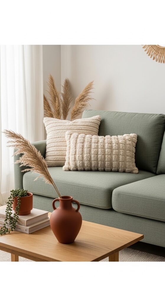
Vibe sentence: A sage green sofa doesn’t just sit in a room — it anchors the whole space with a quietly confident, earthy elegance.
What makes it work: Sage green is a sophisticated neutral in disguise — it reads as color without overwhelming, which allows surrounding accents to breathe. Against a warm white or greige wall, its cool-warm balance creates visual tension that keeps the room from feeling flat. The linen texture amplifies the organic quality of the green.
How to achieve it: Look for sofas upholstered in linen-blend or performance-linen fabric in shades labeled “sage,” “eucalyptus,” or “fern.” Pair with cream and terracotta accessories rather than stark white — it keeps the palette cohesive and warm.
💡 Can’t afford a new sofa? A sage green sofa slipcover ($80–$150) transforms any existing couch in under an hour.
2. Emerald Velvet Accent Chair
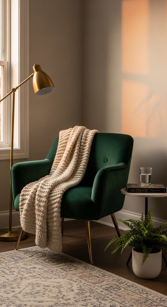
Vibe sentence: One emerald velvet chair is all it takes to make a living room feel like somewhere genuinely special.
What makes it work: Velvet absorbs and reflects light simultaneously, which gives emerald green a jewel-like depth that flat fabrics can’t match. The richness of the color paired with brass hardware creates a sophisticated contrast that reads as intentional and collected. It works as a single statement in a neutral room without needing anything else around it to justify its presence.
How to achieve it: Choose a chair with tapered brass or gold-toned legs — this lifts the visual weight of the dark velvet and keeps the piece from feeling heavy. Position near a floor lamp to catch the light and show off the velvet’s dimension.
3. Forest Green Painted Walls
Vibe sentence: Painting all four walls forest green feels bold — and then you walk in and realize it feels like the most peaceful room you’ve ever stood in.
What makes it work: Full-room dark green creates a cocooning effect that makes any living room feel intentional and intimate. The contrast of bright white trim and built-ins pops brilliantly against the depth of the green, preventing the room from feeling cave-like. Matte finishes work best here — they absorb light softly and give the color its full, moody quality.
How to achieve it: Try Farrow & Ball’s “Calke Green” or Benjamin Moore’s “Hunter Green” in a flat or matte finish. Always test two large swatches (at least 12″x12″) on opposite walls before committing, as the color shifts significantly depending on light direction.
💡 Start with just one accent wall if full-room commitment feels too bold — the north-facing wall gives the richest, most consistent color.
4. Olive Green Linen Curtains
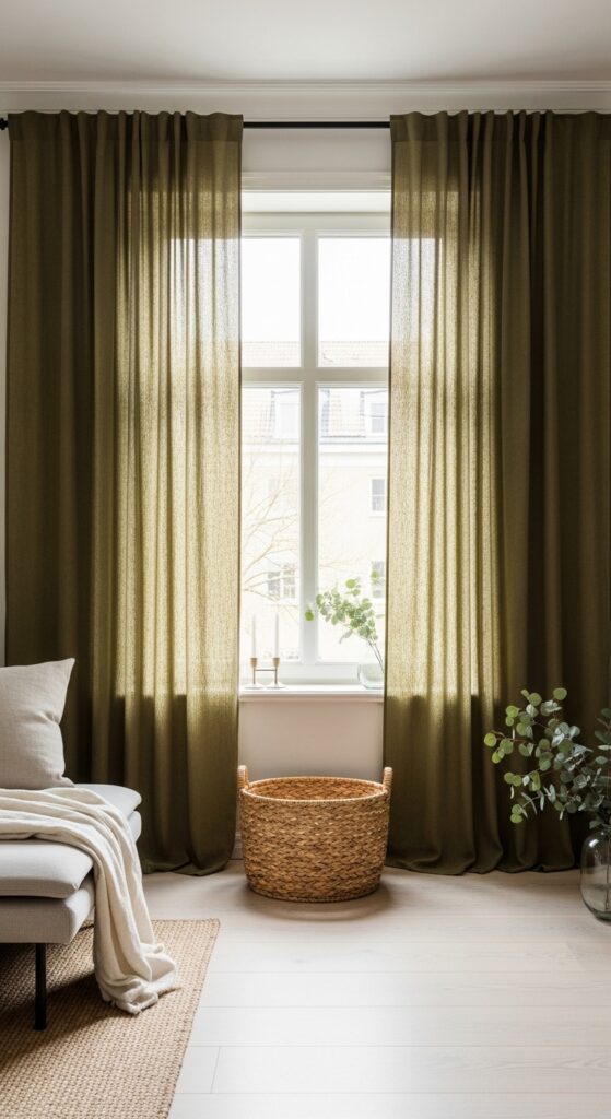
Vibe sentence: Olive linen curtains change the quality of light in a room in a way no other window treatment can — everything becomes golden, soft, and unhurried.
What makes it work: Linen’s natural slubs and irregular weave give olive green a lived-in warmth that synthetic fabrics completely miss. Hanging curtains close to the ceiling and letting them just pool on the floor is a classic designer trick that makes windows appear taller and ceilings higher. The filtered green-toned light they cast ties together every other element in the room.
How to achieve it: Hang your curtain rod 4–6 inches above the window frame (or directly below the crown molding) and select panels that are at least 12 inches wider than the window on each side to create full, generous folds.
5. Sage and Terracotta Color Story
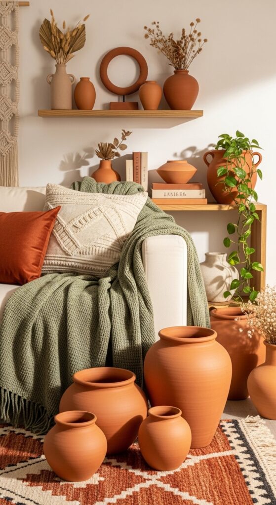
Vibe sentence: Sage and terracotta together feel like a California afternoon — warm, earthy, and completely at ease.
What makes it work: These two colors sit opposite each other on a muted tonal wheel — green and red-orange — which creates natural visual tension that feels alive without being jarring. Both are desaturated enough to feel sophisticated rather than primary and bold. The pairing works because each color makes the other look more complex and interesting than it would alone.
How to achieve it: Start with terracotta as your accent — bring it in through pots, a single cushion, or a vase — then layer sage green through textiles. Avoid 50/50 balance; aim for roughly 70% sage, 30% terracotta throughout the space.
6. Green Gallery Wall with Botanical Prints
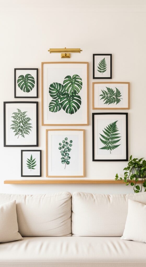
Vibe sentence: A botanical gallery wall is the living room equivalent of bringing in a garden without getting your hands dirty.
What makes it work: Mixing frame styles (black metal and natural wood) in the same wall arrangement creates depth and an “collected over time” quality that matching sets never achieve. Botanical prints work especially well together because the variations in green across different plants create tonal interest within a cohesive color story. Sizing variation — one large anchor print surrounded by smaller ones — gives the arrangement natural hierarchy.
How to achieve it: Before nailing anything, lay your arrangement on the floor. Aim for consistent spacing of 2–3 inches between frames. Mix at least three different frame sizes for visual rhythm.
💡 Download free botanical illustrations from sites like rawpixel.com and print at home — frame them for under $15 total.
7. Rattan and Greenery Boho Corner
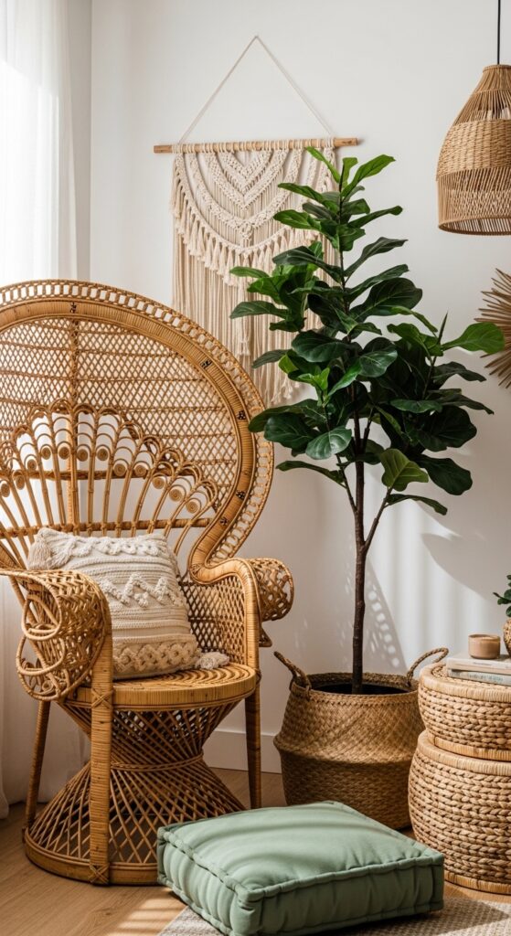
Vibe sentence: This is the corner of the room where you’d read for three hours without realizing how much time has passed.
What makes it work: Rattan’s warm honey tones create the perfect foil for deep green foliage — the contrast between the dry, textured natural fiber and the lush wet-looking leaves is deeply satisfying. Layering a macramé hanging above pulls the eye upward, making the corner feel taller and more deliberate. The key is scale — a large plant, not a small one, commands this kind of space properly.
How to achieve it: A fiddle leaf fig, bird of paradise, or large monstera works best here. Pot in a woven seagrass basket planter (rather than a plastic nursery pot) to keep the natural materials story consistent throughout.
8. Hunter Green Velvet Throw Pillows
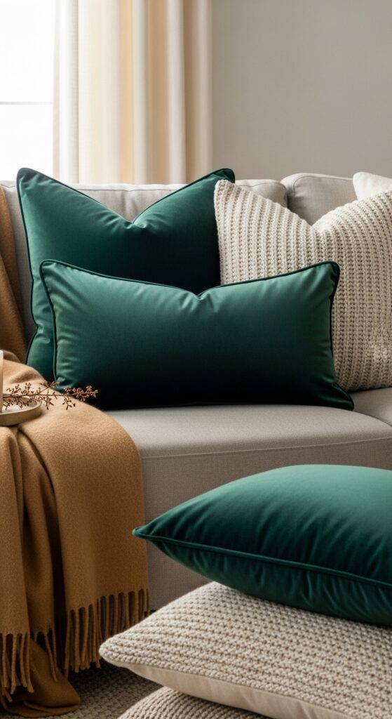
Vibe sentence: Sometimes the fastest way to transform a living room is as simple as swapping in two new throw pillows.
What makes it work: Hunter green velvet reads as instantly sophisticated against neutral sofas because the depth of color provides contrast while the velvet texture adds tactile luxury. The rule of odd numbers applies — three green pillows of varying sizes creates more visual interest than two matching ones. The addition of one contrasting texture (knit, wool, or waffle weave) prevents the arrangement from feeling monotonous.
How to achieve it: Combine one 20″x20″ square, one 18″x18″ square, and one 12″x20″ lumbar in the same hunter green velvet. Layer a different-textured neutral pillow at the front to add depth. Kasentex, Anthropologie, and H&M Home all offer affordable velvet options under $40.
💡 Rotate pillow covers seasonally — buy covers, not full pillows, to save storage space and cost.
9. Green Limewash or Textured Paint Wall
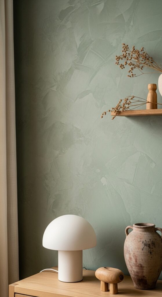
Vibe sentence: A limewash green wall looks like it’s been part of a Tuscan farmhouse for two hundred years — in the best possible way.
What makes it work: Limewash paint’s layered application creates variation in depth and tone that flat paint simply cannot replicate. The raking light that grazes across the textured surface throughout the day makes the wall feel almost alive, changing character from morning to evening. This texture also makes imperfections in older walls virtually invisible — a rare bonus in renovation.
How to achieve it: Brands like Portola Paints offer ready-to-use limewash in sage tones. Apply in two to three thin layers with a large sea sponge or chip brush, working in circular motions and varying pressure to achieve authentic depth.
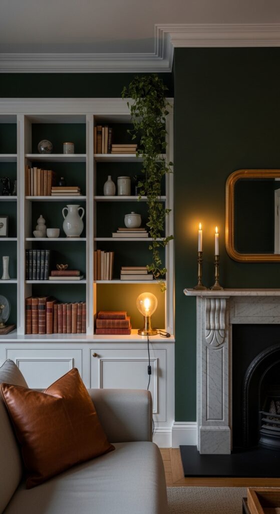
10. Dark Green Bookcase Backdrop
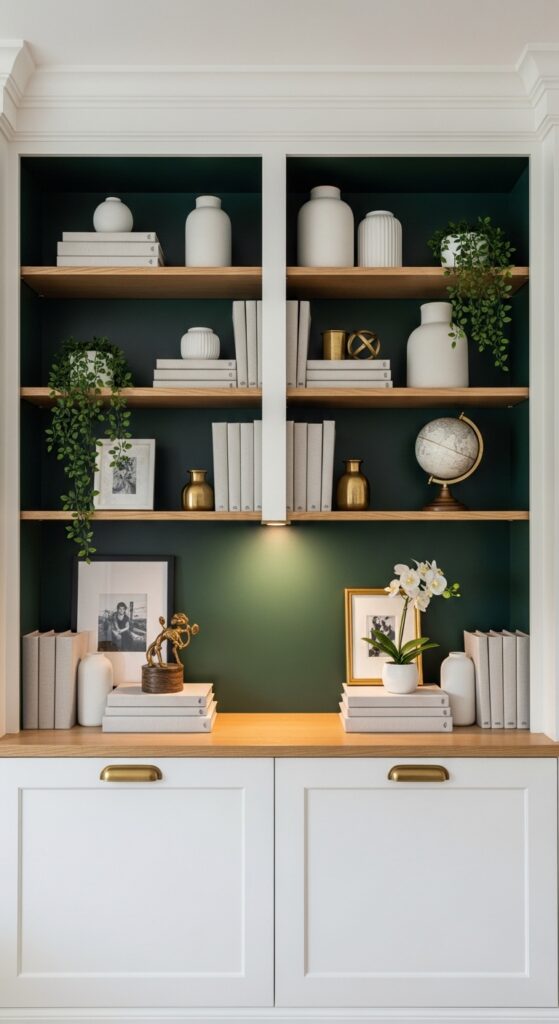
Vibe sentence: Painting the inside back of a bookcase is one of the highest-impact, lowest-effort design moves in a living room.
What makes it work: The dark green interior of a bookcase creates a shadow box effect that makes every object displayed in front of it pop with clarity. White ceramics, brass accents, and natural wood tones all sing against bottle green in a way they never would against a bare white wall. The trick is to treat the bookcase as a curated display — fewer, better objects spaced with breathing room.
How to achieve it: You don’t need built-ins — this works on any IKEA Billy bookcase or freestanding unit. Paint only the back panel in a deep green (Benjamin Moore’s “Salamander” or Sherwin-Williams “Cascades”), and keep the shelves and frame their original color or white.
💡 Add a small battery-powered LED strip to the top shelf interior for an instant warm glow that highlights your display.
11. Layered Green Textiles and Throws
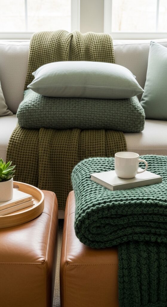
Vibe sentence: Tonal green layering is the design equivalent of a chord progression — each shade adds a note until the whole thing hums.
What makes it work: Layering three or four shades of the same color family creates monochromatic depth that looks intentional and sophisticated. Texture variation is what prevents it from becoming flat — a linen base, a waffle throw, and a chunky knit blanket all read as different despite sharing the green family. The result is warmth built from color alone, without needing warmth from a contrasting tone.
How to achieve it: Stay within greens that share the same undertone — all warm (yellow-based) or all cool (blue-based) — to avoid a clashing effect. Sage, olive, and moss are all warm greens that layer harmoniously together.
12. Organic Modern with Marble and Green
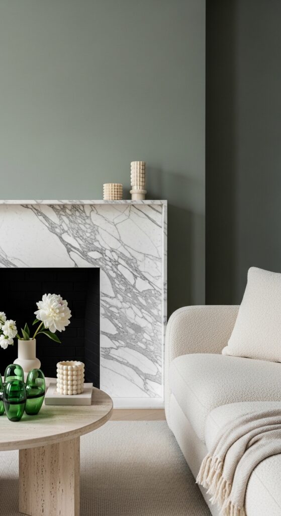
Vibe sentence: Sage green walls behind a white marble fireplace feel like the visual equivalent of a deep, slow exhale.
What makes it work: The cool blue-white of white marble and the warm grey-green of sage are tonal neighbors that complement without competing. Marble’s natural veining provides organic pattern in an otherwise restrained palette, which gives the eye something to explore without adding visual clutter. Rounded furniture forms — boucle sofa, travertine circle table — soften the hard edges of the stone.
How to achieve it: If a real marble fireplace surround is out of budget, look for large-format porcelain tile in a marble look (Marazzi and MSI both make excellent, affordable options) or a plaster-finish painted surround in warm white.
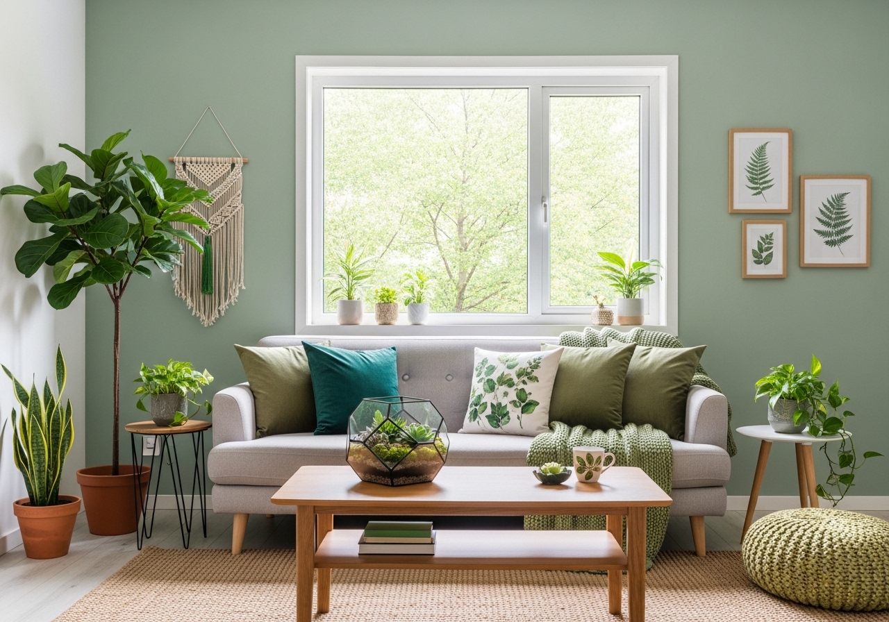
13. Indoor Plants as Primary Decor
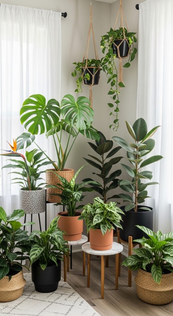
Vibe sentence: When plants become the decorating strategy — not just the accent — a living room begins to feel genuinely extraordinary.
What makes it work: The secret to an effective indoor plant display is height variation. A floor-level rubber plant, a mid-height monstera on a plant stand, and a trailing pothos on a high shelf create a vertical green column that draws the eye upward and makes ceilings feel taller. Using pots in one consistent material (all terracotta, or all matte black) unifies what could otherwise look chaotic.
How to achieve it: If low light is a concern, stick to pothos, snake plants, ZZ plants, and cast iron plants — all genuinely thrive in indirect or minimal light and maintain gorgeous deep green color year-round without much effort.
💡 Group plants in odd numbers (3 or 5) and vary height by at least 12 inches between each for the most editorial look.
14. Green and Gold Glamour
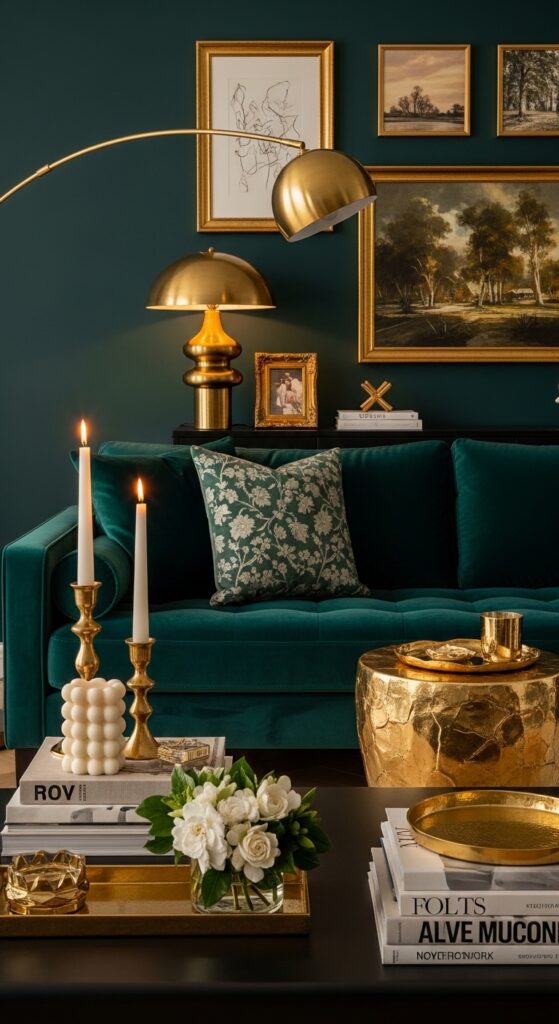
Vibe sentence: Deep green and gold is the color combination that makes a living room feel genuinely glamorous without trying too hard.
What makes it work: The richness of deep teal or jewel-toned green absorbs warm golden light in a way that creates visual warmth and drama simultaneously. Gold’s warm yellow undertone pulls the green toward the warm side of the spectrum, preventing it from feeling cold or corporate. This pairing has the advantage of looking expensive at multiple price points — it’s all in the proportion and the finish quality of key pieces.
How to achieve it: Focus gold in lighting (a brass arc lamp or table lamp), one or two frames, and small accessories like trays and candleholders. Overloading on gold turns glam into gaudy — treat it as the seasoning, not the main ingredient.
15. Green Kitchen-Adjacent Living Room Flow
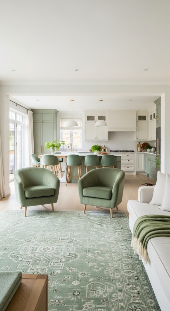
Vibe sentence: Using the same green tone across an open-plan space creates the kind of effortless flow that makes a home feel genuinely designed, not just decorated.
What makes it work: In open-plan homes, repeating a single accent color across the living and kitchen zones (through rugs, chairs, and cabinetry) creates visual continuity that makes the whole space read as intentional. Sage green is especially effective because it bridges the gap between the warmth of the kitchen and the relaxed quality of the living room. The key is keeping the shade consistent across zones even if materials and applications differ.
How to achieve it: Use the same Benjamin Moore or Sherwin-Williams paint color code in both spaces — on kitchen island cabinetry, kitchen chairs, and living room accent pieces — to ensure the green stays truly consistent across different materials and lighting conditions.
16. Sage Green Painted Ceiling
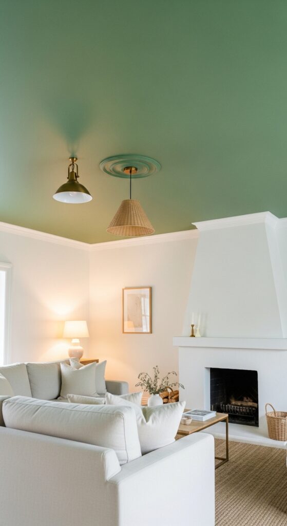
Vibe sentence: Painting the ceiling sage green is the design move that makes guests look up and immediately say “wait, that’s genius.”
What makes it work: A colored ceiling lowers the visual height of a room in the best possible way — it creates a canopy-like intimacy that makes large, high-ceilinged living rooms feel cozy and intentional. Sage’s muted quality keeps the effect subtle enough to feel sophisticated rather than theme-park. Against crisp white walls and trim, the sage ceiling becomes a quiet statement that anchors the whole room from above.
How to achieve it: Use your existing sage green paint and simply take it to the ceiling — no special ceiling paint required unless the surface has stains. Roll in two thin coats rather than one thick coat for an even, streak-free finish. This works best in rooms with natural light.
💡 Always use matte finish on ceilings — eggshell or satin will show every imperfection when light rakes across the surface.
17. Nature-Inspired Green and Brown Palette
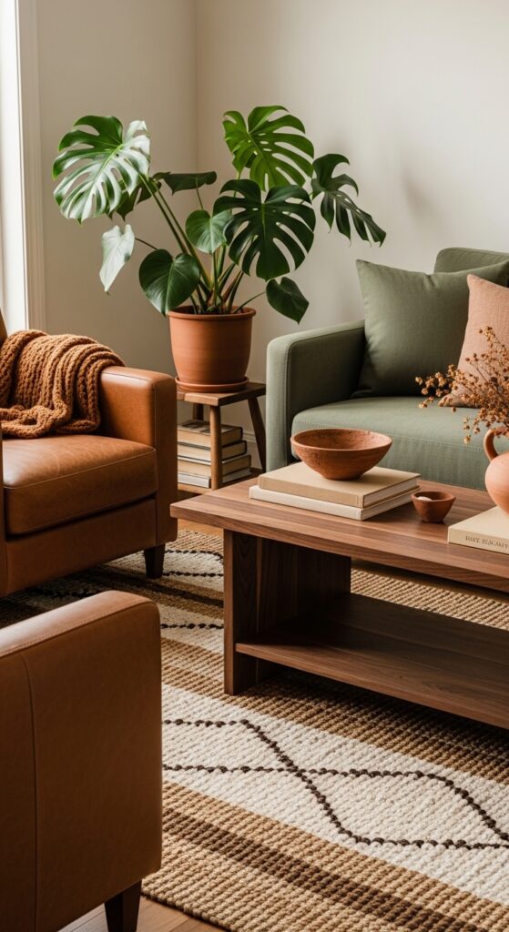
Vibe sentence: Green and brown together are nature’s own palette — and in a living room, they create a warmth that feels less like a design choice and more like the room has always been exactly this way.
What makes it work: Brown and green share the same natural origin, which is why they’re so instinctively comfortable together. Warm brown leather adds texture, depth, and a sense of aging that makes green palettes feel more grounded and less fresh-paint-new. The layering of brown wood, caramel textiles, and green upholstery creates the tonal warmth that pure green alone can’t achieve.
How to achieve it: Introduce brown through the most permanent elements — a wood coffee table, wood floors, or leather furniture — and bring green in through softer elements like upholstery and textiles. This makes future redecorating easier since brown anchors are more neutral and versatile long-term.
18. Mismatched Green Dining and Living Room Chairs
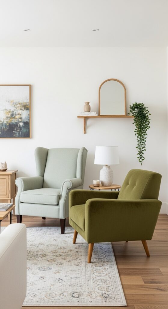
Vibe sentence: Two chairs that almost-but-don’t-quite-match create the kind of quietly interesting living room that always gets a compliment.
What makes it work: Intentionally mismatched seating in tonal variations of the same color signals design confidence — it reads as deliberately “collected” rather than accidentally uncoordinated. The key is ensuring both chairs share either the same undertone (both warm greens or both cool greens) or the same silhouette style. Texture difference — linen versus velvet — gives each its own identity while keeping the palette unified.
How to achieve it: Shop from different stores or eras deliberately. Pair a sage linen wingback with an olive velvet mid-century chair — similar scale, similar leg height, contrasting texture. Never match them on fabric; match them on shape and undertone instead.
19. Oversized Green Area Rug as Foundation
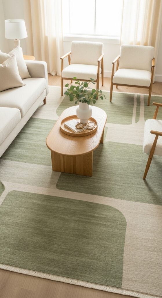
Vibe sentence: A large green rug is the quietest way to introduce color into a living room — it grounds every piece of furniture around it without announcing itself loudly.
What makes it work: An area rug that extends under all furniture legs (rather than just the front legs of the sofa) creates a room-within-a-room effect that makes the seating arrangement feel deliberate and complete. Sage green in a rug reads warmer than sage on walls because the horizontal plane catches light differently — more golden, less cool. The rug becomes the room’s foundation color, and every other element simply responds to it.
How to achieve it: Size up rather than down — most living rooms need at least a 9’x12′ rug to seat all furniture on it properly. For green area rugs, look at brands like Loloi, Rugs USA, and Nourison for wide selection at accessible price points.
💡 Use a rug pad — it prevents slipping, extends the rug’s life, and adds underfoot cushioning worth far more than its $30–$50 cost.
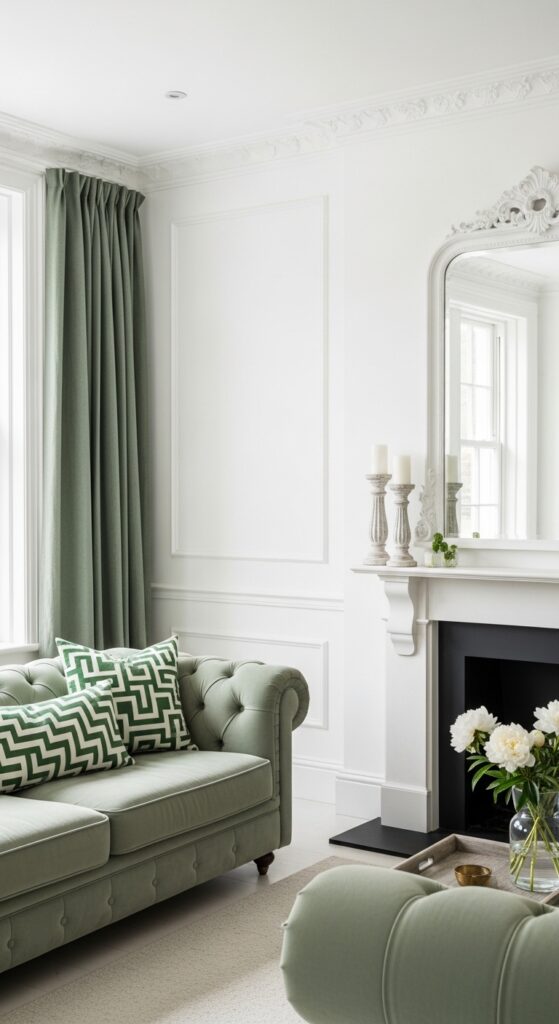
20. Green Painted Fireplace Surround
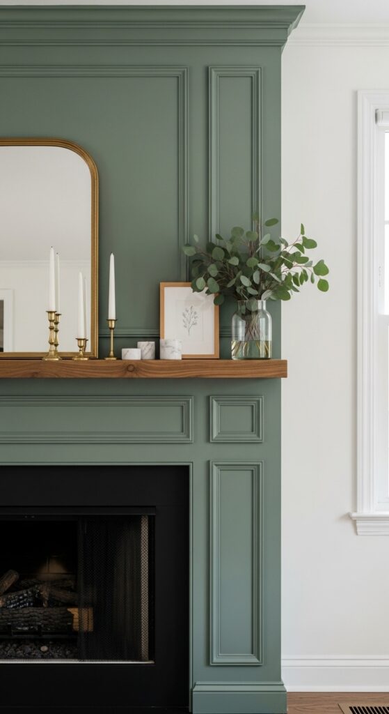
Vibe sentence: A sage-painted fireplace surround turns a standard living room focal point into the room’s most defining feature.
What makes it work: Painting just the fireplace surround (rather than the whole wall) concentrates color exactly where the eye naturally lands first, making maximum visual impact with minimal paint. The contrast between the painted millwork and the surrounding neutral wall reads as architectural and intentional. Keeping the mantel shelf in natural wood adds warmth that prevents the sage from feeling cold against the white walls.
How to achieve it: Use semi-gloss or satin finish on the fireplace surround — unlike walls, this surface benefits from a harder finish that resists heat and allows occasional cleaning. Prep with a quality bonding primer first, especially if painting over previously stained or lacquered wood.
21. Green Living Room with Arch Doorway
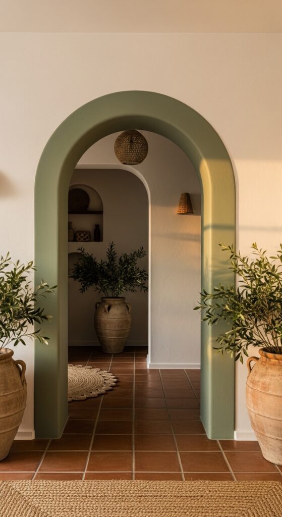
Vibe sentence: An arched doorway painted sage green transforms architecture into art — it’s the frame and the painting in one.
What makes it work: Painting or plastering an arch in a contrasting color draws the eye naturally to the room’s transition point and creates depth — you’re simultaneously decorating the living room and the view beyond it. Sage green on a thick arch with visible depth (revealing interior plaster) looks especially rich because the color reads differently on the face versus inside the reveal. This works in any home with any arch, even simple rectangular doorways with a faux arch painted around them.
How to achieve it: Even in a flat-walled rental, you can paint a faux arch frame on the wall around a standard doorway and fill it with sage green to mimic this effect — no structural changes required. Use painter’s tape and a compass to create a perfect arch guide.
22. Green and Cream Scandinavian Simplicity
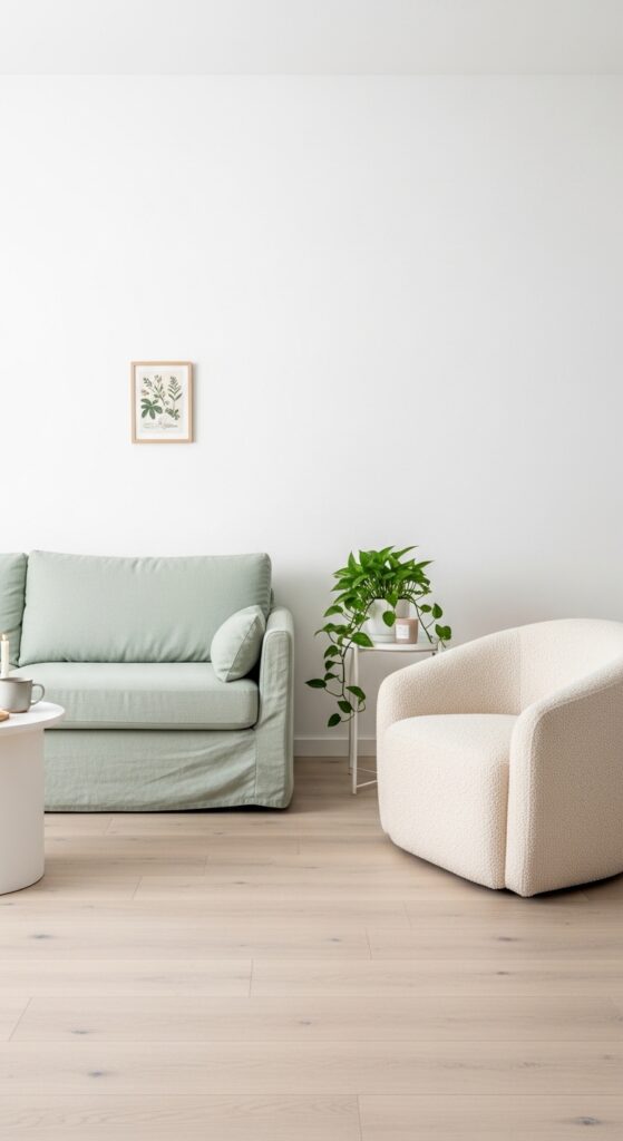
Vibe sentence: Sage green in its palest, most restrained form creates a living room that feels like taking a full breath of clean air.
What makes it work: Scandinavian design’s strength is in what it removes — and pale sage green works perfectly within that restraint because it adds color without adding visual noise. The texture of linen upholstery provides visual interest without pattern, which maintains the clean, uncomplicated quality of the space. Natural light is this palette’s greatest asset, so it works best in rooms with generous windows.
How to achieve it: If committing to a full sage sofa feels bold for a minimalist space, start with a pale sage linen armchair or chaise alongside crisp white everything else. Let that single green piece breathe in its environment before adding more.
23. Mixed Metal Accents with Green Walls
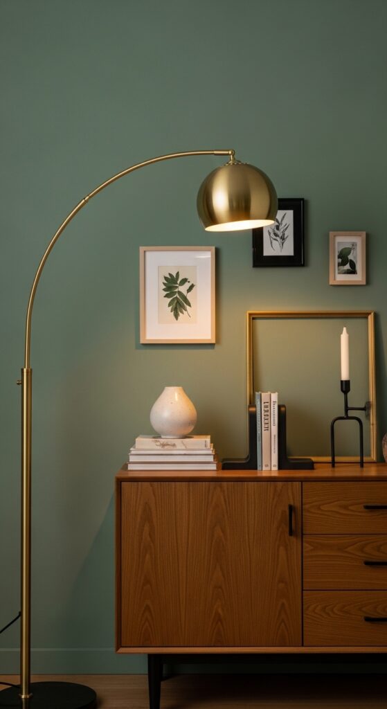
Vibe sentence: Green walls have a rare superpower: they make mixed metals look completely intentional rather than accidentally mismatched.
What makes it work: Green’s position on the color wheel — sitting between warm and cool — allows it to absorb and complement both warm metals (brass, gold, copper) and cool metals (chrome, brushed nickel, black iron) simultaneously. This is why green-walled rooms look uniquely sophisticated with mixed hardware and fixtures — the wall color acts as the unifying backdrop that makes the variety feel curated. No other wall color does this as effectively.
How to achieve it: Lead with one dominant metal (brass is most popular for green rooms), then allow 30% of your metal accents to be a contrasting finish. Never mix more than three metal finishes in one room, and ensure each finish appears at least twice to prevent any single piece from looking accidentally mismatched.
24. Green Living Room with Natural Stone Accents
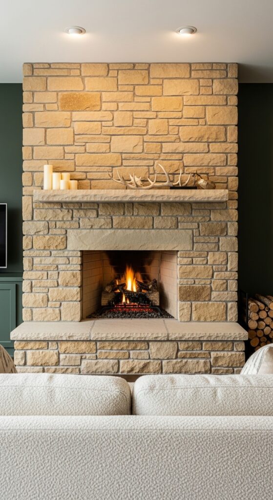
Vibe sentence: Forest green walls and raw stone together create a living room that feels like it grew from the earth itself.
What makes it work: The contrast between the perfectly smooth plane of painted green wall and the rough, irregular texture of natural stone creates one of the most satisfying material juxtapositions in interior design. Both materials appear in nature side by side (think forest stone walls), so the pairing satisfies a deeply instinctive sense of rightness. The warm golden tones in limestone, travertine, or sandstone pull the forest green toward warmth.
How to achieve it: If real stone installation isn’t an option, look at stacked-stone veneer panels (available at Home Depot and Lowe’s) that install directly over drywall without structural changes. Focus them on the fireplace wall only for maximum impact.
25. Green Wallpaper with Botanical Pattern
Vibe sentence: A single wall of botanical wallpaper does more decorating than an entire room full of accessories ever could.
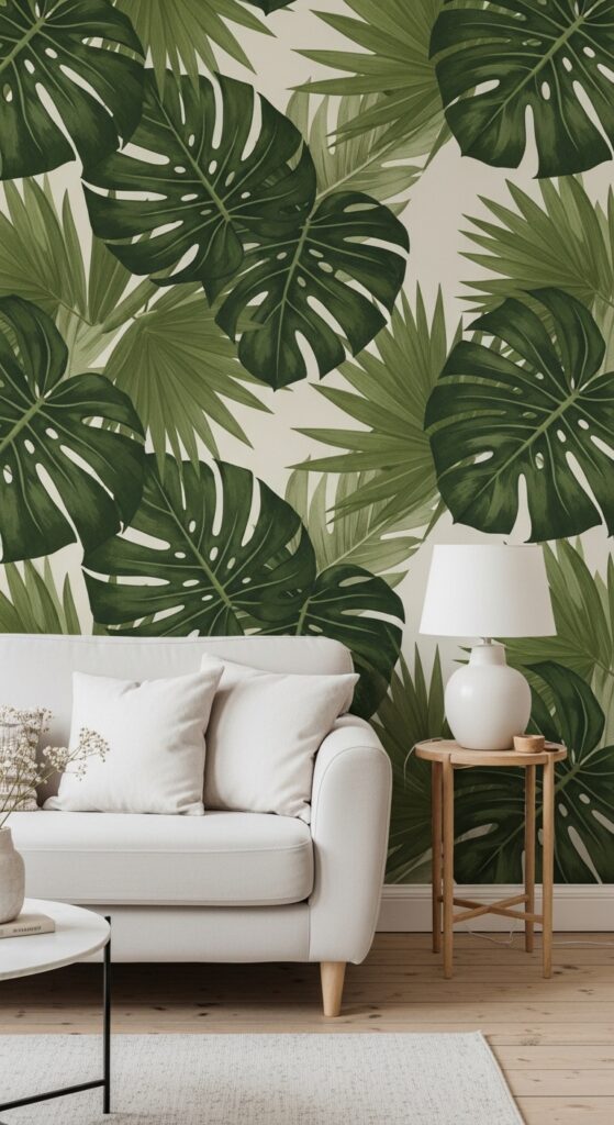
What makes it work: Large-scale botanical wallpaper works on a single accent wall because it functions as both pattern and color at once — you get the richness of green and the visual complexity of print without overwhelming the room. The key is restraint everywhere else: when the wallpaper is the statement, everything else should be a quiet supporting player in cream, white, or natural wood. Fighting the wallpaper with other patterns or colors always loses.
How to achieve it: Graham & Brown, Anthropologie, and Rifle Paper Co. all offer beautiful peel-and-stick botanical wallpapers perfect for renters or commitment-phobic decorators. Apply to one wall only — the one your sofa or bed sits against — for the most impact.
💡 Peel-and-stick wallpapers from Chasing Paper or Tempaper remove without damaging paint — perfect for renters.
26. Vintage Green Accent Pieces
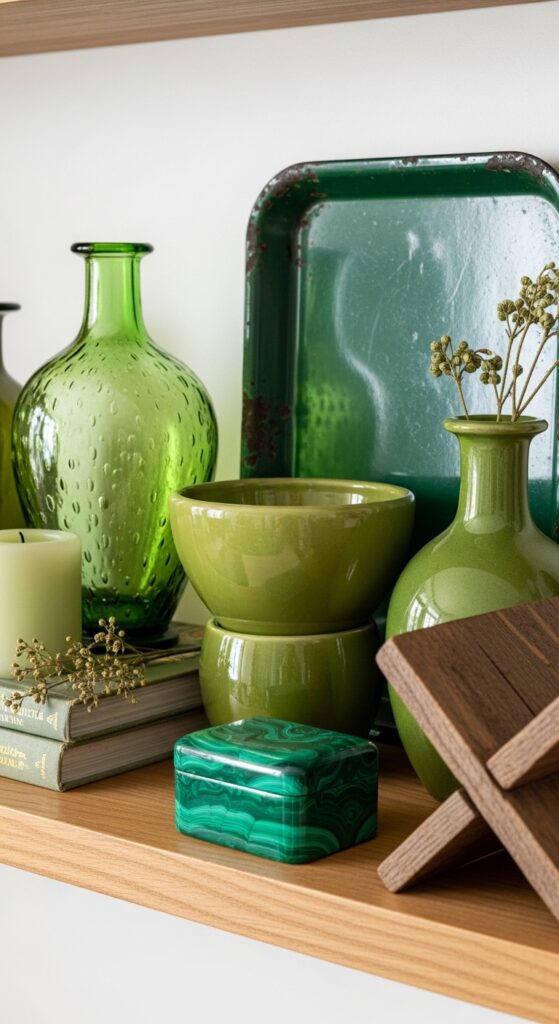
Vibe sentence: A shelf curated with vintage green objects feels like the decorating equivalent of finding something perfect when you weren’t even looking.
What makes it work: Vintage green objects — particularly glass and ceramics — carry tonal variations and surface depth that new mass-produced items simply don’t have. Grouped together, pieces in different greens (bottle, olive, sage, malachite) create a tonal composition that feels genuinely collected rather than bought as a matching set. The aged surfaces catch and scatter light in ways that make the display feel alive throughout the day.
How to achieve it: Estate sales, eBay, and Etsy are the best sources for vintage green ceramics, Depression glass, and enamelware. Focus on grouping objects of varying heights and rounded versus geometric forms for the most visually compelling arrangement.
27. Green Nook or Reading Corner
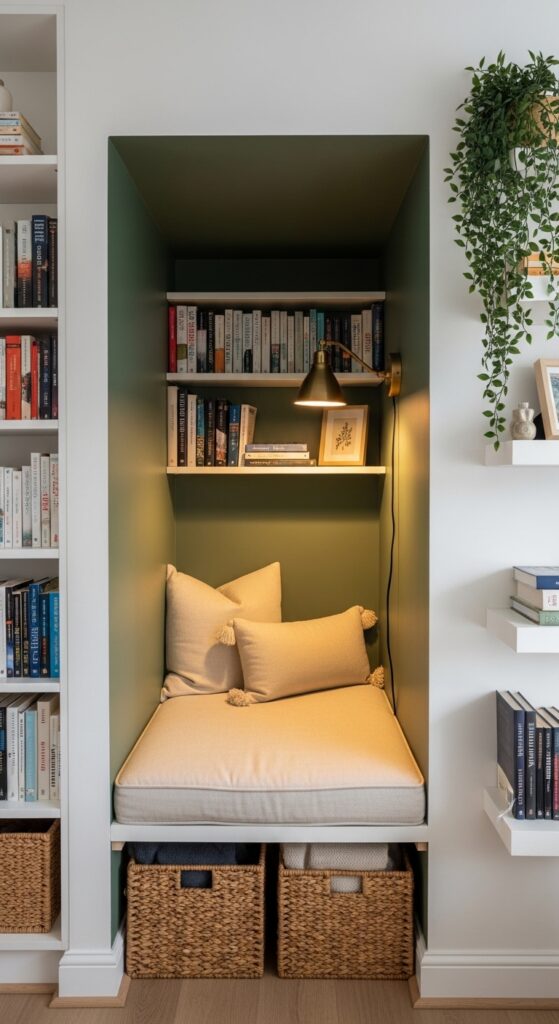
Vibe sentence: A sage-painted reading nook is the living room equivalent of having your own private world — just inside the room everyone shares.
What makes it work: Using a deeper green inside a nook or alcove creates a shadow-box effect that makes the space feel intentionally separate from the main room, even without physical walls. The psychological effect of a painted nook makes people instinctively want to sit inside it — the color signals “this is a specific place with a purpose.” A brass sconce inside the nook provides the warm focused light that distinguishes it from the ambient room lighting.
How to achieve it: Even a standard awkward corner can become a reading nook with a floating shelf for the seat base, a 3-inch thick foam cushion in a linen cover, and a simple IKEA Kallax unit painted green as the backing. Total cost: often under $200.
28. Green Living Room with Exposed Brick
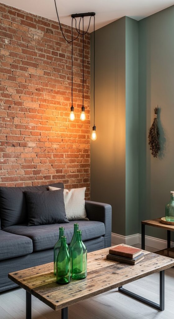
Vibe sentence: Sage green and exposed brick belong together the way old friends do — they bring out the best in each other effortlessly.
What makes it work: The warm red-orange of exposed brick sits directly opposite green on the color wheel, making these two a natural complementary pair. Rather than clashing, the muted quality of sage green and the aged, dusty tone of old brick find a common ground in their organic, natural character. The contrast gives the room visual energy without needing additional decoration — the architectural materials do all the work.
How to achieve it: If your brick wall is painted over, consider hiring a professional to strip it — original brick underneath is almost always worth the effort. If there’s no brick, exposed brick wallpaper from brands like Tempaper gives a convincing effect at a fraction of the cost.
29. Green and White Modern Classic
Vibe sentence: Green and white in a classically proportioned room feels timeless in the truest sense — not trendy, not dated, just permanently right.
What makes it work: White walls and green soft furnishings is one of the oldest and most reliable combinations in interior design, going back centuries to English country houses and Georgian interiors. The freshness comes from the green activating the white — pure white walls look brilliant when set against color rather than standing alone. Classic architectural details (crown molding, dado rails, an ornate mirror) give the green-and-white palette gravitas and structure.
How to achieve it: In a modern home without existing architectural details, add visual interest with a large ornate white-framed mirror (thrift stores consistently carry them) or install simple chair-rail molding on the lower third of the wall — both can be done on a modest budget.
30. Moody Green with Candlelight and Warm Layers
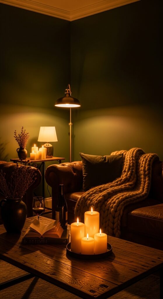
Vibe sentence: A moody green living room at night, lit only by lamps and candles, is the most genuinely atmospheric room you can possibly create.
What makes it work: Dark green walls absorb artificial light rather than reflecting it, which creates a rich, enveloping warmth in evening light that no other wall color achieves quite the same way. The warm amber of candlelight against deep green produces a color interaction — the green appears almost gold-toned in the warmth — that is simply extraordinary. Layer chocolate leather, camel wool, and deep wood tones and the room reaches a depth that photographs barely do justice.
How to achieve it: Invest in at least three light sources at varying heights: a floor lamp in a corner, a table lamp at sofa level, and a cluster of pillar candles at coffee table height. Never rely on overhead lighting alone in a dark-walled room — the combination of heights creates the layered warmth that makes the space work.
💡 Battery-powered LED candles have become genuinely convincing — use them on a timer for effortless atmospheric lighting without the fire risk.
How to Start Your Green Living Room Transformation
The most common mistake when decorating with green is reaching for paint before testing. Green is notoriously sensitive to light conditions — a color that looks sage and serene in the store can read grey, blue, or even khaki in your specific room’s light. Always test with large paint swatches (at least a 12″x12″ patch directly on the wall) and observe them across morning, midday, and evening light before committing.
Start with the smallest commitment that makes the biggest impact. For most rooms, that’s throw pillows, a throw blanket, or a small piece of furniture. This gives you a chance to live with the color in your actual space before investing in paint or larger pieces.
Budget-friendly entry points for green living room decor include: sage green throw pillow covers ($20–$40 for a pair), a green area rug from Rugs USA or Wayfair ($100–$300 for quality), and a single velvet accent chair from H&M Home or Target ($150–$400). Paint is almost always the highest-impact and lowest-cost change — a gallon covers most accent walls for $50–$80.
Give yourself permission to go slowly. The most beautiful green living rooms are built over time, not decorated in a single weekend. Add one piece, let it breathe, and then decide what it’s asking for next.
Frequently Asked Questions
What shade of green is best for a small living room?
Pale sage, mint, or soft eucalyptus green work best in small living rooms because their light value doesn’t close in the walls the way darker shades can. Look for shades with a slightly warm (yellow-based) undertone — Benjamin Moore’s “Pale Celery” or Sherwin-Williams “Aloe” are excellent choices that read as green without feeling dark or heavy. Avoid jewel tones like emerald or forest green on all four walls in small spaces; save those for a single accent wall or for accessories instead.
Is green living room decor timeless or just trendy?
Green is genuinely one of the most enduring colors in interior design history — it appeared in Victorian parlors, mid-century modern homes, and 1980s country kitchens, and it’s found in current design at every price point today. The current trend is for muted, organic greens (sage, olive, eucalyptus) rather than bright or neon tones, which means today’s green choices are likely to age well for 10–15 years without feeling dated. Unlike very trendy palettes, green’s connection to nature gives it a timeless biological resonance.
How do I make green living room decor work with existing furniture I can’t replace?
Start by identifying the undertone of your existing furniture — warm wood tones pair best with olive, sage, and hunter green; grey or cool-toned pieces pair best with eucalyptus, teal-green, or sage with blue undertones. Introduce green through the most easily changed elements: throw pillows, a rug, curtains, or a single accent chair. A green area rug is particularly powerful because it ties existing furniture together under a new color story without requiring you to replace anything.
What colors go best with green in a living room?
Green’s most successful living room partners are cream and warm white (always, for balance), terracotta and rust (for an earthy, boho feel), warm brass and gold (for glamour), natural wood tones (for organic warmth), and soft blush or dusty rose (for a romantic, feminine quality). Navy blue and deep green can work together in jewel-tone schemes but require confident handling to avoid the room feeling dark. Avoid cool grey alongside green — it tends to flatten both colors and remove all warmth from the palette.
How much does it cost to get a green living room look?
You can introduce meaningful green living room decor for as little as $50–$150 through throw pillows, a throw blanket, and one or two plant additions. A mid-range transformation — including a green area rug, new curtains, and a painted accent wall — typically runs $300–$700 depending on room size. A full commitment including a green sofa or velvet accent chairs, quality curtains, artwork, and painted walls can range from $1,500–$4,000 for a completely refreshed room. The best investment for cost-per-impact remains paint, which transforms an entire wall for $50–$80 in materials.
Ready to Create Your Dream Green Living Room Space?
You now have 30 complete, actionable green living room decor ideas — from a single sage throw pillow to full forest-green walls with layered candlelight and mixed metals. The range is intentional: because the best version of your living room is the one that genuinely fits your space, your light, your budget, and your taste. Save the ideas that stopped your scroll and come back to them when you’re ready to take the next step. Remember that the most beautiful rooms are built one considered choice at a time — you don’t need all 30. You just need the one that feels exactly right. Start there, and let the green do the rest.