There is a room in every home that sets the emotional temperature for everything else — where mornings begin before anyone is quite ready, where conversations happen without being planned, and where the smell of something good can change the entire character of an ordinary day. The kitchen is that room, which is precisely why getting its aesthetic right matters more than almost any other design decision in the house. Kitchen aesthetic ideas have never been more exciting or more varied than they are right now — a genuine moment of stylistic plurality where dark and moody exists comfortably alongside bright and Scandinavian, where maximalist color sits beside earthy minimalism, and where the warmth of natural materials meets the precision of industrial design. These 27 trending kitchen aesthetic ideas span every style, every budget, and every architectural context. Here are 27 ideas you genuinely need to see.
Why Kitchen Aesthetics Matter So Much Right Now
The kitchen has undergone a fundamental reimagining over the past decade — from a functional workspace designed to be efficient and easy to clean, into the home’s primary social room, its most photographed space, and increasingly its most emotionally significant architectural environment. This shift in how kitchens are used has driven a corresponding shift in how they are designed: away from the purely rational and toward the genuinely beautiful, the personally expressive, and the materially rich.
What defines the current moment in kitchen aesthetics is the decisive move away from the white-and-chrome standard that dominated residential design for two decades. Today’s most compelling kitchen aesthetics are characterized by color confidence — deep navy, forest green, warm terracotta, matte black — paired with natural materials that age and improve rather than merely endure. Stone, timber, unlacquered brass, hand-thrown ceramic, and hand-painted tile have collectively displaced laminate, stainless steel, and synthetic surfaces as the most desirable kitchen finishes.
Pinterest and interior design media consistently reflect this shift — searches for “moody kitchen,” “earthy kitchen aesthetic,” “sage green kitchen,” and “dark kitchen design” have grown exponentially year-over-year, while the classic “all-white kitchen” aesthetic has declined from its decade-long dominance. The cultural driver is a desire for kitchens that feel genuinely personal and unique, that reflect the people who cook in them, and that reward the long daily relationship of a household rather than simply impressing occasional visitors.
Even a small or architecturally constrained kitchen responds dramatically to aesthetic intervention. Cabinet color, hardware, lighting, open shelving, and backsplash tile are all independently transformative without requiring structural renovation — making kitchen aesthetic upgrades among the highest-return design investments available to any homeowner or renter.
1. Dark and Moody Forest Green Cabinetry
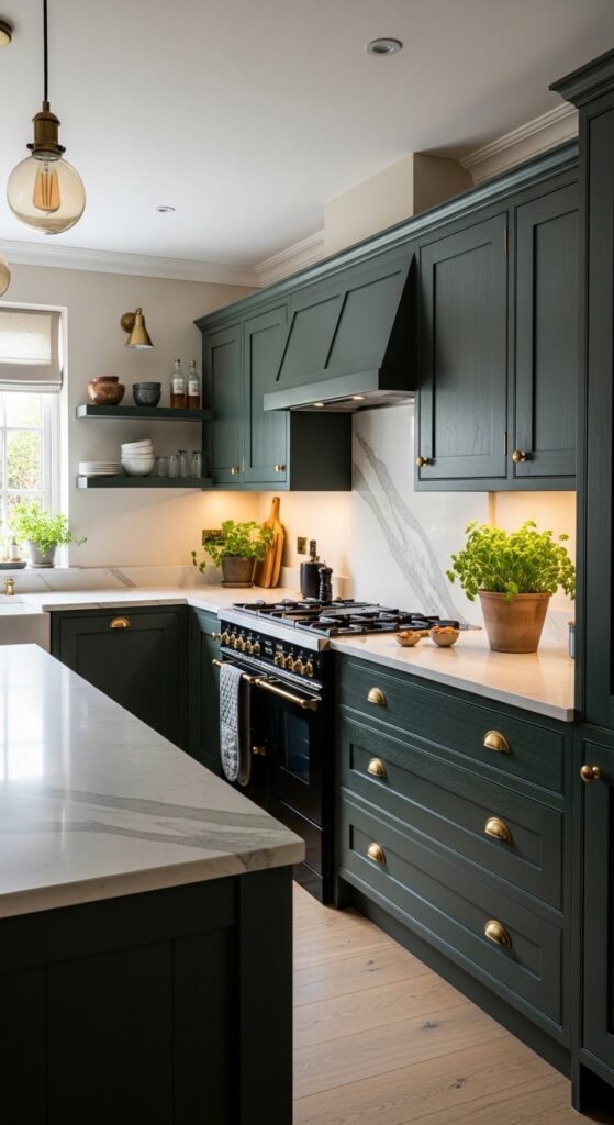
Vibe: The kitchen that stays with you long after you leave — deep, green, and charged with an atmosphere that makes cooking feel like a genuine pleasure.
What makes it work: Forest green cabinetry succeeds as a kitchen color because its natural botanical reference connects intuitively to food, growth, and the kitchen’s fundamental purpose — it feels right in a way that more arbitrary colors do not. The grey undertone in deep forest green prevents the color from reading as bright or juvenile, keeping it firmly in sophisticated, adult territory. Against white marble, the contrast is extraordinary — the coolness of the stone and the depth of the green are natural complements.
How to achieve it: Choose a paint or factory-sprayed cabinet finish in a matte or near-matte sheen — forest green in a high gloss reads as institutional rather than elegant. Farrow & Ball “Studio Green,” Sherwin-Williams “Hunt Club,” and Little Greene “Sage” represent the spectrum from cool-leaning to warm-leaning forest greens worth sampling. Pair exclusively with unlacquered brass or aged bronze hardware — cool silver or chrome hardware fights the warmth of green and prevents the palette from cohering.
💡 Cabinet painting (rather than full replacement) in a deep forest green typically costs $2,000–4,000 for a full kitchen — delivering 80% of the new-kitchen visual impact at 20% of the cost.
2. Warm Terracotta and Cream Earthy Kitchen
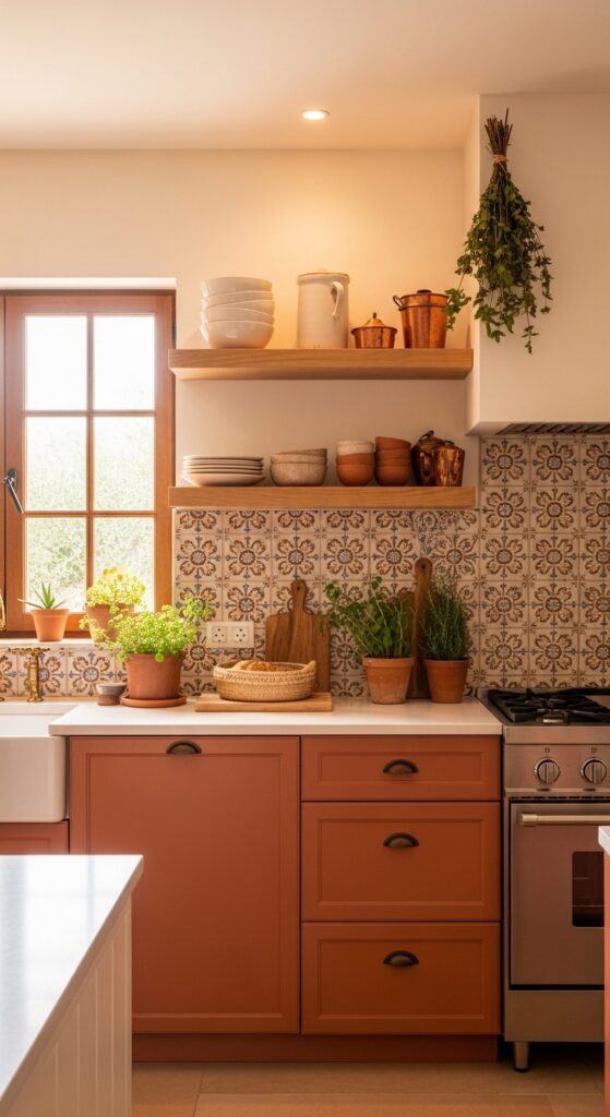
Vibe: A kitchen that feels like it was built in a sun-warmed farmhouse in the south of France — earthy, abundant, and radiating the kind of warmth that has nothing to do with temperature.
What makes it work: Terracotta and cream in a kitchen creates a naturally food-positive atmosphere — warm earth tones are fundamentally appetite-stimulating and domestically comfortable in a way that cooler palettes are not. The hand-painted Moroccan or Mediterranean tile backsplash introduces pattern and handcraft that industrially produced subway tiles cannot replicate, elevating the kitchen from decorated to genuinely designed.
How to achieve it: Achieve the terracotta cabinet tone through a specialty clay paint finish (brands like Bauwerk Colour and COAT Paints offer excellent clay-mineral formulations) rather than standard latex, which lacks the earthy, matte depth of mineral pigment. The tile backsplash is the room’s defining aesthetic investment — authentic hand-painted tiles from Spanish, Mexican, or Moroccan producers cost more than standard tiles but deliver the handcraft variation that makes the kitchen genuinely distinctive.
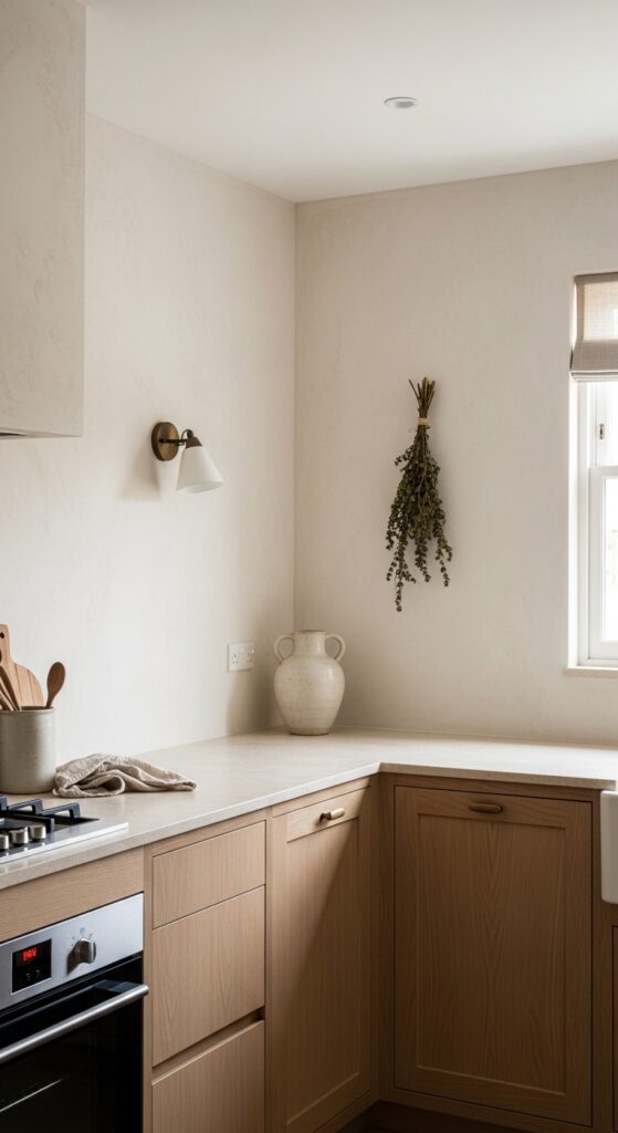
3. All-White Japandi Minimalist Kitchen
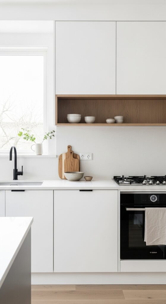
Vibe: The kitchen where clarity is the luxury — everything removed that did not need to be there, everything remaining exactly right.
What makes it work: Japandi kitchen aesthetics achieve their power through the precision of their editing — every element that remains has survived the question “does this earn its place?” The warm oak shelf against white cabinetry introduces the Japanese wabi-sabi principle of imperfect natural material against controlled human-made surface, creating a tension between warmth and precision that is the aesthetic’s defining emotional quality.
How to achieve it: The success of a Japandi kitchen depends entirely on the quality of finish on its reduced number of surfaces — handleless cabinetry must be perfectly flat and gap-free, countertops must be immaculately clean-edged, and the single open shelf must be styled with extraordinary restraint (three objects maximum, significant negative space between each). Choose honed rather than polished stone surfaces throughout — the matte finish is both more forgiving of daily use and more aligned with the aesthetic’s rejection of display and performance.
4. Maximalist Colorful Eclectic Kitchen
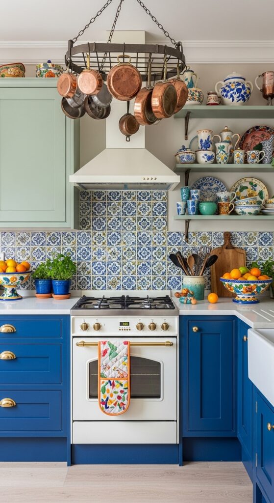
Vibe: The kitchen that refuses to be beige about anything — colorful, abundant, and making every meal feel like a celebration simply by existing.
What makes it work: A maximalist eclectic kitchen succeeds when its apparent chaos is actually governed by a cohesive color principle — in this case, the cool tones of cobalt and sage are complemented by the warmth of copper and yellow, creating a palette that reads as complete rather than random. The hand-painted backsplash is the compositional key, acting as a visual bridge between the different cabinet colors while adding the handcraft quality that prevents the room from feeling like a paint experiment.
How to achieve it: The structural rule for mixing cabinet colors is to use the more saturated, darker color on the lower cabinets (grounding the room visually) and the lighter or more muted color above (keeping the upper zone from becoming heavy). Introduce the third accent color exclusively through accessories and textiles rather than architectural surfaces — this gives the room visual relief and allows the palette to be adjusted over time without repainting.
5. Sage Green Shaker Kitchen with Brass Hardware
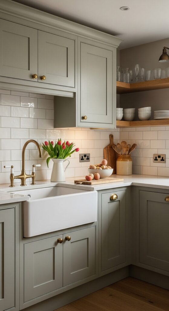
Vibe: The kitchen that everyone photographs but nobody can quite replicate — a combination of color, material, and proportion that is simultaneously classic and completely contemporary.
What makes it work: Sage green is the most consistently popular kitchen cabinet color of the current design moment for specific, identifiable reasons — its grey undertone prevents it from reading as a trend color while its green warmth connects it to the botanical and natural material interests driving contemporary kitchen aesthetics. Against white subway tile and aged brass, it forms a three-material palette of exceptional harmony, each element reinforcing the others’ best qualities.
How to achieve it: The critical specification choice for sage green shaker kitchens is the grey-to-green ratio of the chosen color — colors with too much yellow-green read as olive and lose the sophisticated restraint of true sage; colors with too much grey read as blue-grey and lose the botanical warmth. Farrow & Ball “Mizzle,” Little Greene “Sage Derby,” and Benjamin Moore “Saybrook Sage” are among the most consistently successful options. Install the subway tile in a classic brick bond rather than a stack bond — the offset horizontal pattern has more visual movement and better suits the organic character of the sage palette.
💡 Painting only the lower cabinets in sage green with white upper cabinets above achieves the sage kitchen aesthetic at half the paint cost and with a lighter, more airy overall impression.
6. Industrial Loft Kitchen with Exposed Brick and Steel
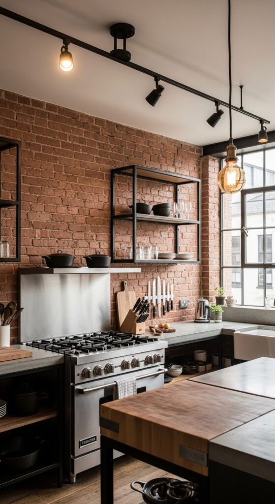
Vibe: A kitchen that takes cooking seriously and makes no attempt to hide it — raw materials, serious equipment, and an atmosphere that means business.
What makes it work: Industrial kitchen aesthetics derive their power from material honesty — every surface in an industrial kitchen is what it appears to be: real brick, poured concrete, actual steel, genuine cast iron. This authenticity creates a visual credibility that more decorated kitchens lack, and the warm amber of Edison lighting over raw brick and concrete delivers an unexpectedly intimate warmth within the industrial framework.
How to achieve it: Concrete countertops can be cast in place by specialist concrete fabricators ($80–150 per linear foot) or achieved with concrete overlay systems applied to existing countertop substrates — the overlay approach is significantly more accessible and achieves a near-identical visual result. Seal with a penetrating food-safe concrete sealer (not a film-forming sealer, which will chip and peel) and reseal annually. Exposed brick backsplash should be sealed with a matte brick sealer to prevent dust and make the surface wipeable in a kitchen environment.
7. Coastal Mediterranean White and Blue Kitchen
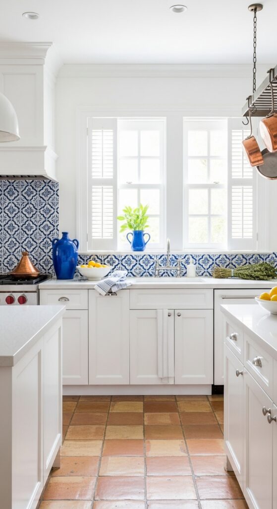
Vibe: A kitchen where the Mediterranean came to stay — sun, cobalt, terracotta, and the particular happiness of a room that knows exactly where it belongs.
What makes it work: The white-and-cobalt Mediterranean kitchen is one of design’s most emotionally evocative palette combinations — it references a specific geography and way of life (Santorini, Cinque Terre, the Algarve) while remaining completely functional as a domestic kitchen. The terracotta floor grounds the palette in earthy warmth, preventing the brilliance of the white and cobalt from reading as clinical or cold, and the copper introduces the warmth of artisan craft.
How to achieve it: Authentic Portuguese or Spanish hand-painted tiles (azulejos) are available from specialist tile importers and can be used for a full backsplash installation at $25–60 per tile — a 2-square-meter backsplash typically requires 30–50 tiles depending on size. Terracotta floor tiles should be sealed with a penetrating sealer before grouting and regularly maintained with a terracotta-specific sealer — unsealed terracotta stains permanently in a kitchen environment. Use white grout throughout for the most authentic Mediterranean result.
8. Warm Wood and Cream Scandi Kitchen
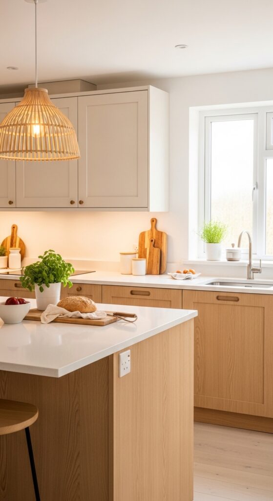
Vibe: Nordic warmth distilled into a kitchen — light, honest, and making every morning feel like a slow Saturday.
What makes it work: Warm Scandinavian kitchen aesthetics resolve a persistent interior design paradox — the tension between minimal and warm. By using natural wood (rather than painted or laminate finishes) for the primary cabinet surface, the Scandi kitchen achieves minimal design principles (clean lines, integrated hardware, reduced ornament) while delivering genuine warmth through material. Light ash and birch specifically have a honey warmth that paler woods like maple or pine lack.
How to achieve it: Natural wood cabinet fronts are available as handleless or integrated-handle flat-panel doors in birch, ash, oak, and pine from Scandinavian suppliers including IKEA’s Axstad and Torhamn ranges, which offer excellent quality at accessible prices. Pair with white or cream paint for all non-wood surfaces — ceiling, walls, and upper cabinets — and introduce the single pendant light over an island or dining table as the room’s dominant decorative element. Choose rattan or white ceramic shades for pendant lights rather than metal, which reads as industrial rather than Scandi.
9. Matte Black Kitchen with Gold Accents
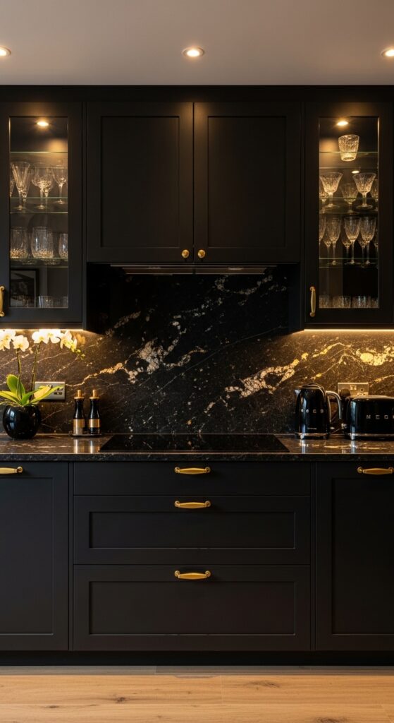
Vibe: A kitchen that operates at full glamour without a single apology — dark, golden, and designed to be photographed at midnight.
What makes it work: Matte black cabinetry succeeds where high-gloss black fails — the matte finish absorbs light rather than reflecting it, creating depth and richness rather than a mirror-like surface that shows every fingerprint and flaw. The gold veining in the stone countertop and the matte gold hardware provide the warmth that prevents the all-black palette from reading as oppressive or funerary, functioning as the light source within the dark composition.
How to achieve it: Factory-sprayed matte black cabinet finishes are significantly more durable and consistent than site-painted black — the ultra-smooth factory spray eliminates brush marks and achieves the precise matte depth that makes the aesthetic work. Specify a black with a warm rather than cool undertone — cool black in a kitchen can read as blue-grey under warm lighting. Black granite with gold veining (Volga Blue, Absolute Black with gold leaf inclusions) is more durable and forgiving than marble in a heavily used kitchen environment.
10. Open Shelf Kitchen with Styled Ceramics Display
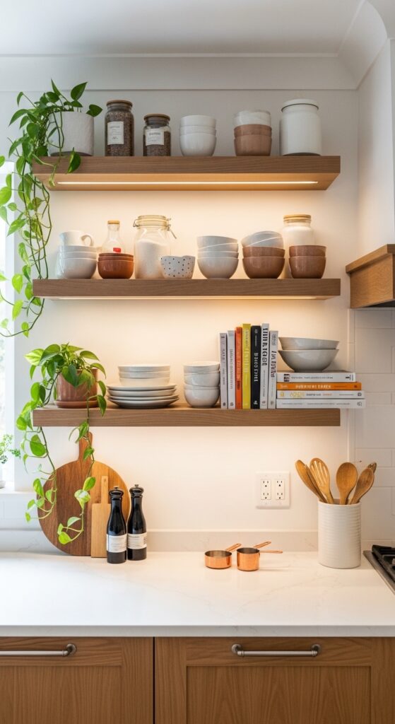
Vibe: A kitchen wall that tells the whole story of who cooks here — every shelf a still life, every object chosen with care.
What makes it work: Open shelving in a kitchen achieves something closed cabinetry fundamentally cannot — it transforms stored objects into displayed objects, converting the kitchen’s everyday contents into a continuous, evolving composition that reflects the personality and tastes of the household. The styling discipline required by open shelving also tends to rationalize kitchen possessions, forcing an edit that benefits both the kitchen’s visual and functional organization.
How to achieve it: The golden rule of open kitchen shelving is to display only items you use at minimum weekly — purely decorative objects that must be moved to access working items will turn any open shelf into a frustrating obstacle within weeks. Style in groups that mix heights (a tall jar, a medium bowl, a low plate) with a consistent color edit (cream, terracotta, and wood tones only) for coherence. Install under-shelf LED strip lighting in a warm white (2700K) — it dramatically improves both the display quality and the functional workspace illumination.
11. Butcher Block Countertop Farmhouse Kitchen
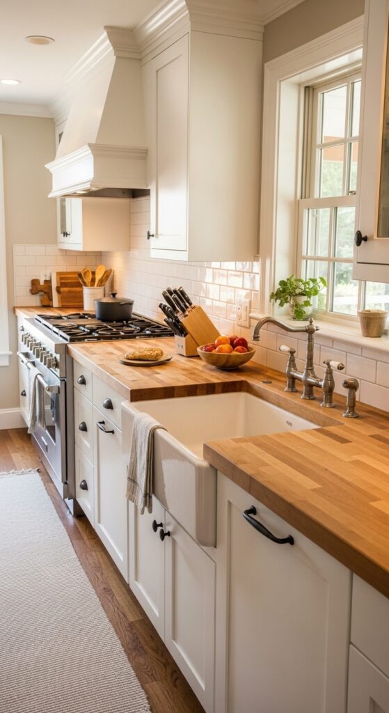
Vibe: A kitchen that was built for actual cooking by people who love food — warm, honest, and improving with every meal prepared on it.
What makes it work: Butcher block countertops are uniquely suited to the farmhouse kitchen aesthetic because they are the one countertop material that actively improves with use — the surface develops character marks, oiling darkens and enriches the grain, and cutting marks become part of the working history of the kitchen. This quality of honest aging is central to the farmhouse aesthetic’s appeal and fundamentally different from stone or quartz surfaces that must be maintained in original condition.
How to achieve it: End-grain butcher block (where the wood cross-section faces upward) is more durable and knife-friendly than edge-grain or face-grain construction. Oil with food-grade mineral oil or beeswax finish immediately after installation and monthly thereafter — never leave water standing on butcher block, as it will penetrate and cause swelling and cracking. Keep away from the sink zone where water contact is unavoidable, or seal the sink-adjacent section with a waterproof finish and use it for display only.
12. Limewash or Venetian Plaster Kitchen Wall Finish
Vibe: A wall that has the depth and warmth of centuries of Mediterranean craft — smooth yet textured, simple yet endlessly interesting.
What makes it work: Venetian plaster and limewash finishes introduce a surface quality that no paint can replicate — the multi-layer troweled application creates genuine physical depth and tonal variation that shifts with light direction throughout the day. In a kitchen context, the warm, organic quality of a plastered wall provides a perfect counterpoint to the hard-edged precision of cabinetry and stone countertops.
How to achieve it: Venetian plaster requires specialist application — the multiple layers of troweled calcium carbonate plaster must be applied and burnished in a precise sequence by an experienced plasterer. Budget $50–150 per square meter for professional Venetian plaster application. Limewash is more accessible for DIY application — thin the limewash with water to achieve the desired translucency and apply in cross-hatch brush strokes, immediately wiping back partially while wet for an organic, uneven result. Apply a food-safe sealer over limewash in kitchen splash zones.
13. Grandmillennial Chintz and Pattern Kitchen
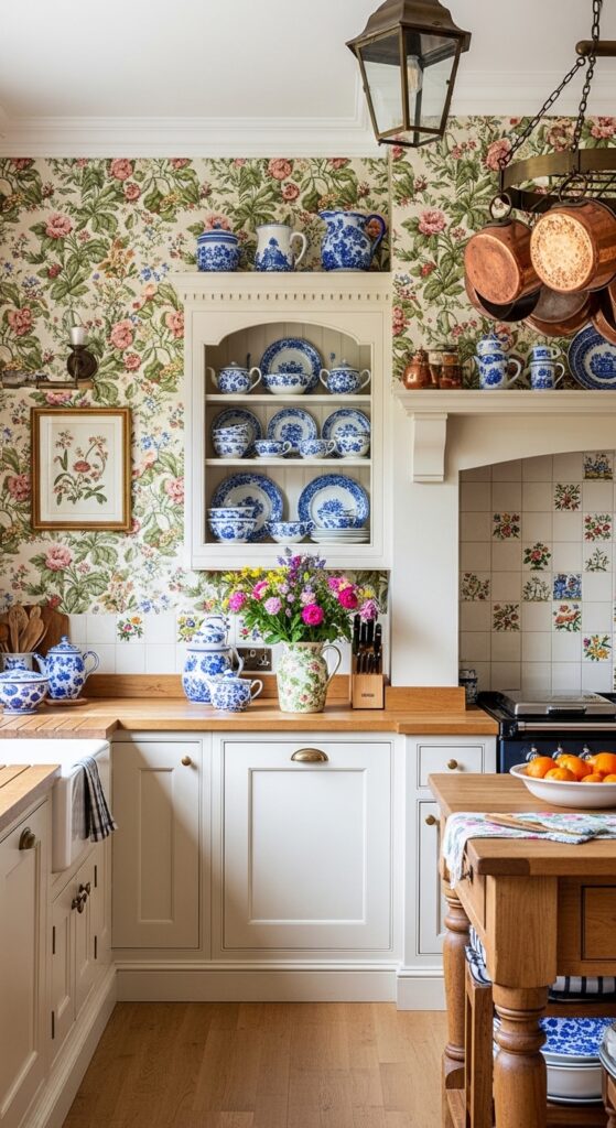
Vibe: The grandmother’s kitchen as design aspiration — warmly eccentric, pattern-rich, and completely confident in exactly what it loves.
What makes it work: The grandmillennial kitchen aesthetic is driven by a genuine and generationally interesting design reversal — younger decorators embracing the pattern-heavy, china-displaying, floral-wallpaper traditions of their grandparents’ generation as a deliberate rejection of the minimalism and restraint that preceded it. The resulting kitchens are characterized by an authentic warmth and accumulated character that deliberately manufactured “cozy” aesthetics struggle to achieve.
How to achieve it: The critical editorial principle of the grandmillennial kitchen is that all patterns must share a cohesive color palette — the chintz wallpaper, the tile backsplash, and the transferware collection should all work within the same blue, green, cream, and warm rose family. Mixing patterns from different color families creates chaos rather than richness. Confine bold pattern to non-wet walls only — wallpaper will not survive proximity to cooking splash and steam without specialist protection.
14. Two-Tone Navy and White Classic Kitchen
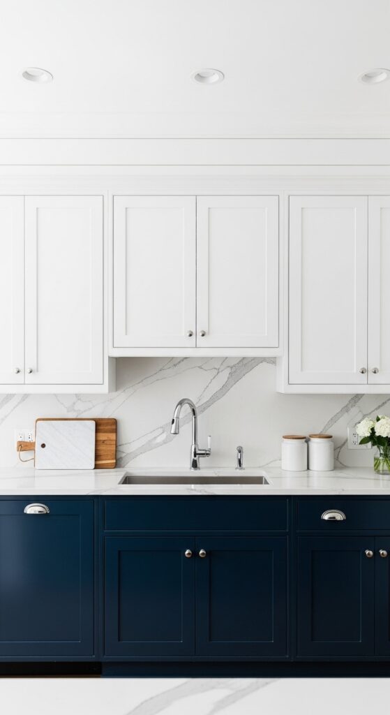
Vibe: A kitchen with the confidence of a classic — navy and white have been right for three hundred years and show absolutely no sign of stopping.
What makes it work: Navy and white is one of interior design’s most enduringly successful color combinations because of the specific nature of its contrast — navy is dark enough to be dramatic but not so dark as to be oppressive, and white against it reads as especially crisp and clean. In a shaker kitchen, the combination also references the long history of American colonial and coastal design, giving it an architectural provenance that transcends trend.
How to achieve it: The success of a two-tone kitchen depends on using the exact same door profile and hardware on both upper and lower units — the color contrast should be the only distinguishing variable between upper and lower cabinets. Any difference in door style or hardware between the two tiers will read as a mismatch rather than a designed choice. Specify a satin or semi-gloss finish rather than matte for navy cabinetry — navy in a flat matte finish can appear dusty and absorbs too much light in the lower kitchen zone.
15. Reclaimed Wood and Stone Rustic Kitchen
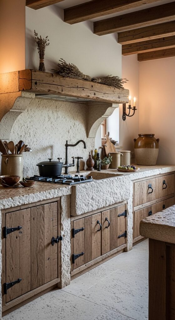
Vibe: The kitchen that time built rather than a designer — ancient stone, aged timber, and the accumulated warmth of centuries of daily use.
What makes it work: Reclaimed wood and natural stone deliver a kitchen aesthetic of material authenticity that no manufactured finish can approach — the age marks, grain variation, surface irregularity, and honest imperfection of genuinely old materials create a visual richness that develops from within the material rather than being applied to its surface. These kitchens get better rather than worse with use.
How to achieve it: Source reclaimed timber cabinet fronts from architectural salvage specialists who can supply matching thicknesses and widths for consistent cabinet door production. Natural limestone countertops are more porous and maintenance-demanding than granite or quartz — seal annually with a penetrating stone sealer and address spills immediately. The stone farmhouse sink is the room’s defining hero piece — budget for a genuine hand-carved or cast stone sink rather than a resin reproduction for the most authentic result.
16. Peach and Warm White Romantic Kitchen
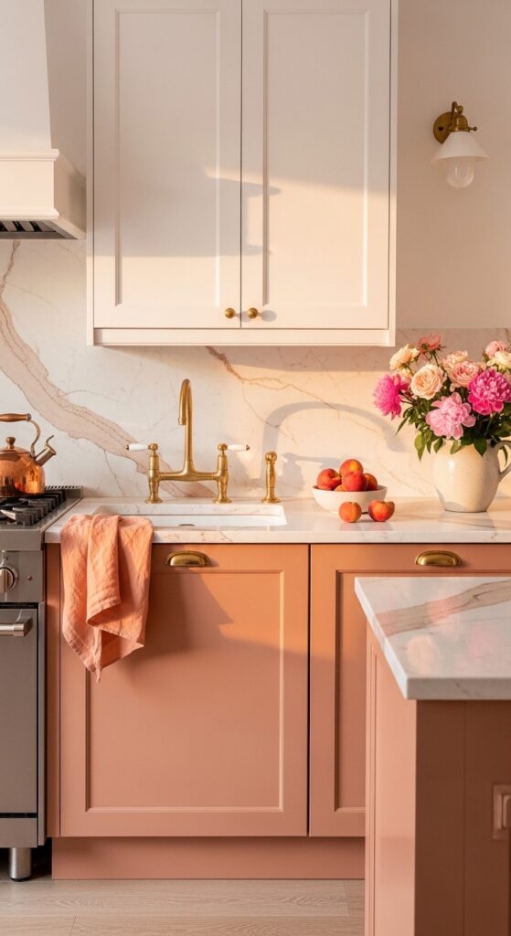
Vibe: The kitchen that makes everyone want to linger — warm, softly colored, and quietly the most beautiful room in the house.
What makes it work: Dusty peach is one of the most flattering and food-positive kitchen colors available — its warm undertone enhances the appearance of both food and the people eating it, while its muted, dusty quality prevents it from reading as a bright or trendy accent color. Against white marble with warm veining and aged brass, the peach creates a palette of extraordinary warmth and femininity that is completely distinct from the more commonly seen sage and navy kitchen aesthetics.
How to achieve it: The critical specification for a peach kitchen is ensuring the color reads as dusty and muted rather than bright coral or orange — the grey-inflected peach tones of Farrow & Ball “Sulking Room Pink,” Little Greene “Confetti,” or Portola Paints clay-mineral formulations in warm pink-peach are the most successful. Introduce fresh flowers in complementary garden rose, peony, and ranunculus tones as a recurring styling commitment — the kitchen genuinely completes itself with fresh flowers present.
17. Dark Charcoal and Warm Timber Kitchen
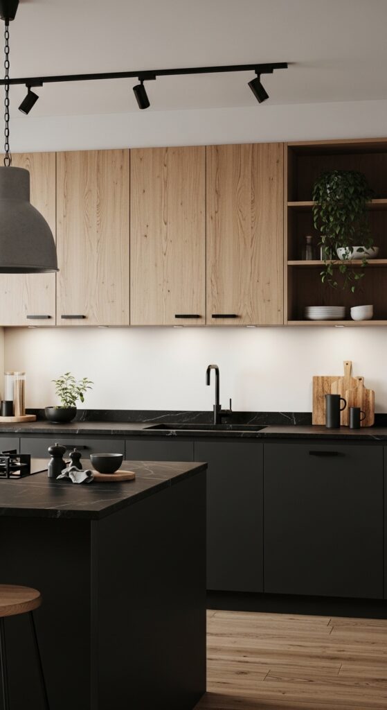
Vibe: Warmth and drama in genuine equilibrium — a kitchen that is dark without being cold and warm without being sweet.
What makes it work: The charcoal-and-warm-oak pairing is one of the most sophisticated material combinations available in contemporary kitchen design — the cool depth of charcoal against the warm grain of white oak creates a tension between industrial precision and organic warmth that is precisely the quality defining the best contemporary kitchen aesthetics. Soapstone countertops reinforce the charcoal palette while introducing a matte, soft surface quality that polished stone lacks.
How to achieve it: Specify the white oak for upper cabinets and open shelving with a clear matte or natural oil finish rather than a tinted stain — the natural warmth and grain of white oak is sufficient and should not be artificially darkened or reddened. Charcoal lower cabinets should be factory-sprayed in a flat matte finish. Soapstone countertops are naturally soft and will develop surface scratches that must be sanded out periodically — this maintenance requirement is part of the material’s honest, living character.
18. Penny Tile and Bold Color Maximalist Kitchen Floor
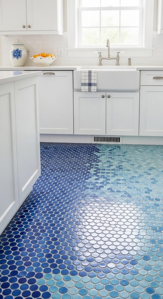
Vibe: A kitchen floor so beautiful it stops you at the threshold — mosaic blue, gradient-bright, and making everything above it look instantly better.
What makes it work: A bold statement floor with deliberately restrained cabinetry inverts the usual kitchen design hierarchy — instead of the cabinets and countertops making the primary design statement while the floor plays a supporting role, the floor becomes the room’s hero element. This inversion is visually sophisticated because it demonstrates a confident understanding of where design attention is most unexpected and therefore most effective.
How to achieve it: Penny tile sheets (12×12 inch mesh-backed mosaic sheets of 19mm diameter circles) make installation more manageable than individual tile setting — each sheet covers approximately 0.09 square meters. A gradient effect is achieved by ordering tiles in three to five colors from the same manufacturer (ensuring consistent tile diameter and thickness across colors) and blending at the transitions by mixing tiles from adjacent sheets. Use unsanded grout in white or light grey for penny tiles — sanded grout will scratch the glazed tile surface.
19. Lacquered Red or Paprika Bold Statement Kitchen
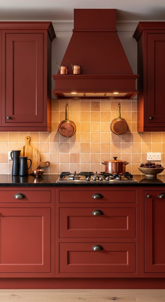
Vibe: The bravest kitchen in the neighborhood — rich, warm, and making no attempt whatsoever to blend in.
What makes it work: A warm paprika-terracotta red is the most appetite-stimulating color in the spectrum — restaurants have known this for decades, and the most confident residential kitchen designers are now applying the same principle with extraordinary results. The brown undertone in paprika red distinguishes it from primary red, preventing it from reading as aggressive or juvenile and keeping it firmly in the sophisticated, food-positive territory of traditional European country kitchen aesthetics.
How to achieve it: Specify a factory lacquer finish in a warm paprika rather than attempting a site-painted version — the depth and consistency of lacquered color on cabinetry is considerably superior to any brush or roller-applied finish. The brown undertone is critical — specify against a warm white reference rather than a cool white, and reject any sample that reads as blue-red or pure fire-engine red. Pair exclusively with warm metals (aged copper, dark bronze, unlacquered brass) and avoid any cool silver or chrome that would fight the warmth of the palette.
20. Integrated Appliance Handleless Modern Kitchen
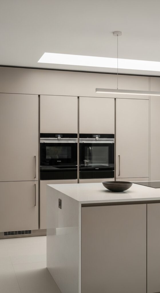
Vibe: A kitchen where the design achievement is how little you can see — everything hidden, everything perfect, and nothing to indicate the daily chaos within.
What makes it work: A fully integrated handleless kitchen achieves the visual effect of a kitchen that has been reduced to pure architectural surface — walls of cabinetry with no hardware breaks, no visible appliance fronts, and no protruding elements create a spatial quality closer to a gallery room than a functional kitchen. The waterfall island reinforces this architectural reading by treating the countertop as a sculptural object rather than a working surface.
How to achieve it: Full appliance integration requires coordination between the kitchen designer, appliance supplier, and installer from the earliest planning stage — panel-matching doors must be specified and ordered alongside the appliances they cover. Push-to-open handleless mechanisms require perfectly balanced cabinet doors with high-quality soft-close hinges — any door that doesn’t sit flush or open smoothly disrupts the seamless surface effect entirely. Budget 20–30% more than a handled kitchen equivalent for the precision of integration.
21. Cottage Core Floral and Natural Material Kitchen
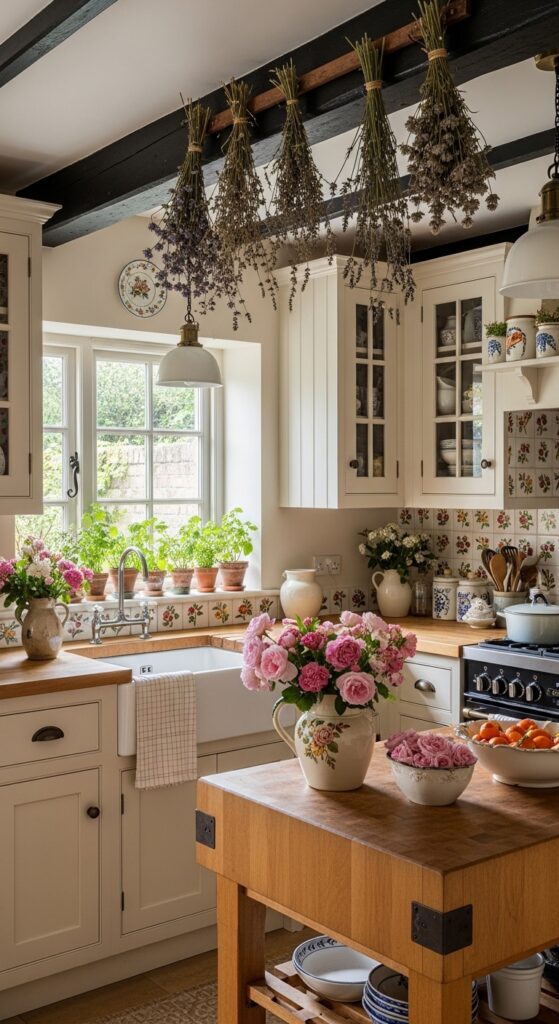
Vibe: A kitchen built by someone who loves their garden as much as their cooking — botanical, abundant, and sweetly, thoroughly romantic.
What makes it work: Cottage core kitchen aesthetics derive their extraordinary warmth from the integration of garden and interior — fresh flowers in multiple vessels, living herbs on the windowsill, and dried botanicals from the ceiling beams dissolve the boundary between kitchen and garden. The floral-lined cabinet interiors visible through glass doors create a layer of pattern-within-pattern that rewards close examination and makes every cabinet a small visual delight.
How to achieve it: Line the interiors of glass-fronted kitchen cabinets with a water-resistant botanical wallpaper — peel-and-stick papers make this project completely reversible. Source hand-painted floral or botanical tiles for the backsplash from independent ceramic artists on Etsy for a truly bespoke result. Commit to maintaining fresh flowers in the kitchen year-round — this is the single most transformative and relatively low-cost element of the cottage core kitchen, and the aesthetic reads as incomplete without it.
💡 Grow one pot of herbs per windowsill position and replace seasonally — living herbs in the kitchen window cost $3–5 each and deliver the cottage core botanical quality far more convincingly than any accessory.
22. Mixed Metal Kitchen with Layered Finishes
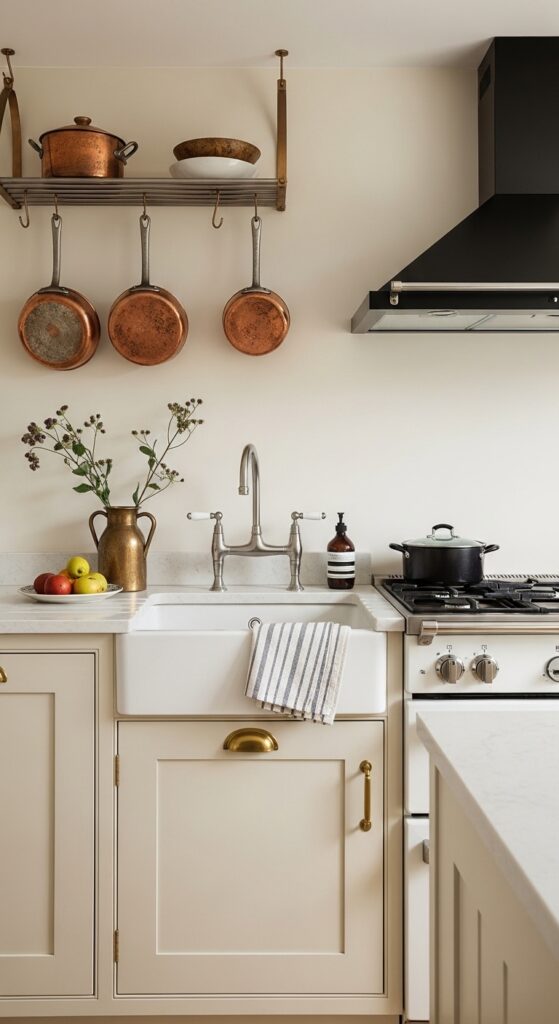
Vibe: A kitchen assembled by someone who understands that metal mixing, done with intention, is always more interesting than matching everything to a single finish.
What makes it work: Intentional metal mixing in a kitchen creates a layered, collected quality that single-metal kitchens lack — the eye moves between different reflective qualities and warmth levels across the room, experiencing a material richness that a uniform finish prevents. The critical principle is intention — the mixing must be planned and deliberate, with each metal appearing at least twice in the room to feel designed rather than inconsistent.
How to achieve it: The most successful metal mixing approach is to anchor the kitchen in one dominant metal (aged brass on the cabinet hardware, appearing most frequently) and introduce one to two secondary metals in specific functional positions (brushed nickel for the faucet, matte black for the range hood). Avoid distributing the secondary metals randomly — each should occupy a specific architectural position that can be justified as a designed choice.
23. Burgundy and Warm Wood Jewel-Tone Kitchen
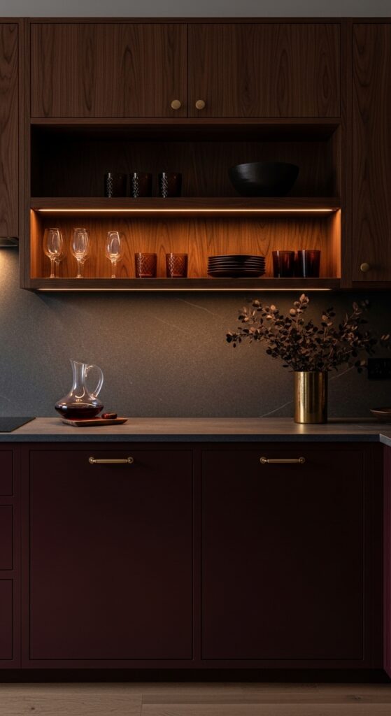
Vibe: A kitchen that belongs to someone who takes pleasure seriously — deep, warm, and richly the most beautiful room in the house at evening.
What makes it work: Burgundy and dark walnut is one of the most underused yet most successful kitchen palette combinations — the wine-red of deep burgundy and the chocolate warmth of walnut share a similar warm undertone that makes them natural allies, while the contrast in texture (painted cabinet surface versus visible wood grain) prevents the combination from reading as monotonous. The palette is strongest at evening under warm light, when the burgundy deepens dramatically.
How to achieve it: The burgundy must have a clear red-purple character rather than tipping toward brown-red (which reads as maroon) or bright red (which reads as fire-engine). Farrow & Ball “Brinjal,” Little Greene “Carmine,” and Benjamin Moore “Cabernet” represent excellent burgundy options for cabinetry. Walnut cabinet fronts should be specified in a medium sheen rather than high gloss — the visible grain of walnut is best appreciated in a finish that allows the wood to breathe rather than encasing it in a reflective film.
24. Terrazzo Countertop and Backsplash Kitchen
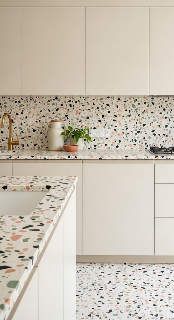
Vibe: A kitchen where the material itself is the design — speckled, cheerful, and impossibly distinctive from every other kitchen on the street.
What makes it work: Terrazzo is one of design’s great comeback materials — its aggregate chip pattern creates a visual texture unlike any other surface, and its continuous floor-to-counter-to-backsplash application has a spatial cohesion that makes kitchens appear significantly larger and more architecturally resolved than surface-by-surface material changes. The flecks of pink and sage in the aggregate connect the counter material to the wider room palette in an unusually direct way.
How to achieve it: Cast-in-place terrazzo countertops are the premium option, poured and ground by specialist terrazzo contractors to the exact aggregate colors and matrix specified — budget $150–300 per linear foot. Terrazzo tile (available in large format from specialist suppliers) is significantly more accessible and achieves a near-identical visual result. Ensure the aggregate colors in the terrazzo are reflected in at least one soft furnishing or accessory element in the room — this repetition creates the palette cohesion that makes terrazzo feel designed rather than random.
25. Kitchen Banquette with Pattern Cushion Seating
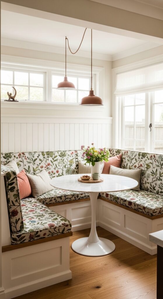
Vibe: The corner of the kitchen that becomes the whole family’s favorite place — the banquette that turns every meal into a reason to stay longer.
What makes it work: A built-in banquette transforms a kitchen corner from dead circulation space into the room’s most socially active zone — the enclosed, bench-seated dining nook creates an intimacy and settledness that freestanding dining chairs simply don’t generate. Children particularly gravitate toward banquettes, making them the most family-functional kitchen seating investment available.
How to achieve it: Build the banquette bench frame from standard timber framing, faced with tongue-and-groove or shaker-panel painted boards for the most integrated, furniture-like appearance. Standard bench seat height is 450mm from floor to cushion top surface, with the table surface at 720–740mm — the gap of 270–290mm between seat and table is critical for comfortable seating. Use 100mm-thick high-density foam for seat cushions and cover in a performance fabric with a minimum 50,000 martindale rub rating.
26. Arched Doorway and Arch Detail Kitchen
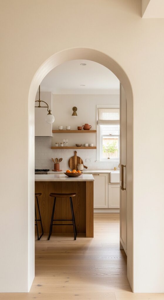
Vibe: An entrance so beautiful you pause before walking through — the arch that makes the kitchen feel like a destination rather than a room.
What makes it work: Arched openings in a kitchen introduce one of architecture’s most universally beautiful forms into a room that is typically defined by exclusively rectilinear geometry — the curve of the arch contrasts with and softens every straight line in the kitchen, making the whole room feel more considered and architecturally intentional. The deep reveal of a properly executed arch also creates a genuine sense of arrival, transitioning from one space to another in a way that a flat doorway cannot.
How to achieve it: An arched opening can be formed within an existing square doorway using a steel arch former as the centering, with two to three coats of sand-and-cement render over metal lath building the arch form. The reveal depth should be minimum 150mm — a shallow arch reads as applied decoration rather than genuine architecture. Apply a fine finish plaster coat and paint in the same warm white as adjacent walls for the most seamless, architecturally integrated result.
💡 Arch window details within cabinetry — glass-fronted cabinet doors with arched tops — introduce the same visual softening at a fraction of the construction complexity.
27. Zellige Tile Backsplash Statement Kitchen
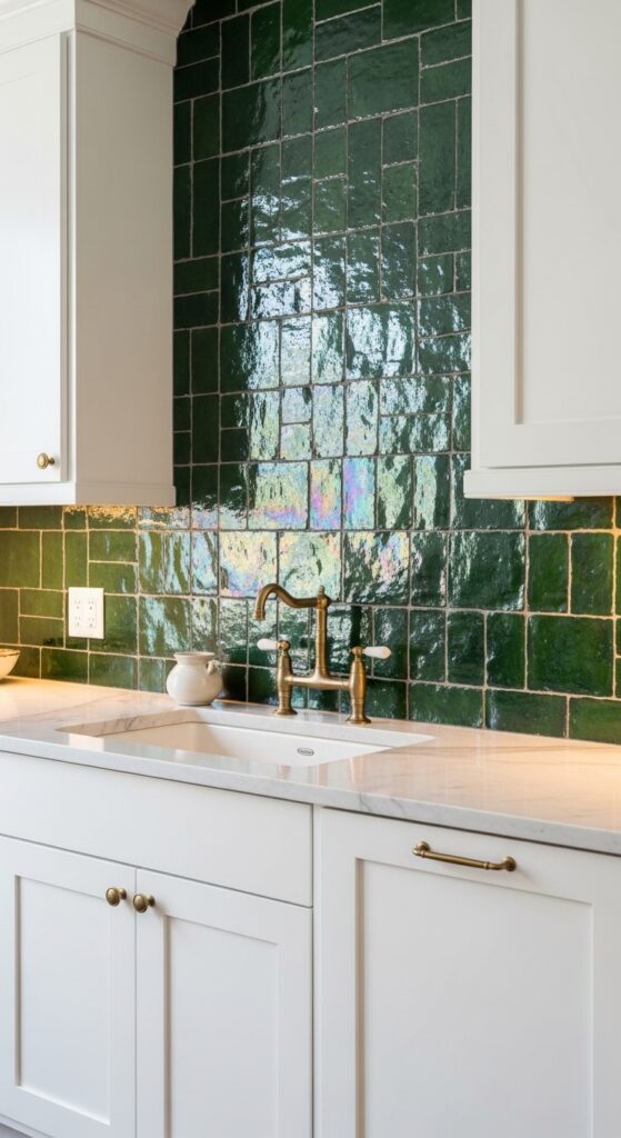
Vibe: A backsplash that changes with every hour of light — iridescent, handmade, and the most beautiful thing in a kitchen full of beautiful things.
What makes it work: Authentic Moroccan zellige tile is one of the most visually extraordinary kitchen backsplash materials available — each hand-cut tile is individually glazed with the characteristic variation in depth, color, and surface texture that makes the assembled backsplash shimmer and shift with light in a way that machine-made tile cannot replicate. Forest green zellige specifically catches light with a depth and iridescence that has made it one of the most consistently celebrated kitchen design choices of the current moment.
How to achieve it: Authentic zellige tiles are hand-cut from individually fired clay biscuits — the inherent variation in thickness and size means they must be installed by a tiler experienced with handmade tile, who understands that perfect uniform grout lines are neither achievable nor desirable with this material. Budget $60–120 per square foot for authentic Moroccan zellige including installation — significantly more than standard tile, but delivering a result that cannot be approximated at lower cost. Source from specialist importers rather than domestic reproductions, which lack the characteristic glaze depth of the genuine article.
How to Start Your Kitchen Aesthetic Transformation
Begin with the single element that will deliver the most immediate and irreversible visual impact in your specific kitchen — and for most kitchens, that element is the cabinet color. A professionally painted set of existing cabinets in a considered, confident color transforms a kitchen more dramatically than any other single intervention, and at a cost ($2,000–5,000 including professional preparation and spraying) that is a fraction of replacement. Before committing to a color, order samples of your top three choices and observe them on your actual cabinet doors — not on the wall, not on a sample card — for a full week across different lighting conditions and times of day.
Once the cabinet color direction is established, address hardware next. Replacing existing handles, knobs, and faucets in a coordinated metal finish costs $300–800 for a full kitchen and delivers a visual refinement that makes the painted cabinets read as new rather than refreshed. The hardware finish should be specified before the cabinet color is confirmed — aged brass, matte black, and brushed nickel each shift the character of the same cabinet color significantly.
The backsplash is your third priority — it frames the kitchen’s primary working zone and functions as the room’s pattern or texture element. Whether you choose handmade zellige, classic subway tile, bold penny mosaic, or hand-painted ceramics, the backsplash is the detail that most clearly communicates the aesthetic direction of the entire kitchen. It is also the most reversible of the three interventions and the most accessible for a DIY approach.
Avoid the common mistake of making all three changes simultaneously without a clear material hierarchy — establish which element you want the kitchen to be defined by (the cabinet color, the tile, or the material of the countertop) and ensure everything else supports rather than competes with that defining element.
Frequently Asked Questions
What is the most popular kitchen aesthetic right now?
The current dominant kitchen aesthetic movement is best described as warm, earthy, and materially rich — characterized by deep, saturated cabinet colors (forest green, navy, terracotta, burgundy), natural stone or butcher block countertops, unlacquered brass or aged bronze hardware, and handmade or artisan tile backsplashes. The all-white kitchen that dominated residential design for the previous two decades has definitively declined, replaced by this color-confident, material-honest approach. Sage green remains the single most searched individual kitchen color, while zellige tile and limewash wall finishes have emerged as the most distinctive individual material trends of the current moment.
How do I choose a kitchen aesthetic that will not date quickly?
The most enduring kitchen aesthetics are those rooted in genuine materials rather than surface finishes, and in natural color palettes rather than trend-specific accent colors. A kitchen built from real timber, genuine stone, and ceramic tile in a palette of deep green, warm cream, and natural wood will remain beautiful for decades because these materials and colors have proven longevity rooted in the natural world rather than in fashion cycles. Avoid aesthetics defined by a single highly specific trend detail — an unusual geometric backsplash pattern, an unconventional color combination — in favor of those defined by material quality and palette coherence. The kitchen aesthetic most likely to date is the one most perfectly aligned with this precise moment in design media.
Can I achieve a high-end kitchen aesthetic on a budget?
The highest-impact, lowest-cost kitchen aesthetic changes available to any budget are, in order: cabinet painting ($2,000–4,000 full kitchen professionally sprayed), hardware replacement ($300–800 full kitchen), backsplash tile ($15–40 per square foot for standard tiles, DIY installable), open shelving to replace upper cabinets (floating shelves in timber cost $50–200 each installed), and lighting replacement ($200–600 for new pendants and under-cabinet LEDs). Together, these five changes can be achieved for $3,000–6,000 and will transform a standard builder kitchen into a space that reads as entirely custom and designed. The kitchen countertop and appliance changes that most significantly impact cost should be deferred to a later phase once the primary aesthetic direction is established.
What kitchen aesthetic works best in a small kitchen?
Small kitchens benefit most from aesthetics that either maximize the sense of space (light palettes, reflective surfaces, seamless integrated cabinetry) or lean deliberately into the intimate enclosure of a small room (dark moody palettes that make the room feel cocooned rather than cramped). The worst approach for a small kitchen is a mid-range aesthetic that is neither light enough to open the space nor dark enough to create atmosphere — a pale greige kitchen with standard white tile and chrome fixtures reads as incomplete in a small space. The Japandi minimal aesthetic (white, oak, and matte black) and the dark moody aesthetic (navy, forest green, or charcoal with warm lighting) are the two most successful approaches for spatially challenging kitchens.
How important is lighting to a kitchen aesthetic?
Lighting is the single most underinvested element in most residential kitchens and the one that most profoundly affects how every other aesthetic choice reads. The same cabinet color appears dramatically different under warm 2700K lighting versus cool 4000K lighting — and most builder-installed kitchen lighting is specified at the cool, functional end of the spectrum, which actively undermines the warmth and atmosphere of every material and color choice around it. Replacing overhead lighting with warm 2700K recessed LEDs, adding under-cabinet LED strips at the same color temperature, and introducing one or two statement pendant lights over an island or sink creates a layered lighting scheme that transforms the kitchen’s atmosphere from purely functional to genuinely beautiful. Budget minimum $800–1,500 for a complete kitchen lighting transformation — it consistently delivers more aesthetic return per dollar than any comparable spend on surfaces or finishes.
Ready to Transform Your Kitchen Aesthetic?
These 27 trending kitchen aesthetic ideas represent the full spectrum of what is possible when a kitchen is designed with genuine confidence, material honesty, and a clear sense of the atmosphere it should create. Whether you are drawn to the dramatic depth of a forest green shaker kitchen, the earthy warmth of terracotta and hand-painted tile, the architectural precision of an integrated Japandi space, or the joyful abundance of a cottage core botanical room — the kitchen you are imagining is achievable, and closer than it might currently appear.
Save the ideas that stop your scrolling. Return to them over several days and notice which aesthetic consistently feels most like the kitchen you actually want to cook in, not just photograph. That distinction — between the kitchen you admire and the kitchen you would genuinely love to inhabit — is your real design direction. Start with the cabinet color, commit to the hardware, choose the backsplash, and let the rest follow. The kitchen that reflects who you are and how you live is the most beautiful kitchen of all.