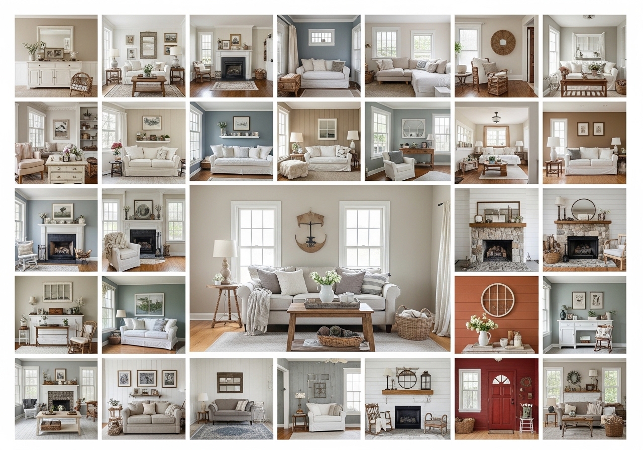
Farmhouse paint colors for a cozy interior look are rooted in soft, hardworking hues that make a home feel warm, lived-in, and quietly timeless rather than sharp or trend-driven. These 26 ideas give you exact paint directions, mood shifts, and room-by-room applications so you can choose colors with more confidence.
The feeling is mellow light on wood grain, linen catching the afternoon sun, and walls that never shout. A good farmhouse palette doesn’t just decorate a room—it settles it. It adds warmth without heaviness and calm without flatness. Here are 26 ideas worth saving — and stealing.
Why Farmhouse Paint Colors for a Cozy Interior Look Work So Well
Farmhouse style comes from practical rural interiors shaped by utility, natural materials, and a preference for simple finishes over ornament. Its modern version still leans on that history—painted woodwork, neutral backdrops, and warmth—but it feels softer and cleaner than country cottage, and less stark than minimalism. Architectural Digest
The core palette starts with warm white, creamy ivory, putty, greige, mushroom, muted sage, dusty blue, weathered charcoal, and clay-toned taupe. Those colors work best with painted shaker millwork, shiplap, limewash, fireclay, unlacquered brass, matte black iron, jute, and unfinished white oak. Better Homes & Gardens notes that farmhouse color schemes are moving away from icy whites toward earthier, nature-led tones. Better Homes & Gardens
It’s trending now because people want interiors that feel restorative, not high-gloss or disposable. Post-pandemic nesting changed how homes are used, and farmhouse palettes fit that shift: they photograph well, age well, and make mixed old-and-new furniture feel cohesive. Benjamin Moore also frames farmhouse colors around soft whites, warm grays, off-whites, and greige with gentle accents. Benjamin Moore
Small spaces can absolutely carry this look. Start with one warm neutral on the walls, then layer texture through wood and linen instead of adding more colors. The only real limit is undertone confusion—if the paint is too cool, a compact room can feel flat instead of welcoming.
| Element | Core Trait | Supporting Trait |
| Philosophy | practical warmth | relaxed simplicity |
| Key Materials | painted wood, oak, linen | brass, ceramic, iron |
| Key Colors | warm white, greige, sage | dusty blue, taupe, charcoal |
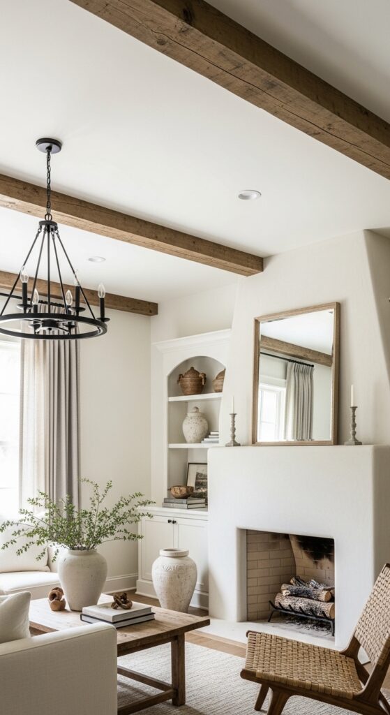
1. Farmhouse Paint Colors for a Cozy Interior Look Start With White Dove Walls
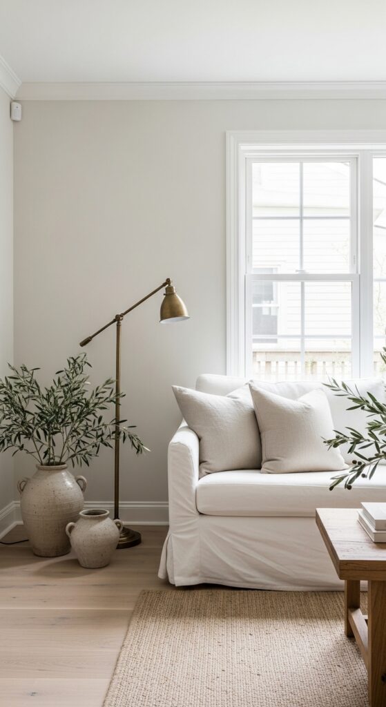
Vibe: The room feels luminous and gently settled.
Why it works: White Dove has enough cream in it to soften shadows, so the walls feel warm instead of glaring. That undertone helps white oak, linen, and antique brass read layered rather than washed out, which is exactly what farmhouse interiors need.
How to get it: Use an eggshell finish on walls and satin on trim in the same color for a quiet tonal shift. This works especially well in living rooms with mixed natural light because the paint stays soft from morning through evening.
💡 Quick Win: Paint just the main walls first and leave the trim for later if you want a lower-risk test.
2. Use Mushroom Taupe on Built-In Bookcases
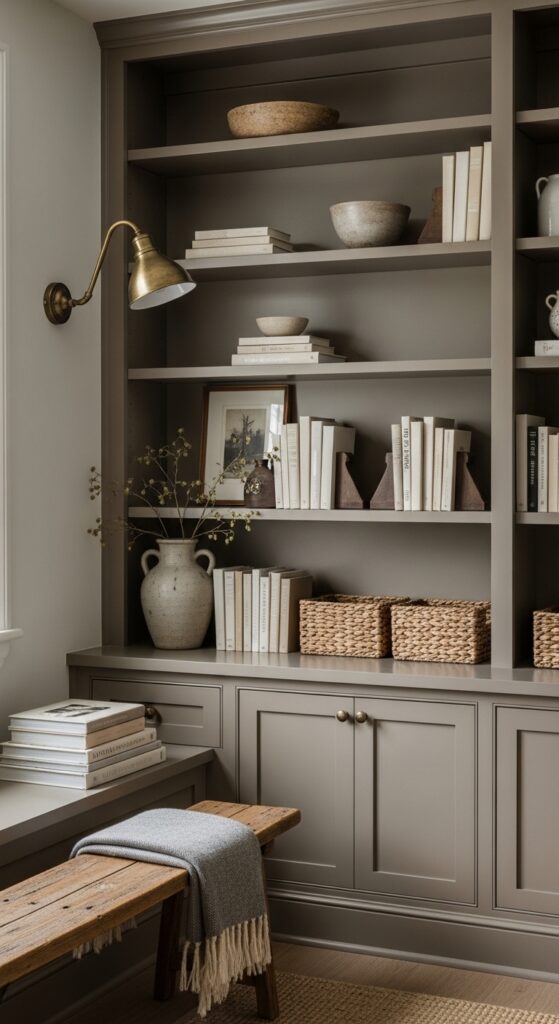
Vibe: It feels grounded and quietly enveloping.
Why it works: Painting built-ins in mushroom rather than bright white adds visual weight without making the room feel dark. The color deepens the architecture and gives shelves, baskets, and pottery stronger contrast against the wall plane.
How to get it: Try Benjamin Moore Pashmina or Farrow & Ball Drop Cloth on shelving and cabinetry only. Keep the surrounding wall a softer cream so the built-in reads like furniture instead of disappearing into the room.
3. Choose Greige That Glows in Lamplight
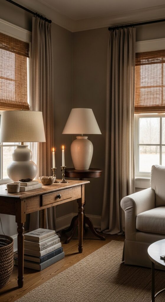
Vibe: It feels sun-warmed even after dark.
Why it works: Greige is strongest when it responds well to artificial light. In farmhouse rooms, that matters because warm lamplight is part of the mood, and a good greige will deepen softly instead of turning muddy or pink.
How to get it: Look at Sherwin-Williams Accessible Beige or Benjamin Moore Edgecomb Gray under 2700K bulbs before you commit. Paint a large swatch near a lamp and check it at night, not just in daytime.
💡 Quick Win: Change your bulbs to 2700K first; a cool bulb can ruin even the right farmhouse paint color.
4. Paint a Farm Table Base in Soft Putty
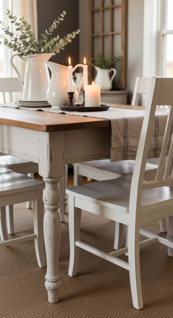
Vibe: It feels raw and familiar in the best way.
Why it works: Painted furniture breaks up too much wood and keeps a farmhouse room from reading heavy. A soft putty tone adds age and dimension while letting the natural top stay the focal point through contrast and texture layering.
How to get it: Use a mineral-style furniture paint in a shade close to warm clay-beige, then seal it with a dead-flat topcoat. Let a little wear show on corners so the piece feels softened rather than factory-finished.
5. Pair Cream Walls With Ticking-Stripe Textiles
Vibe: It feels layered and softly breathable.
Why it works: Cream walls create a forgiving backdrop that makes classic farmhouse textiles feel intentional, not busy. The contrast is gentle, so stripes, quilted linen, and pine furniture can add pattern and texture without visually crowding the room.
How to get it: Choose a wall color like Behr Blank Canvas or BM Swiss Coffee, then keep fabrics in one restrained family—navy ticking, flax linen, or oatmeal cotton. One patterned textile is enough to carry the look.
💡 Quick Win: Start with two striped pillow covers before changing the entire bedding mix.
6. Use Warm White to Open a Choppy Floor Plan
Vibe: It feels still and visually easier to move through.
Why it works: One continuous color reduces hard visual stops, which is essential in broken-up interiors. Warm white reflects light from room to room and lets architectural lines, not paint shifts, define the house.
How to get it: Carry the same warm white through hallway walls, door casings, and connecting rooms with only sheen changes. This works better than introducing accent walls when your goal is flow rather than contrast.
7. Try Dusty Sage in a Small Entry Instead of Gray
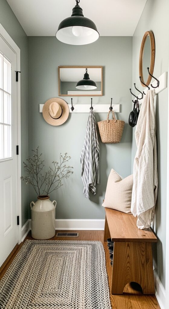
Vibe: It feels hushed and unexpectedly spacious.
Why it works: A muted sage with gray in its base behaves almost like a neutral, so it adds character without boxing in a small space. Against black iron and warm wood, it creates color contrast while still keeping the palette soft.
How to get it: Look at Sherwin-Williams Clary Sage or BM Saybrook Sage, but sample first in low light. The right sage should read dusty, not minty, especially in narrow entries.
💡 Quick Win: Paint only the back wall of the entry first if you want to test the undertone safely.
8. Farmhouse Paint Colors for a Cozy Interior Look Love Alabaster Ceilings
Vibe: It feels luminous from top to bottom.
Why it works: Painting the ceiling in a soft off-white instead of builder-flat bright white removes the harsh line where walls end. That tonal continuity makes beams feel more intentional and gives the entire room a wrapped, calmer atmosphere.
How to get it: Use Sherwin-Williams Alabaster in a flat finish overhead and eggshell on the walls. This approach is especially good in older farmhouse-inspired homes where ceiling angles and beams deserve to feel integrated.
9. Let Weathered Charcoal Sharpen White Trim
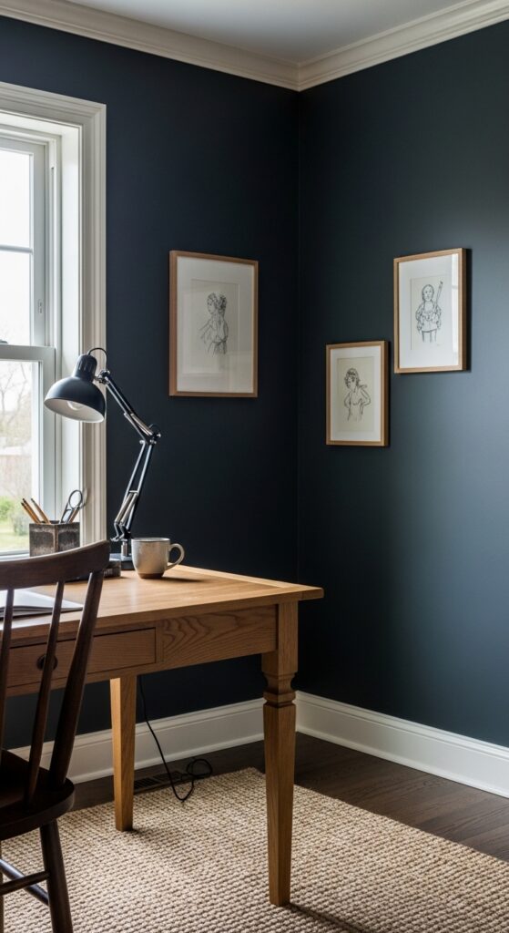
Vibe: It feels grounded and focused.
Why it works: Dark paint in farmhouse interiors works best when it has softened undertones rather than a blue-black cast. Weathered charcoal increases contrast around windows, trim, and wood grain, giving the room depth without feeling sleek or overly urban.
How to get it: Try Farrow & Ball Mole’s Breath or BM Kendall Charcoal on one study or office space. Pair it with creamy trim and matte finishes so the look stays rustic rather than formal.
💡 Quick Win: Start with the smallest enclosed room in the house; dark paint often looks richest where it can fully wrap the space.
10. Limewash a Fireplace Wall in Soft Stone Beige
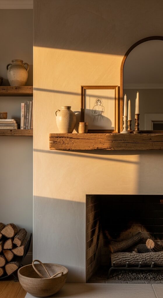
Vibe: It feels earthy and softly timeworn.
Why it works: Limewash adds movement, and movement is what keeps a neutral farmhouse palette alive. On a fireplace wall, the subtle tonal variation catches light differently across the day and adds depth without introducing a new strong color.
How to get it: Choose a mineral limewash in a pale stone or mushroom tone and brush it in crossing strokes rather than rolling it flat. This technique works best on plaster, brick, or properly primed masonry surfaces.
11. Paint a Hutch in Faded Blue Instead of Buying New Storage
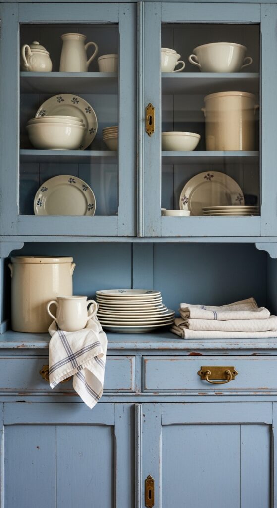
Vibe: It feels collected and lightly storied.
Why it works: Painting one storage piece in faded blue gives a farmhouse interior a focal point without forcing a whole-room commitment. Because the color sits between gray and blue, it adds personality while still harmonizing with creams, woods, and white ceramics.
How to get it: Use a chalk-style or casein finish on an old hutch, pantry cabinet, or sideboard rather than built-ins. A color like BM Van Courtland Blue or SW Smoky Blue keeps the mood muted, not coastal.
12. Frame Windows With Warm Mushroom Instead of Stark White
Vibe: It feels layered around the light itself.
Why it works: Window trim painted a touch deeper than the wall creates just enough visual outline to make daylight feel framed. In farmhouse spaces, that softer trim contrast looks more settled than high-bright white against every surrounding surface.
How to get it: Use one low-contrast trim shade like SW Shiitake or BM Pale Oak on the casing only. This is a smart move in rooms with lots of glazing, where too much bright trim can feel busy.
💡 Quick Win: Test the trim color on one window first; the shift is subtle but surprisingly effective.
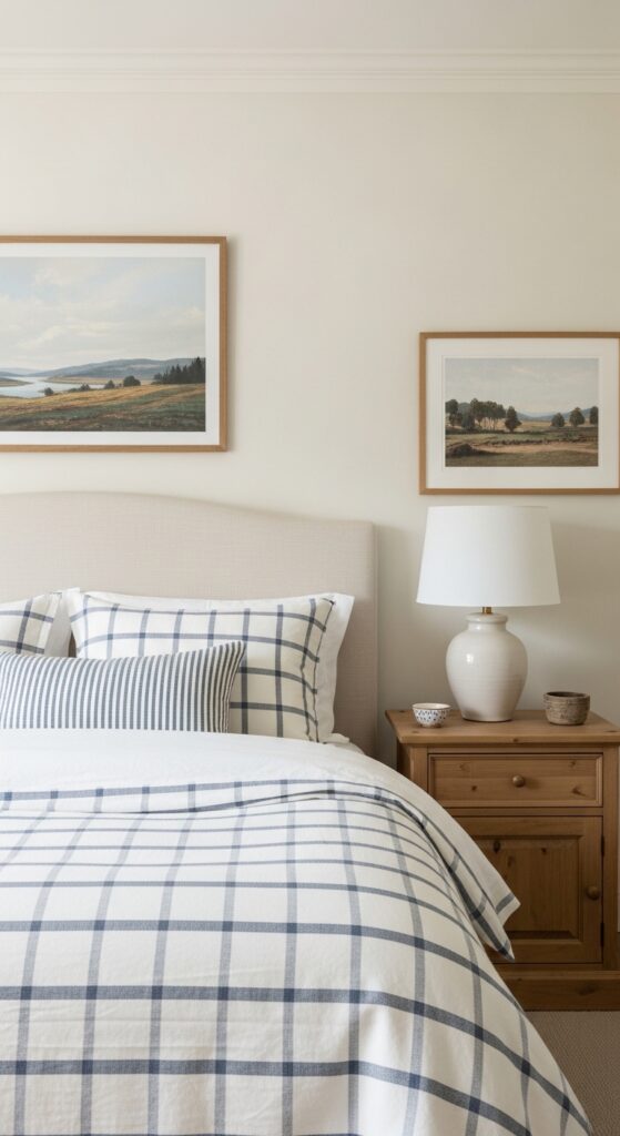
13. Farmhouse Paint Colors for a Cozy Interior Look Get Better With Muted Sage Bedrooms
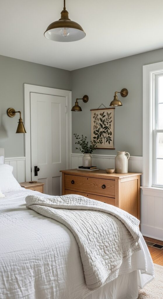
Vibe: It feels serene and quietly cocooning.
Why it works: Bedrooms respond especially well to colors with low saturation. A muted sage softens the room without flattening it, and the green undertone makes white bedding and oak furniture feel fresher and more alive.
How to get it: Choose a sage with gray in the base and use matte paint to keep the finish velvety. Pair it with white bedding, not cream-on-cream everywhere, so the room still has crispness.
14. Use Putty Paint on Shiplap for Texture Without Contrast
Vibe: It feels textured without feeling busy.
Why it works: Shiplap already carries visual rhythm, so it doesn’t need a bold color to stand out. A putty tone lets the grooves cast gentle shadows, adding texture through light behavior rather than strong contrast.
How to get it: Paint the boards and the trim in the same putty shade, then let sheen do the work—eggshell on boards, satin on trim. That keeps the effect subtle and more current than high-contrast farmhouse paneling.
15. Let Morning Light Work With a Soft Buff Breakfast Nook
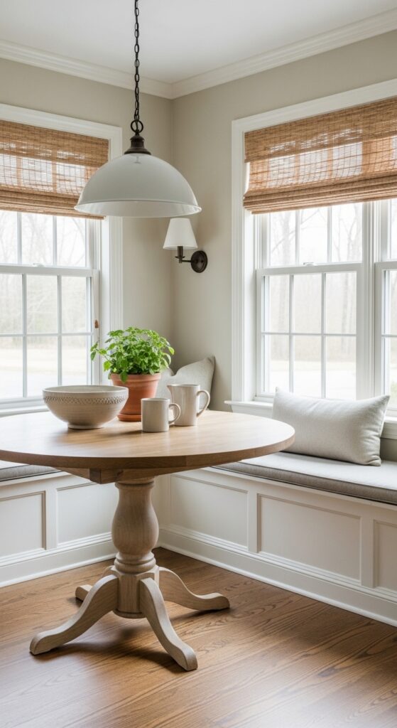
Vibe: It feels sun-warmed before coffee is even poured.
Why it works: Buff tones can mimic the effect of sunlight, especially in east-facing rooms. They make white trim feel softer and help oak tables, woven shades, and ceramic pieces carry more warmth without introducing a strong yellow cast.
How to get it: Use buff only where the room gets real daylight; in dark rooms it can look dull. Paint large poster boards and view them at breakfast time, which is when this color should do its best work.
💡 Quick Win: Try buff on the nook walls only and keep the ceiling white for a gentler transition.
16. Paint a Bench Nook in Clay-Tinted Taupe
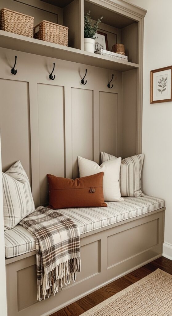
Vibe: It feels grounded and inviting enough to linger in.
Why it works: Seating nooks benefit from a little more depth than surrounding walls because they are meant to feel anchored. A clay-tinted taupe adds weight to the built-in while making striped cushions, baskets, and black hooks feel more integrated.
How to get it: Pick a warm taupe with a hint of terracotta in the undertone and use it only on the nook base or paneling. It’s a useful trick for making custom seating look intentional without turning the whole room darker.
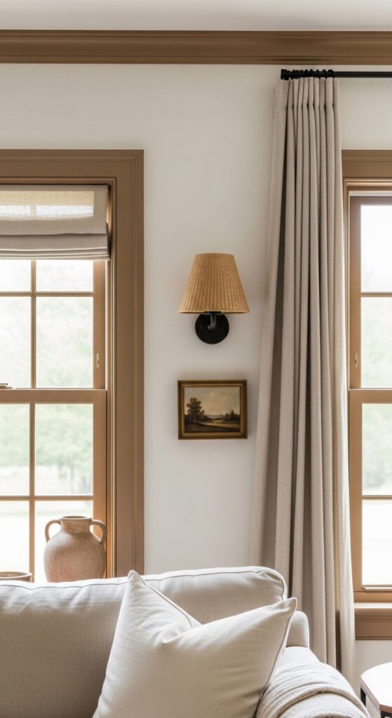
17. Style Warm White Walls With Black-Framed Art
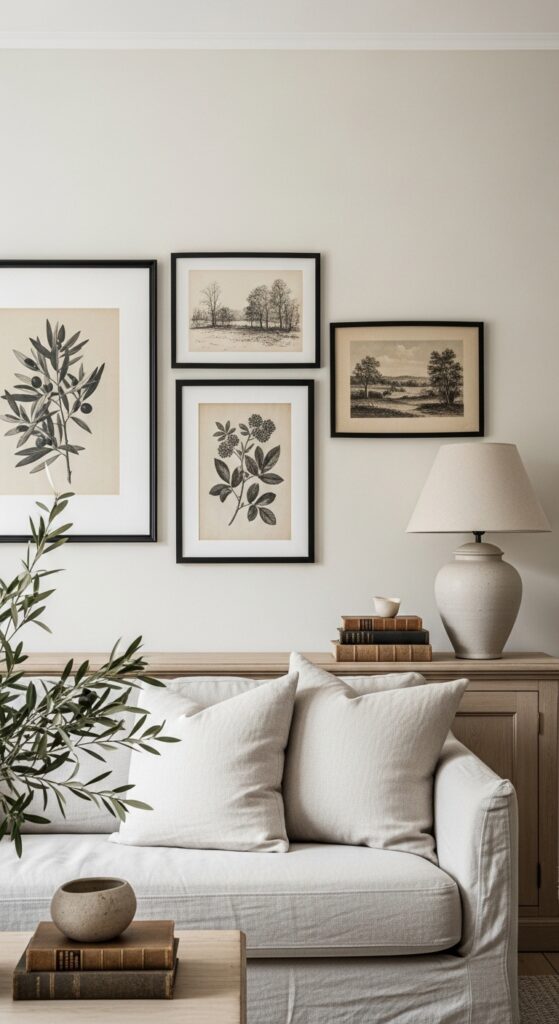
Vibe: It feels still and crisply edited.
Why it works: Warm white walls need one sharper note to avoid drifting into beige-on-beige sameness. Black-framed art adds graphic structure and gives the paint a cleaner edge, while still letting the softer materials hold the overall mood.
How to get it: Keep the art restrained—botanicals, charcoal studies, old landscapes—and use thin black or dark bronze frames only. The contrast works because the wall tone stays creamy rather than paper-white.
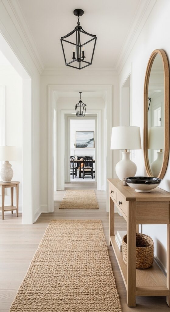
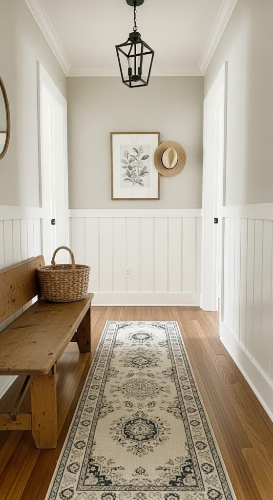
18. Carry One Greige Through Hall, Stair, and Landing
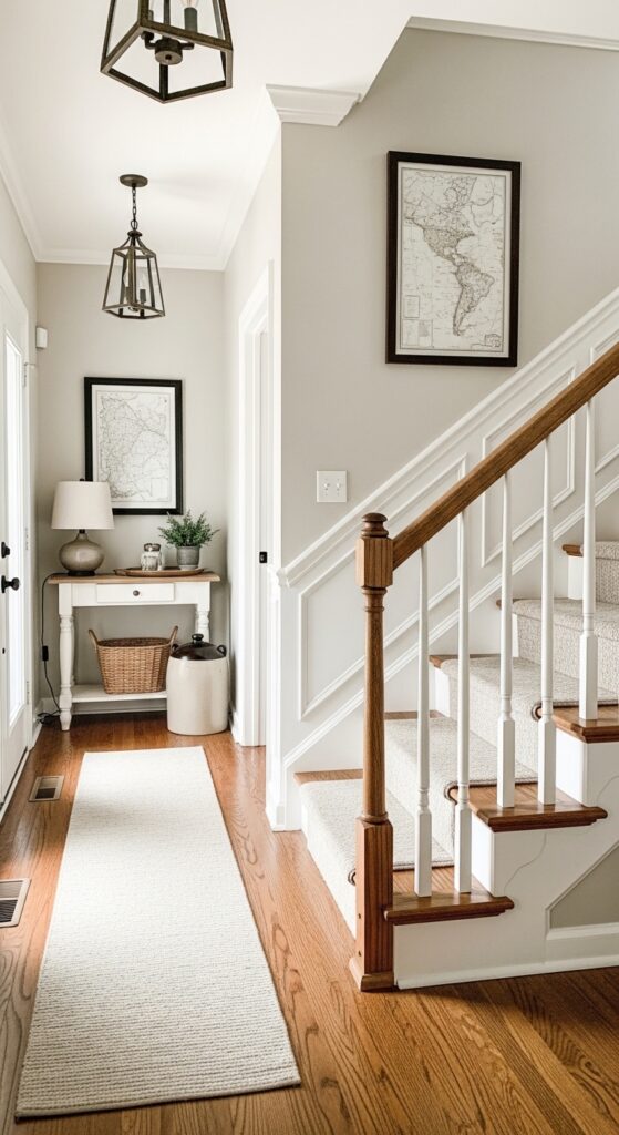
Vibe: It feels calm and more spacious than it is.
Why it works: Transitional spaces are where color inconsistency shows first. One greige across the stair hall, landing, and upper corridor creates cohesion, makes trim lines cleaner, and lets wood treads or railings carry the texture.
How to get it: Use one mid-light neutral with a warm base and repeat it continuously through connected circulation zones. This is one of the simplest ways to make a farmhouse interior look more intentional without buying a single new furnishing.
💡 Quick Win: Paint the stair wall and upper landing first; that single move often changes the whole house’s feel.
19. Use Pale Oatmeal in a Small Bathroom With White Tile
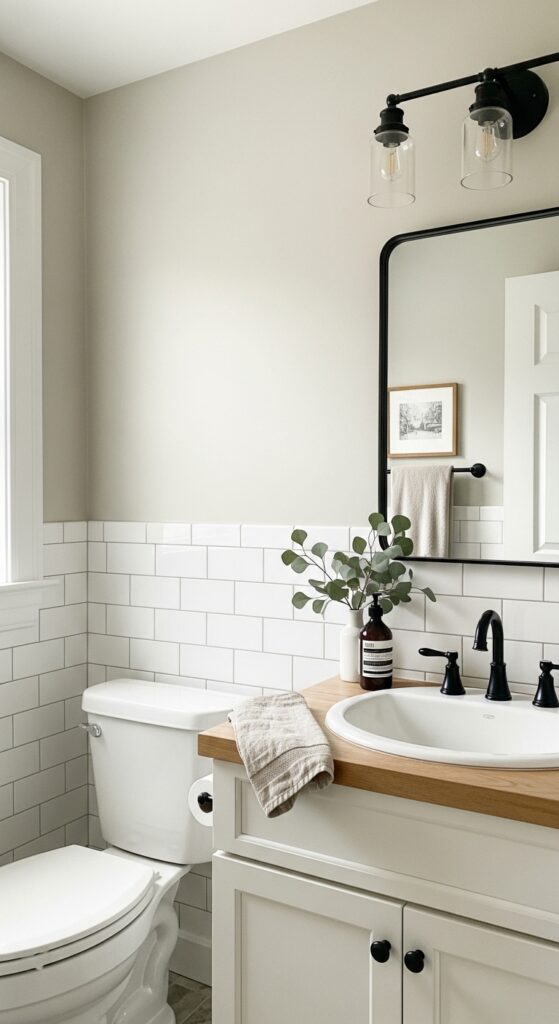
Vibe: It feels clean without turning cold.
Why it works: Small bathrooms often suffer under hard white light, and a pale oatmeal neutral softens that effect immediately. Against subway tile and white fixtures, it introduces warmth while still preserving the crispness people want in a bath.
How to get it: Stop the paint above the tile line and keep the vanity in natural oak or a creamy white. A pale oatmeal works better here than gray because it complements warm grout and wood much more naturally.
20. Farmhouse Paint Colors for a Cozy Interior Look Can Lean Dusty Blue
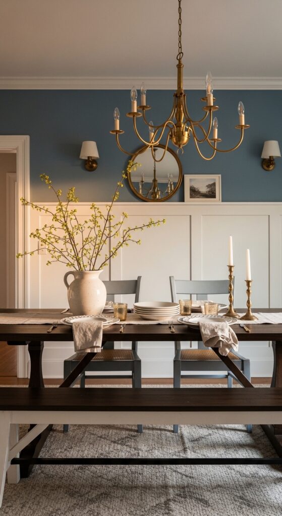
Vibe: It feels romantic and softly tailored.
Why it works: Dusty blue adds color while staying historically believable in farmhouse-inspired homes. It has enough gray to feel quiet, and it makes white millwork, walnut, and brass stand out through restrained contrast rather than loud saturation.
How to get it: Use dusty blue in rooms where you want more mood—dining rooms, studies, or guest bedrooms. Keep the sheen low and pair it with warm bulbs so the blue stays muted instead of turning cold.
21. Let White Oak Floors Balance Creamy Walls
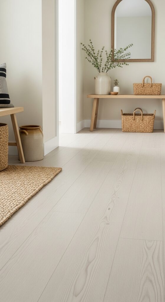
Vibe: It feels airy but not washed out.
Why it works: Paint colors land differently when the floor undertone fights them. Pale white oak with a matte finish supports creamy farmhouse walls by adding warm structure underfoot, which keeps the palette from floating into blandness.
How to get it: If refinishing isn’t realistic, use light oak-toned mats, stools, or shelving to repeat that undertone. The goal is simple: every wall color should have at least one wood tone nearby that makes it feel warmer.
💡 Quick Win: Add one unfinished oak stool or side table before repainting the whole room to test the warmth shift.
22. Highlight Soft White Walls With Schoolhouse Sconces
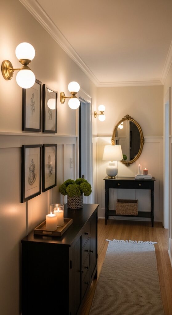
Vibe: It feels warm in that low-lit, old-house way.
Why it works: White paint is never just about the paint—it’s also about what light does to it. Schoolhouse sconces cast a diffused glow that deepens creamy undertones and helps paneling, art, and trim lines read softer and more dimensional at night.
How to get it: Choose opal glass sconces with 2700K bulbs and position them where they wash across the wall rather than glare outward. This is one of the fastest ways to make farmhouse paint colors feel richer after sunset.
23. Paint a Dresser in Warm Black for Contrast
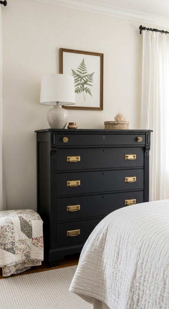
Vibe: It feels grounded and more defined instantly.
Why it works: Farmhouse rooms need some visual weight, especially when the walls stay light. A warm black dresser or cabinet introduces that contrast in a contained way, which helps pale walls and bedding look brighter by comparison.
How to get it: Use a softened black like SW Iron Ore or BM Wrought Iron on one furniture piece, not the whole room. Keep surrounding textiles light so the painted piece becomes the anchor rather than overwhelming the space.
24. Use Putty Walls as the Quiet Backdrop for Handmade Ceramics
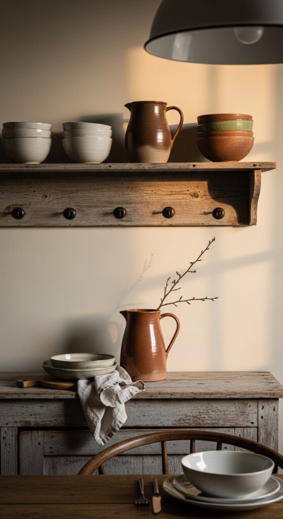
Vibe: It feels layered and tactile without trying too hard.
Why it works: Handmade ceramics need a wall color that supports their irregular form and earthy glaze. Putty does that beautifully because it sits between beige, gray, and clay, letting matte whites and terracotta pieces stand out through subtle tonal contrast.
How to get it: Keep the pottery palette narrow—chalk white, brown, clay, one muted green—and let the wall do the quiet connecting work. This is a strong move for dining corners, shelves, and sideboards.
💡 Quick Win: Group three ceramic pieces in varying heights against an existing beige wall to see if the layered effect is what you want before repainting.
25. Choose Soft Clay Beige for a Guest Room That Feels Welcoming
Vibe: It feels warm and quietly welcoming.
Why it works: Guest rooms do well with colors that flatter both daylight and lamplight. A soft clay beige adds more comfort than standard tan because it carries a subtle earthy note, which makes black iron, linen, and ivory bedding feel richer and more intentional.
How to get it: Sample clay-beige paints next to your bedding first, not just against the trim. The right one should feel muted and dusty, never orange, especially if the room gets strong afternoon sun.
26. Paint Interior Doors in Deep Olive-Greige for a Collected Finish
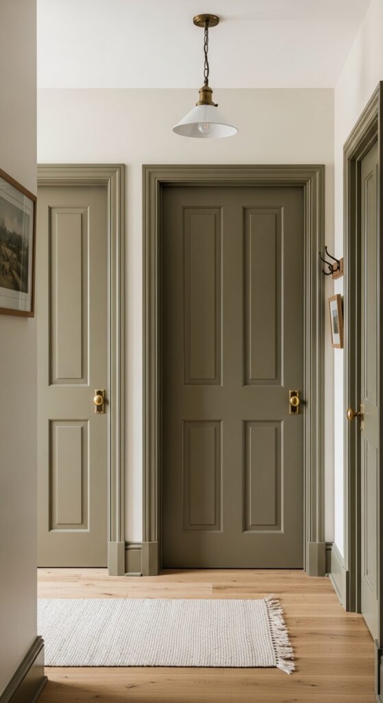
Vibe: It feels collected and a little more custom.
Why it works: Painted doors add architectural punctuation without requiring a full-room color commitment. A deep olive-greige is especially good for farmhouse interiors because it bridges warm neutrals and muted greens, making brass, oak, and cream walls feel tied together.
How to get it: Use the color only on interior doors or a pantry door in satin enamel for durability. This is a smart technique when you want color presence but don’t want to repaint every wall in the house.
💡 Quick Win: Start with one pantry or laundry door before carrying the idea to bedrooms and hallways.
How to Start Your Farmhouse Transformation
Start with paint. Benjamin Moore White Dove is the one first move worth making because it creates the warm, flexible foundation that lets every wood tone, brass finish, and linen texture you add afterward feel deliberate instead of random.
The most common mistake is choosing a white or greige with the wrong undertone for your fixed finishes. A cool white beside honey oak floors or creamy stone instantly makes the room feel off-balance. Fix it by sampling your paint directly against flooring, trim, tile, and upholstery before you commit.
For budget impact, start with three items under $50: a woven seagrass basket in natural tan, an ivory linen-look pillow cover in a 20-inch size, and a matte ceramic lamp base or crock in chalk white. Those pieces make new farmhouse wall colors feel grounded fast.
A starter refresh can happen in one weekend for $80 to $300 if you’re repainting one room and swapping a few accessories. A fuller whole-home palette shift usually takes several weeks and often lands between $1,000 and $4,000 depending on paint quality, prep, and labor. One room is realistic in a weekend; trim, ceilings, doors, and connected hallways take longer.
Frequently Asked Questions About Farmhouse Paint Colors for a Cozy Interior Look
What is the difference between farmhouse paint colors and modern farmhouse paint colors?
Classic farmhouse paint colors lean warmer and softer, with creamy whites, putty neutrals, dusty blues, and muted sage greens. Modern farmhouse palettes often stay more edited, bringing in sharper contrast through crisp whites, stronger blacks, and cooler grays. If you want a room to feel older, gentler, and more relaxed, traditional farmhouse hues usually do the job better. Architectural Digest
What colors work best in a farmhouse interior?
The most reliable farmhouse interior colors are warm white, greige, mushroom, muted sage, dusty blue, clay taupe, and weathered charcoal. Better Homes & Gardens highlights white, earthy neutrals, greens, blues, and warm nature-based tones as especially effective in farmhouse homes. A color like White Dove, Accessible Beige, or Clary Sage is easier to live with long-term than a cold gray. Better Homes & Gardens
Is farmhouse design expensive to achieve with paint?
Not necessarily. Paint is one of the least expensive ways to shift a room’s mood, and one gallon of good interior paint typically costs far less than new furniture or flooring. If you start with one room, sample carefully, and keep the palette cohesive, you can create a strong farmhouse effect for a few hundred dollars plus basic accessories.
Can I mix farmhouse paint colors with other styles?
Yes—farmhouse colors mix especially well with cottage, English country, Scandinavian, and even lightly industrial interiors. The key is keeping the base palette warm and muted so your other elements do not fight it. A creamy wall color, pale oak, and one dark metal finish can support a surprising range of furniture styles without losing the cozy farmhouse feeling.
Which paint finish works best with farmhouse paint colors?
In most interiors, eggshell on walls and satin on trim is the safest farmhouse combination because it looks soft while still being wipeable. Flat paint can be useful on ceilings or low-traffic bedrooms, while semi-gloss is better reserved for cabinetry, doors, and heavy-use millwork. If you want the color to feel chalkier and more relaxed, avoid high-shine finishes unless the room truly needs the durability.
Ready to Create Your Dream Farmhouse Paint Colors for a Cozy Interior Look?
These 26 ideas covered the full range—warm whites, muted greens, dusty blues, mushroom neutrals, textured finishes, painted furniture, and layout-friendly color moves that make a home feel more settled. Starting small is not a compromise here; it is usually the smartest way to learn what your light, floors, and finishes actually need. Paint one interior door or one small wall in a warm farmhouse tone this week and watch how quickly the room’s energy changes. Once the palette is right, the whole house begins to feel calmer, softer, and more rooted in everyday comfort. Save the shades with White Dove, putty shiplap, dusty sage, and olive-greige doors so your farmhouse palette can come together one grounded choice at a time.