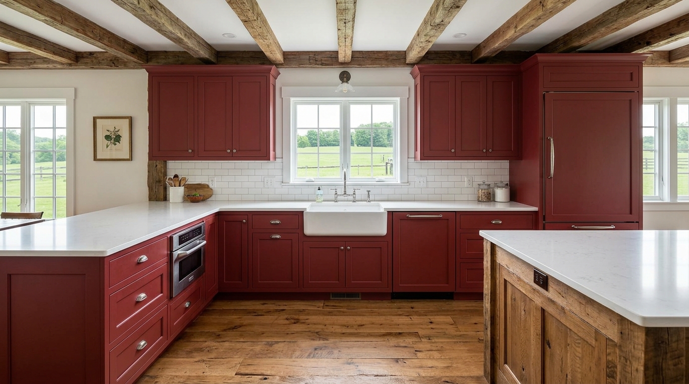
A red farmhouse kitchen uses barn red, crimson, cherry, and dusty brick tones as the design anchor in a space built on natural materials, honest craftsmanship, and lived-in warmth. These 26 ideas show you exactly how to use red in a farmhouse kitchen — from full cabinet color to small accent strategies — so the result feels bold and grounded rather than aggressive or themed.
Red in a farmhouse kitchen doesn’t shout. It settles in. It deepens the warmth of butcher block, makes white shiplap walls feel crisper, and turns a cast iron skillet on the wall into a deliberate design choice. There’s an energy to these kitchens — something that says this room is used, loved, and very much alive. Here are 26 ideas worth saving — and stealing.
Why Red Farmhouse Kitchen Style Works So Well
The red farmhouse kitchen has roots in 19th-century American agricultural life, where barn red (a mixture of linseed oil, rust, and skimmed milk) was the most affordable and durable exterior paint available. That same tone — earthy, slightly muted, warm rather than fire-engine — migrated into the domestic interior as a color of belonging and energy. What distinguishes a red farmhouse kitchen from a retro diner aesthetic or a country cottage is restraint: the red is grounded by natural materials, balanced by warm whites and wood tones, and never used without purpose.
The color palette extends well beyond red itself. The anchor tones are barn red (Sherwin-Williams “Heartthrob” or Benjamin Moore “Caliente”), dusty brick, warm cream, and natural greige. Materials are deliberately honest: butcher block or reclaimed wood countertops, fireclay or farmhouse sinks, matte black or oil-rubbed bronze hardware, shiplap or beadboard paneling, and natural linen or grain sack stripe textiles in red-and-cream. These are materials that age into the color rather than fighting it.
Red is experiencing a genuine cultural resurgence. After a decade of gray-and-white kitchen dominance, designers and homeowners are returning to color with intention — and red farmhouse kitchens are at the front of that shift. Pinterest searches for “red farmhouse kitchen” have climbed sharply since late 2023, driven by a collective appetite for kitchens that feel emotionally warm rather than photographically neutral. The color signals confidence and comfort simultaneously.
Small kitchens can carry red well, but placement matters enormously. In a compact kitchen, use red on a single lower cabinet run, a focal wall, or as an accent in textiles and accessories rather than painting every surface. Red advances visually — it makes surfaces feel closer — so restraint in small spaces is what keeps the room feeling energetic rather than claustrophobic.
Style at a Glance
| Element | Key Trait | Key Trait |
| Philosophy | Bold warmth through honest materials | Confident color, lived-in feeling |
| Materials | Butcher block, shiplap, fireclay, linen | Matte black iron, oil-rubbed bronze |
| Color Palette | Barn red, warm cream, dusty brick, greige | Red-and-cream grain sack, warm white |
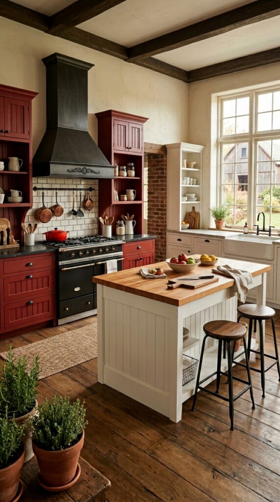
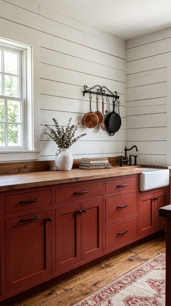
1. Barn Red Lower Cabinets With White Uppers
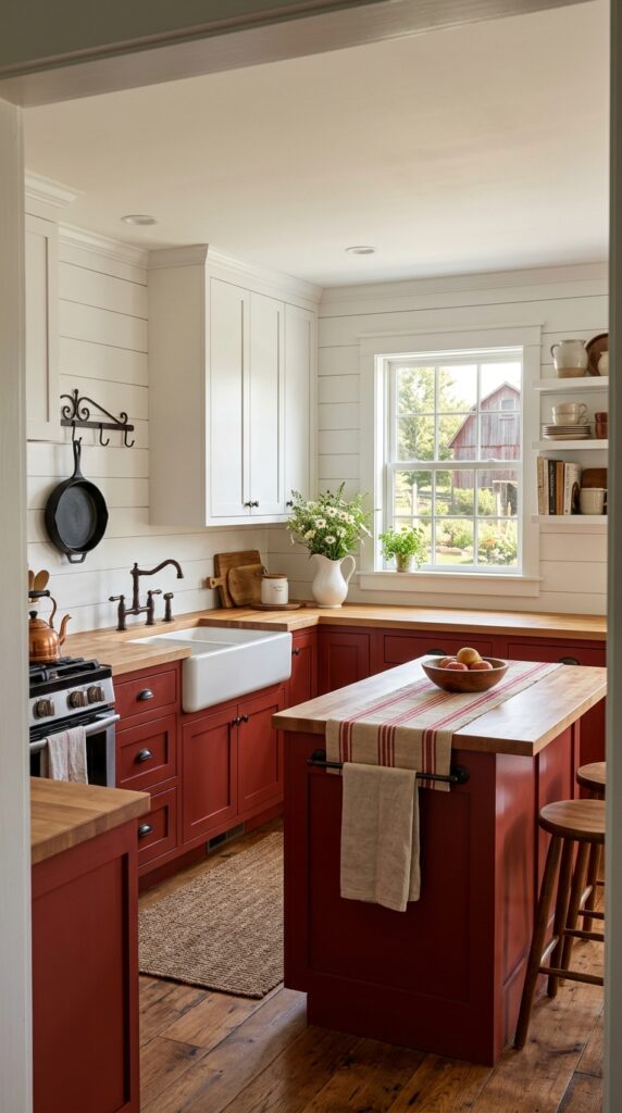
Vibe: Grounded and confident — the first choice that makes every other decision easier.
Why it works: The two-tone cabinet approach — rich lower tone, light upper tone — follows the visual weight principle: heavier colors read as more grounded when placed lower, which mirrors how nature arranges itself (earth below, sky above). Barn red on the lowers creates the boldest farmhouse statement while white uppers keep the room from feeling boxed in. Butcher block countertops in warm maple bridge the two tones by introducing a material that is simultaneously warmer than white and lighter than the red.
How to get it: Paint lower cabinets in Sherwin-Williams “Heartthrob” (SW 6866) — a desaturated barn red that photographs warmly without reading as candy-bright. Sand cabinet faces, apply a bonding primer, and use a small foam roller for two coats in satin finish. Satin is easier to clean than eggshell in a kitchen environment and holds the red tone more faithfully.
💡 Quick Win: Test a red paint sample on a 12×12 inch piece of foam board and hold it against your existing butcher block or wood countertop before committing — barn red reads very differently against warm wood versus cool stone, and the undertone match is everything.
🛍️ Shop the Look — Amazon Product Ideas
| # | Product Search Phrase | Why It Fits |
| 1 | barn red chalk paint cabinet furniture quart | Core cabinet color |
| 2 | oil rubbed bronze cabinet pulls bar handle set | Hardware complement |
| 3 | white ironstone pitcher farmhouse kitchen counter | Counter styling piece |
| 4 | red cream grain sack stripe table runner | Island textile accent |
| 5 | butcher block countertop maple unfinished 6 foot | Countertop material |
2. Red-and-Cream Grain Sack Curtains at the Kitchen Window
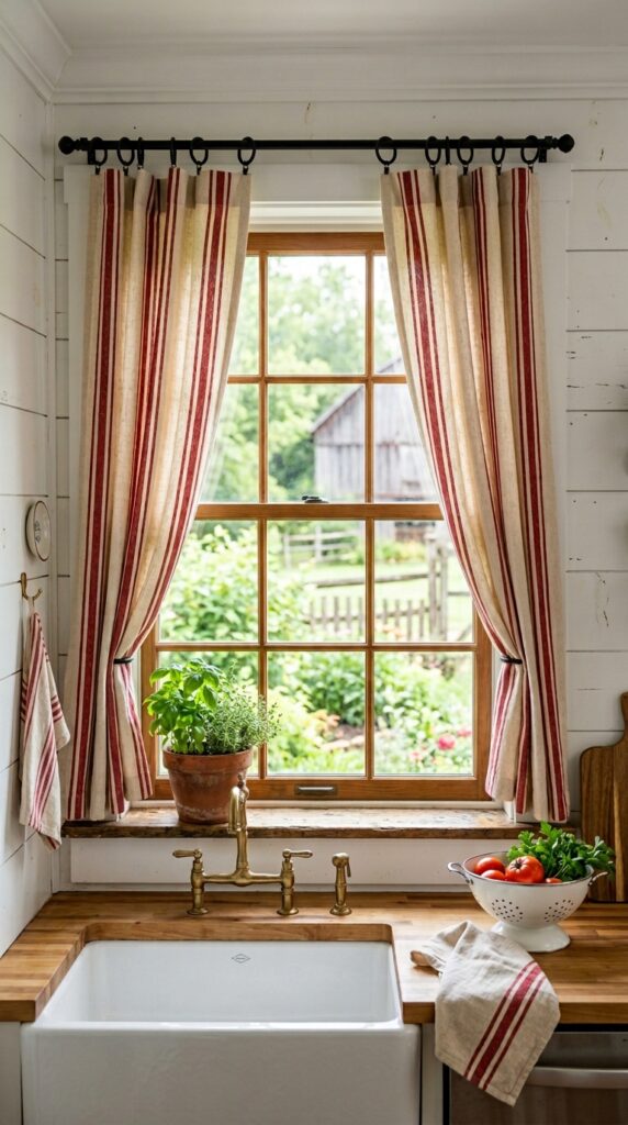
Vibe: Raw and warm — the pattern that started the red farmhouse conversation.
Why it works: Grain sack stripe is the most historically authentic pattern for a red farmhouse kitchen — these woven cotton fabrics were used in actual grain and flour sacks on American farms, and the bold stripe was a practical identification marker rather than a decorative choice. As a curtain material, the wide red vertical stripe introduces the color note at the window without requiring any paint or cabinetry commitment. Vertical stripes also apply the proportion principle of line direction — they draw the eye upward, making the ceiling feel higher and the window feel taller.
How to get it: Hang grain sack stripe panels on black iron curtain rings (not a rod pocket) so the rings become a visible design detail consistent with matte black hardware elsewhere. Use panels that are 1.5x the window width for an adequate gather — too flat and the stripe reads as wallpaper rather than a textile.
🛍️ Shop the Look — Amazon Product Ideas
| # | Product Search Phrase | Why It Fits |
| 1 | red cream grain sack stripe curtain panels kitchen | Core curtain material |
| 2 | matte black iron curtain rings clips set 10 | Authentic hanging detail |
| 3 | black curtain rod 48-84 inch farmhouse | Rod complement |
| 4 | terracotta herb planter pot small windowsill | Sill styling accent |
| 5 | white enamel colander farmhouse kitchen vintage | Counter functional decor |
3. Cast Iron Skillet Wall Display in a Red Kitchen
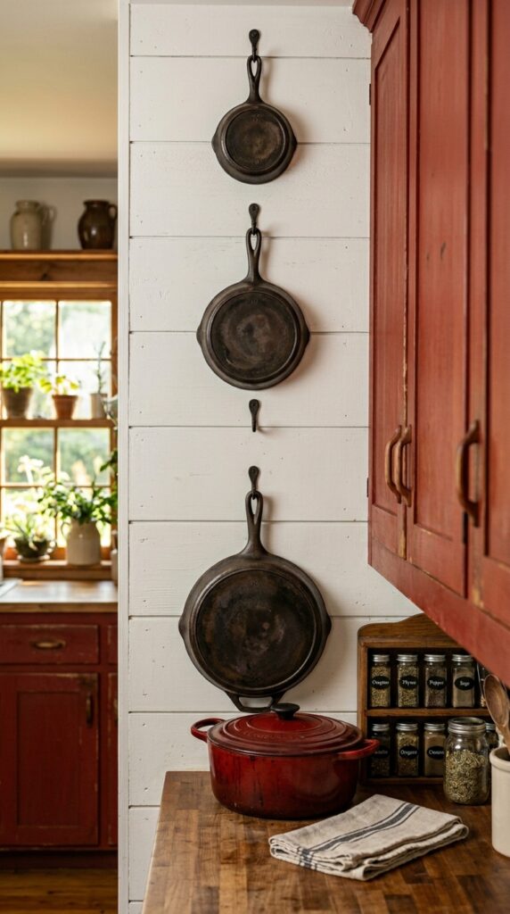
Vibe: Purposeful and warm — functional objects that refuse to hide in a cabinet.
Why it works: A cast iron skillet wall display turns the kitchen’s most honest material into its most honest decor — no pretense, no ornament, just the objects that actually get used. In a red farmhouse kitchen, the dark patina of seasoned cast iron creates a third tone between the barn red and the warm white, preventing the color contrast from feeling binary. The material weight of cast iron also introduces visual heaviness at wall level, which grounds the display and prevents the red cabinetry below from looking too flat or uniform.
How to get it: Use cast iron-specific wall hooks rated for at least 15 lbs each — standard picture hooks are not sufficient. Space skillets in graduated sizes from smallest to largest in a loose diagonal line rather than a rigid grid; the slight informality reads as collected rather than arranged. A 3-skillet display takes about 30 minutes to install.
💡 Quick Win: A red enamel Dutch oven on the stovetop or counter costs $35–$85 and instantly ties the cast iron wall display to the red color story — it’s the ground-level echo that makes the whole wall read as intentional.
🛍️ Shop the Look — Amazon Product Ideas
| # | Product Search Phrase | Why It Fits |
| 1 | cast iron skillet set 3 piece graduated farmhouse | Core wall display pieces |
| 2 | matte black wall hook heavy duty cast iron | Display mounting hardware |
| 3 | red enamel cast iron Dutch oven 5 quart | Counter color anchor |
| 4 | wooden wall-mounted spice rack kitchen rustic | Adjacent wall storage |
| 5 | cast iron seasoning oil skillet conditioner | Skillet maintenance product |
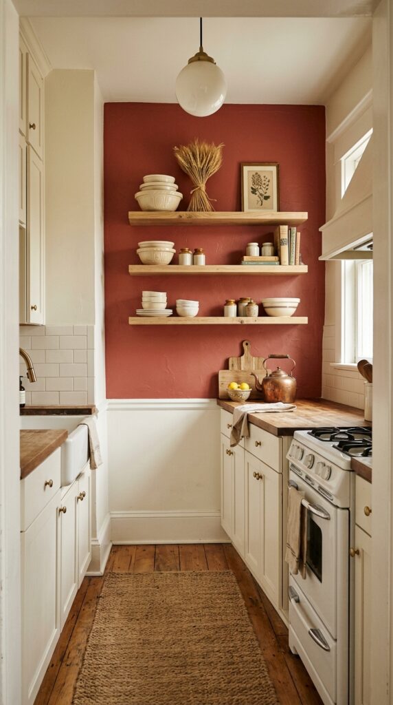
4. Red Farmhouse Kitchen With Open Shelving
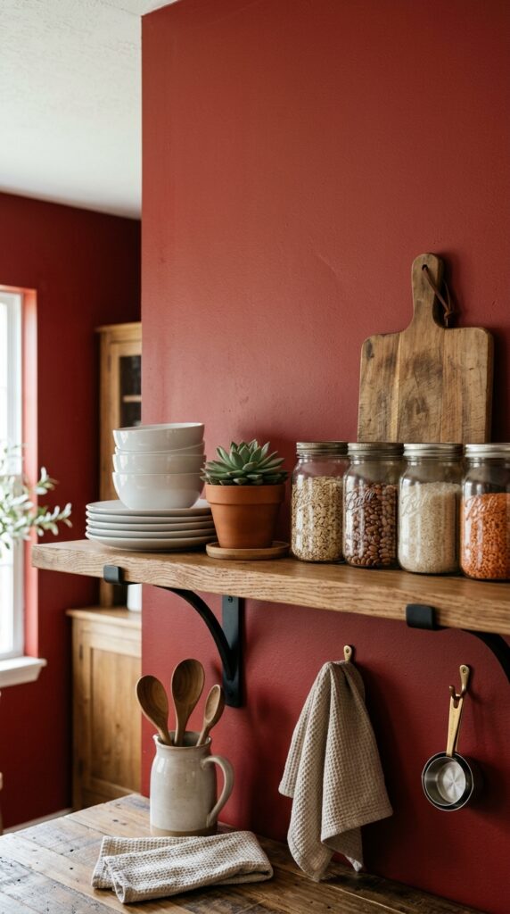
Vibe: Curated and warm — shelving that performs best against the boldest wall in the room.
Why it works: White ceramics displayed against a barn red wall exploit the maximum contrast principle — the crisp white of ironstone plates reads as almost luminous against the deep earthy red, making the shelving display far more visually impactful than the same items against a white wall. White oak shelving bridges the two tones with its warm honey grain, preventing the contrast from reading as jarring. This arrangement also uses the red wall as a backdrop rather than a surface to cover, which keeps the bold color visible and celebrated rather than buried under decor.
How to get it: Paint the single wall behind your open shelving in barn red and leave all adjacent walls in warm white — this focused color application makes the shelving wall read as a composed, intentional vignette rather than an all-over color decision. Use simple black iron brackets so the shelf hardware echoes the dark tones of the wall rather than competing with the ceramics.
🛍️ Shop the Look — Amazon Product Ideas
| # | Product Search Phrase | Why It Fits |
| 1 | white oak floating shelf set natural edge | Core shelf material |
| 2 | black iron shelf bracket heavy duty set 2 | Bracket hardware |
| 3 | white ceramic stacking plates set farmhouse | Shelf display ceramics |
| 4 | wide mouth mason jars set 12 quart glass | Shelf storage jars |
| 5 | small succulent arrangement pot white ceramic | Shelf plant accent |
5. Red Enamelware Collection as Counter Decor
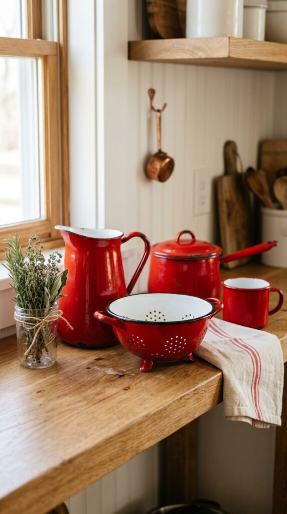
Vibe: Collected and warm — color that belongs to the room because it’s also genuinely useful.
Why it works: Enamelware is the farmhouse kitchen’s most honest approach to introducing red as an accessory rather than a structural commitment — these pieces are functional, historical (enamelware has been a kitchen staple since the 19th century), and immediately recognizable as farmhouse rather than contemporary. Grouping four to five pieces of red enamelware together creates a color moment substantial enough to read from across the room, while keeping each individual piece in its intended role as kitchenware. The white interior of most enamelware also provides the tonal contrast that prevents the grouping from reading as a solid block of red.
How to get it: Source a red enamelware collection by building from one piece at a time — start with a pitcher or colander, then add pieces in the same red (not orange-red, not burgundy — look for classic tomato red with white trim). Display on a dedicated shelf rather than scattering pieces throughout the kitchen; concentration is what makes the color moment land.
💡 Quick Win: A single red enamel pitcher on an open shelf or the counter, filled with wooden spoons and spatulas, costs $18–$35 and acts as the room’s red accent anchor — it’s functional, historical, and immediately farmhouse.
🛍️ Shop the Look — Amazon Product Ideas
| # | Product Search Phrase | Why It Fits |
| 1 | red enamelware pitcher white interior farmhouse | Hero enamelware piece |
| 2 | red enamel colander kitchen vintage style | Enamelware set addition |
| 3 | red enamel mug set farmhouse camp style | Collection builder |
| 4 | natural linen dish towel oatmeal stripe kitchen | Counter textile beside |
| 5 | dried herb bundle mason jar kitchen shelf decor | Shelf adjacent styling |
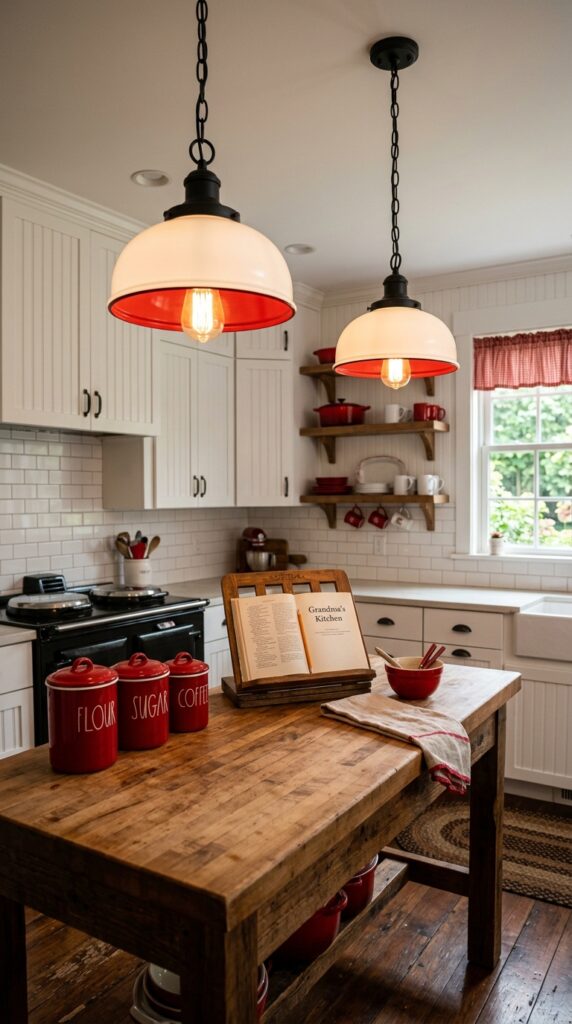
6. Pendant Lights With Red Accents Over the Island
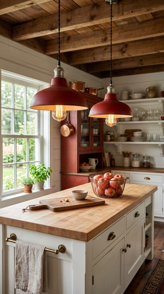
Vibe: Warm and directional — light fixtures that deliver both function and personality.
Why it works: Red-shaded pendant lights introduce the color at ceiling level — the highest possible position in the room — which threads the color through the full vertical space rather than confining it to counter height. The dome shade shape references factory and industrial utility lighting, which sits comfortably within the farmhouse aesthetic’s affection for honest, working-class materials. Positioning the red at the light fixture also means the color is visible from every angle and every seated position, making it the room’s most consistent color element.
How to get it: Hang pendants so the bottom of the shade sits 30–36 inches above the island surface. If red shade pendants feel too committed, use matte black dome shades — the silhouette does the farmhouse work while leaving the red to other elements. Wire pendants on a dimmer to shift between bright task light and warm amber evening ambiance.
🛍️ Shop the Look — Amazon Product Ideas
| # | Product Search Phrase | Why It Fits |
| 1 | red metal dome pendant light farmhouse industrial | Core red pendant fixture |
| 2 | Edison bulb LED warm white 2200K E26 | Period-correct bulb |
| 3 | dimmer switch in-wall single pole rotary | Lighting control essential |
| 4 | wooden cutting board large round kitchen island | Island surface styling |
| 5 | wicker basket small red apples kitchen counter | Counter color accent |
7. Red Kitchen in a Small Galley Layout
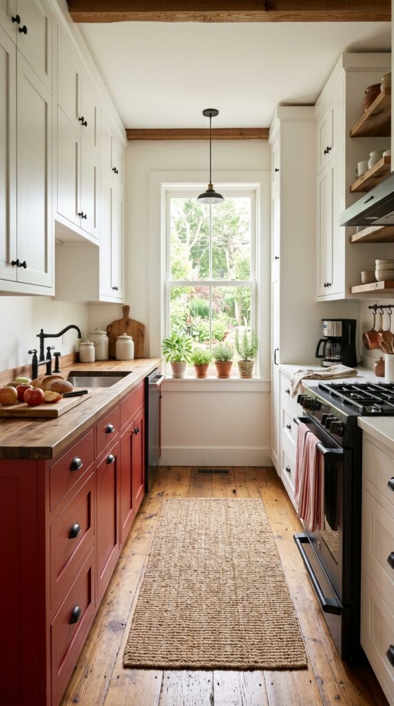
Vibe: Efficient and bold — a galley kitchen that commits to color on its own terms.
Why it works: In a galley layout, applying red to only one wall of lower cabinets is the correct proportion decision — full red on both sides would close the narrow space in visually. Single-side color application follows the asymmetry principle: the eye moves between the red wall and the neutral white opposite, which actually makes the galley feel wider because the contrasting walls create a sense of visual movement. The white terminal wall at the far end (where the window sits) maintains the light-borrowed depth that galley kitchens depend on.
How to get it: Paint only the lower cabinets on the longer wall of the galley — the wall that is most visible from the entrance. Keep the opposite wall in white or greige entirely, including lower cabinets. This creates the maximum contrast effect at the minimum visual cost to the room’s sense of space.
💡 Quick Win: A single red dish towel draped over the oven handle in an otherwise neutral galley kitchen costs $8–$12 and tests whether your eye responds well to red in that space before you commit to a paint project.
🛍️ Shop the Look — Amazon Product Ideas
| # | Product Search Phrase | Why It Fits |
| 1 | barn red chalk furniture paint quart matte | Cabinet color for galley |
| 2 | red linen dish towel kitchen farmhouse style | Color test accent |
| 3 | under counter cabinet organizer pull out | Galley storage efficiency |
| 4 | white tension rod small window inside mount | Galley end window curtain |
| 5 | magnetic knife strip wood mount wall galley | Space-saving galley tool |
8. Brick Red Backsplash Tile in a Farmhouse Kitchen
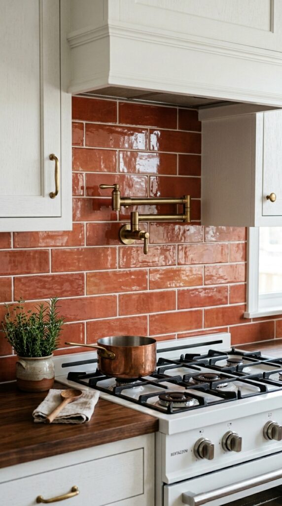
Vibe: Tactile and grounded — the kind of backsplash that makes the stove wall a feature.
Why it works: Handmade-look terracotta subway tile introduces red at the backsplash zone — the most architecturally permanent position in the kitchen — while the tile format (rectangular, horizontally laid, grout-jointed) keeps the installation feeling farmhouse-appropriate rather than contemporary. The slight color variation between individual tiles (brick red to dusty terracotta) is the quality that distinguishes handmade-look tile from standard ceramic; this imperfection is the material honesty the style values. White grout rather than matching or dark grout makes the tile pattern legible and keeps the backsplash from reading as a solid block of color.
How to get it: Look for terracotta-tone subway tiles with a matte or satin finish rather than a high gloss — glossy red tile reads as Spanish tile or bistro rather than farmhouse. Fireclay Tile and similar manufacturers offer handmade terracotta options; for a more accessible budget, search “handmade look matte terracotta subway tile” on Amazon or at Home Depot.
🛍️ Shop the Look — Amazon Product Ideas
| # | Product Search Phrase | Why It Fits |
| 1 | terracotta red subway tile handmade look matte | Core backsplash tile |
| 2 | white tile grout sanded 10 lb bag | Grout for tile installation |
| 3 | brushed brass pot filler wall mount kitchen | Range wall hardware |
| 4 | notched trowel tile installation tool set | DIY tile tool |
| 5 | tile adhesive mastic white kitchen backsplash | Tile adhesive material |
9. Red Farmhouse Kitchen Island as the Focal Point
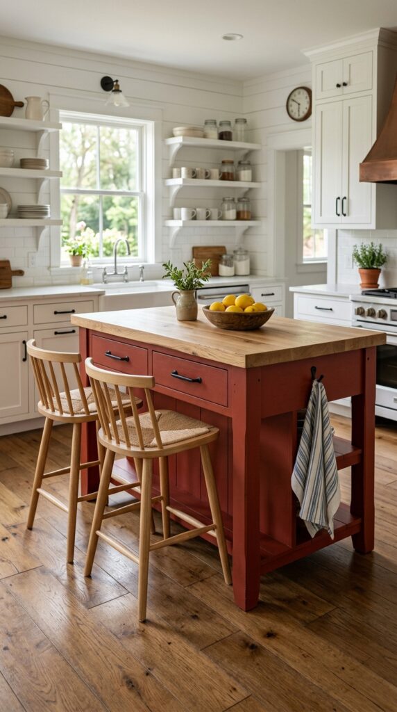
Vibe: Anchored and alive — an island that makes the whole kitchen orient around it.
Why it works: Painting only the island in barn red while keeping all surrounding cabinetry white is the most controlled and reversible way to introduce red as a dominant color. The island becomes the room’s focal point by color contrast alone — no architectural modification required. A butcher block top in warm maple softens the red’s intensity by introducing a third warm tone between the bold cabinet color and the white walls, preventing the island from reading as a stranded red object in a white room.
How to get it: Use a freestanding or semi-freestanding island rather than built-in cabinetry for this look — the furniture-style format reinforces the farmhouse principle of pieces that could theoretically be moved, which feels less permanent and more curated than a bank of red built-in cabinets. Attach a simple hook or two to the island’s end panel for hanging dish towels; this functional detail reads as both practical and styled.
💡 Quick Win: A wooden bowl of lemons or red apples on the island top costs under $15 total and is the single most photographable counter styling move in a red farmhouse kitchen — the yellow-against-red or red-on-red color story photographs vibrantly.
🛍️ Shop the Look — Amazon Product Ideas
| # | Product Search Phrase | Why It Fits |
| 1 | freestanding kitchen island butcher block red | Core island furniture |
| 2 | natural wood counter stool 24 inch farmhouse | Island seating |
| 3 | wooden bowl large kitchen fruit display | Island styling piece |
| 4 | farmhouse dish towel hook iron single black | Island functional hook |
| 5 | bonding primer spray cabinet furniture adhesion | Island paint prep |
10. Red and Wood: The Two-Tone Farmhouse Kitchen
Vibe: Balanced and warm — color and material in a conversation that neither dominates.
Why it works: Pairing red paint with natural wood shelving uses the principle of material contrast — the solid, opaque quality of painted red cabinets is softened by the organic, grain-visible quality of natural oak. Red and natural wood are historically aligned in the farmhouse aesthetic (barn red exteriors with wood-framed interiors), so the combination reads as both bold and rooted. The key is keeping white walls as the neutral connector — without a unifying white, the red and wood combination can feel too rustic or too busy.
How to get it: Apply red to the lower cabinet run and install natural white oak floating shelves on the perpendicular wall — this “L” arrangement of color versus material creates the dialogue without requiring either surface to do all the visual work. Use the same matte black bracket and hardware finish on both sides to connect the two zones.
🛍️ Shop the Look — Amazon Product Ideas
| # | Product Search Phrase | Why It Fits |
| 1 | natural white oak floating shelf 36 inch | Wood shelving material |
| 2 | matte black heavy duty shelf bracket set | Connecting hardware |
| 3 | white ceramic crock set farmhouse kitchen | Shelf styling ceramic |
| 4 | wooden trivet round natural handle kitchen | Counter material accent |
| 5 | dried botanical bunch kitchen shelf display | Shelf organic accent |
11. Vintage Red Farmhouse Kitchen Signs and Wall Art
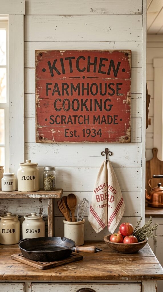
Vibe: Nostalgic and warm — wall art that earns its place because it has something to say.
Why it works: A vintage farmhouse kitchen sign serves the style’s philosophy of making the domestic feel valued — text-based wall art in a kitchen space (referencing cooking, gathering, or the farm itself) connects the room to its purpose. Red-painted signs on aged wood extend the color into the upper half of the wall, threading red through the room’s full vertical range rather than keeping it at counter or cabinet level. The distressed finish is essential — a freshly painted sign reads as novelty décor; an aged sign reads as inheritance.
How to get it: Create a vintage-look sign using a pine board (pre-stained in Minwax “Dark Walnut”), a stencil in a period-appropriate serif font, and red chalk paint. Sand back the letters lightly after they dry, then seal with matte wax. Total material cost: under $25 for a sign that looks like it’s been in the family for decades.
💡 Quick Win: A pre-made distressed farmhouse kitchen sign in red and black from Amazon runs $18–$30 and is one of the fastest color introductions available — hang it above the sink or stove for maximum visibility.
🛍️ Shop the Look — Amazon Product Ideas
| # | Product Search Phrase | Why It Fits |
| 1 | farmhouse kitchen sign vintage red wood wall decor | Core wall art piece |
| 2 | flour sack dish towel set cotton white kitchen | Counter textile accent |
| 3 | red apple decorative display kitchen counter | Counter color echo |
| 4 | chalk paint red quart furniture craft | DIY sign paint |
| 5 | stencil kit farmhouse letters serif wood sign | DIY sign tool |
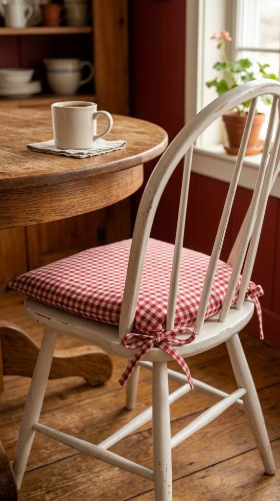
12. Red Gingham Textiles in a Farmhouse Kitchen
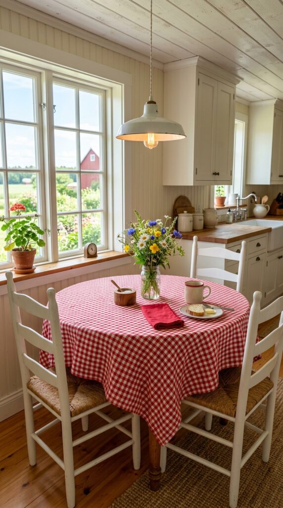
Vibe: Cheerful and warm — the textile equivalent of Sunday morning.
Why it works: Red and white gingham is the most universally recognized farmhouse kitchen textile — it appears in American domestic interiors from the mid-1800s through the present day as tablecloths, curtains, and apron fabric. As a table covering, gingham introduces the color note at the horizontal surface rather than the vertical cabinet face, which means it can be changed seasonally without any commitment or cost. Small-scale gingham (1-inch check or smaller) reads as more refined and authentically farmhouse than large-scale; large-scale gingham tips toward picnic rather than kitchen.
How to get it: Use a gingham tablecloth that’s 12–14 inches longer than the table on each side — the relaxed drape is what makes it read as farmhouse rather than formal. Pair with white ladder-back or Windsor chairs to keep the surrounding furniture palette calm and let the gingham carry the color moment.
🛍️ Shop the Look — Amazon Product Ideas
| # | Product Search Phrase | Why It Fits |
| 1 | red white gingham tablecloth cotton round 60 inch | Core textile color piece |
| 2 | white ladder-back dining chair farmhouse set 2 | Table seating complement |
| 3 | mason jar glass vase small wildflower table | Table centerpiece |
| 4 | wooden salt cellar small with spoon | Table styling detail |
| 5 | red cloth napkins cotton farmhouse set of 4 | Textile color extension |
13. Brick Red Painted Walls in a Small Red Farmhouse Kitchen
Vibe: Enveloping and warm — a small kitchen that uses color to feel richer rather than larger.
Why it works: In a small kitchen, a single accent wall painted in dusty brick red (Benjamin Moore “Caliente” or Sherwin-Williams “Antique Red”) creates the warmth and depth of a fully colored room without the visual compression of painting all four walls. The accent wall technique focuses the eye rather than surrounding it, which means the space reads as intentional rather than small. White shelving and trim against the brick red wall maximize the contrast principle — the bright white reads as even crisper against the deep warm red background, making the shelving display more impactful than it would be against a neutral wall.
How to get it: Apply the brick red to the wall that is most directly opposite the kitchen’s entrance — this is the wall the eye naturally lands on first, and the paint placement will feel immediately impactful rather than peripheral. Keep all other walls in a bright warm white (Benjamin Moore “White Dove” or Sherwin-Williams “Alabaster”) to prevent the room from feeling compressed.
💡 Quick Win: A small aged copper kettle on the counter beside a red accent wall costs $25–$45 and creates the warm metallic accent that connects the red to natural materials without requiring any additional decor investment.
🛍️ Shop the Look — Amazon Product Ideas
| # | Product Search Phrase | Why It Fits |
| 1 | dusty brick red interior paint sample quart matte | Accent wall color |
| 2 | copper tea kettle stovetop small farmhouse | Counter metallic accent |
| 3 | dried wheat bundle kitchen shelf display | Shelf botanical accent |
| 4 | white ironstone bowl set nesting farmhouse | Shelf styling ceramic |
| 5 | white paint eggshell quart trim adjacent walls | Adjacent wall paint |
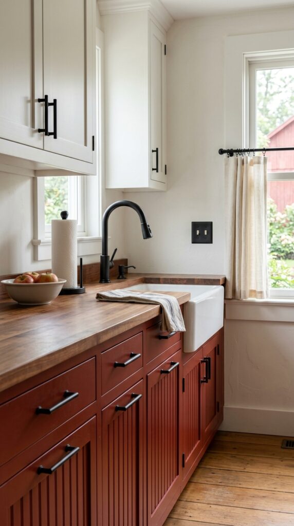
14. Red Kitchen With a Farmhouse Apron Sink
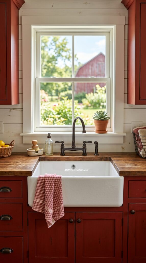
Vibe: Purposeful and warm — the contrast of white and red doing exactly the work it’s supposed to.
Why it works: The white fireclay apron front against barn red lower cabinets is the most concentrated example of the contrast principle in a red farmhouse kitchen — two highly saturated values (the deepest warm white and the deepest warm red) at close proximity produce the maximum visual impact from the most functional element in the kitchen. This contrast also draws attention to the sink zone, effectively making it the room’s focal point before any additional styling is added. The oil-rubbed bronze faucet introduces the warm metallic tone that connects the red to the room’s broader warm palette.
How to get it: Choose a fireclay apron sink rather than a stainless or composite option — the matte, slightly chalky quality of fireclay white sits against barn red without any visual conflict, while stainless reflects the red and creates an unintended orange-tinted effect. KOHLER’s “Whitehaven” fireclay and Ruvati’s fireclay apron sinks are the most widely reviewed options at accessible price points.
🛍️ Shop the Look — Amazon Product Ideas
| # | Product Search Phrase | Why It Fits |
| 1 | white fireclay apron front farmhouse sink single | Core sink element |
| 2 | oil rubbed bronze gooseneck kitchen faucet | Period-correct faucet |
| 3 | red white stripe linen dish towel kitchen | Sink styling towel |
| 4 | small succulent pot white ceramic windowsill | Sill plant accent |
| 5 | shiplap peel and stick panel white backsplash | Backsplash complement |
15. Red Farmhouse Kitchen Lighting: Schoolhouse Pendants
Vibe: Nostalgic and warm — lighting that references the schoolroom and the farmhouse simultaneously.
Why it works: Schoolhouse globe pendants are one of the most historically rooted farmhouse lighting forms — they appear in American domestic and institutional interiors from the early 1900s and carry an authenticity that more decorative pendant forms lack. Using pendants with a red interior accent (the inside of the globe shade painted red) introduces the color at the light source itself, which means every time the light glows it projects a warm red ambient tone into the surrounding space — a color behavior that no purely decorative red element can replicate.
How to get it: If pre-painted red interior pendants aren’t findable within budget, buy standard white schoolhouse globe pendants and spray the inside of the globe with red enamel spray paint — the effect is identical once the bulb is lit. Use warm white LED bulbs rated at 2200K for the warmest, most amber-toned light output.
💡 Quick Win: A red ceramic canister set on the counter below your pendants runs $25–$45 and connects the pendant’s color accent to the horizontal surface below, completing the color thread from ceiling to counter.
🛍️ Shop the Look — Amazon Product Ideas
| # | Product Search Phrase | Why It Fits |
| 1 | white schoolhouse globe pendant light farmhouse | Core pendant fixture |
| 2 | red enamel spray paint gloss indoor heat resistant | Interior globe paint |
| 3 | warm white LED bulb 2200K E26 vintage | Period-correct bulb |
| 4 | red ceramic canister set kitchen counter | Counter color anchor |
| 5 | wooden recipe book stand holder kitchen counter | Counter functional decor |
16. Red Farmhouse Kitchen Layout: The Two-Zone Kitchen
Vibe: Organized and warm — a kitchen that knows what it’s doing and where.
Why it works: Designating the cooking zone (range, hood, adjacent cabinet run) as the “red zone” and keeping the prep zone (island or secondary counter) in white creates a functional layout logic that is also visually coherent — the color change signals the zone change. This is the zone definition principle applied with color rather than walls or furniture. The cooking zone’s red cabinetry benefits from the heat and energy association of the color (red has long been culturally linked to fire and cooking), making the design choice both practical in meaning and authentic in farmhouse precedent.
How to get it: Install a dark matte black range hood above the red cooking zone — its dark tone bridges the red cabinetry and the white ceiling without requiring an additional design element. The contrast between the red walls and the black hood at the zone’s center creates a deliberate focal point that anchors the layout.
🛍️ Shop the Look — Amazon Product Ideas
| # | Product Search Phrase | Why It Fits |
| 1 | matte black wall mount range hood farmhouse | Cooking zone anchor |
| 2 | white kitchen island freestanding butcher block top | Prep zone furniture |
| 3 | barn red wall paint interior flat quart | Zone color material |
| 4 | jute rug runner 2×6 natural kitchen | Zone transition rug |
| 5 | black iron pot rack ceiling mount kitchen | Cooking zone storage |
17. Antique Red Painted Hutch as Kitchen Storage
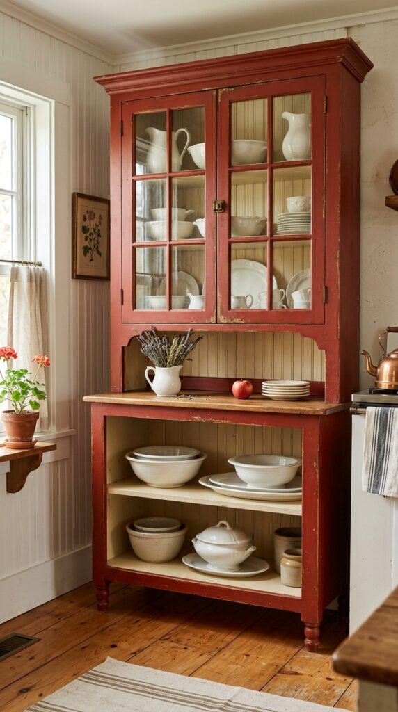
Vibe: Collected and timeworn — a piece that makes the kitchen feel like it accumulated its character slowly.
Why it works: A freestanding painted hutch introduces the red color note as a piece of furniture rather than an architectural element — it can be moved, repainted, or replaced, which makes it the most reversible red commitment in the kitchen. The distressed finish is the material quality that earns the piece its farmhouse credibility: visible paint wear at corners and edges signals genuine use and history, not a manufactured finish. Glass-front upper doors make the hutch’s white ceramic contents part of the room’s visual story, providing a built-in contrast between the red exterior and the white interior display.
How to get it: Distress an existing hutch or new furniture piece using Rust-Oleum Chalk Paint in “Barn Red” followed by fine-grit sandpaper at corners, edges, and areas that would naturally see wear. Finish with clear furniture wax rather than polyurethane — the wax gives a soft, aged surface quality that polyurethane’s sheen destroys.
💡 Quick Win: Apply chalk paint in barn red to any existing wooden hutch or buffet using a wide brush rather than a roller — the brush marks that result actually enhance the aged, handpainted quality that farmhouse style rewards.
🛍️ Shop the Look — Amazon Product Ideas
| # | Product Search Phrase | Why It Fits |
| 1 | farmhouse hutch freestanding storage cabinet red | Core furniture piece |
| 2 | chalk paint barn red furniture quart brush-on | Hutch paint material |
| 3 | clear furniture wax paste matte finish | Paint sealing wax |
| 4 | white ironstone serving bowl collection | Hutch display ceramic |
| 5 | dried herb bundle small pitcher hutch decor | Hutch styling botanical |
18. Red Kitchen With Natural Rattan Accents
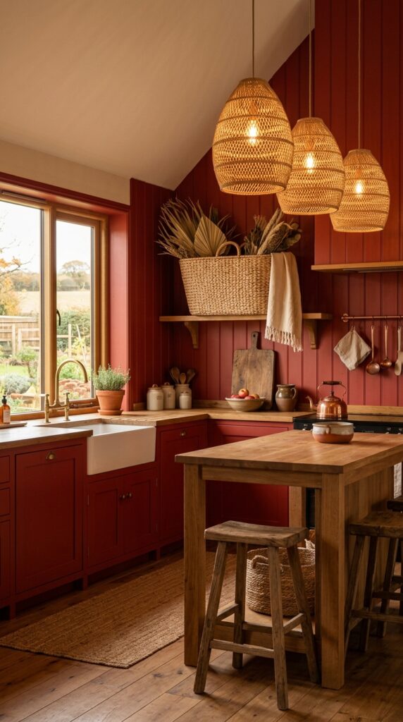
Vibe: Warm and layered — the organic texture that keeps red from reading as too loud.
Why it works: Natural rattan in its undyed tan tone is the most effective material for softening red in a farmhouse kitchen — its warm honey-amber color sits between the red and the warm white, acting as a tonal bridge rather than a contrast. This is the material mediation principle: introducing a third tone that shares undertones with both the dominant color and the neutral base prevents any two-tone room from feeling binary or stark. Rattan also introduces organic texture (the woven warp and weft pattern) that interrupts the flat painted surface of red cabinetry with something tactile and dimensional.
How to get it: Start with rattan in a pendant light shade — this places the organic material at the highest possible position in the kitchen and makes the rattan visible from all angles. A rattan pendant shade in the 12–16 inch diameter range fits most farmhouse kitchen proportions above an island or peninsula.
🛍️ Shop the Look — Amazon Product Ideas
| # | Product Search Phrase | Why It Fits |
| 1 | rattan pendant light shade kitchen woven natural | Material softening piece |
| 2 | rattan storage basket medium kitchen open shelf | Shelf rattan element |
| 3 | dried palm leaf stems bundle natural decor | Basket botanical insert |
| 4 | linen kitchen dish towel natural undyed | Counter texture layer |
| 5 | wooden cutting board round handle leaning shelf | Shelf styling surface |
19. Red Kitchen Accessories: The Non-Commitment Approach
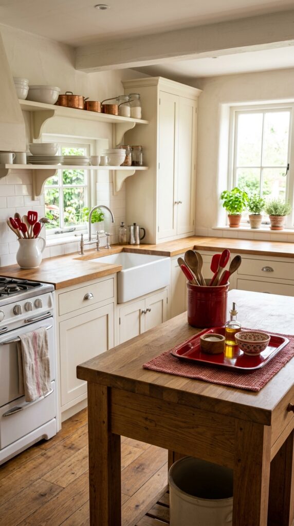
Vibe: Collected and warm — color that belongs to the room because it arrived one piece at a time.
Why it works: The accessories-only approach to red in a farmhouse kitchen uses the repetition principle — the same color appearing in four or five different objects and materials creates a color story as cohesive as paint, without any of the permanence. The key is that each red item must be in a different material: one enamel, one ceramic, one textile, one metal. Varied material in a single color prevents the accessories from reading as a matched set (which feels manufactured) and makes them read as collected (which feels authentic and farmhouse).
How to get it: Build the red accessory story over several shopping trips rather than in a single purchase — the “collected” quality is undermined when everything arrives in the same box. Start with a red woven placemat (the lowest commitment), then add a red ceramic crock, then a red enamel tray. Each addition builds the color momentum without requiring the next one.
💡 Quick Win: A set of red-handled kitchen utensils in a white ceramic pitcher runs $15–$25 total and is the fastest way to introduce red as an accessory without a single item feeling out of place — it’s both functional and styled.
🛍️ Shop the Look — Amazon Product Ideas
| # | Product Search Phrase | Why It Fits |
| 1 | red kitchen utensil set silicone handle wood | Utensil holder contents |
| 2 | white ceramic pitcher kitchen utensil holder | Utensil display vessel |
| 3 | red enamel tray rectangular kitchen serving | Tray counter accent |
| 4 | red woven placemat cotton farmhouse set of 4 | Table textile accent |
| 5 | red stoneware crock kitchen counter storage | Ceramic color piece |
20. Shiplap Walls With Red Cabinet Paint in a Farmhouse Kitchen
Vibe: Textured and grounded — two farmhouse classics in conversation.
Why it works: Shiplap’s horizontal shadow lines at wall level create a textural rhythm that prevents red cabinets from reading as flat planes of color — the wall behind the cabinets is already doing design work, which means the red cabinetry sits against a surface rather than floating on a blank one. The white shiplap also introduces the maximum possible tonal contrast to barn red at close proximity, which makes the red appear deeper and richer rather than brighter. This is a specific light behavior: warm whites make warm reds appear more saturated when placed side by side.
How to get it: Install shiplap (or peel-and-stick shiplap panels) on all kitchen walls before painting cabinets, so the horizontal lines extend uninterrupted behind the cabinetry and above the countertop. Paint shiplap in a flat or eggshell finish — the subtle shadow gaps between boards are the texture detail, and a high-sheen finish on the shiplap would compete with the red cabinet paint for visual attention.
🛍️ Shop the Look — Amazon Product Ideas
| # | Product Search Phrase | Why It Fits |
| 1 | white peel stick shiplap panel wall kitchen | Shiplap wall material |
| 2 | flat white interior wall paint gallon | Shiplap paint finish |
| 3 | white ceramic bud vase kitchen counter decor | Counter styling piece |
| 4 | iron pot rack ceiling mount hanging kitchen | Cooking zone storage |
| 5 | caulk white paintable shiplap seam finish | Shiplap seam sealing |
21. Red Farmhouse Kitchen With Black Hardware Throughout
Vibe: Precise and warm — the hardware doing the room’s most quietly important work.
Why it works: In a red farmhouse kitchen, matte black hardware is the essential visual connector — it bridges the barn red cabinetry and the warm white walls by introducing a neutral tone that relates to both without being either. Matte black specifically (rather than oil-rubbed bronze or brushed brass) creates the sharpest, most modern-farmhouse contrast against barn red, which prevents the kitchen from reading as “country” or “retro.” The repetition principle applies here at the hardware scale: using matte black on every fixture and fitting creates a design thread that ties a visually complex kitchen together.
How to get it: Replace all hardware simultaneously rather than piece by piece — partial replacement in a red kitchen looks immediately unfinished because the contrast between the old and new finish is amplified by the bold cabinet color. Cabinet pulls in matte black run $3–$18 each depending on source; Rejuvenation and Schoolhouse Electric offer premium options, while Amazon carries virtually identical profiles at $3–$6 each.
💡 Quick Win: A matte black paper towel holder ($15–$22) on the counter is the smallest, most practical way to introduce a hardware note in a red kitchen — it sits at eye level and reinforces the finish language used on cabinet pulls.
🛍️ Shop the Look — Amazon Product Ideas
| # | Product Search Phrase | Why It Fits |
| 1 | matte black cabinet bar pulls set of 10 | Core hardware upgrade |
| 2 | matte black kitchen faucet single handle | Sink hardware complement |
| 3 | matte black paper towel holder countertop | Counter hardware detail |
| 4 | white linen counter cloth kitchen runner | Counter textile under hardware |
| 5 | matte black light switch plate cover set | Wall hardware consistency |
22. Red Farmhouse Kitchen Chair Cushions and Seat Pads
Vibe: Domestic and gathered — comfort made visible and color made comfortable.
Why it works: Chair cushions are the most low-commitment and frequently overlooked opportunity to introduce red in a farmhouse kitchen — they’re at seat level, which is the height at which people most often interact with the kitchen’s design when seated, and they’re easily removable and replaceable. Tied-back cushion covers in red grain sack stripe or gingham on white painted chairs complete the material narrative of the room’s textiles: the grain sack on the cushion echoes the grain sack curtain at the window, threading a consistent textile note through the room at two different heights.
How to get it: Sew simple tie-back cushion covers from grain sack stripe fabric (available by the yard from fabric stores or Etsy for $8–$14 per yard) using a 2-inch foam insert cut to the chair seat size. Add four fabric tie loops at the corners and rear rail positions. Total cost per cushion: $12–$18 in materials, versus $25–$40 for a purchased equivalent.
🛍️ Shop the Look — Amazon Product Ideas
| # | Product Search Phrase | Why It Fits |
| 1 | red grain sack stripe chair cushion cover ties | Core cushion textile |
| 2 | white Windsor dining chair farmhouse painted | Chair complement |
| 3 | foam cushion insert chair pad 14×14 inch | Cushion fill material |
| 4 | red gingham kitchen chair pad set of 4 | Alternative cushion option |
| 5 | white ceramic farmhouse mug set of 4 | Table adjacent styling |
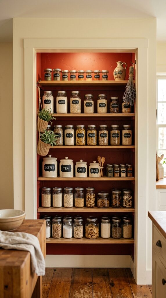
23. Red Farmhouse Kitchen With Open Pantry Display
Vibe: Warm and ordered — a pantry that rewards opening the door.
Why it works: Painting a pantry alcove interior in barn red while keeping the exterior wall and shelves in white creates a “jewel box” effect — a moment of rich color revealed only when you look inside. This interior color application technique is a specific design strategy that confines the bold color to a defined architectural zone, making it feel intentional and controlled rather than aggressive. The white shelves against the red walls replicate the same contrast effect as open shelving on a red accent wall, but in a three-dimensional space rather than a flat surface.
How to get it: Apply barn red only to the three interior walls of the pantry alcove (back and two sides), leaving the shelves, trim, and exterior surround in white. Use a foam roller for smooth application on the walls, and be meticulous with the cut-in line where the red wall meets the white shelf — this precision edge is what separates the jewel box effect from a messy paint job.
💡 Quick Win: Chalk-label your pantry jars with white chalk paint marker in a simple serif font — the white lettering against red-reflected jar labels makes the pantry look editorial rather than utilitarian, and the entire labeling project takes under 30 minutes.
🛍️ Shop the Look — Amazon Product Ideas
| # | Product Search Phrase | Why It Fits |
| 1 | mason jar pantry set wide mouth quart 12 pack | Core pantry storage |
| 2 | white chalk paint marker glass labeling | Jar labeling tool |
| 3 | ceramic canister set white farmhouse kitchen | Pantry display container |
| 4 | small hanging basket hook pantry storage | Alcove hanging detail |
| 5 | dried lavender bunch kitchen pantry decor | Alcove botanical touch |
24. Red Farmhouse Kitchen Runner Rug
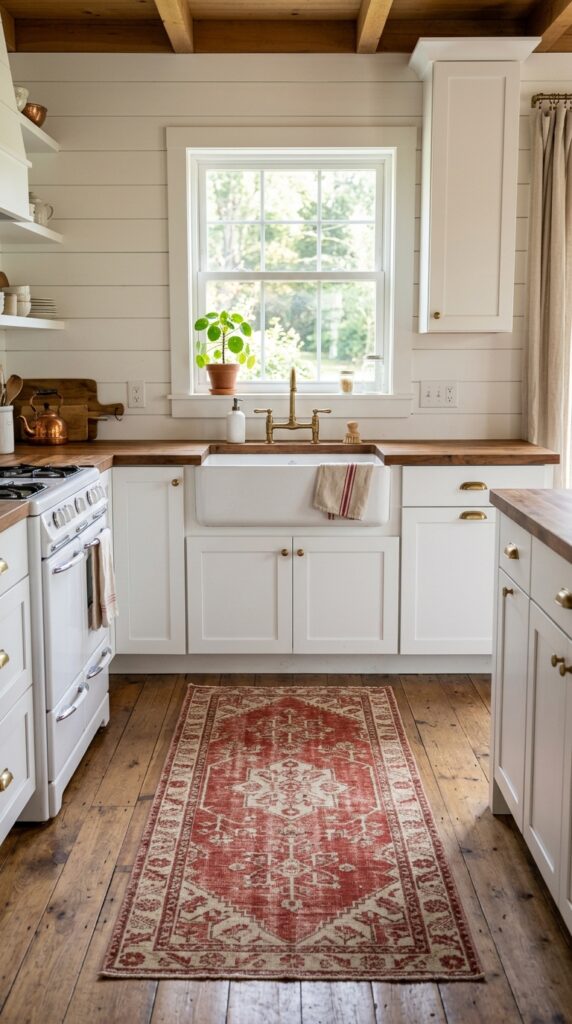
Vibe: Grounded and worn-in — the kind of rug that looks better with every passing year.
Why it works: A red runner rug in front of the farmhouse sink introduces the color at floor level — the lowest possible position — which grounds the red rather than making it advance toward the viewer. Red at floor level reads as warmth underfoot, not as a color demanding attention, which means a red rug can carry significant color without making the kitchen feel dominated by red. A worn or faded vintage-style pattern is essential — a bright, saturated red rug reads as contemporary; a slightly faded one reads as farmhouse.
How to get it: Look for cotton flat-weave runners rather than plush pile — cotton is easier to clean in a kitchen, lies flat naturally (preventing trip hazards), and the woven texture shows the pattern without bulk. A runner in a vintage-style geometric or medallion pattern in barn red and cream reads as more farmhouse-authentic than a solid red runner.
🛍️ Shop the Look — Amazon Product Ideas
| # | Product Search Phrase | Why It Fits |
| 1 | red cream cotton kitchen runner rug 2×6 vintage | Core floor color element |
| 2 | rug pad non-slip kitchen runner thin | Runner safety backing |
| 3 | white ceramic kitchen soap dispenser pump | Sink counter styling |
| 4 | small indoor plant pot white ceramic windowsill | Sill plant accent |
| 5 | red braided oval rug farmhouse cotton | Alternative runner style |
25. Red Kitchen Chalkboard Menu Wall
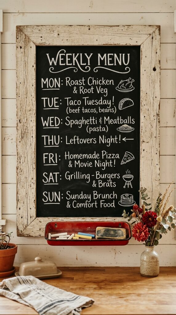
Vibe: Personal and warm — a wall that belongs to the people who live in this kitchen.
Why it works: A chalkboard framed in weathered barn wood introduces a fourth material into the red farmhouse kitchen — the rough, silvered gray of aged barn wood sits alongside red, white, and black to complete the tonal range the style calls for. A red farmhouse kitchen without a dark contrast tone (black chalkboard surface, matte black hardware, cast iron) risks reading as too warm-saturated without relief. The chalkboard’s dark surface provides that tonal anchor at wall level while also serving the farmhouse philosophy of making the domestic feel personal and valued.
How to get it: Build the frame from reclaimed barn wood boards — rough-sawn pine boards treated with a gray wood stain (Varathane “Classic Gray”) approximate the look if reclaimed material isn’t available. Apply Rust-Oleum Chalkboard Paint to the interior panel and season it before first use by rubbing the flat of a chalk stick across the entire surface, then erasing.
💡 Quick Win: A pre-made barn wood framed chalkboard from Amazon (18×24 inch) costs $25–$45 and needs only one nail to hang — position it beside the refrigerator or above a counter for the farmhouse kitchen menu board moment with no DIY required.
🛍️ Shop the Look — Amazon Product Ideas
| # | Product Search Phrase | Why It Fits |
| 1 | barn wood framed chalkboard sign kitchen large | Core chalkboard piece |
| 2 | white chalk sticks thick box for wall writing | Chalkboard writing tool |
| 3 | red enamel chalk ledge tray farmhouse | Frame base ledge detail |
| 4 | dried dahlia stems red artificial display | Adjacent botanical accent |
| 5 | chalkboard paint black quart wall panel | DIY chalkboard option |
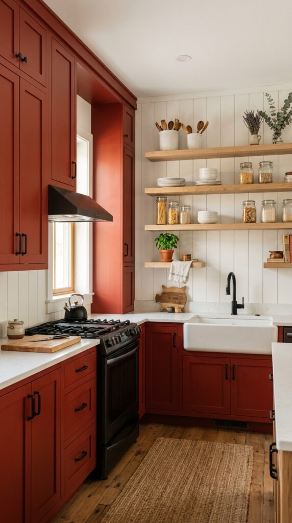
26. Red Farmhouse Kitchen: The Full Bold Commitment
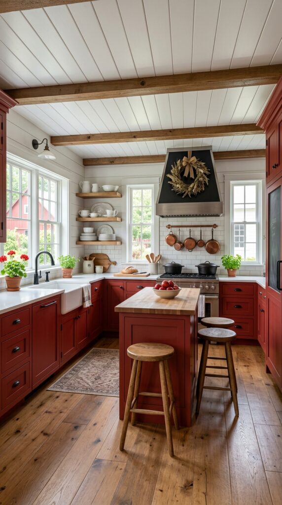
Vibe: Bold and grounded — the full red farmhouse kitchen that makes you stop scrolling.
Why it works: When every cabinet is painted barn red and white is reserved exclusively for walls, ceiling, countertop, and ceramics, the style principle at work is full saturation balanced by material relief. The red is bold, but the white surfaces around it are doing the necessary work of visual breathing room — without white walls, white ceiling, and white or light countertops, an all-red kitchen would feel overwhelming rather than bold. Natural wood open shelving in white oak breaks the red cabinet repetition at wall level and introduces the third material tone that keeps the room from reading as a single-material statement.
How to get it: Commit to the full red only after confirming your kitchen has adequate natural light — barn red in a north-facing kitchen without strong window light reads as dark and heavy rather than warm and rich. South- or west-facing light is the ideal condition for full red cabinetry. Paint all cabinets in a single session rather than section by section for color consistency, and use the same paint batch throughout to avoid visible tone variation between upper and lower cabinets.
🛍️ Shop the Look — Amazon Product Ideas
| # | Product Search Phrase | Why It Fits |
| 1 | barn red interior cabinet paint satin gallon | Core full-room paint |
| 2 | white oak floating shelf set natural 48 inch | Open shelving material |
| 3 | white ironstone serving set kitchen shelf display | White contrast ceramics |
| 4 | dried herb wreath farmhouse kitchen wall decor | Range hood seasonal decor |
| 5 | large cast iron Dutch oven 7 quart stovetop | Stove statement piece |
How to Start Your Red Farmhouse Kitchen Transformation
Start with paint on the island only. Paint your existing kitchen island — or a freestanding butcher block cart — in Sherwin-Williams “Heartthrob” (SW 6866). This single move introduces barn red as the room’s anchor color at the lowest possible commitment: an island can be repainted in an afternoon, costs $30–$50 in paint and supplies, and gives you an immediate, full-scale preview of how barn red reads in your specific kitchen light conditions before you touch a single cabinet door.
The most common mistake in a red farmhouse kitchen is choosing a red with an orange undertone. Orange-based reds (think of tomato red or brick orange) read as warm but clash with warm wood tones — the two warm hues compete rather than harmonize. Barn red, by contrast, has a brown-red base that integrates naturally with butcher block, white oak, and oil-rubbed bronze. The fix: always test paint samples in your kitchen light before buying a full quart, and hold the sample against your countertop material to check the undertone relationship.
Three items under $50 that immediately establish red farmhouse kitchen energy: a red enamel pitcher filled with wooden spoons on the counter ($20–$35); a red-and-cream grain sack stripe dish towel set of two ($12–$18 from Amazon); and a single cast iron skillet hung on a matte black hook on the wall ($15–$22 for the hook; you likely already own the skillet).
A weekend transformation — island paint, new textiles, accessory styling — costs $80–$200. A full cabinet paint project across a standard kitchen takes 2–3 weekends and runs $150–$400 in materials. A full renovation with new cabinetry, fireclay sink, and tile backsplash is a 4–8 week project at $3,000–$15,000.
Frequently Asked Questions About Red Farmhouse Kitchen Ideas
What is the difference between a red farmhouse kitchen and a country kitchen?
Red farmhouse kitchens and country kitchens share a love of warm color and natural materials, but they differ significantly in tone and material quality. Country kitchens tend toward brighter, more saturated reds (cherry red, tomato red) and pair them with heavier pattern — roosters, sunflowers, checkered tile in primary colors. Red farmhouse kitchens use desaturated, earthy reds — barn red, dusty brick — and ground them in honest natural materials: butcher block, fireclay, shiplap, linen. The farmhouse version feels earned and historical; the country version often reads as themed. The distinction is in the red’s undertone: brown-based barn red is farmhouse, orange-based cherry red is country.
What shade of red works best in a farmhouse kitchen?
Desaturated, brown-based barn reds work best in a farmhouse kitchen — they integrate with warm wood tones and neutral whites without reading as too bright or contemporary. The most widely used paint choices are Sherwin-Williams “Heartthrob” (SW 6866), Benjamin Moore “Caliente” (AF-290), and Sherwin-Williams “Antique Red” (SW 0006). Avoid reds with orange or pink undertones, which either clash with warm wood or read as more contemporary than farmhouse. The easiest test: hold your paint sample against a piece of butcher block or warm oak — if the undertones harmonize, it’s the right red.
Is a red farmhouse kitchen expensive to achieve?
Not necessarily. The red farmhouse kitchen is one of the more achievable bold-color aesthetics because the primary investment is paint (for cabinets or a single wall), and paint is the most cost-effective surface change available. A starter approach — accessories only, no paint — can be achieved for under $100 using red enamelware, a grain sack textile, and a runner rug. Painting one island or a lower cabinet run costs $50–$150 in materials. A full kitchen cabinet repaint runs $150–$400 in paint and supplies for a DIY project. The farmhouse style’s alignment with vintage sourcing also makes it unusually thrift-friendly — red enamelware and ironstone are common estate sale finds.
Can I mix red with other accent colors in a farmhouse kitchen?
Yes, but selectively. Red farmhouse kitchens mix best with: warm white (always), natural wood tones (always), matte black (always), and dusty sage green as a secondary accent (occasionally). Sage green and barn red together reference the classic American rural color pairing of barn red structures against natural green landscapes — historically grounded and visually complementary. Avoid mixing red with cool blues, purples, or bright yellows in a farmhouse kitchen — these combinations shift the palette toward “country” or “vintage diner” depending on the secondary color. Dusty terracotta can also work as a secondary accent, as it sits in the same earthy warm family as barn red.
What flooring works best in a red farmhouse kitchen?
Wide-plank hardwood or engineered wood flooring in warm honey, medium oak, or reclaimed pine tones works best in a red farmhouse kitchen. The floor’s warm wood color bridges the barn red cabinetry and the white walls by introducing a continuous warm neutral at the base of the room. Avoid gray-toned or cool ash flooring — these undertones conflict with the warm earth tones of barn red and make the kitchen feel color-disjointed. Terracotta tile flooring is an equally strong choice for the most historically grounded farmhouse option; its warm clay tone echoes the earthy quality of barn red paint. Avoid white, gray, or cold-toned tile — contrast at floor level in a red kitchen amplifies rather than balances the overall color intensity.
Ready to Create Your Dream Red Farmhouse Kitchen?
These 26 ideas covered the full range of what a red farmhouse kitchen can be — from the full bold commitment of all-red cabinetry to the quiet color strategy of a single red enamelware pitcher on a white open shelf. Transformation doesn’t require doing everything at once; the most authentic red farmhouse kitchens are the ones that build their color story slowly, one deliberate piece at a time. Today, order a paint sample of Sherwin-Williams “Heartthrob” and tape it to your kitchen island — live with it for 48 hours in your actual light before you make any decision. When the kitchen is finished, the red won’t feel like a statement you made — it will feel like the room’s personality you uncovered. Pin the ideas that made your pulse quicken a little, especially the ones with a red enamel piece on a white shelf — those small moments are where this whole style lives.