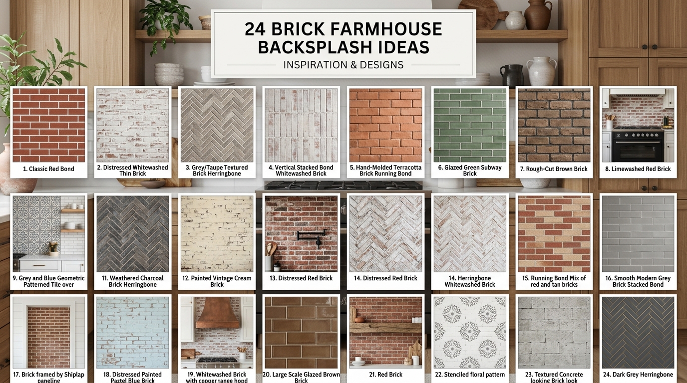
A brick farmhouse backsplash is a kitchen wall treatment that uses real or faux brick — typically in a running bond or stacked pattern — to bring raw, handcrafted texture to a farmhouse-style kitchen. Here are 24 brick farmhouse backsplash ideas spanning color, material, finish, and layout, so you can find the version that fits your exact space.
There’s something deeply grounding about exposed brick in a kitchen. It holds light differently at every hour — dusty and warm in the morning, amber-lit and almost glowing by evening. Paired with farmhouse staples like open shelving, aged brass, and worn wood countertops, a brick backsplash turns a functional surface into the most characterful wall in your home. Here are 24 ideas worth saving — and stealing.
Why Brick Farmhouse Backsplashes Work So Well
The farmhouse kitchen style is rooted in the American rural vernacular of the 18th and 19th centuries — working kitchens built for utility, where materials were local, honest, and built to last. Over time, that utilitarian aesthetic has been refined into something warmer and more intentional, blending aged character with modern comfort. What sets farmhouse apart from, say, rustic or industrial is its softness: it invites rather than intimidates.
Brick farmhouse backsplashes live in a very specific material palette. Think warm whites, aged cream, terracotta blush, antique red, and mortar in warm gray or buff. Surrounding materials tend to be unfinished white oak or pine for shelving, aged brass or matte black hardware, butcher block or honed marble countertops, and undyed linen or cotton for any textiles in the space. A reader could shop this paragraph: creamy Venetian plaster paint, reclaimed Chicago brick, and Rejuvenation’s unlacquered brass pulls all belong here.
Brick backsplashes are surging on Pinterest right now for a very specific reason: post-pandemic homeowners want kitchens that feel human-made, not manufactured. After years of sleek white subway tile, there’s a collective hunger for imperfection — for surfaces that show their age and tell a story. Searches for “exposed brick kitchen” and “farmhouse backsplash ideas” have climbed steadily since 2021, and the trend shows no sign of reversing. People want to feel anchored in their kitchens, not just efficient.
Small kitchens can absolutely achieve this look — with one important caveat. In tight spaces, full-wall brick can feel heavy. The fix is to limit brick to a single focal zone (typically the range wall), keep grout lines tight and pale, and choose a lighter brick tone — cream, whitewashed, or pale buff — over deep red. A thin brick veneer tile (under ½ inch thick) is the practical choice for renters or anyone without structural capability to install real brick.
Style at a Glance
| Element | Core Trait | Core Trait |
| Philosophy | Honest materials, handcrafted character | Warmth over perfection |
| Key Materials | Reclaimed brick, unfinished oak, aged brass | Shiplap, butcher block, linen |
| Key Colors | Warm white, terracotta, antique red, buff mortar | Creamy off-white, muted sage, warm charcoal |
1. Whitewashed Brick with Open Shelving
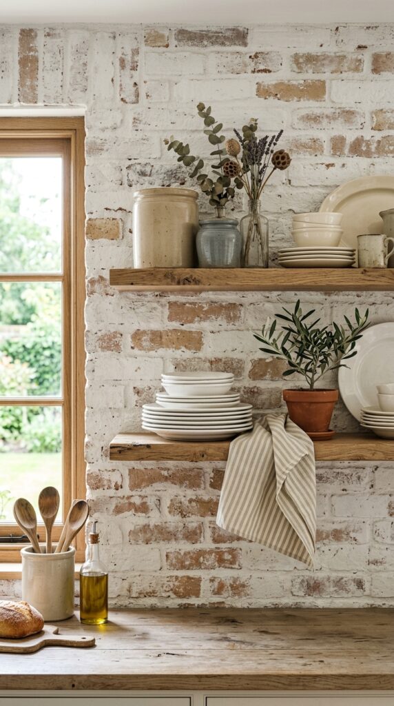
Vibe: This kitchen has a sun-washed, still quality — like it’s been lived in gently for decades.
Why it works: Whitewashing brick doesn’t erase its texture — it unifies the color while letting the dimensional surface breathe. The technique creates what designers call “layered neutrals”: a white wall that reads white but contains multitudes. When paired with open shelving in unfinished white oak, the combination hits the farmhouse sweet spot between raw and refined. Light bounces off the irregular brick faces in a way flat paint never could.
How to get it: Mix one part white latex paint with one part water. Apply with a stiff brush, working into the mortar joints, then immediately wipe back across the brick face with a damp rag — controlling how much white remains. Test on a single brick before committing.
💡 Quick Win: Pick up a pint of Benjamin Moore “White Dove” thinned 50% with water. It gives a warmer, less stark whitewash than pure white — that creamy undertone is what makes farmhouse feel cozy rather than clinical.
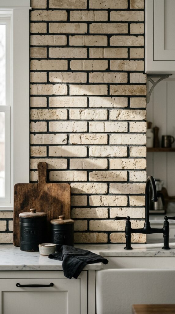
2. Terracotta Brick with Matte Black Hardware
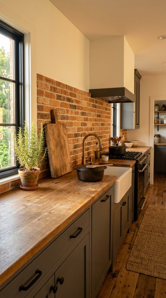
Vibe: Raw and grounded, with the earthy heat of a working kitchen that takes itself seriously.
Why it works: Terracotta brick and matte black hardware operate on the principle of warm-dark contrast — the earthy orange tones of the brick are amplified rather than neutralized by the cool darkness of black metal. This isn’t a clash; it’s a tension that feels intentional. The variation in brick color from piece to piece (even in manufactured thin brick veneer) provides the visual complexity that keeps a dark palette from reading flat.
How to get it: Source thin brick veneer tiles in a “antique red” or “old chicago” colorway from companies like Old Mill Brick — they install over drywall with standard tile adhesive and can be grouted with a warm buff grout to keep the palette cohesive.
3. Floor-to-Ceiling Brick Range Wall
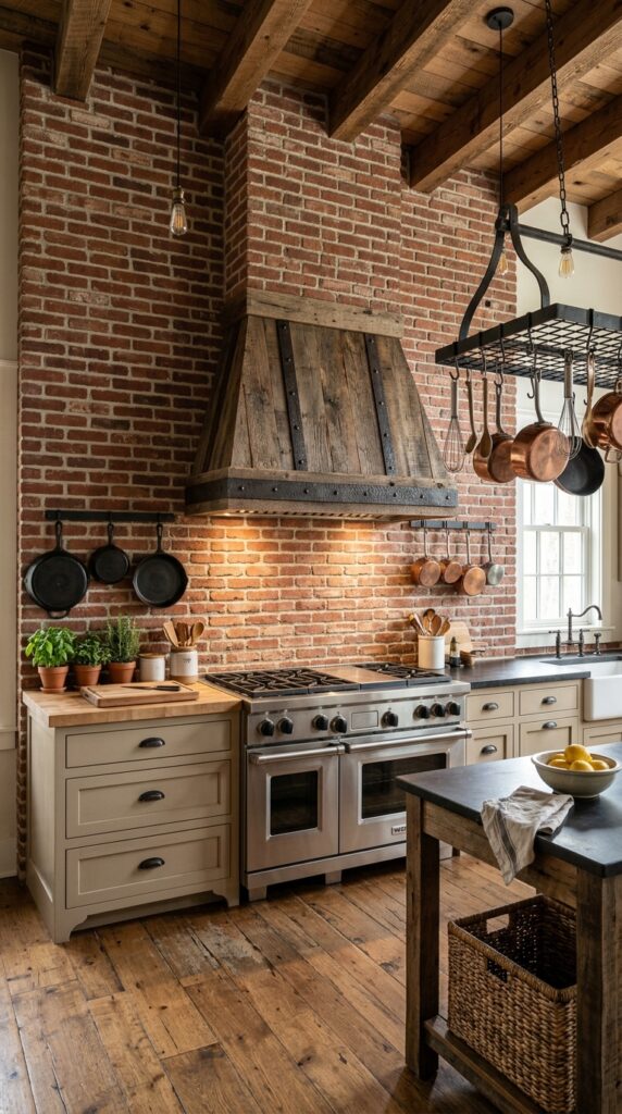
Vibe: The kitchen commands attention — it’s the room’s undisputed anchor, and it knows it.
Why it works: Taking brick from countertop to ceiling eliminates the visual interruption of a backsplash edge and allows the wall to function as a true architectural statement. Design-wise, this is about vertical scale: a full-height feature makes an ordinary kitchen ceiling feel taller by drawing the eye upward. The key is to keep everything else quiet — white or cream cabinets, simple hardware — so the brick wall doesn’t compete. It’s the one element in the room that gets to speak loudly.
How to get it: Frame the range wall with a custom wood hood in rough-hewn fir or reclaimed pine, stained in Early American or Jacobean. The hood’s organic form softens the weight of the full brick wall and introduces the wood element that farmhouse kitchens need to feel warm rather than industrial.
💡 Quick Win: If real brick isn’t an option, Aspect peel-and-stick brick tiles in “Weathered Red” create a convincing floor-to-ceiling look for under $3 per square foot — and they’re renter-friendly.
4. Limewashed Brick in Warm Greige
Vibe: Hushed and chalky-soft — this is farmhouse with the volume turned down to its most elegant register.
Why it works: Limewash on brick achieves something that paint cannot: it seeps into the porous surface, creating color variation at the microscopic level. The result is depth without gloss — a finish that looks aged from the moment it’s applied. In a greige tone (a warm blend of gray and beige), it bridges the gap between cool modern kitchens and warm farmhouse ones, making it the ideal choice for homeowners who want farmhouse texture without the traditional red-brick rusticity.
How to get it: Portola Paints’ limewash products are formulated specifically for masonry and brick. Their color “Arles” — a warm, chalky off-white with just a hint of warmth — gives that authentic aged look without going too yellow. Apply in two coats with a chip brush, letting the first coat dry completely before adding the second.
5. Thin Brick Veneer in a Stacked Pattern
Vibe: Clean without being cold — a farmhouse kitchen that breathes.
Why it works: The stacked pattern (bricks aligned vertically rather than offset) gives thin brick veneer a more structured, architectural quality than a traditional running bond. It reads as slightly more modern, which is exactly what a “contemporary farmhouse” needs: the warmth of brick without the full rustic weight. The tight grout lines (⅛ inch or less) are critical here — wider joints would tip the look back toward traditional, which isn’t the goal.
How to get it: Order thin brick veneer tiles from Inglenook Brick Tiles — their “Dover White” colorway is a warm, lightly textured cream that photographs beautifully. Install with a white polymer-modified thinset and use unsanded grout in a matching off-white for those tight joints.
💡 Quick Win: For a stacked pattern, rent a wet saw for a weekend — a $50 rental fee versus a $200+ daily tile installation quote. Stacked patterns are easier to DIY because every cut is a straight line.
6. Exposed Brick with Industrial Pendant Lighting
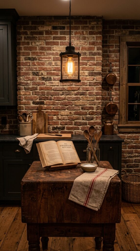
Vibe: Layered and amber-lit — a kitchen that feels better as the day winds down.
Why it works: Raw exposed brick absorbs light rather than reflecting it, which makes it the ideal backdrop for warm pendant lighting. The combination creates what lighting designers call “luminous contrast” — bright pools of warm light against a textured dark surface. This is the farmhouse version of a bistro or wine bar atmosphere. The key principle here is that the brick’s imperfect, handmade surface multiplies the visual interest of even a single bulb.
How to get it: Schoolhouse Electric makes a “Utility Pendant” in oil-rubbed bronze with an Edison bulb that pairs perfectly with exposed brick. Hang it 30–34 inches above the island countertop — lower than you’d expect — for that enveloping, intimate quality.
7. Sage Green Grout with Cream Brick
Vibe: Serene and garden-fresh — a backsplash that makes you want to cook something from scratch.
Why it works: Colored grout is the underrated variable in backsplash design. Sage grout against cream brick creates a gentle color contrast that reads as cohesive from a distance and intricate up close — a quality designers call “integrated complexity.” The muted green tone connects the kitchen to garden and natural elements without needing a single plant in the room. This works especially well with butcher block counters, where the wood’s warm grain echoes the sage’s earthy undertone.
How to get it: Custom-color grout using Laticrete’s SpectraLOCK epoxy system in their “Sage” colorway — epoxy grout is stain-resistant and maintains its color for years, a crucial feature in a kitchen environment. Mix to a smooth, slightly dry consistency before applying.
💡 Quick Win: You can achieve a similar effect by painting existing white grout with Polyblend Grout Renew in “Eucalyptus” — a $12 tube that transforms standard white mortar lines without retiling.
8. Herringbone Brick Pattern Backsplash
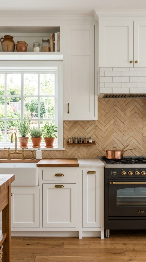
Vibe: Artisanal and considered — a backsplash that looks like someone made a real decision here.
Why it works: The herringbone pattern introduces directional movement to what is otherwise a static surface. Each brick points in an alternating diagonal, which creates a subtle visual pull across the wall — making the eye travel and the backsplash feel larger than it is. This is a proportion technique: the pattern’s geometry makes a short backsplash section feel architecturally important. Warm buff tones keep it firmly in farmhouse territory rather than drifting into Mediterranean.
How to get it: Use a laser level to establish your center point and first diagonal reference line before you set a single tile. Herringbone is unforgiving of a drifting center — that reference line is what keeps the pattern from looking amateur after four or five rows.
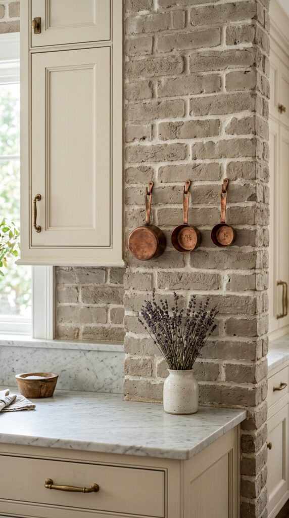
9. Whitewashed Brick with Copper Accents
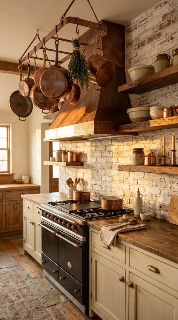
Vibe: Luminous and alchemical — a kitchen that glows from the inside.
Why it works: Copper against whitewashed brick exploits the principle of warm-on-warm contrast — two earthy, warm tones in dramatically different values and finishes. The matte, chalky white of the brick makes the hammered copper’s reflectivity look extraordinary by comparison. This is how accessories drive a room’s character without needing expensive renovations: a single copper range hood or pot rack does more tonal work than a full cabinet repaint.
How to get it: Source a hammered copper pot rack from a company like Solid Copper Products and hang it 40–42 inches above the range surface. If a full copper hood is out of budget, copper-toned cabinet hardware (not painted, but actual solid copper) develops a natural patina that connects the kitchen to the brick’s aged character.
💡 Quick Win: A set of copper measuring cups hung on simple S-hooks along the brick backsplash costs under $30 and creates an instant artisanal moment — functional decor at its best.
10. Brick Backsplash with Shiplap Upper Walls
Vibe: Layered and cottage-sweet — a kitchen built from the ground up with intentional materials.
Why it works: This layout uses what designers call “zone differentiation” — two distinct materials in the same color family that tell the eye where one surface ends and another begins. The rough texture of brick below the countertop transitions to the smooth, flat planes of shiplap above, creating variety without chaos. Both materials are white-painted here, which is what keeps the combination cohesive rather than busy. The visual interest comes from texture contrast, not color contrast.
How to get it: When transitioning from brick backsplash to shiplap above, install a horizontal piece of quarter-round molding at the point where the two materials meet — it gives a clean, intentional finish line that reads as designed rather than improvised.
11. Antique Red Brick with Sage Cabinets
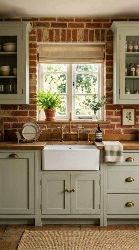
Vibe: Color-rich and grounded — a kitchen that feels like it grew out of the garden.
Why it works: Antique red brick and sage green sit in a split-complementary relationship on the color wheel — they don’t clash because sage is desaturated enough to read as a neutral, but they enliven each other in a way that two neutrals never could. This is one of the most searched farmhouse color combinations on Pinterest for good reason: it’s sophisticated without being precious. The unlacquered brass hardware is the critical third element — it warms the sage and complements the red’s earthy undertones simultaneously.
How to get it: Paint your cabinets with Farrow & Ball “Mizzle” (No. 279) for that specific dusty, botanical sage that photographs beautifully without reading too blue or too yellow under artificial kitchen lighting.
💡 Quick Win: Start with just one cabinet door in the sage color before committing to the full kitchen — hardware stores will mix a sample quart for under $10 that’s enough to test.
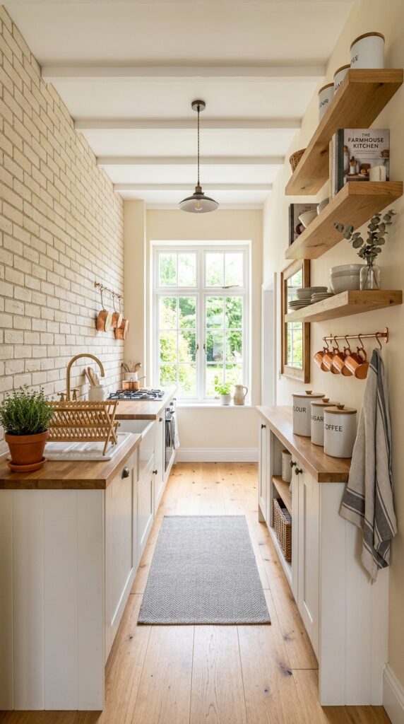
12. Brick Backsplash in a Galley Kitchen
Vibe: Compact and purposeful — every inch earning its place.
Why it works: In a galley kitchen, a brick backsplash on one long wall creates a focal surface that draws the eye down the length of the space — this is a trick of perspective that makes the galley feel longer and more intentional. The key is using a pale brick tone (cream, off-white, or whitewashed) so the textured surface adds depth without adding visual weight. In a narrow space, dark or heavily saturated materials on both walls create a tunnel effect; one pale textured wall avoids this completely.
How to get it: Limit brick to one wall only in a galley — the cooking wall is usually the better choice because it frames the range and creates a clear focal point. Install floating shelves in white oak above the opposite wall’s upper cabinet zone to balance the visual weight without adding solid cabinet bulk.
13. Dark Grout Running Bond for Drama
Vibe: Graphic and moody — a backsplash with serious architectural backbone.
Why it works: Dark grout is one of the fastest ways to make a standard brick backsplash look intentional and designed. The charcoal lines act like a drawn grid — they emphasize the brick’s pattern geometry and give the surface a “framed” quality. This is a technique borrowed from historic masonry buildings, where dark mortar joints were often used deliberately for contrast. Against cream brick, it creates a high-contrast surface without the visual heaviness of fully dark brick.
How to get it: Use Laticrete “Charcoal” or Custom Building Products’ “Charcoal Gray” unsanded grout — specify unsanded because brick joints under ⅛ inch are sealed with unsanded, and the finer texture gives a cleaner line. Seal the grout within 72 hours of installation with a penetrating silicone sealer.
💡 Quick Win: Grout renew pens in charcoal ($12 at any hardware store) can reline existing white grout in a weekend without retiling — the transformation is shockingly effective.
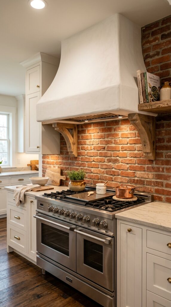
14. Brick Backsplash with a Farmhouse Range Hood
Vibe: Architectural and warm — a cooking alcove that makes the act of cooking feel ceremonial.
Why it works: A custom range hood floating against a brick backsplash creates what designers call a “focal vignette” — a composed scene the eye returns to as a complete unit rather than reading the room piecemeal. The hood’s smooth plaster finish against the rough brick surface is an intentional texture contrast: one material shaped and refined, one raw and structural. The corbel brackets tie the hood to the brick by introducing wood — a material that mediates between the two extremes.
How to get it: A plaster range hood can be DIY’d using a wood-framed form covered in metal lath and finished with pre-mixed base coat stucco. Sand to a smooth but not perfect finish — a few tool marks add to the handmade quality that farmhouse interiors rely on.
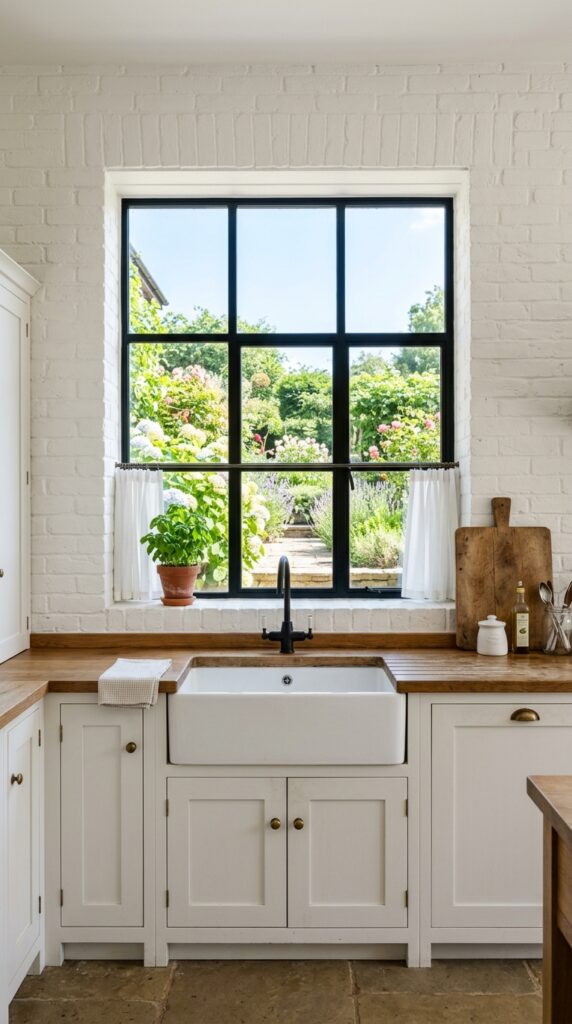
15. White Painted Brick with Black Window Frames
Vibe: Luminous and stripped-back — a kitchen that breathes deeply.
Why it works: All-white painted brick reads completely differently from whitewashed brick — it’s fully opaque, uniform in tone, and emphasizes the three-dimensional texture of the bricks themselves through shadow rather than color variation. The key design move here is the black window frame: it provides the single sharp contrast element that keeps all-white from feeling washed out. Without that dark anchor, the eye has nowhere to rest.
How to get it: Paint brick with a masonry-specific paint like Rust-Oleum’s Zinsser Perma-White, tinted to Benjamin Moore “Chantilly Lace” (OC-65) — a cool, clear white that doesn’t yellow under kitchen conditions. Apply two coats minimum with a thick-nap roller to get into all the surface recesses.
💡 Quick Win: Replace your existing window frame trim with black-painted MDF casing for under $40 in materials — the contrast against white brick is immediate and dramatic.
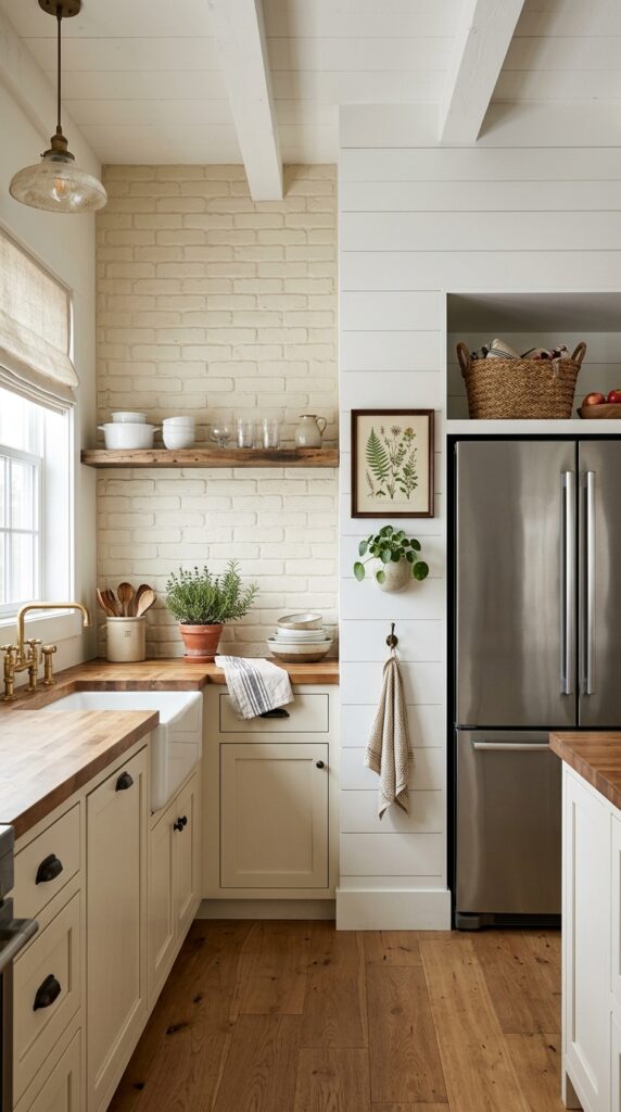
16. Reclaimed Wood Shelves on Brick
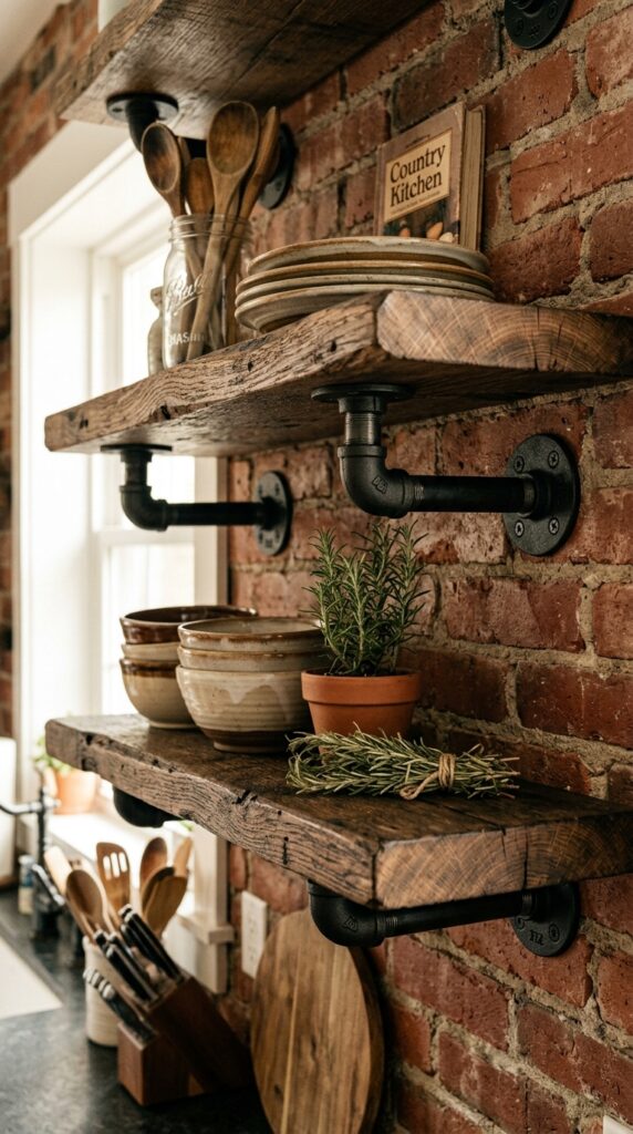
Vibe: Raw and purposeful — like the kitchen has always been this way, and always will be.
Why it works: Mounting shelves directly into brick creates a visual bond between the storage element and the wall surface — they become one system rather than two separate features. The black iron pipe brackets reinforce this by echoing the dark tones of the mortar while adding an industrial-farmhouse edge. Reclaimed wood, with its nail holes, color variation, and surface imperfections, is the only shelf material that holds its own against brick’s strong visual texture without competing or disappearing.
How to get it: Source reclaimed heart pine or barn oak boards at least 2 inches thick from a local salvage yard — aim for boards 10–12 inches deep to hold a full stack of dinner plates. Attach into brick using ½-inch diameter concrete anchors rated for the shelf weight.
17. Brick Backsplash with Vintage Tile Inset
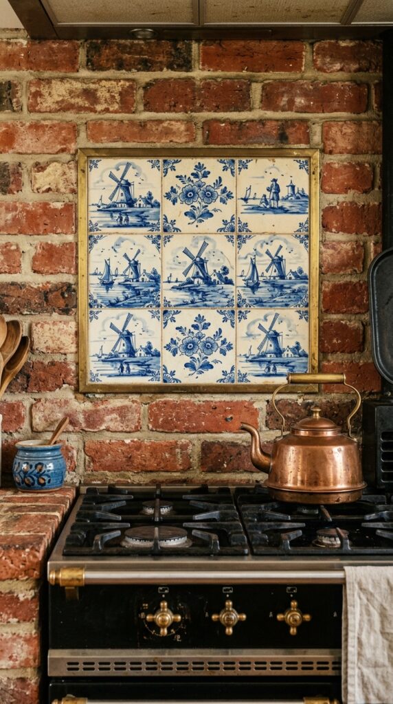
Vibe: Collected and storied — a kitchen that looks like it’s been assembled over a lifetime.
Why it works: A decorative tile inset within a brick backsplash creates what’s known in design as a “jewel box moment” — a small, highly detailed element that rewards close inspection. The surrounding brick acts as a rustic frame, making the delicate hand-painted tile look more precious by contrast. The cobalt blue and cream palette of Delft-style tile connects to farmhouse’s historical Dutch and colonial American roots — it’s a historically grounded combination, not just a trendy one.
How to get it: Etsy sellers specializing in hand-painted Mexican Talavera or Dutch-inspired ceramic tiles offer panels starting at $45–$80 for a 9-tile set. Plan the inset during tile installation — leave a brick-sized opening above the range centerline and frame it with a ⅛-inch brass Schluter strip for a finished edge.
💡 Quick Win: A single decorative tile from a salvage store, mounted on a small plate hanger directly on the brick, achieves a similar collected effect for under $15.
18. Narrow Kitchen with Half-Height Brick Backsplash
Vibe: Considered and light — small-space farmhouse at its most functional.
Why it works: In kitchens with 8-foot ceilings or under, running brick all the way up can feel heavy and top-heavy — particularly if the brick is in a traditional red or buff tone. Limiting brick to the backsplash zone (countertop to approximately 24 inches above) and finishing with painted shiplap above keeps the eye moving upward, preserving the ceiling’s visual height. This is the small-space version of the floor-to-ceiling treatment, and it’s actually more practical for most homes.
How to get it: Define the transition line between brick and shiplap with a continuous piece of 1×4 pine trim, painted white, running horizontally at the top of the brick zone. It gives the half-height treatment a deliberate, designed finish rather than a “we ran out of brick” look.
19. Earthy Tonal Palette: Brick, Linen, and Clay
Vibe: Sun-warmed and deeply rooted — a kitchen that feels physically warm even in photographs.
Why it works: Tonal layering is the technique of stacking multiple materials within the same color family — here, the entire earthy-warm spectrum from pale buff to deep terracotta. When it’s done well, the result reads as sophisticated rather than monotonous because each material brings a different texture and finish to the same hue range. The brick’s rough face, the linen’s open weave, the plaster’s matte smoothness — all warm, all distinct. This approach works particularly well in kitchens that receive a lot of natural light, which activates the warm tones.
How to get it: Anchor the tonal palette by selecting your floor tile first — terracotta from Saltillo Tile or Mission Stone & Tile sets the temperature for every other material decision. Then match brick, plaster, and textiles in the same warm family, varying only texture and value.
💡 Quick Win: A single undyed linen Roman shade (IKEA makes a clean version in “Majgull” that reads beautifully natural) adds immediate warmth to a tonal palette for under $40.
20. Brick Backsplash with Integrated Chalkboard Section
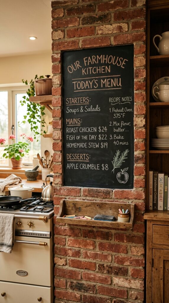
Vibe: Lived-in and functional — a kitchen that wears its daily life as decoration.
Why it works: A chalkboard section within a brick wall works because both materials share a raw, non-precious quality — neither is trying to look perfect, and that’s precisely the point. The dark chalkboard surface creates a strong focal panel within the brick, giving the wall a graphic anchor. For farmhouse kitchens, where function and character are meant to coexist, a chalkboard is one of the most historically honest additions possible — it references the schoolhouse and country store traditions that are part of the style’s DNA.
How to get it: Paint a defined section of brick with Rust-Oleum Chalkboard Paint in Flat Black — apply four to five thin coats over masonry primer to build a smooth writing surface on the naturally rough brick texture. Frame the section with a thin strip of ¾-inch pine trim for a clean edge.
21. Brick Backsplash Behind a Butler’s Pantry
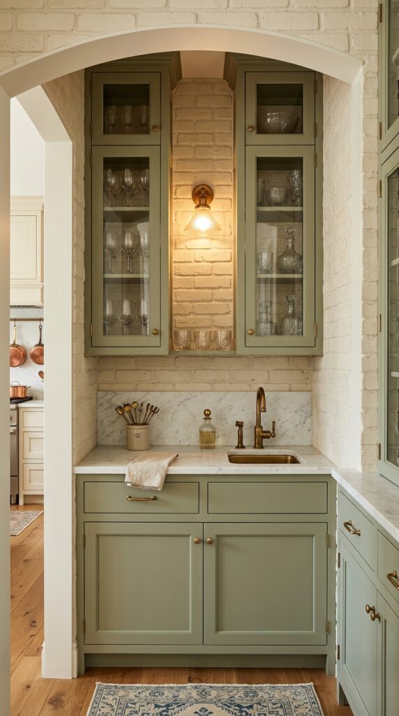
Vibe: Intimate and curated — a tucked-away space that rewards the people who find it.
Why it works: A butler’s pantry is a naturally intimate space, and brick backsplash makes it feel architecturally layered in a way that painted drywall never could. The brick seen through glass cabinet doors creates a depth effect — the eye travels through the glass, past the displayed objects, to the textured brick beyond — adding visual dimension to a small space. The combination of sage cabinetry, cream brick, and brass hardware is a tonal triad that feels considered and collected.
How to get it: Install picture-frame glass inserts in existing cabinet doors using router-cut rebates — a local millwork shop can convert solid shaker doors to glass-insert doors for $15–$25 per door. The glass is what allows the brick to do its visual work from across the room.
💡 Quick Win: Even in a pantry without a bar sink, a simple aged brass cabinet latch ($8 each from House of Antique Hardware) instantly elevates the cabinetry against a brick backdrop.
22. Herringbone Brick with Marble Countertop
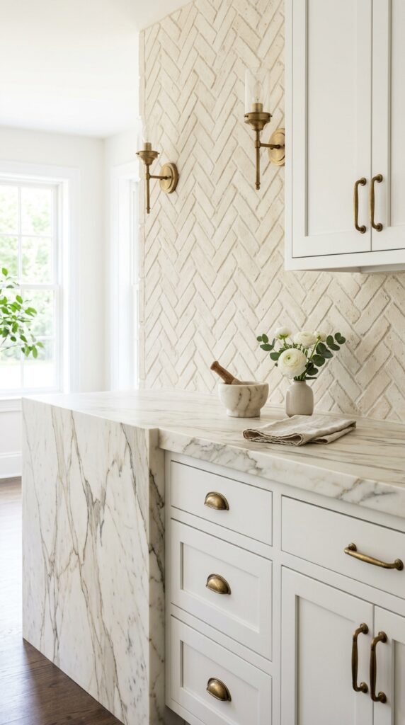
Vibe: Refined and still — the farmhouse kitchen at its most grown-up.
Why it works: Cream herringbone brick and honed Calacatta marble are both textured, naturally imperfect surfaces — which is what makes them work together. The marble’s soft gray veining picks up the cooler undertones in the buff brick mortar, creating a tonal bridge. This is elevated farmhouse: it keeps the handcrafted character of the style but replaces the rustic overtones with something quieter and more considered. A honed (rather than polished) marble finish is critical — polished marble would feel too formal against brick.
How to get it: Specify honed finish when ordering countertops — it costs the same as polished but shows less etching from acids (lemons, wine, vinegar) that are constant in kitchen use. Seal with a penetrating marble sealer every 6–12 months to protect the surface.
23. Brick Backsplash with Vertical Shiplap Accent
Vibe: Airy and quietly layered — a kitchen that rewards a second look.
Why it works: Using vertical shiplap alongside horizontal-running brick introduces a deliberate change in directional line — brick reads horizontally, shiplap vertically. This directional contrast is a layout technique that breaks a wall into intentional zones without using color or a physical partition. The refrigerator alcove, framed in vertical shiplap, becomes its own architectural moment rather than an awkward void where the kitchen “ran out” of material.
How to get it: Use 1×4 or 1×6 pine boards installed vertically with a ¼-inch reveal between each plank (stack a quarter coin between boards as a spacer while nailing). Paint in a bright white — Benjamin Moore “Decorator’s White” has a clean, warm-white quality that doesn’t yellow under kitchen lighting.
💡 Quick Win: Install vertical shiplap on just one short kitchen wall to test the combination. A 4×8 sheet of primed MDF, ripped into 6-inch planks on a table saw, can cover an 8-foot wall section for under $45 in materials.
24. Brick Backsplash with Warm Brass Under-Cabinet Lighting
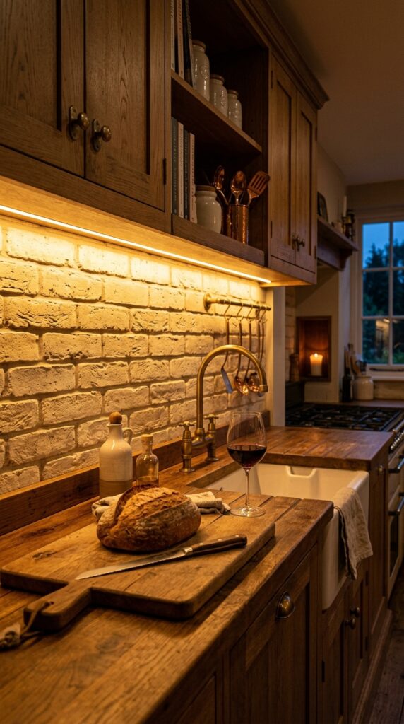
Vibe: Intimate and amber-warm — the kitchen at its most inviting hour.
Why it works: Under-cabinet lighting changes a brick backsplash entirely after dark. The wash of warm light rakes across the brick surface from above, casting a shadow on the lower edge of each brick and highlighting the face of the one above — a technique called “grazing light” that turns every surface imperfection into a feature. The same brick that looks sturdy and earthy in daylight becomes textural and almost cinematic under grazing LED light. This is how lighting transforms material, not just illuminates it.
How to get it: Install Kichler’s LED under-cabinet tape light system in 2700K (warm white) color temperature — not 3000K or 4000K, which reads cool and clinical against brick. Hardwire through the cabinet interior for a clean installation, or use a plug-in version tucked behind the cabinet face for a renter-friendly option.
How to Start Your Brick Farmhouse Backsplash Transformation
Start with the brick selection — specifically its tone. Before choosing grout color, cabinet paint, or hardware, hold a sample of your candidate brick (in its actual veneer or tile form) in your kitchen at three different times of day: morning, midday, and evening under artificial light. A brick that reads warm and creamy in natural light can turn orange or muddy under incandescent light, and that’s the version you’ll live with most often. This single decision — the brick tone — anchors every other material choice that follows.
The most common beginner mistake with brick backsplashes is choosing a grout color that’s too close to the brick face. When grout and brick are nearly the same value and tone, the pattern disappears and you’re left with an undifferentiated surface that looks like textured paint rather than masonry. Go either lighter or darker — by at least two to three shades — and watch the whole pattern come alive.
Three items under $50 that create immediate farmhouse brick impact: a set of simple ceramic canisters in matte off-white by Hearth & Hand at Target ($28 for a set of three), a bundle of dried pampas grass in a simple terracotta vase ($18–22 at HomeGoods or TJ Maxx), and a white cotton waffle-weave kitchen towel hung on an aged brass ring hook ($12 at McGee & Co).
A realistic backsplash transformation timeline: a full peel-and-stick or thin brick veneer DIY installation typically takes one full weekend for an average kitchen (20–30 square feet of backsplash). Budget $200–$500 for materials for a DIY veneer approach, or $800–$2,000 for professional installation of full-depth brick. A “starter” farmhouse kitchen makeover — new backsplash, hardware, and paint — sits comfortably in the $600–$1,200 range for most homeowners.
Frequently Asked Questions About Brick Farmhouse Backsplashes
What is the difference between a farmhouse backsplash and a rustic backsplash?
Farmhouse backsplashes emphasize warmth and intentional character — the materials look aged but chosen, not accidental. Rustic backsplashes lean heavier into raw, unfinished, and even rough-edged materials, often with less curation. A farmhouse brick backsplash in whitewashed cream with a clean mortar joint reads farmhouse; exposed rough-cut fieldstone with uneven grout reads rustic. The dividing line is polish: farmhouse allows for softness and refinement within its natural materials, while rustic resists it. Thin brick veneer tiles in the “Old Chicago” or “Colonial” style tend to land in farmhouse territory; raw quarry stone tends toward rustic.
What colors work best with a brick farmhouse kitchen backsplash?
The most effective pairings for brick backsplash kitchens are sage green, warm white, cream, and soft charcoal — with the specific shade depending on the brick’s undertone. For antique red brick, sage green cabinets (Farrow & Ball “Mizzle” or “Breakfast Room Green”) create a sophisticated, plant-adjacent warmth. For cream or buff brick, warm white cabinets (Benjamin Moore “White Dove” or “Chantilly Lace”) keep the palette cohesive. Charcoal works with either brick tone but is best reserved for lower cabinets only in smaller kitchens, to avoid a heavy feeling.
Is a brick farmhouse backsplash expensive to achieve?
Not necessarily — and this is where thin brick veneer tiles change the game. Real full-depth brick installation (which requires structural preparation and professional masonry work) runs $30–$60 per square foot installed. Thin brick veneer tile, which is real fired clay cut to ½-inch depth, costs $4–$12 per square foot for materials and $8–$15 per square foot installed. Peel-and-stick faux brick panels — like those from NovaBrik or Aspect — drop the cost to $1.50–$3 per square foot. For a standard kitchen backsplash of 25–35 square feet, a DIY thin veneer project typically runs $200–$450 total in materials.
Can I mix a brick backsplash with other styles in my kitchen?
Yes — and some of the most interesting kitchens do exactly that. Brick backsplash pairs naturally with modern farmhouse (add black hardware and clean-lined shaker cabinets), transitional (pair with marble counters and chrome fixtures), and industrial farmhouse (add open pipe shelving and Edison pendants). The key is to use brick as the grounding texture and let other style elements be softer or more polished. Where mixing tends to fail is when a second strong rustic element — like heavily distressed wood floors — competes with the brick rather than complementing it. One raw, textural hero element; everything else should support it.
What lighting works best with a brick farmhouse kitchen backsplash?
Warm-spectrum lighting is non-negotiable with brick backsplashes — specify 2700K bulbs in every fixture. Anything cooler (3000K+) shifts the brick’s warm red and buff tones toward pink or gray, which fights the palette rather than enhancing it. Under-cabinet LED strips (in 2700K) are particularly effective because they graze light down the brick surface and create the shadow-play that makes the texture read. For overhead fixtures, a woven rattan pendant or an aged brass barn light both connect to the farmhouse palette without competing with the brick’s visual weight.
Ready to Create Your Dream Brick Farmhouse Kitchen Backsplash?
These 24 ideas have covered the full spectrum — from the color decisions (sage grout, greige limewash, tonal terracotta) to the material moments (reclaimed wood shelves, copper accents, decorative tile insets) to the layout choices (galley adaptations, floor-to-ceiling drama, half-height transitions for small spaces). You don’t need to do all of it — and you shouldn’t try. Transformation is incremental by design: one material decision opens the door to the next, and each choice becomes clearer once the previous one is in place. This week, pick up a single brick veneer sample tile and hold it against your current kitchen wall in morning light and evening light — watch how the room reacts to it, and let that reaction guide your next move. When the brick farmhouse kitchen is done, it does something specific: it makes your kitchen feel like it belongs to you, built from real material, with real character, in a world that produces too many surfaces that look like they could be anywhere. Pin the ideas that stopped you mid-scroll — those are the ones worth returning to.