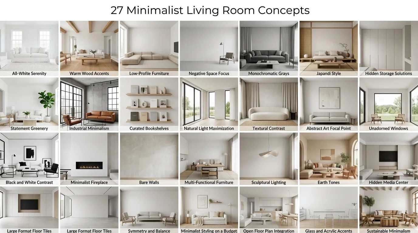
Minimalist living room design is the intentional practice of reducing a space to its most essential, functional, and beautiful elements — nothing displayed without purpose, nothing chosen without consideration. This article gives you 27 distinct minimalist living room concepts organized across color, material, lighting, furniture, accessories, layout, and small-space design.
There’s a particular kind of calm that settles into a room when everything unnecessary has been removed. The air feels cleaner. The furniture breathes. Shadows fall in straight, deliberate lines. Minimalism isn’t about living with less for its own sake — it’s about making every object in the room earn the space it occupies. Here are 27 ideas worth saving — and stealing.
Why Minimalist Living Room Design Works So Well
Minimalist interior design emerged from the collision of two powerful 20th-century movements: the Bauhaus school’s conviction that form must follow function, and Japanese wabi-sabi philosophy’s reverence for simplicity, imperfection, and negative space. What distinguishes true minimalism from simply “sparse” decorating is intentionality — each object is chosen not because it fills a gap but because its presence improves the room. The style draws equally from mid-century Scandinavian modernism (clean profiles, natural warmth) and Japanese ma (the meaningful pause between objects), which is why well-executed minimalist rooms feel both rigorous and deeply livable.
The material palette is precise enough to shop directly from. Think unfinished white oak and honed concrete for hard surfaces; undyed linen, bouclé, and fine wool for textiles; brushed brass, matte black, and warm nickel for hardware and lighting. Color names to anchor your palette: Benjamin Moore White Dove (OC-17) for walls, SW Accessible Beige (SW 7036) for warm greige base tones, Farrow & Ball Mole’s Breath (No. 276) for a warm mid-tone grey, and Natural Linen (2153-50) for upholstery reference.
The cultural pull toward minimalist living rooms has only intensified. Post-pandemic, people spent enough time inside their homes to develop genuine opinions about visual noise — and many found that cluttered rooms produced a low-grade anxiety that simpler spaces did not. Pinterest data consistently shows searches for “minimalist living room” and “japandi interior” among the fastest-growing home categories, reflecting a real and durable shift away from maximalist accumulation toward considered, quality-over-quantity interiors.
Small spaces are, in many ways, where minimalism performs best. The style’s core discipline — choosing one hero piece per visual zone, allowing negative space to breathe — is exactly what prevents a compact living room from feeling claustrophobic. Prioritize a single low-profile sofa with clean lines and one anchor textile. Everything else follows.
Style at a Glance
| Element | Trait 1 | Trait 2 |
| Philosophy | Form follows function | Intentional negative space |
| Materials | Unfinished white oak, honed concrete, linen | Bouclé, brushed brass, fine wool |
| Color palette | Warm white, greige, warm charcoal | Natural linen, dusty sage, matte black |
27 Minimalist Living Room Concepts
1. Warm White and Unfinished Oak Foundation
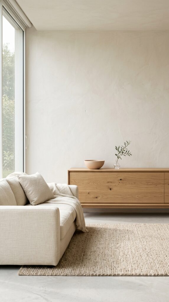
Vibe: Luminous and unhurried — a room that feels like the first quiet hour of the morning, sustained all day.
Why it works: Warm white walls and unfinished white oak operate on the principle of tonal harmony within a narrow warm range — both carry yellow-beige undertones that prevent the space from reading as clinical or cold. White oak’s open grain provides all the visual texture the room needs at the material level, which means decorative accessories can be reduced to near zero without the space feeling bare. The design logic is that the materials themselves become the decoration.
How to get it: Use Benjamin Moore White Dove (OC-17) rather than pure white on the walls — its warm undertone prevents the blue-shift that north-facing rooms produce under cool daylight. Apply it in an eggshell finish, which reads flatter than satin but holds up to daily contact better than flat.
💡 Quick Win: A single white oak floating shelf ($35 to $60 at most hardware retailers) mounted at 56 inches from the floor with nothing but one ceramic bowl on it immediately establishes the minimalist material palette in any room.
| Shop The Look |
| White oak credenza low profile minimalist modern |
| Linen sofa cover ivory natural minimalist |
| Natural wool area rug undyed minimalist |
| Ceramic bowl single handthrown neutral |
| Single stem bud vase white oak base minimal |
2. Monochromatic Greige Palette
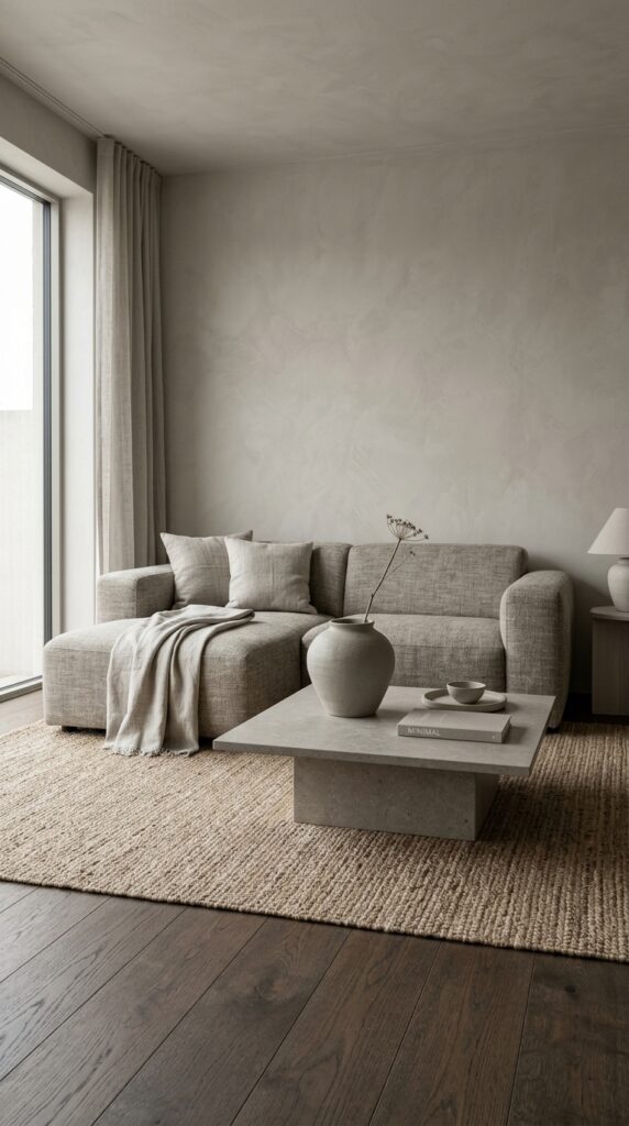
Vibe: Meditative and still — a room where nothing announces itself and everything coheres.
Why it works: A monochromatic palette works in minimalist design through tonal layering — using the same base hue (greige) at multiple values creates depth without introducing visual tension. The secret is material differentiation: greige plaster reads differently from greige linen, which reads differently from a greige-toned honed stone surface, because each material has a distinct texture that catches light uniquely. The eye reads variety in texture even when color is absent, which prevents the space from feeling flat.
How to get it: Anchor the monochromatic palette by introducing one dark element — a dark oak floor, a matte black light fixture, or a deep charcoal trim — to provide the contrast that prevents the room from dissolving into a single undifferentiated tone. Without this anchor, a monochromatic greige room reads as washed out rather than serene.
| Shop The Look |
| Greige linen sofa pillow covers set minimalist |
| Honed stone coffee table grey minimalist |
| Natural jute area rug undyed minimalist |
| Oversized ceramic floor vase greige minimal |
| Natural linen throw blanket undyed minimalist |
3. Single Statement Pendant Light
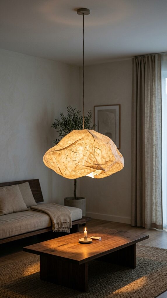
Vibe: Warm and focused — light as a design decision rather than a utility afterthought.
Why it works: A single oversized pendant centered in a minimalist living room applies the principle of light as sculpture — the fixture itself becomes the room’s primary decorative object, which eliminates the need for additional art or accessory layers. A washi paper shade diffuses light into a warm, even glow that eliminates harsh shadows across the room’s surfaces. The pendant hung low (28 to 32 inches above the coffee table) creates an intimate overhead plane that defines the seating zone without walls or rugs.
How to get it: Size the pendant to at least one-third the diameter of the coffee table beneath it — a pendant that is too small reads as tentative and breaks the proportional logic. For a standard 48-inch coffee table, a 16-to-20-inch pendant diameter is the minimum; 24 inches is ideal.
💡 Quick Win: A washi paper pendant shade kit ($25 to $45 online) fits any standard pendant socket and transforms a builder-grade fixture into a considered design statement in under ten minutes.
| Shop The Look |
| Washi paper pendant light shade large minimalist |
| Pendant light cord fabric black minimalist ceiling |
| Low profile oak platform coffee table minimal |
| Single taper candle holder brushed brass minimal |
| Linen curtain panel floor length natural minimalist |
4. Low-Profile Platform Sofa Arrangement
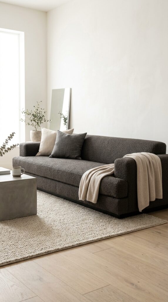
Vibe: Grounded and still — low furniture lowers the room’s visual center of gravity and everything feels more intentional for it.
Why it works: A low-profile platform sofa — seat height 14 to 16 inches versus the standard 18 inches — fundamentally changes a room’s proportional logic. It increases the apparent ceiling height by expanding the visible vertical space above the furniture line, which makes even standard 8-foot ceilings feel generous. Bouclé in warm charcoal provides tactile richness (the looped fabric surface catches light across its texture) while the color grounds the pale palette with the necessary contrast anchor. The absence of exposed legs is deliberate: a platform base reads as more architecturally resolved and less furniture-like.
How to get it: When placing a low-profile sofa, maintain at least 18 inches between the front sofa edge and the coffee table — standard coffee table clearance rules apply even more strictly at low seat heights, because the visual plane is lower and proximity feels more compressed.
| Shop The Look |
| Low profile platform sofa bouclé charcoal minimalist |
| Solid linen throw pillow cover set tonal minimal |
| Cashmere throw blanket natural minimalist |
| Low concrete side table minimalist modern |
| Natural wool flat weave rug minimalist living room |
5. Negative Space as Design Feature
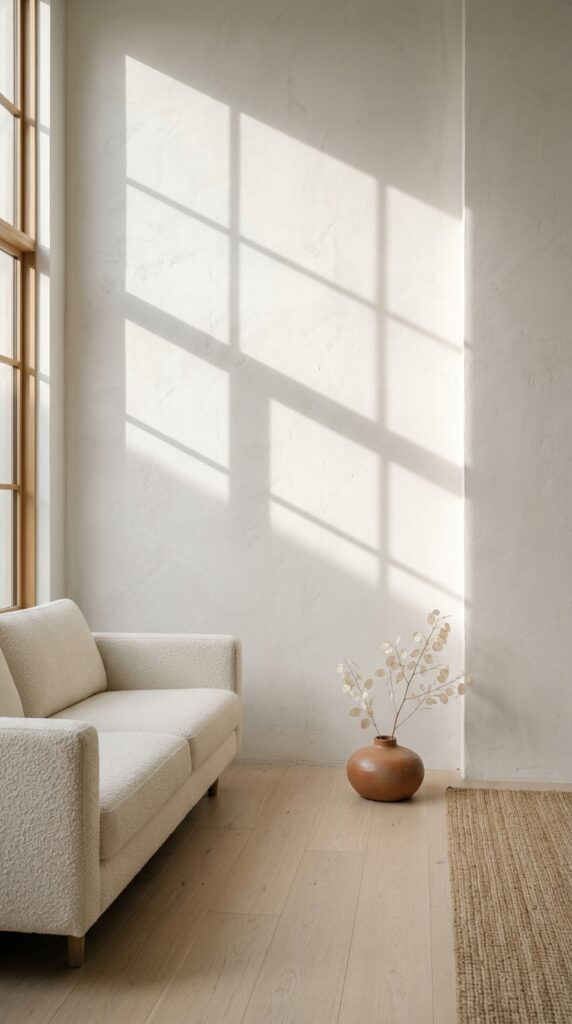
Vibe: Architectural and still — the room that understands emptiness as something you choose, not something you haven’t filled yet.
Why it works: The Japanese concept of ma — meaningful negative space — is the most misunderstood principle in minimalist design. An empty wall is not an incomplete wall; it is a deliberate spatial decision that allows natural light to become the room’s primary visual experience. When afternoon sun casts a geometric window shadow across bare plaster, the wall becomes more dynamic than any art piece could make it. This works because the shadow moves — its angle, intensity, and pattern shift through the day, which means the “decoration” is never static.
How to get it: Choose walls that receive direct sunlight for intentional negative space treatment — north-facing walls in low-light conditions don’t produce the shadow play that makes the technique work. West-facing walls in afternoon light produce the most dramatic geometric shadow patterns.
| Shop The Look |
| Low ceramic floor vase minimal single neutral |
| Smooth plaster wall paint warm white finish |
| Low ivory sofa minimalist platform |
| Natural linen floor cushion minimal accent |
| Honed concrete floor tile large format minimal |
6. Matte Black Accent Framework
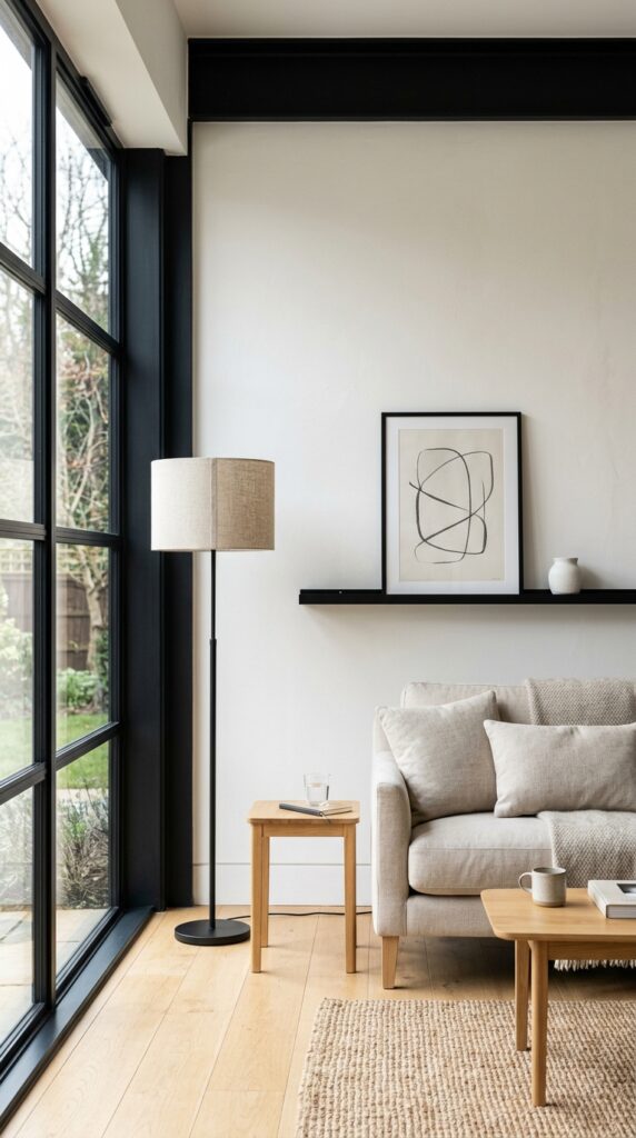
Vibe: Precise and confident — the kind of room where the dark lines make the light feel brighter.
Why it works: Matte black functions as a graphic element in minimalist interiors — it draws the eye to architectural edges (window frames, lighting fixtures, shelving) and creates a visual grid that organizes the room’s pale palette. The design principle is contrast at the framework level: matte black outlines structural elements while everything within that framework stays warm and neutral. This means the room has strong visual structure without requiring color, pattern, or decorative clutter to achieve it.
How to get it: Restrict matte black to architectural and structural elements only — window frames, one light fixture, and possibly a single picture ledge. Introducing matte black into furniture or soft furnishings (a black sofa, black cushions) overwhelms the framework logic and makes the room feel heavy rather than precise.
💡 Quick Win: A matte black picture ledge shelf (36 inches wide, $25 to $40) mounted at eye level with a single small ceramic object creates the entire matte-black-framework effect on a wall that has no architectural features.
| Shop The Look |
| Matte black floor lamp linen shade minimalist |
| Matte black picture ledge shelf wall mount |
| White ceramic object decorative minimalist small |
| Matte black steel window hardware minimal |
| Single framed art print minimalist neutral |
7. Japandi Hybrid Material Story
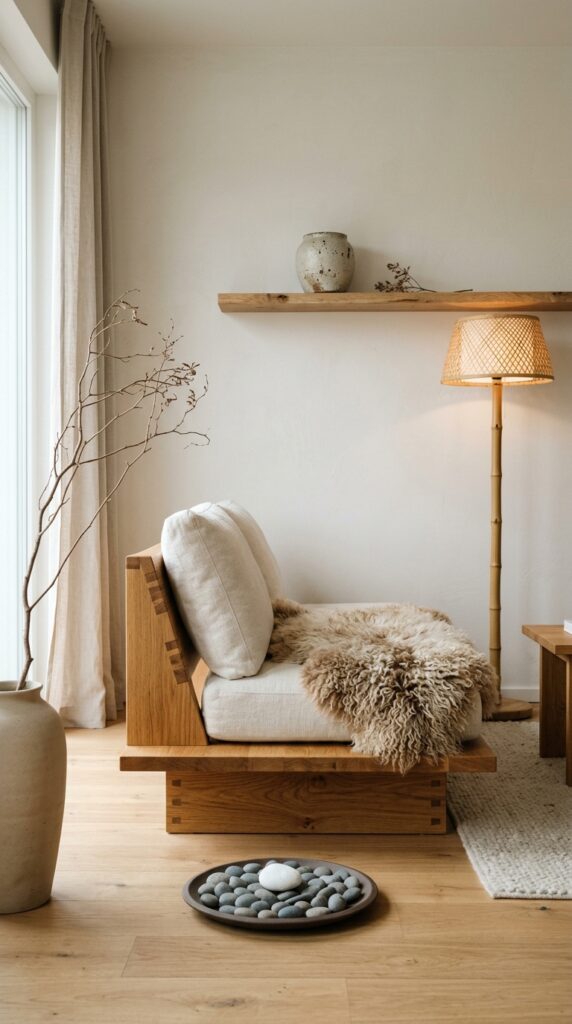
Vibe: Meditative and warm — two slow cultures distilled into one room.
Why it works: Japandi succeeds as a hybrid because Japanese and Scandinavian minimalism share the same material values — natural, imperfect, honest — while differing in emotional register. Japanese minimalism tends toward restraint and emptiness; Scandinavian toward warmth and livability. The combination of a low Japanese platform form with a Scandinavian sheepskin throw is precisely this balance: the form is rigorous, the tactile invitation is generous. Wabi-sabi ceramics (hand-thrown, visibly imperfect) bring the Japanese wabi aesthetic to a surface that also functions as decoration.
How to get it: Choose bamboo or smoked oak for the lighting fixture when styling a Japandi room — these materials bridge the two cultures’ palettes and prevent the lighting from reading as either purely Japanese (too spare) or purely Scandinavian (too hygge-heavy).
| Shop The Look |
| Low profile oak platform sofa Japandi minimalist |
| Natural sheepskin throw rug ivory minimalist |
| Bamboo floor lamp natural minimalist |
| Wabi-sabi handthrown ceramic vase neutral |
| Flat clay pebble tray minimalist accent |
8. Linen Curtain Wall Treatment
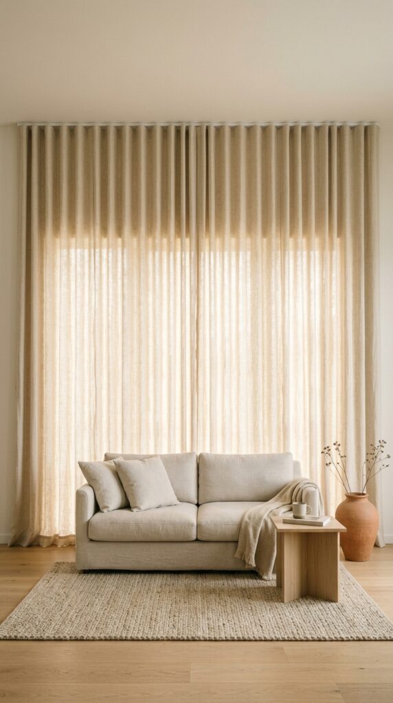
Vibe: Luminous and enveloping — fabric as architecture, the softest wall you’ve ever been near.
Why it works: Running linen curtain panels wall-to-wall rather than window-to-window applies the principle of material continuity — the textile becomes the room’s architectural finish rather than a window treatment. This has multiple design effects simultaneously: it conceals any wall imperfections or awkward architectural features, it softens acoustics noticeably (linen absorbs mid-frequency sound), and it creates a warm, diffused backdrop that makes furniture profiles stand out more clearly. In rooms without strong architectural features, a full linen curtain wall creates the visual anchor the space needs.
How to get it: Use a continuous ceiling-mounted track system rather than individual curtain rods — this allows the panels to glide without exposed hardware interrupting the textile plane. VIDGA or similar ceiling track systems from IKEA handle this at $40 to $80 for a standard wall width.
| Shop The Look |
| Natural linen curtain panel set floor length wall |
| Ceiling curtain track system minimalist |
| Floor ceramic vase single neutral minimal |
| Pale oak side table minimalist modern |
| Natural wool rug minimalist neutral living room |
9. Concrete Coffee Table as Focal Anchor
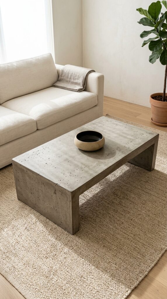
Vibe: Architectural and grounded — a coffee table that feels like it was poured in place.
Why it works: Honed concrete as a coffee table material works in minimalist living rooms because it brings structural weight and visual gravity to the room’s center without introducing color. The surface aggregate variation in concrete means no two tables look identical — this material imperfection is its own form of decoration, aligned with the wabi-sabi principle that values natural irregularity. One ceramic bowl on a honed concrete surface creates a conversation between two hand-finished materials that is more visually interesting than any styled tray arrangement.
How to get it: Hone rather than polish concrete surfaces for minimalist interiors — polished concrete has a reflective quality that reads as industrial or commercial. Honed concrete has a flat, matte surface that absorbs light and feels more residential and warm.
💡 Quick Win: A concrete effect table tray ($20 to $35) placed on an existing coffee table introduces the material language of concrete without furniture investment and immediately reads as a minimalist design choice.
| Shop The Look |
| Honed concrete rectangular coffee table minimalist |
| Single handthrown ceramic bowl neutral minimalist |
| Linen sofa throw natural undyed minimalist |
| Large format concrete effect floor tile |
| Low profile floor plant minimal planter |
10. Tonal Art: One Large Canvas
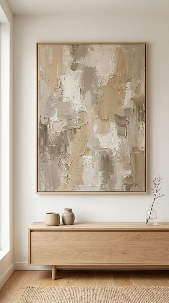
Vibe: Gallery-quiet and considered — a single piece of art that carries the entire room’s emotional weight.
Why it works: One large canvas centered on a wall is the highest-impact minimalist art decision because it applies the principle of visual hierarchy through scale — the painting is unmistakably the room’s focal point, which means the eye has somewhere definitive to rest. Tonal abstract work in sand, greige, and warm ivory stays within the room’s material palette while providing brushstroke texture and compositional movement that purely neutral walls cannot. The absence of a gallery wall or multi-piece arrangement is a deliberate statement of restraint.
How to get it: Size the canvas to span 60 to 70% of the wall width it occupies — a canvas too narrow floats tentatively on the wall; one spanning 70% feels anchored. For a standard 12-foot living room wall, a 72-to-84-inch canvas is the correct range.
| Shop The Look |
| Large abstract canvas art neutral tonal minimalist |
| Pale oak low sideboard minimalist living room |
| Small ceramic decorative object set neutral |
| Single stem glass vase minimal clear |
| Gallery light wall mounted minimal brass |
11. Warm Sage and White Oak Accent Palette
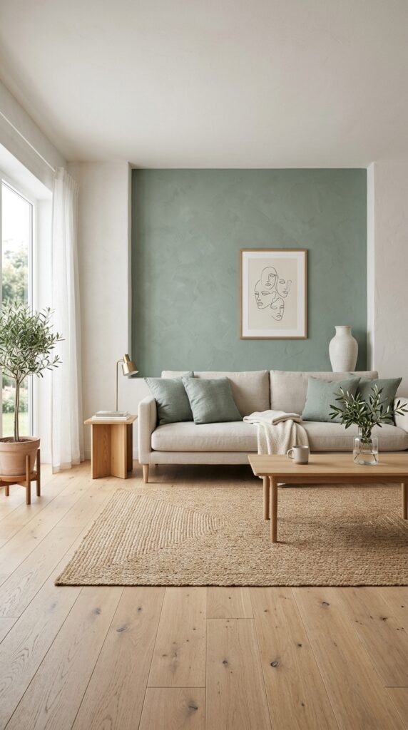
Vibe: Calm and quietly alive — a single color used sparingly is always more powerful than many colors used freely.
Why it works: A single accent color in a minimalist room works through the principle of color economy — when one hue appears in a room otherwise built entirely of neutrals, it carries enormous visual weight without requiring saturation. Dusty sage is the optimal minimalist accent color because it reads simultaneously as a warm neutral (in cool light) and a genuine green (in warm light), which means it integrates with the room’s neutral base across all lighting conditions rather than creating jarring contrast. Repeating the sage in cushion covers at the sofa level ties the wall color to the furniture zone.
How to get it: Choose a muted, grey-green sage rather than a pure or bright green — paint references include Farrow & Ball Mizzle (No. 266) or Portola Paints Artisan mineral finish in Sage Wisdom. Avoid any sage with yellow undertones; they read as olive rather than sage under interior lighting.
| Shop The Look |
| Dusty sage linen pillow cover set minimalist |
| White ceramic tall floor vase minimal |
| Natural jute area rug minimalist neutral |
| Framed minimal line drawing art print |
| Sage linen throw pillow lumbar minimalist |
12. Floating Shelf as Sole Display Surface
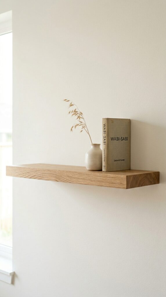
Vibe: Composed and deliberately spare — three objects given room to be seen fully rather than competed with.
Why it works: A single floating shelf styled with three objects and abundant negative space is the purest expression of minimalist display logic. The grouping of three follows the design principle of visual triangulation — three objects at slightly varying heights create a micro-composition with a visual center of gravity, a peak, and a base. What makes this minimalist rather than simply sparse is the deliberate empty space on either side of the grouping: the emptiness is as considered as the objects.
How to get it: Mount one shelf only — resist the impulse to add a second shelf below or above. One shelf with three objects on a bare wall reads as an intentional design decision. Two shelves with similar arrangements reads as a bookcase that hasn’t been finished.
| Shop The Look |
| White oak floating shelf wall mount minimal |
| Ceramic vase small neutral minimalist |
| Dried botanical single stem minimal |
| Minimalist hardcover book set neutral spines |
| Floating shelf invisible bracket hardware |
13. Natural Fiber Rug as Room Definer
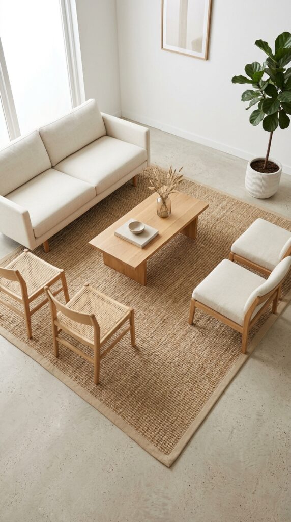
Vibe: Grounded and ordered — a rug that tells you exactly where the room begins.
Why it works: In a minimalist living room, the rug is the room’s organizational tool as much as its textile element. A natural sisal or jute rug at correct scale — large enough that all major furniture pieces sit with front legs on it — defines the seating zone as a complete, self-contained room-within-a-room. The natural fiber provides texture contrast to hard floor surfaces (concrete, stone, pale oak) without introducing color or pattern that would compete with the neutral palette. Binding edges in natural cotton or leather prevent fraying and maintain the rug’s clean profile.
How to get it: Size the rug to be 8×10 feet minimum for a standard living room — 9×12 is more forgiving. The front two legs of every seating piece should sit on the rug. A rug too small for the furniture arrangement is the most common proportion mistake in minimalist rooms and makes the space feel unresolved.
💡 Quick Win: A natural sisal or jute rug in 8×10 from most home goods stores runs $80 to $180 and is the single highest-leverage investment for making a minimalist living room feel spatially complete.
| Shop The Look |
| Natural sisal area rug 8×10 minimalist neutral |
| Pale linen sofa pillow cover minimal set |
| White ceramic floor planter minimal large |
| Low profile oak side chair minimalist |
| Sisal rug pad non-slip natural minimalist |
14. Brushed Brass Hardware as Warmth Accent
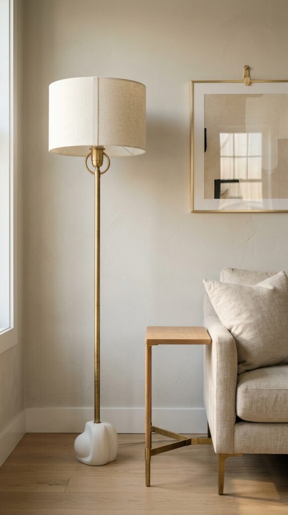
Vibe: Warm and precise — brass in a neutral room operates like a single musical note held clear and long.
Why it works: Brushed brass introduces warmth into a cool-neutral minimalist room through the principle of metallic accent economy — when only one metal finish appears in a space, it reads as a deliberate design choice rather than a random hardware selection. Brushed rather than polished brass is critical: polished brass reflects light as a bright mirror surface, creating visual noise; brushed brass has a matte, directional sheen that glows rather than flashes. The warmth of the brass also counteracts any clinical coolness in an all-neutral palette.
How to get it: Limit brushed brass to three appearances maximum in one room: one lighting fixture, one table or side element, and one hardware piece (hook, handle, or frame). More than three instances tips the metallic accent into a dominant palette element rather than a warm punctuation.
| Shop The Look |
| Brushed brass floor lamp linen shade minimalist |
| Brass footed side table minimal modern |
| Brushed brass picture hook set minimal wall |
| White ceramic decorative object small minimal |
| Linen shade replacement floor lamp |
15. Arched Doorway Framing Technique
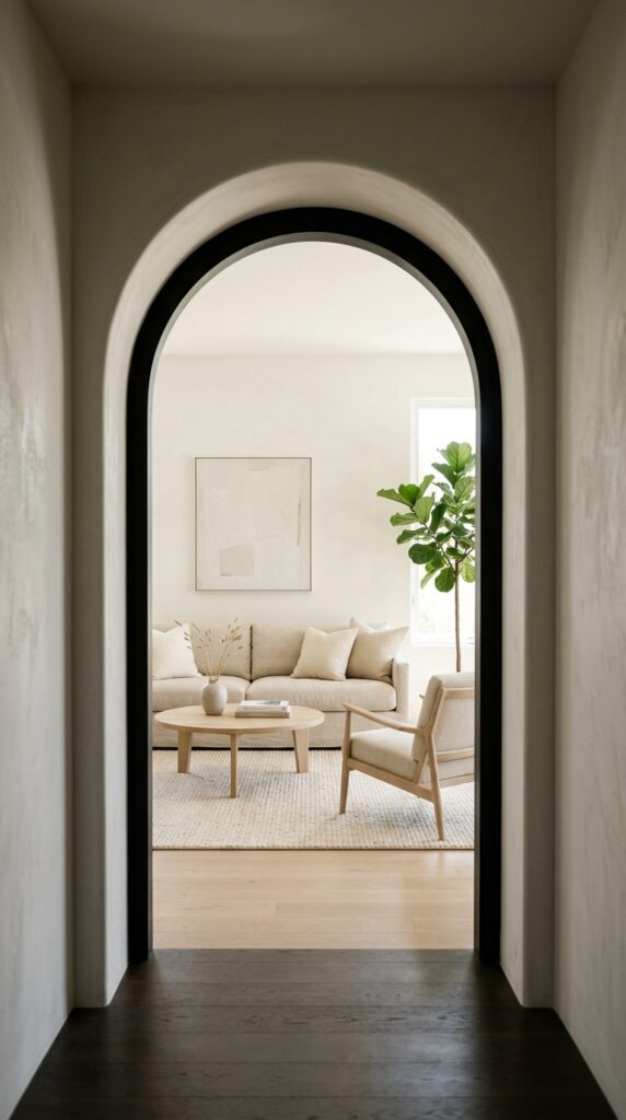
Vibe: Architectural and serene — the arch that turns a doorway into a destination.
Why it works: An arched doorway applies the design principle of framed view — it turns the act of looking from one room into another into a composed visual experience, as though the living room beyond is a painting hung in the aperture of the arch. Smooth plaster arches (rather than trimmed rectangular openings) carry no decorative molding, which keeps the architectural gesture aligned with minimalist philosophy: form as the only ornament. The arch’s curved shadow on the inner wall becomes the room’s most interesting graphic element at no material cost.
How to get it: Plaster over an existing rectangular doorway with a curved top using a foam arch form and standard joint compound — a weekend DIY that costs $40 to $80 in materials and adds significant architectural character to a flat-walled room.
💡 Quick Win: Even without physical modification, hanging a single arched mirror ($60 to $120) on the wall opposite a doorway creates the visual impression of an arched portal and deepens perceived room length significantly.
| Shop The Look |
| Arched wall mirror large minimalist plaster |
| Smooth plaster wall finish mineral paint |
| Pale oak threshold strip flooring transition |
| Arch form template DIY plaster doorway |
| Warm white limewash wall paint minimalist |
16. Floor-Level Seating Zone
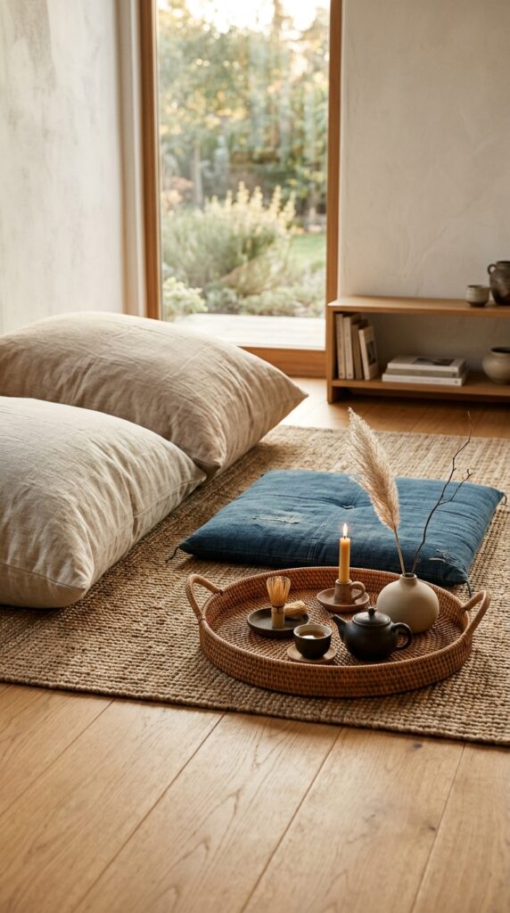
Vibe: Grounded and meditative — the room that asks you to sit lower and stay longer.
Why it works: Floor-level seating draws from Japanese interior design’s fundamental reorientation of how bodies occupy rooms — at floor level, eye height drops from 50 inches (seated standard) to 16 to 20 inches, which makes ceiling height more dramatic, views of the room more expansive, and the overall spatial experience more immersive. It also functions as the most honest form of minimalist furniture: cushions laid flat are the most material-efficient seating objects possible, and their flexibility (rearrangeable, stackable, storable) aligns with minimalism’s preference for objects that don’t impose their arrangement on a room.
How to get it: Use a flat woven rattan or reed tray at 18 to 24 inches diameter as the floor-level coffee surface — it elevates objects just enough above the floor plane to read as a table, while its natural material language integrates with linen and oak without visual friction.
| Shop The Look |
| Oversized linen floor cushion set natural |
| Japanese zabuton floor mat minimalist |
| Flat rattan serving tray large natural |
| Small ceramic tea set minimal neutral |
| Clay taper candle holder floor level minimal |
17. Warm Charcoal Limewash Accent Wall
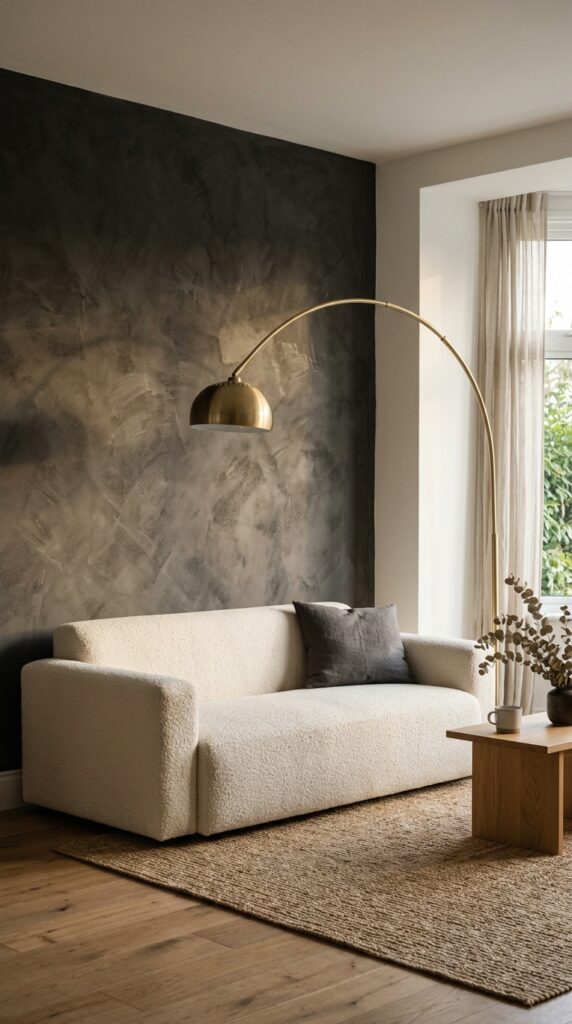
Vibe: Textured and grounded — a wall that changes with the light and makes the room feel older than it is.
Why it works: Limewash paint on an accent wall introduces material depth that flat paint cannot achieve — the layered application creates tonal variation across the surface, with slightly lighter and darker areas that shift as light angle changes through the day. In warm charcoal, limewash reads almost like natural slate or aged stone, which gives the room a sense of geological permanence. Against pale ivory bouclé, the contrast follows the principle of texture opposition: the rough chalky wall surface makes the smooth looped textile appear even softer.
How to get it: Apply limewash in three thin coats with a wide natural-bristle brush, using random cross-hatched strokes rather than parallel rows — randomness in application creates the tonal variation that distinguishes limewash from plain grey paint. Portola Paints Roman Clay and Farrow & Ball Limewash are the two most reliable products for authentic limewash texture at residential scale.
| Shop The Look |
| Limewash wall paint warm charcoal mineral |
| Ivory bouclé sofa pillow cover set minimalist |
| Arc floor lamp brushed brass minimalist |
| Natural jute rug 8×10 minimalist neutral |
| Single throw pillow linen tonal minimalist |
18. Minimal Bookshelf Edit
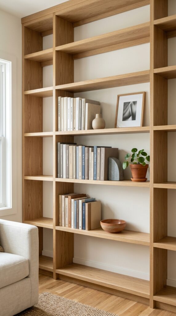
Vibe: Composed and ordered — the bookshelf that proves editing is a form of generosity.
Why it works: A bookshelf in a minimalist room succeeds by applying radical curation — the shelf should hold 30 to 40% of its maximum capacity, with the empty sections treated as deliberately as the populated ones. Grouping books by neutral spine tone (cream, white, grey, natural) rather than by subject creates a visual harmony that doesn’t require a stylist’s eye to maintain; the color grouping does the organizational work automatically. Spacing three small ceramic objects as punctuation between book clusters creates rhythm without filling the shelf with miscellaneous objects.
How to get it: Remove all books with brightly colored or patterned spines from the display — either face them backward (white pages out) or store them in a closed cabinet. The remaining neutral-spined books, grouped by tone, will immediately read as a curated minimalist collection rather than a working library.
💡 Quick Win: Turning five to eight brightly colored book spines backward instantly transforms a cluttered bookshelf into a minimalist display at zero cost.
| Shop The Look |
| White oak built-in bookshelf minimalist |
| Neutral book cover set linen minimalist |
| Stone bookend pair minimal living room |
| Small clay pot plant minimalist shelf |
| Ceramic object set minimalist shelf accent |
19. Compact Minimalist Living Room Layout
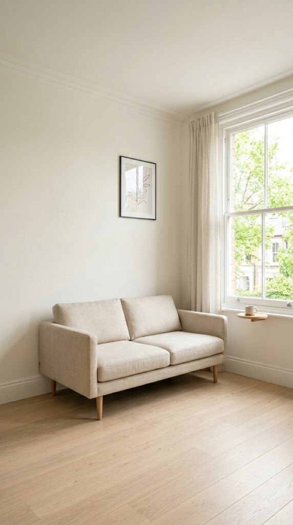
Vibe: Airy and resolved — a small room that earns every inch of the space it has.
Why it works: A compact room styled with fewer pieces than it could technically hold applies the principle of spatial generosity — visible floor area creates perceived spaciousness more reliably than any other design technique. In a 10×12-foot living room, the temptation is to fill every corner; the minimalist counter-move is a single two-seat sofa, one side table, and wall-mounted storage that frees the floor completely. The wall-mounted floating shelf replaces a media console, recovering 18 inches of floor depth that transforms the room’s circulatable space.
How to get it: In rooms under 130 square feet, every furniture piece should be at least 6 inches off the floor (to see the floor beneath) or wall-mounted entirely. Furniture that sits on the floor without legs — platform sofas, floor cushions — works only in larger rooms where the floor plane is expansive enough to read clearly around them.
| Shop The Look |
| Two seat sofa compact minimalist pale linen |
| Wall mounted floating media shelf oak minimal |
| Single side table small minimalist oak |
| Floor lamp minimalist slender brass shade |
| Small area rug natural minimalist compact |
20. Stone and Ceramic Material Pairing
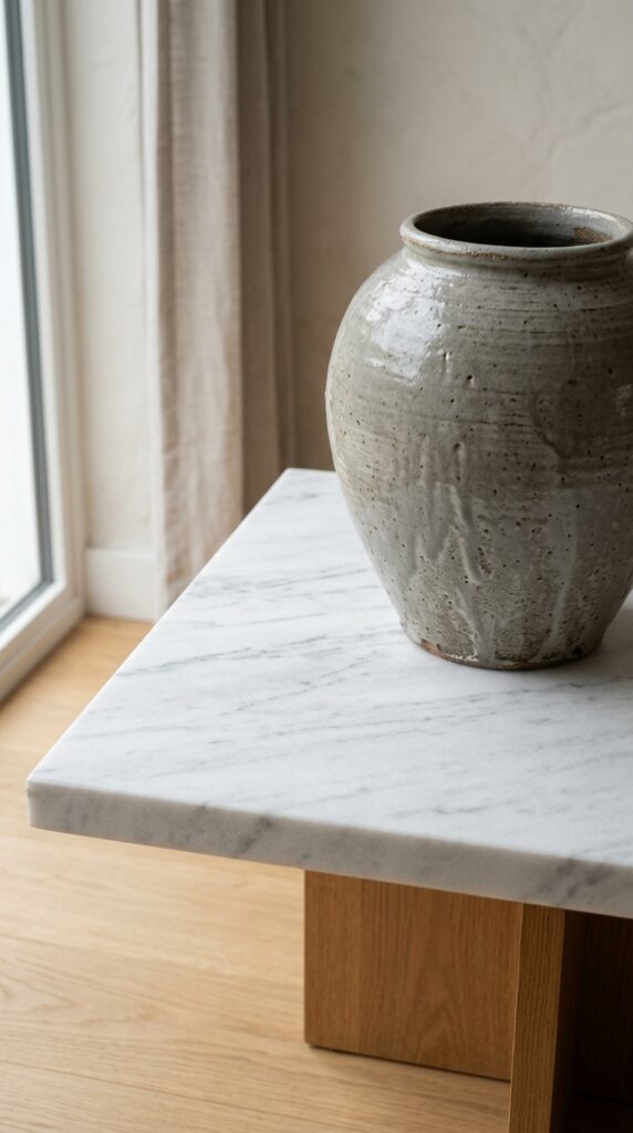
Vibe: Quiet and material-focused — two surfaces placed together as a conversation rather than a display.
Why it works: Stone and ceramic share the same origin — both are earth materials transformed by heat and pressure — which gives any pairing between them an inherent material logic that feels resolved rather than assembled. Honed marble and hand-thrown ceramic are the ideal pairing because both have matte, non-reflective surfaces that behave similarly in light. The veining in marble and the glaze variation in stoneware provide all the visual complexity the vignette needs — no styling additions required. This is minimalism at the material level: interest achieved through choice of surface, not accumulation of objects.
How to get it: Choose a ceramic vase proportional to the table it sits on — the vase diameter should be no more than one-third the table surface width, and the vase height should not exceed the table height. These proportions keep the ceramic reading as an accent on the stone surface rather than competing with it.
| Shop The Look |
| Honed marble side table minimalist modern |
| Large handthrown ceramic vase grey glaze |
| Marble tray minimalist honed surface |
| Ceramic bowl set neutral stoneware minimalist |
| Stone coaster set minimalist natural |
21. Recessed Niche Display
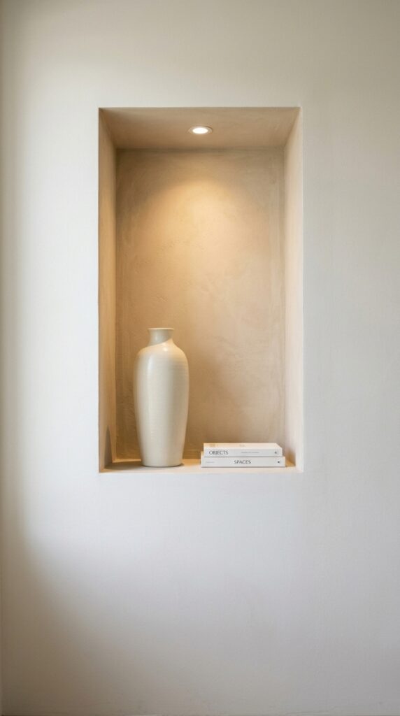
Vibe: Composed and focused — a niche that turns two objects into an exhibition.
Why it works: A recessed wall niche is the most architecturally resolved display solution in minimalist design because it builds the display into the wall itself — no furniture, no shelving hardware, no bracket shadows. The niche creates its own light environment through shadow geometry: the depth of the niche casts graduated shadow on the interior walls, which makes the objects inside appear to glow slightly even in natural lighting. A small recessed LED above the niche enhances this effect without visible hardware.
How to get it: A niche between wall studs (14.5 inches wide, 3.5 inches deep) can be created in a single weekend with a drywall saw, blocking lumber, and joint compound finishing — a low-cost architectural intervention that reads as a considered custom feature.
| Shop The Look |
| Recessed wall niche kit display minimal |
| Small recessed LED puck light niche display |
| Tall ivory ceramic vase minimal niche |
| Small book stack minimal neutral spines |
| Smooth plaster wall finish mineral paint |
22. Timber Ceiling Beam Feature
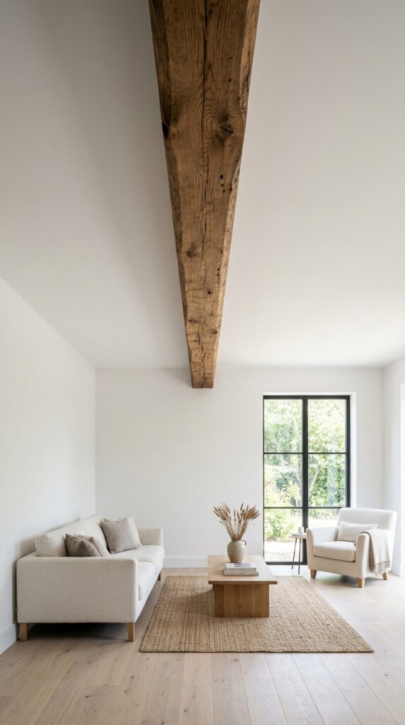
Vibe: Architectural and warm — a single structural element that makes the room feel like it was built with intention.
Why it works: One exposed timber ceiling beam in an otherwise white-ceiling room applies the principle of singular architectural gesture — a single departure from the neutral plane draws the eye in a controlled direction (toward the window or the room’s focal wall) without creating visual noise. The beam’s natural timber surface provides the room’s primary texture contrast: warm, fibrous, irregular grain against flat white plaster. No pendants, no macramé, no decorative objects should hang from a minimalist ceiling beam — the beam itself is the decoration.
How to get it: Apply a beam in unfinished white oak or reclaimed fir — the natural oils in these woods keep them from looking too rough or barn-like in a refined minimalist room. Sand to 120 grit, apply a single coat of Rubio Monocoat in Cotton White to preserve the natural grain while lightening the tone slightly for a modern context.
💡 Quick Win: A hollow box beam in painted MDF ($60 to $120 in materials) slips over an existing ceiling joist and creates the visual impression of a structural timber beam with no structural modification required.
| Shop The Look |
| Box beam hollow faux timber ceiling minimalist |
| Rubio Monocoat natural wood oil clear finish |
| White oak floating shelf beam matched minimal |
| Ceiling beam bracket support minimal hardware |
| Natural timber beam raw white oak section |
23. Minimalist Fireplace Surround
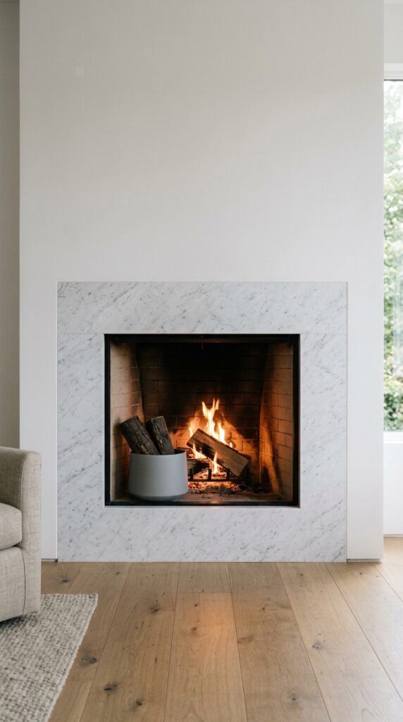
Vibe: Warm and architectural — a fireplace that earns its place through form alone.
Why it works: A flush fireplace surround with no mantel shelf is the most architecturally rigorous minimalist fireplace treatment because it refuses to provide the horizontal display surface that traditional mantels create. The absence of a mantel eliminates the temptation to style it — and eliminates the visual clutter that even the most restrained mantel styling eventually accumulates. Honed marble flush to the wall plane creates a monolithic effect: the fireplace reads as an aperture cut into the wall, not as a piece of furniture applied to it.
How to get it: Choose honed Bianco Sivec or Calacatta Borghini marble for a flush minimalist surround — the white base with warm grey veining maintains the room’s neutral palette while providing the material luxury that justifies the simplicity of the treatment.
| Shop The Look |
| Honed marble fireplace surround kit flush minimal |
| Ceramic log holder set minimalist fireplace |
| Zero clearance fireplace insert electric minimal |
| Fireplace tool set brushed brass minimal |
| Marble honed side panel fireplace minimal |
24. Single Indoor Tree as Botanical Statement
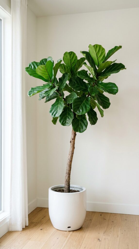
Vibe: Serene and quietly alive — one large plant always says more than a collection of small ones.
Why it works: A single large indoor tree in a minimalist room applies botanical logic consistent with the style’s broader principle of singular, scaled gestures — one olive tree at 6 feet reads as a design decision; six small succulents on a shelf reads as a collection. The tree also solves the corner problem: corners are the hardest zones in minimalist rooms to resolve because furniture doesn’t fit neatly into them, but a large-scale plant in a floor planter fills the corner vertically without blocking floor circulation. The white ceramic planter keeps the botanical element within the room’s neutral material palette.
How to get it: Water a fiddle leaf fig deeply once every 10 days and rotate it 90 degrees each time — this prevents the plant leaning toward its light source and maintains the straight, architectural trunk silhouette that makes it work as a minimalist statement piece.
| Shop The Look |
| Fiddle leaf fig tree live indoor 5-6 ft |
| Large white ceramic floor planter smooth minimal |
| Plant stand white oak minimal low profile |
| Indoor tree care kit fertilizer drainage |
| Olive tree indoor live minimalist statement |
25. Gallery-Style Art Lighting
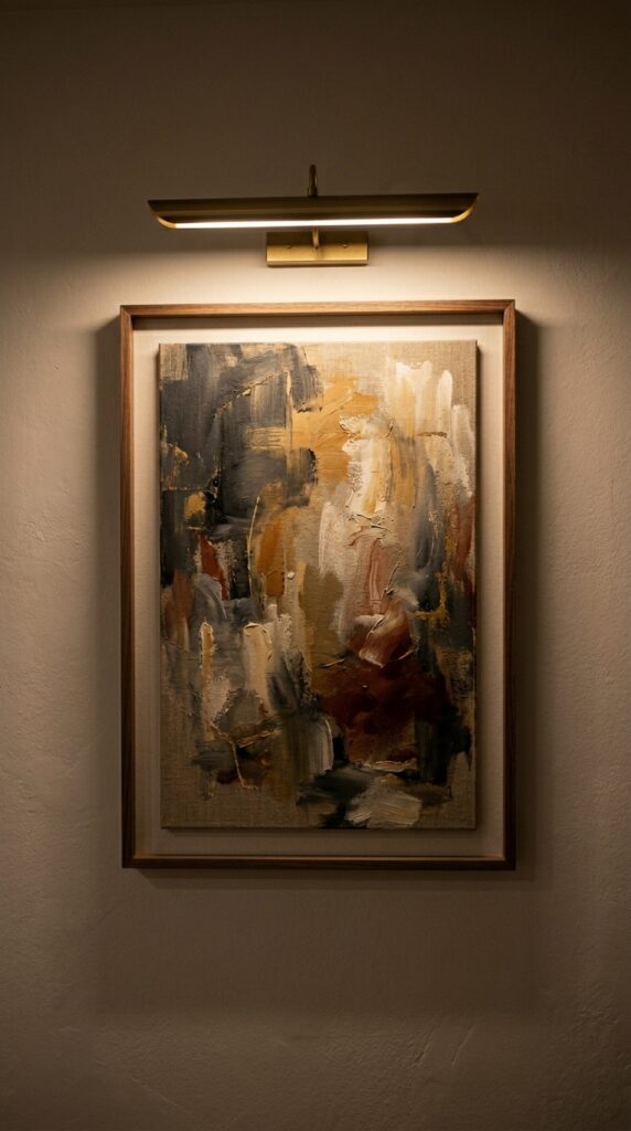
Vibe: Gallery-like and warm — light that turns a picture on a wall into something closer to an event.
Why it works: A picture light mounted on a single artwork creates a focused micro-environment on the wall — the warm, directed beam illuminates the canvas and casts a soft halo that separates the artwork from the ambient room light. This applies the principle of spatial hierarchy through lighting: the lit artwork becomes the room’s visual priority, and everything else recedes into soft ambient context. In minimalist rooms with few or no other decorative elements, this hierarchy gives the room a clear focal point that anchors the eye without requiring additional objects.
How to get it: A picture light’s beam length should match the artwork’s width — a 20-inch artwork takes a 18-to-20-inch picture light. Under-sized picture lights create a hot spot at the center of the canvas and dark margins; a properly sized light illuminates edge to edge with gradual falloff.
| Shop The Look |
| Picture light brushed brass frame mount minimal |
| Framed abstract art print large neutral tonal |
| Warm white wall paint smooth finish |
| Single art hanging hardware minimal brass |
| Gallery picture hook set minimal wall |
26. Tonal Textile Layering Without Pattern
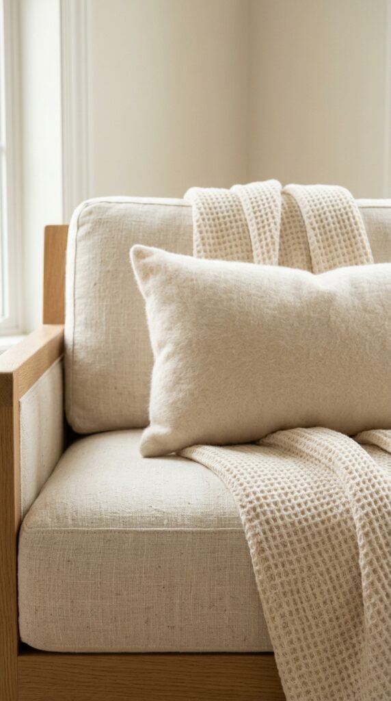
Vibe: Warm and deeply tactile — when there’s no color contrast to rely on, texture becomes everything.
Why it works: Tonal textile layering without pattern or color variation is one of the most sophisticated minimalist styling techniques because it depends entirely on material quality and texture differentiation. Linen, waffle-knit, and cashmere in the same ivory-cream family create visual depth through surface behavior: linen reflects light directionally (the weave structure creates a subtle sheen), waffle-knit traps it in its grid depressions (reading as matte and dimensional), and cashmere absorbs it almost completely (appearing to glow softly). Three distinct light behaviors in one tonal range.
How to get it: The layering rule for tonal textiles: heaviest and most structured fabric as the base (linen sofa cushion), mid-weight open texture as the drape (waffle or cable-knit throw), and the softest, finest fabric as the smallest accent piece (cashmere lumbar). Scale decreases as softness increases — structurally the most logical arrangement.
💡 Quick Win: A single undyed cashmere or fine merino lumbar pillow ($35 to $65) placed against existing neutral cushions introduces tonal textile layering to any sofa without purchasing a full cushion set.
| Shop The Look |
| Ivory linen throw pillow cover set tonal minimal |
| Cream waffle knit throw blanket natural |
| Undyed cashmere lumbar pillow minimal |
| Natural linen sofa cushion insert cover |
| Merino wool throw natural undyed minimalist |
27. Micro Living Room with Murphy Bed Concealment
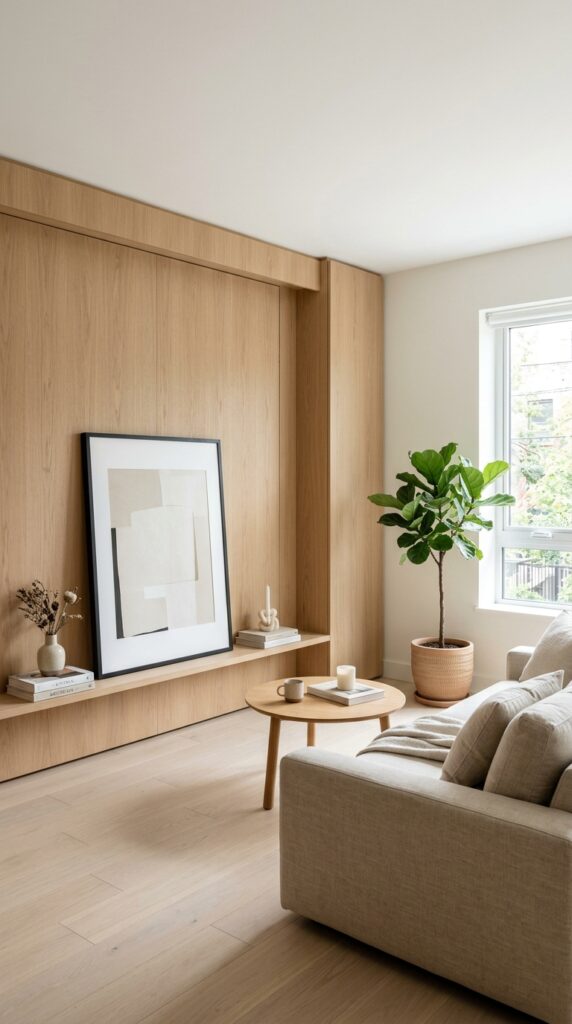
Vibe: Resolved and spacious — the small space that refuses to announce its limitations.
Why it works: A Murphy bed behind a floor-to-ceiling panel wall applies the principle of architectural concealment — the living room function is preserved completely during waking hours because there is no visual evidence of the sleeping function. The panel wall, when executed in white oak or painted to match the room’s walls, reads as a considered architectural feature rather than a practical solution. This is the most honest form of minimalist small-space design: the constraint (limited square footage) is solved at the architectural level rather than disguised with decorative distractions.
How to get it: Panel the Murphy wall in the same material as the room’s primary hard surface — white oak panels if the floor is white oak, painted panels if the walls are painted. Material continuity makes the panel read as wall rather than furniture, which preserves the minimalist room’s spatial coherence.
| Shop The Look |
| Murphy bed kit wall mount horizontal modern |
| White oak wall panel cladding sheets minimal |
| Low profile compact sofa studio apartment minimal |
| Floor plant large minimal white ceramic planter |
| Framed minimal art print leaned style |
How to Start Your Minimalist Living Room Transformation
Your single first move is this: choose a wall paint in Benjamin Moore White Dove (OC-17) and commit to it on every surface in the room — walls, ceiling, and trim in the same color and finish (eggshell throughout). This single decision eliminates the visual noise created by trim contrast, creates a continuous envelope that makes the room feel significantly larger, and establishes the warm neutral backdrop that every minimalist material layer depends on. It is the decision that makes everything else easier.
The most common mistake in minimalist living room design is under-scaling furniture — choosing pieces that are too small for the room in an attempt to create spaciousness. A too-small sofa floating in a large room looks uncertain and the space feels emptier rather than intentionally sparse. The correct minimalist approach is one well-scaled sofa that occupies the appropriate proportion of the room’s width (50 to 60% of the main wall it faces), which reads as anchored and resolved. Spaciousness comes from what surrounds the furniture, not from shrinking it.
Three specific items under $50 for immediate minimalist impact: a single dried pampas grass stem in a secondhand ceramic vessel ($12 to $18 total, sourced from a craft store and a charity shop); a linen throw in undyed ivory draped over an existing sofa armrest ($25 to $35, look for OEKO-TEX certified cotton-linen blends); and a package of matte black command strips to remove all existing wall decorations and replace with a single framed print centered at eye level, rehung clean ($8 for the strips, free if you already own a print).
Realistic expectations: a meaningful minimalist refresh — new paint, one hero furniture piece, edited accessories — takes two weekends and costs $400 to $900. A full transformation including new sofa, lighting, rug, and architectural modifications runs $2,500 to $6,000. The important timeline truth: minimalism requires subtraction before addition, and the editing process — identifying and removing what doesn’t belong — typically takes longer than selecting and placing new pieces.
Frequently Asked Questions About Minimalist Living Rooms
What is the difference between minimalist and Japandi living room design?
Both styles share core principles — restraint, natural materials, neutral palettes, negative space — but they differ in emotional register and material emphasis. Minimalist design, in its broader Western form, tends toward geometric precision, harder surfaces (concrete, polished plaster, steel), and a cooler, more architectural feeling. Japandi — the Japanese-Scandinavian hybrid — introduces more tactile warmth through handcrafted ceramics, natural wood with visible grain, sheepskin, and the wabi-sabi acceptance of imperfection. In practice, a purely minimalist room might feel like a gallery; a Japandi room feels like a considered home. Many successful minimalist living rooms borrow from both: the spatial discipline of Western minimalism with the material warmth of Japandi.
What colors work best for a minimalist living room?
The most successful minimalist palettes are built on warm whites and warm neutrals rather than cool or pure whites. Specific references: Benjamin Moore White Dove (OC-17) for walls, Farrow & Ball Elephant’s Breath (No. 229) for a warm mid-grey, and SW Accessible Beige (SW 7036) for a greige base. The critical rule is undertone consistency — every color in a minimalist room should share the same undertone family (warm yellow-beige, not blue-grey). If a single accent color is introduced, dusty sage, warm terracotta, or muted ochre are the most successful minimalist accent choices because they read as natural pigments rather than synthetic dyes, which keeps the palette feeling honest.
How much does it cost to create a minimalist living room?
A starter minimalist refresh — new wall paint, one quality linen throw, edited accessories, and a natural fiber rug — costs $300 to $700. A mid-range transformation with a new sofa, quality lighting, and architectural modifications (arched doorway, floating shelves) runs $3,000 to $7,000. The single highest-ROI investment in minimalist living room design is the sofa: a well-scaled, well-made sofa in a quality neutral fabric (linen or bouclé) in a low-profile silhouette will last 10 to 15 years and forms the permanent design anchor of the room. Budget $800 to $2,000 for this piece before investing in anything else.
Can a minimalist living room feel warm and inviting rather than cold?
Yes — the key is choosing warm-undertoned materials throughout. A minimalist room feels cold when it relies on cool greys, polished reflective surfaces, and blue-white lighting. Warm minimalism uses unfinished white oak (warm honey undertone), linen and bouclé in ivory and natural cream, honed rather than polished stone surfaces, warm-white LED bulbs at 2700K color temperature, and brushed brass hardware as the metallic accent. These material choices keep the spatial discipline of minimalism while ensuring the room feels genuinely livable — the test is whether it looks as inviting at 7 PM under lamp light as it does at noon in natural light.
What is the most important principle for styling a minimalist living room?
Every object must justify its presence. Before placing any item in a minimalist living room, apply the single-question test: does this object improve the room — functionally, visually, or both? If the honest answer is “not really,” it belongs in storage or donation. The practical implication is that minimalist styling requires a higher quality-per-object standard than other styles — each piece is more visible and receives more scrutiny because it isn’t surrounded by competing objects. A single handthrown ceramic bowl of genuine quality and character in a minimalist room reads as a design statement; a collection of $5 trinkets in the same room reads as unresolved clutter regardless of how carefully they are arranged.
Ready to Create Your Dream Minimalist Living Room?
These 27 concepts span the full range of what minimalist living room design can achieve — from the precise material pairings and tonal color strategies that define the palette, to the lighting decisions, furniture profiles, and spatial arrangements that give the style its particular calm authority. A minimalist transformation is incremental by nature: the person who begins by removing three things from a shelf and painting one wall in White Dove is already practicing the exact discipline the complete look requires. The single most concrete action you can take today is to walk into your living room, identify the three objects that contribute the least to how the room feels, and remove them — because in minimalist design, the most important decisions are subtractive. When the space finally coheres — when the light falls across honest surfaces and the eye has somewhere clear to land — the room will feel less designed than resolved. Save the ideas that made the room in your mind grow quieter, and return to the ones built on a single material and a lot of restraint — those are the choices that age into something genuinely lasting.