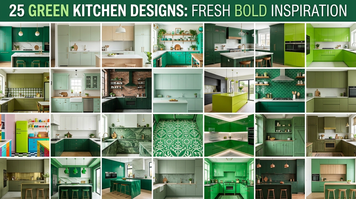
Green kitchens are defined by the use of green as a primary or dominant color across cabinetry, walls, tile, or materials — ranging from barely-there sage to deep forest and high-drama emerald. This article delivers exactly 25 green kitchen design ideas, covering every shade, material, layout approach, and budget level so you can find the right version of green for your space.
There’s a particular kind of confidence in a green kitchen. It smells like rain through an open window and feels like the room was always supposed to look this way. Whether it’s the still, muted depth of hunter green shiplap or the electric charge of glossy jade tile bouncing morning light around a narrow galley, green kitchens carry an aliveness that white and gray simply cannot replicate. Here are 25 ideas worth saving — and stealing.
Why Green Kitchen Designs Work So Well
Why Green Kitchens Work So Well
Green as a kitchen color draws from multiple design traditions simultaneously — the earthy Arts and Crafts movement of the early 20th century, the saturated jewel tones of Victorian parlors, the clean naturalism of Scandinavian design, and the lush warmth of Mediterranean tile work. What distinguishes green from every other color in the kitchen is its unique position on the spectrum: it bridges warm and cool, sits at the center of human visual sensitivity, and is the color most directly associated with the living world. It doesn’t dominate a room the way red does or retreat the way gray can — it belongs.
The materials and colors that make green kitchens work are highly specific. Shaker and flat-panel cabinetry in matte sage, hunter, forest, or emerald are the primary vehicles. Countertop pairings that consistently succeed include warm white Calacatta marble, raw unlacquered brass hardware, honed black granite, and bleached white oak butcher block. On the wall, aged terracotta tile, sage zellige, white subway with dark grout, and unlacquered copper backsplash tile all amplify different green registers. Paint colors that interior designers reach for repeatedly include Farrow & Ball’s “Mizzle,” Benjamin Moore’s “Salamander,” and Sherwin-Williams’ “Jasper.”
Green kitchens are trending now for a layered set of reasons. The post-pandemic nesting movement pushed homeowners toward colors that feel grounding and connected to nature — green delivers biophilic benefit even without a plant in sight. Simultaneously, the backlash against the all-white kitchen has been building for years, and green has emerged as the considered alternative for homeowners who want personality without the commitment of black or the risk of bold red. Pinterest data confirms “green kitchen cabinets” among the fastest-growing home search terms for three consecutive years.
Small kitchens handle green extremely well — with one important caveat about shade selection. Lighter greens (sage, celadon, pale mint) expand a small kitchen visually by reflecting ambient light. Deeper greens (hunter, forest, bottle) can make a small kitchen feel intentionally moody and jewel-box rather than cramped, provided the lighting is warm and layered. The mistake in small spaces is using a cool-toned mid-value green (the “army green” register) that neither brightens nor enriches — it simply flattens.
Style at a Glance
| Element | Light Green Kitchen | Dark Green Kitchen |
| Philosophy | Airy, connected to nature | Jewel-box, intentional drama |
| Materials | White oak, linen, honed marble, rattan | Unlacquered brass, matte stone, smoked glass |
| Color palette | Sage, celadon, pale mint, warm white | Hunter, forest, emerald, oxblood, deep brass |
25 Green Kitchen Design Ideas
1. Sage Green Shaker Cabinets with Brass Hardware
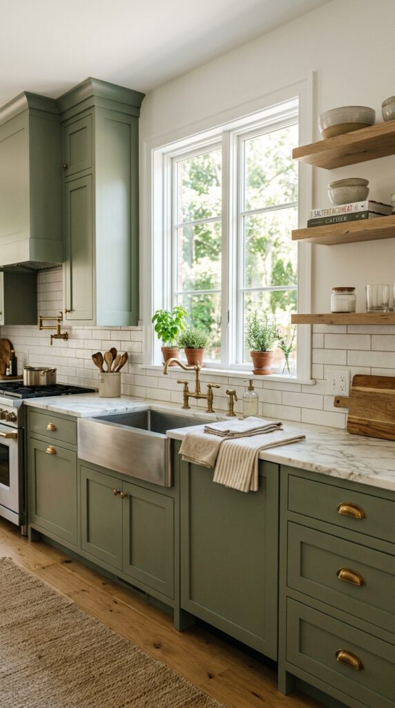
Vibe: Serene and unhurried — this kitchen feels like it was always this color.
Sage green Shaker cabinets work through the design principle of tonal harmony with material contrast — the muted, slightly gray-green of sage sits in perfect mid-register tension with the warm gold of unlacquered brass hardware, neither color overwhelming the other. The Shaker profile specifically matters because its clean inner rail creates a subtle shadow line that adds dimension without visual noise. Aged brass (not polished, not brushed — aged) is non-negotiable for this pairing; polished brass reads as new money, while aged brass reads as patina and permanence.
Start with a paint sample of Farrow & Ball “Mizzle” or Benjamin Moore “Salisbury Green” — both are warm-leaning sages that hold their read under artificial light in the evening, unlike cooler sages that can tip gray. Apply hardware in unlacquered brass, which develops a natural patina within months and deepens the color story over time.
💡 Quick Win: Replacing existing cabinet hardware with aged brass cup pulls (under $4 per pull on Amazon) is the single fastest transformation available — on a 20-cabinet kitchen, this costs under $80 and takes two hours.
🛍️ Shop the Look — Amazon Product Ideas
| # | Product Search Phrase | Why It Fits |
| 1 | Aged brass cup pull cabinet hardware 3 inch | Core hardware element |
| 2 | Sage green chalk paint furniture cabinet | DIY cabinet color |
| 3 | Calacatta white marble contact paper countertop | Budget counter treatment |
| 4 | White subway tile 3×6 kitchen backsplash | Classic backsplash |
| 5 | White oak floating shelf bracket set | Open shelving hardware |
2. Deep Hunter Green Lower Cabinets, White Uppers
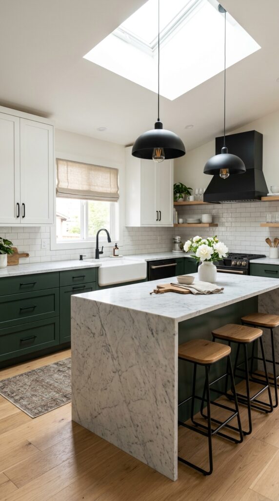
Vibe: Grounded and confident — the kitchen that knows exactly where the floor is.
The two-tone approach — dark below, light above — follows one of the oldest architectural principles of visual weight distribution: heavier visual mass at the base creates stability, while lighter tones above allow the ceiling to feel higher. Hunter green specifically (not forest, not army — hunter, which carries a blue undertone) reads as serious without tipping moody. The hard contrast of white uppers against the deep lower cabinets creates a natural horizon line that makes rooms with lower ceilings feel taller.
The color break works best when it aligns exactly with the countertop surface — any countertop overhang should be considered part of the lower cabinet visual mass. Use the same matte black hardware on both upper and lower cabinets to unify the two-tone palette rather than letting it read as two separate kitchens stacked.
🛍️ Shop the Look — Amazon Product Ideas
| # | Product Search Phrase | Why It Fits |
| 1 | Matte black bar pull cabinet handle 5 inch | Unifying hardware |
| 2 | Hunter green exterior paint sample quart | Deep lower cabinet color |
| 3 | White apron front farmhouse sink ceramic | Anchor sink element |
| 4 | Honed marble contact paper dark vein | Island surface option |
| 5 | Matte black dome pendant light kitchen | Island lighting |
3. Emerald Green Zellige Backsplash Feature Wall
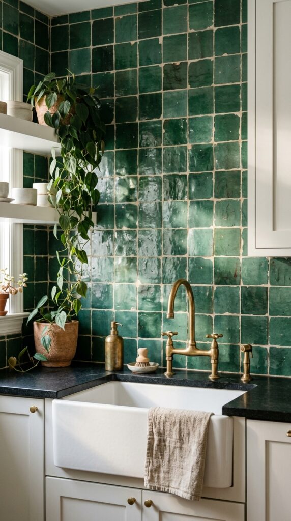
Vibe: Luminous and alive — the kind of wall that changes every hour with the light.
Zellige tile works through the principle of surface complexity — each handmade tile is slightly different in glaze density, surface plane, and edge definition, which means a flat wall becomes a dynamic light study that shifts throughout the day. This is a material that photography consistently undersells; in person, an emerald zellige backsplash behaves almost like water. The combination with honed black granite countertops is a material contrast study in opposites: matte versus slightly reflective, quiet versus active.
Zellige is a specialty tile available through Ann Sacks, Cle Tile, and several importers on Etsy sourcing directly from Moroccan workshops. For a budget-conscious alternative, look for machine-made zellige-effect tile at around $8–$15 per square foot versus authentic handmade zellige at $30–$60 per square foot — the light behavior differs noticeably, but from across the room, the effect is similar.
💡 Quick Win: Install a zellige backsplash behind just the stove or just the sink rather than the entire kitchen — a 12-square-foot feature section creates the full visual impact at a fraction of the tile cost.
🛍️ Shop the Look — Amazon Product Ideas
| # | Product Search Phrase | Why It Fits |
| 1 | Zellige style green ceramic tile 4×4 handmade | Feature backsplash tile |
| 2 | Unlacquered brass kitchen faucet farmhouse | Complementary faucet |
| 3 | Honed black granite tile 12×24 countertop | Counter surface |
| 4 | White grout sanded tile installation | Zellige grouting material |
| 5 | Trailing philodendron live indoor plant | Organic counter accent |
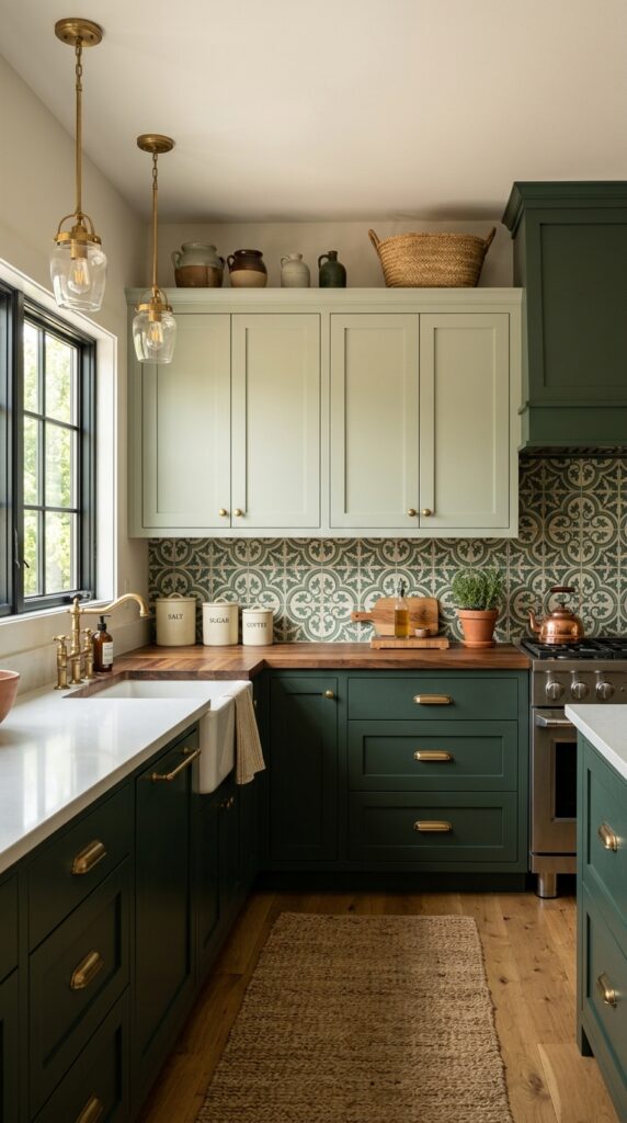
4. Sage and Terracotta Color-Blocked Kitchen
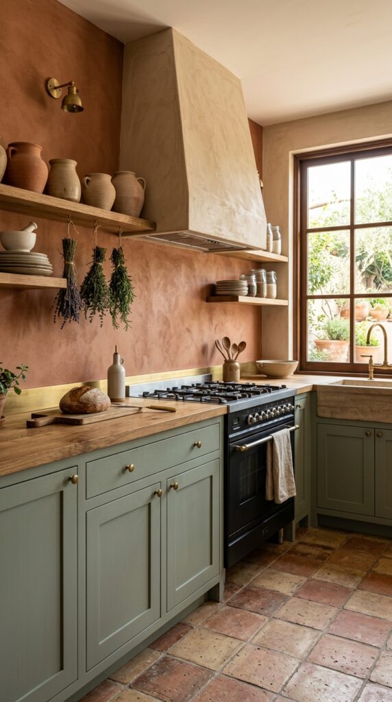
Vibe: Sun-warmed and rooted — a kitchen that could exist anywhere in the Mediterranean.
The sage-and-terracotta pairing is rooted in color theory: these two colors sit in a split-complementary relationship, meaning terracotta (a warm red-orange) is near the complement of sage (a warm blue-green), but offset enough to feel warm and harmonious rather than jarring. The result is a kitchen that feels organically arrived-at rather than designed, which is the highest compliment you can give an earthy palette. The raw plaster range hood is the move that elevates this from a simple color palette to a fully realized aesthetic.
DIY raw plaster range hoods can be created using a prefabricated sheet metal insert covered in cement board and finished with Venetian plaster or a lime wash technique. The result is indistinguishable from custom millwork at a fraction of the cost.
🛍️ Shop the Look — Amazon Product Ideas
| # | Product Search Phrase | Why It Fits |
| 1 | Venetian plaster wall finish smooth natural | Range hood plaster finish |
| 2 | Terracotta cement tile hexagon floor | Earthy floor tile |
| 3 | Unfired clay pot set kitchen display | Shelf collection vessels |
| 4 | Lime wash paint terracotta warm orange | Color-block wall |
| 5 | Thin brass trim strip adhesive 1/4 inch | Color break accent line |
5. Glossy Bottle Green Cabinet with Gold Leaf Ceiling
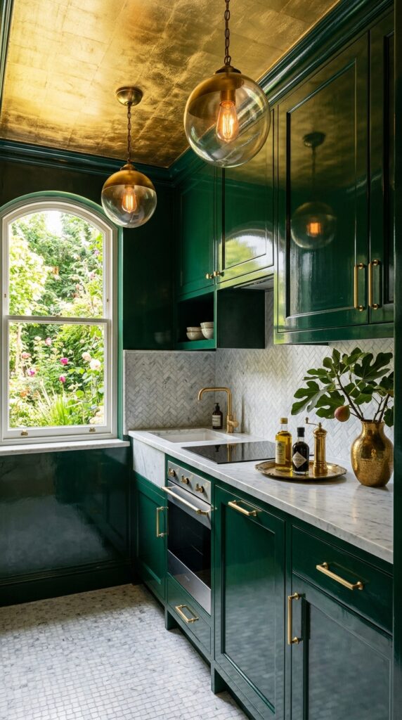
Vibe: Opulent and enclosed — the kitchen as jewel box, deliberately small-feeling.
High-gloss lacquer on cabinetry activates the design principle of reflective amplification — every surface becomes a participant in the light behavior of the room, doubling the visual depth of a space by introducing a mirror plane in the most unexpected location. Bottle green in high gloss reads as a completely different color from bottle green in matte; the sheen shifts it toward emerald territory while the depth of the base color keeps it grounded. A gold leaf ceiling, applied with transfer sheets over a red oxide size coat, is a weekend project achievable for under $100 in materials and transforms a kitchen ceiling into a source of warmth that bounces light across every other surface.
🛍️ Shop the Look — Amazon Product Ideas
| # | Product Search Phrase | Why It Fits |
| 1 | Gold leaf transfer sheets ceiling application | DIY ceiling treatment |
| 2 | Glossy lacquer cabinet spray paint green | High-sheen cabinet finish |
| 3 | Brushed gold cabinet knob set round | Tonal hardware match |
| 4 | Brass globe pendant light fixture | Ceiling lighting accent |
| 5 | Marble mosaic tile floor small bathroom kitchen | Luxurious floor detail |
6. Forest Green Open Shelving Against White Walls
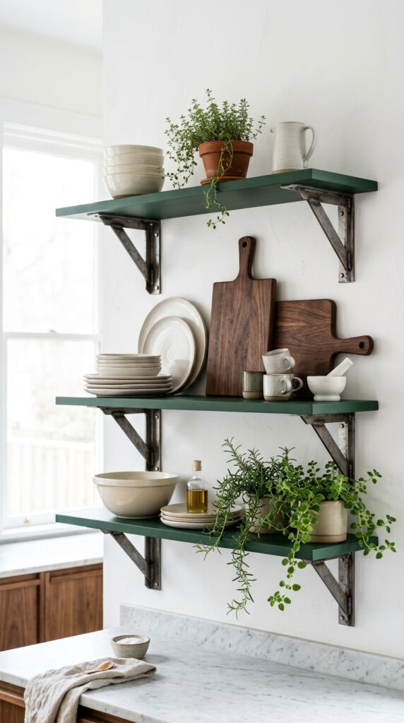
Vibe: Airy and deliberate — the kitchen that reads as a gallery.
Open shelving in a contrasting color to the wall is an application of the frame and subject principle — the dark green shelf becomes the frame, and the objects displayed on it become the subject, elevated to art by the visual boundary the color provides. This is exactly how museum display cases work. Forest green (which sits a register deeper than hunter and has a warmer, earthier undertone) is particularly effective as a shelf color because it shows off cream, white, and wood objects with the clarity of a dark velvet jewelry display.
Style shelves using the rule of three for groupings: one tall item, one medium, one small — then repeat with variation. Leave at least 20% of each shelf surface empty. Overcrowded open shelves negate the gallery effect entirely.
💡 Quick Win: A single tier of forest green floating shelves (12 inches deep, 36 inches wide) costs under $40 in lumber and paint, and has more visual impact than a full cabinet renovation.
🛍️ Shop the Look — Amazon Product Ideas
| # | Product Search Phrase | Why It Fits |
| 1 | Raw steel shelf bracket heavy duty 10 inch | Industrial mounting hardware |
| 2 | Forest green chalk paint furniture shelving | Shelf color treatment |
| 3 | Cream matte ceramic bowl set stackable | Core shelf display pieces |
| 4 | Dark walnut cutting board end grain | Warm wood shelf accent |
| 5 | Small ceramic herb pot set white drainage | Living shelf element |
7. Mint Green and Chrome Retro Kitchen Revival
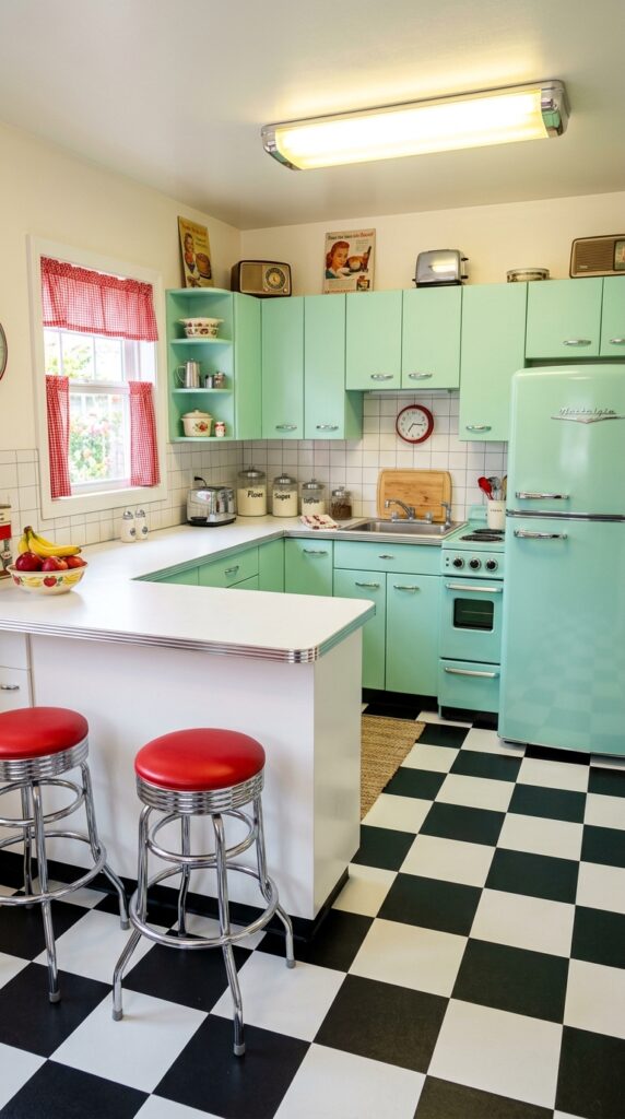
Vibe: Cheerful and electric — a kitchen that serves breakfast with a side of personality.
The retro kitchen revival works through period-specific material coherence — every element (mint, chrome, checkerboard, red accent) is sourced from the same mid-century visual vocabulary, creating a composition where each piece amplifies every other. Mint specifically is the period-accurate color (Crane pink and mint green were the signature appliance colors of the 1950s), and using it in a flat-front cabinet profile rather than Shaker keeps the historical accuracy. Chrome hardware rather than brass or matte black is essential — the high reflectivity of polished chrome is the period signature.
🛍️ Shop the Look — Amazon Product Ideas
| # | Product Search Phrase | Why It Fits |
| 1 | Chrome round cabinet knob polished vintage | Period-accurate hardware |
| 2 | Black white checkerboard vinyl peel stick tile | Retro floor treatment |
| 3 | Vintage glass canister set kitchen counter | Authentic display pieces |
| 4 | Chrome finish bar stool counter height | Peninsula seating |
| 5 | Red gingham kitchen curtain valance | Retro accent color |
8. Sage Green Kitchen with Limewashed Walls
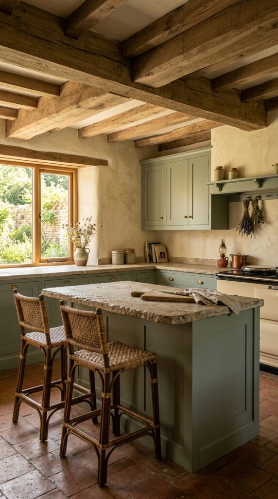
Vibe: Ancient and warm — a kitchen that seems to have always been standing.
Limewash against sage cabinetry works through layered texture depth — both surfaces are matte and slightly rough, so the room reads entirely through material variation rather than color contrast. This is a sophisticated move that requires confidence because it removes the usual visual hierarchy cues (light versus dark, shiny versus matte) and replaces them with tactile variation. The result feels genuinely old in the best possible way. Rough-hewn limestone countertops (honed, not polished — polished limestone destroys the material character) are the third textural layer that locks the composition.
Apply limewash paint in aged ivory using the authentic technique: brush on, then while still wet, wipe back with a damp sponge in random circular motions. The variation creates depth that no flat paint can replicate. Portola Paints and Roman Clay are excellent commercial limewash products that are significantly more forgiving than DIY lime putty formulations.
🛍️ Shop the Look — Amazon Product Ideas
| # | Product Search Phrase | Why It Fits |
| 1 | Limewash paint interior aged ivory white | Textured wall finish |
| 2 | Rattan bar stool counter height natural | Organic island seating |
| 3 | Limestone tile honed 12×12 countertop | Natural stone surface |
| 4 | Dried lavender bundle hanging kitchen | Botanical ceiling accent |
| 5 | Stoneware crock set kitchen rustic | Aged vessel display |
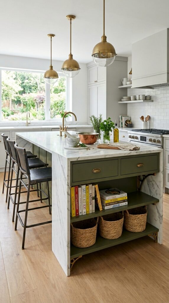
9. Dark Olive Green Island as the Sole Color Statement
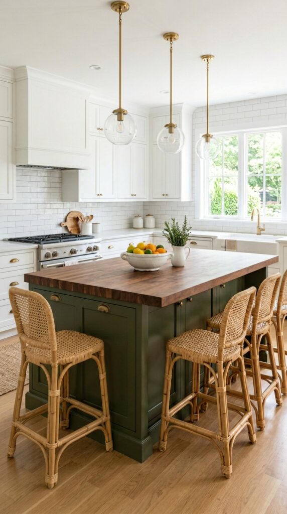
Vibe: Clean and grounded — one decision, made absolutely.
The single-color island in an otherwise white kitchen is a study in focal point theory — when all competing visual information is removed, the one element that differs becomes monumentally important. This technique demands that the island itself be substantial: oversized dimensions (at least 4×7 feet for full effect), a countertop material different from the perimeter (butcher block here versus quartz elsewhere), and enough seating to make it the social center of the room. Deep olive (which sits between forest green and army green, with a warmth that both lack) is the correct green for this application — it’s warm enough to not feel clinical against white but rich enough to serve as a true anchor.
🛍️ Shop the Look — Amazon Product Ideas
| # | Product Search Phrase | Why It Fits |
| 1 | Olive green kitchen island paint sample | Island color reference |
| 2 | Butcher block countertop unfinished 4 foot | Island counter material |
| 3 | Rattan counter stool backless natural | Island seating |
| 4 | Antique brass cabinet pull 4 inch | Island hardware |
| 5 | Unlacquered brass pendant light adjustable | Above-island lighting |
10. Green Herringbone Tile Floor in an All-White Kitchen
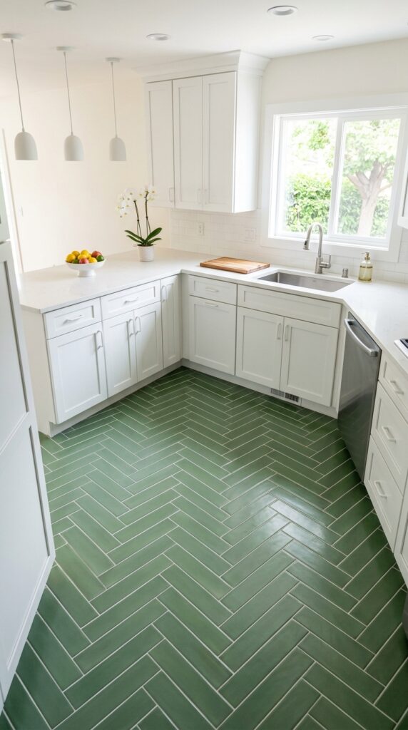
Vibe: Fresh and unexpectedly graphic — the color is underfoot, which makes it feel discovered.
Introducing color through the floor rather than the cabinets inverts the expected hierarchy and creates a design move that surprises. The herringbone pattern specifically amplifies this by adding directional energy — the V-pattern pulls the eye toward the kitchen’s primary axis, which in a galley layout creates a powerful visual tunnel effect. White grout with sage green tile is the correct combination for this installation; dark grout would make the individual tiles disappear into the pattern, while white grout keeps each tile distinctly visible and maintains the graphic quality.
The specific tile size matters enormously: 2×4-inch or 3×6-inch tiles in herringbone create significantly more pattern complexity than larger formats, and complexity is what makes this floor a design statement rather than just a colored surface.
💡 Quick Win: Peel-and-stick herringbone floor tile in sage green is available for under $2 per square foot and is fully repositionable — an ideal test installation before committing to permanent tile.
🛍️ Shop the Look — Amazon Product Ideas
| # | Product Search Phrase | Why It Fits |
| 1 | Sage green ceramic tile 2×4 herringbone | Core floor tile |
| 2 | White sanded grout tile installation | Pattern-preserving grout |
| 3 | Tile leveling system clips installation tool | Precise herringbone install |
| 4 | Peel stick herringbone floor tile green | No-commitment trial option |
| 5 | White ceramic fruit bowl large shallow | Clean counter accent |
11. Green Kitchen with Black Steel Window Frames
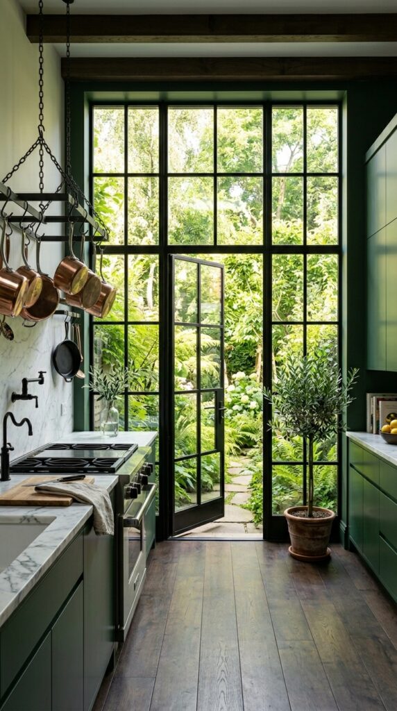
Vibe: Dramatic and expansive — the kitchen that borrows the garden as a fourth wall.
Black steel window frames in a green kitchen work through color family bridging — the black frames are simultaneously the darkest shade in the green family (as a value) and a neutral, which means they read as both part of the green scheme and as a structural contrast element. This is why black and green function together in a way that brown-framed windows in the same kitchen would not. The view to a garden through these windows creates a biophilic continuation — the interior green of the cabinets extends visually into the exterior green of the garden, making the space feel immeasurably larger.
🛍️ Shop the Look — Amazon Product Ideas
| # | Product Search Phrase | Why It Fits |
| 1 | Black steel frame window greenhouse style | Architectural window element |
| 2 | Matte black steel range hood 30 inch | Black family hood |
| 3 | Carrara marble slab look countertop sheet | Counter surface |
| 4 | Black pot rack ceiling mount kitchen | Functional black element |
| 5 | Potted olive tree indoor large ficus | Interior garden accent |
12. Celadon Green Kitchen with Japanese Influenced Design
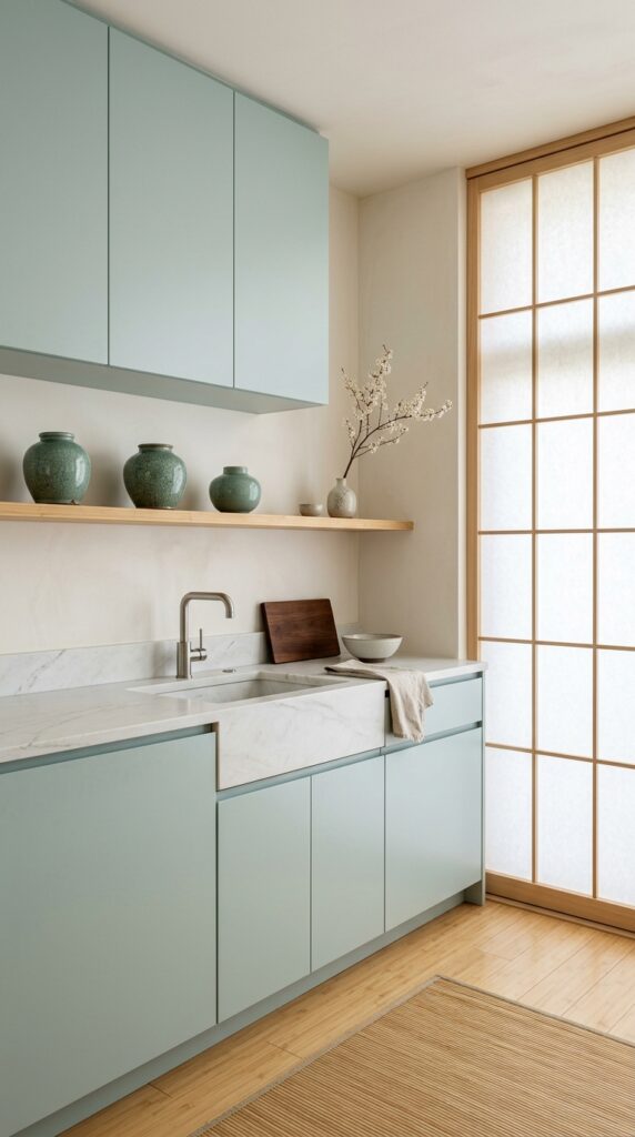
Vibe: Hushed and meditative — a kitchen that asks you to slow down.
Japandi design applied to a green kitchen requires restraint in every category: one countertop material, one shelf, three objects. Celadon — a pale blue-green with a porcelain glaze quality — is the correct green register for this aesthetic because it directly references East Asian ceramic tradition where the celadon glaze was among the most prized in the world. Handleless push-to-open cabinetry is essential for the clean line quality of the Japandi vocabulary; any hardware disrupts the meditative surface continuity.
🛍️ Shop the Look — Amazon Product Ideas
| # | Product Search Phrase | Why It Fits |
| 1 | Handleless push open cabinet hinge soft close | Hardware-free mechanism |
| 2 | Celadon ceramic vase set Japanese inspired | Shelf vessel collection |
| 3 | Honed soapstone tile countertop sample | Matte stone surface |
| 4 | Shoji screen panel translucent room divider | Window diffusion panel |
| 5 | Natural bamboo flooring plank click lock | Warm floor material |
13. Two-Tone Green Kitchen: Sage Upper, Forest Lower
Vibe: Warm and layered — the kitchen that rewards a second look.
An all-green two-tone kitchen (both registers from the same color family) is more sophisticated than a green-and-white two-tone because it demonstrates confidence in the palette without a neutral escape. The design principle is value gradient — using a lighter value of the same hue above and a darker value below, which creates depth and grounds the composition in the same way mountains appear darker at their base. The patterned cement tile backsplash that incorporates both green values is the critical bridging element; without it, the two registers might read as a mistake rather than a decision.
💡 Quick Win: A cement tile backsplash in a sage-and-forest pattern covers approximately 10 square feet of backsplash for under $200 in tile and creates the bridging element that makes both cabinet colors feel intentional.
🛍️ Shop the Look — Amazon Product Ideas
| # | Product Search Phrase | Why It Fits |
| 1 | Sage green Shaker cabinet paint sample | Upper cabinet color |
| 2 | Forest green cabinet paint exterior grade | Lower cabinet color |
| 3 | Patterned cement tile sage green backsplash | Color-bridging backsplash |
| 4 | Walnut butcher block countertop 8 foot | Warm lower counter |
| 5 | Aged brass kitchen faucet pull down | Hardware anchor |
14. Green Kitchen with Exposed Brick and Industrial Lighting
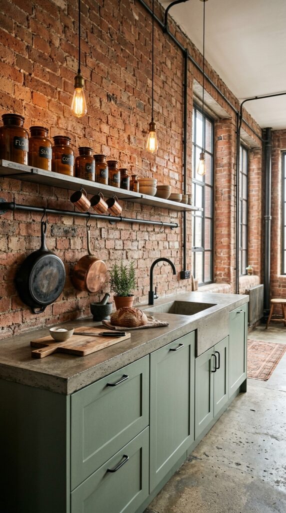
Vibe: Raw and warm — the kitchen that doesn’t try to hide what it was.
Exposed brick with sage green cabinetry works because terracotta brick sits at the warm-red end of the spectrum while sage sits at the cool-green end — they are near-complements, which creates the same pleasing tension as the sage-and-terracotta palette but with the textural dimension that raw brick adds. The industrial lighting (Edison bulbs on conduit, not decorative pendants) reinforces the material honesty of the space and warms the entire palette with amber light that enriches both the brick and the sage.
🛍️ Shop the Look — Amazon Product Ideas
| # | Product Search Phrase | Why It Fits |
| 1 | Edison bulb pendant light vintage black cord | Industrial lighting fixture |
| 2 | Faux exposed brick peel stick wallpaper panel | Renter-friendly brick effect |
| 3 | Black iron pipe shelf bracket kit | Industrial shelf hardware |
| 4 | Concrete countertop resurfacing overlay kit | DIY concrete counter finish |
| 5 | Vintage glass storage jar set wide mouth | Open shelf display canisters |
15. Small Green Galley Kitchen with Mirror Backsplash
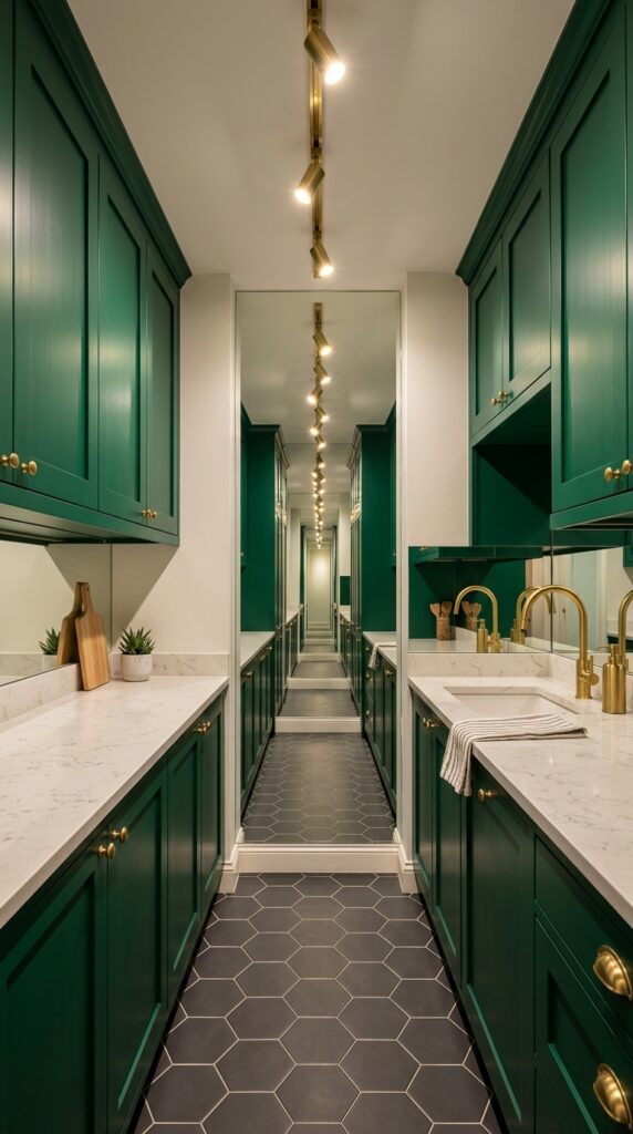
Vibe: Dramatic and surprisingly generous — a narrow kitchen that doesn’t apologize for its dimensions.
A mirror backsplash in a galley kitchen is a spatial illusion technique — it doubles the apparent depth of the narrow room by creating a reflected version of the opposite wall. This is one of the few decorating moves that is both a genuine design statement and a functional space-expander simultaneously. The key specification is antiqued mirror (not standard mirror) — standard mirror creates a cold, bathroom-like reflection, while antiqued mirror produces a slightly foggy, romantically aged reflection that feels designed rather than functional.
This is ideal for small and galley kitchens where a full renovation is not possible. A mirrored backsplash panel in 4mm antiqued glass can be cut to size and installed over existing tile with mirror adhesive — no demolition required.
💡 Quick Win: Antiqued mirror adhesive panels in 12×12-inch sections can be installed over an existing backsplash in under two hours, transforming a small kitchen for under $150 in materials.
🛍️ Shop the Look — Amazon Product Ideas
| # | Product Search Phrase | Why It Fits |
| 1 | Antiqued mirror tile backsplash panel 12×12 | Space-expanding backsplash |
| 2 | Mirror adhesive construction glue panel | Installation material |
| 3 | Emerald green Shaker cabinet paint | Narrow galley cabinet color |
| 4 | Brass track lighting kitchen adjustable | Ceiling lighting solution |
| 5 | Dark gray hexagon tile floor 2 inch | Grounding floor material |
16. Green Kitchen Cabinets with Unlacquered Brass Plumbing
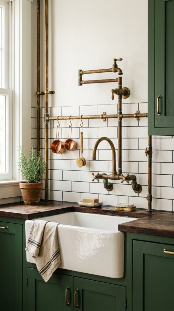
Vibe: Warm and artisanal — a kitchen that celebrates the infrastructure.
Exposed unlacquered brass plumbing is a design move that works through honest material expression — the opposite of concealment. Rather than hiding the supply lines behind drywall, this approach treats them as decorative elements, which only succeeds because unlacquered brass is itself a beautiful material that ages visually. The key distinction is unlacquered (which oxidizes and develops a rich patina over years) versus lacquered or polished brass (which stays static and reads as a finish rather than a material). Against deep forest green, warm brass reads at full intensity because the color contrast is maximized.
🛍️ Shop the Look — Amazon Product Ideas
| # | Product Search Phrase | Why It Fits |
| 1 | Unlacquered brass kitchen faucet farmhouse | Core plumbing feature |
| 2 | Exposed brass supply line braided 24 inch | Decorative supply tube |
| 3 | Porcelain apron sink farmhouse 33 inch | Sink vessel |
| 4 | Subway tile 3×6 white with dark gray grout | Classic backsplash pairing |
| 5 | Copper measuring cup set hanging hook | Functional decor accent |
17. Sage Green Kitchen, No Upper Cabinets
Vibe: Airy and honest — the kitchen that trusts the cook to know where things are.
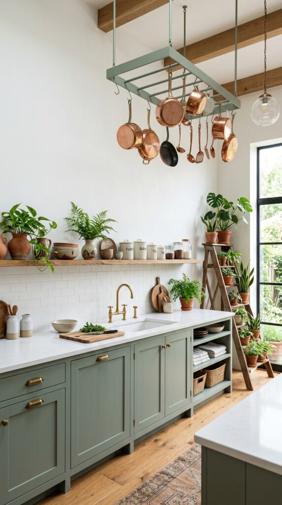
Removing upper cabinets entirely is a spatial liberation technique — it prioritizes ceiling height perception over storage, which is the correct trade for kitchens where the walls are relatively short (under 9 feet) or where the cook values an expansive feel over maximum storage. The sage green lower cabinets become even more intentional without the usual upper cabinet frame competing for attention; they’re now furniture in a room rather than architecture around a room. A ceiling-mounted pot rack in matching sage green maintains the color presence above the counter line without reintroducing the visual weight of upper cabinets.
🛍️ Shop the Look — Amazon Product Ideas
| # | Product Search Phrase | Why It Fits |
| 1 | Ceiling mount pot rack rectangular large | Above-counter storage |
| 2 | Wall ledge shelf kitchen ceramic display | Transition point shelf |
| 3 | Sage green spray paint metal rack | Pot rack color treatment |
| 4 | Ladder plant stand tall indoor corner | Corner vertical garden |
| 5 | Hanging copper pot set kitchen | Functional overhead display |
18. Green and Pink Kitchen: Unexpected Feminine Contrast
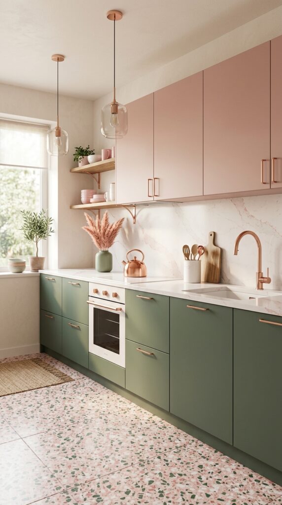
Vibe: Warm and unexpectedly sophisticated — the kitchen that makes guests ask about the designer.
Sage green and dusty pink is a complementary adjacent pairing — pink sits near red, which is in the warm family opposite green on the color wheel, but dusty pink is desaturated enough to feel harmonious rather than competing. This combination appears in nature constantly (spring blossoms against new leaves) which is why it reads as instinctively correct even before the brain processes why. The critical specification is dusty pink — not hot pink, not baby pink, not coral — specifically the desaturated, almost antique pink that reads more like a blush or nude in certain lights.
💡 Quick Win: Rose gold cabinet hardware (knobs and pulls) costs the same as brass but creates an entirely different color story against sage green — warmer and more feminine. A full hardware replacement costs under $100 for most kitchens.
🛍️ Shop the Look — Amazon Product Ideas
| # | Product Search Phrase | Why It Fits |
| 1 | Rose gold cabinet knob round brushed | Unifying hardware |
| 2 | Dusty blush pink cabinet paint sample | Upper cabinet color |
| 3 | Terrazzo floor tile white pink aggregate | Distinctive floor |
| 4 | Dried pink pampas grass small bunch | Counter arrangement |
| 5 | Sage ceramic vase matte medium tall | Pampas vessel |
19. Green Kitchen with Maximalist Floral Wallpaper
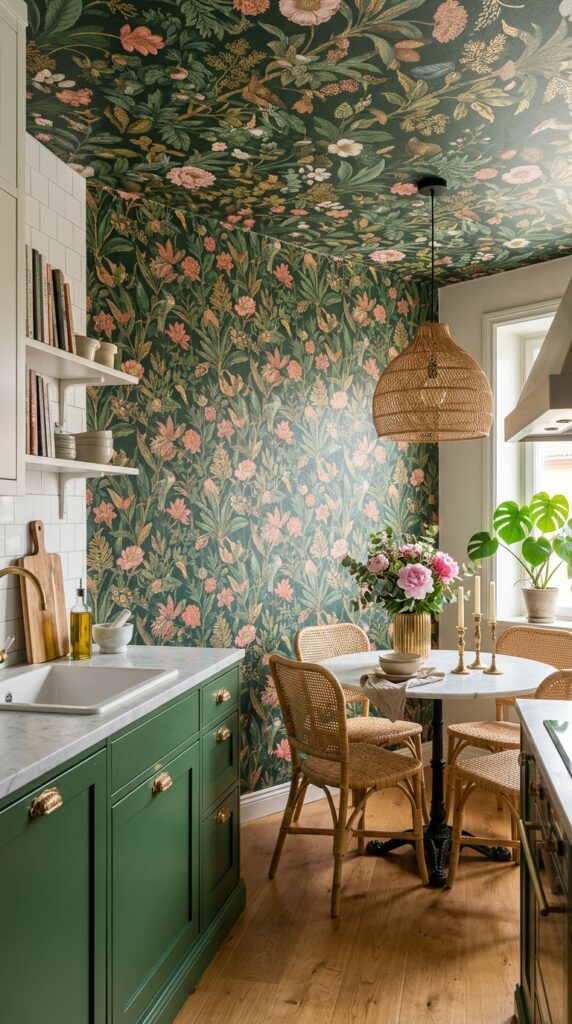
Vibe: Lush and completely committed — a kitchen that has given itself permission to be extraordinary.
Carrying botanical wallpaper from the wall onto the ceiling (the “fifth wall” technique) transforms a flat room into an enveloping environment, which is why it’s used in the world’s most photographed restaurant dining rooms. The design principle is environmental immersion — when pattern covers all planes, the room becomes a space rather than a box. Green cabinetry that pulls its color from the wallpaper’s dominant tone creates color family unity across the wildly different surfaces of cabinet and wallpaper, making the look feel designed rather than accidental.
🛍️ Shop the Look — Amazon Product Ideas
| # | Product Search Phrase | Why It Fits |
| 1 | Botanical floral wallpaper peel stick removable | Statement wall installation |
| 2 | Gold cabinet pull bar handle 4 inch | Wallpaper-complementing hardware |
| 3 | Marble top kitchen dining table 36 inch | Room anchor furniture |
| 4 | Rattan dining chair set natural | Organic seating |
| 5 | Rattan pendant shade light natural drum | Ceiling light in palette |
20. Floating Green Kitchen Island with Waterfall Edge
Vibe: Confident and architectural — the island as the room’s reason for being.
A waterfall edge countertop is an application of continuous surface design — the same material flows without interruption from horizontal to vertical plane, which reads as a single object rather than a surface placed on a cabinet. It elevates the island from furniture to sculpture. The specific combination of deep olive green cabinetry and Calacatta marble waterfall edge works because Calacatta’s warm gold veining echoes the brass hardware while the white field provides maximum contrast with the deep green. The lower open shelf at foot-height creates a shadow gap that makes the island appear to float.
🛍️ Shop the Look — Amazon Product Ideas
| # | Product Search Phrase | Why It Fits |
| 1 | White marble contact paper waterfall edge | Budget waterfall treatment |
| 2 | Leather bar stool counter height brass footrest | Island seating with detail |
| 3 | Brass open shelf bracket 10 inch kitchen | Lower island shelf |
| 4 | Marble mortar pestle white large | Functional counter sculpture |
| 5 | Cookbook stand display holder countertop | Open shelf organization |
21. Green Kitchen with Antique Furniture Piece Integration
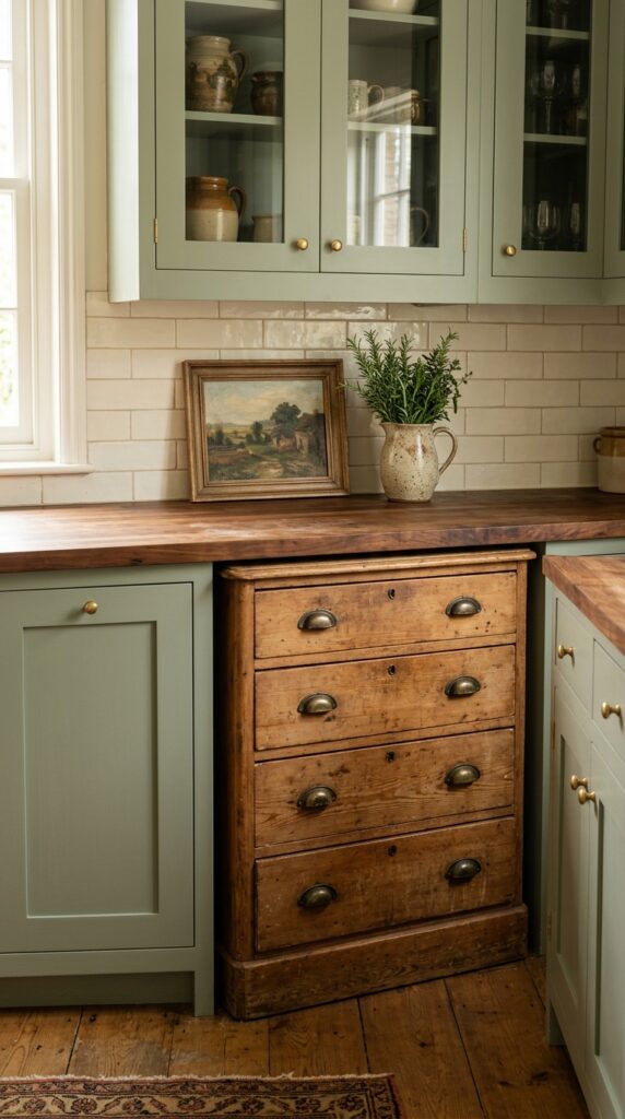
Vibe: Collected and alive — a kitchen that has a history before you arrived.
Integrating an antique furniture piece into a built-in kitchen run is a temporal layering technique — it introduces an object from a different era that makes the surrounding cabinetry read as more intentional by contrast. The design principle is curated imperfection: the dresser’s worn patina and slightly different green tone (since no paint matches aged pine perfectly) become features rather than flaws. This is the most characterful approach in this entire list and the hardest to execute without confidence, but it rewards the commitment completely.
🛍️ Shop the Look — Amazon Product Ideas
| # | Product Search Phrase | Why It Fits |
| 1 | Antique pine dresser furniture small 3 drawer | Integration furniture piece |
| 2 | Butcher block countertop cut to size 24 inch | Custom fitting surface |
| 3 | Milk paint aged finish furniture green | Authentic antique look |
| 4 | Antique brass bin pull dresser hardware | Period-appropriate hardware |
| 5 | Small oil painting kitchen botanical art | Propped backsplash art |
22. Green Kitchen, Black Ceiling Drama
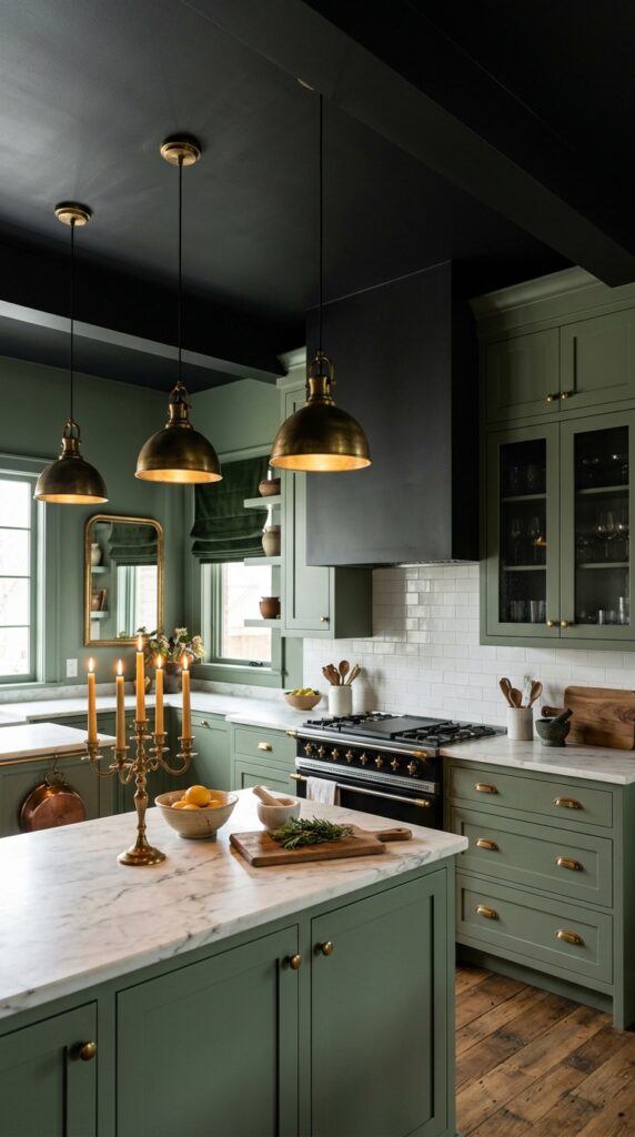
Vibe: Moody and deliberately cave-like — a kitchen that serves dinner at midnight.
A matte black ceiling in an otherwise sage green kitchen inverts the standard light-above-dark-below visual hierarchy, creating a grotto effect where the room feels sheltered and enclosed rather than open. This works because flat black on a ceiling causes it to recede visually — it no longer reads as a ceiling but as an absence, which makes the room feel taller even as it feels more intimate. The sage green walls and white countertops take on additional vividness when the eye is not pulled upward toward a competing ceiling color.
🛍️ Shop the Look — Amazon Product Ideas
| # | Product Search Phrase | Why It Fits |
| 1 | Flat black ceiling paint matte finish | Core ceiling treatment |
| 2 | Aged brass chandelier pendant kitchen | Black ceiling lighting |
| 3 | Smoked glass cabinet insert panel | Moody cabinet detail |
| 4 | Dark green velvet Roman shade custom | Window treatment |
| 5 | Brass candelabra table counter large | Dramatic counter accent |
23. Compact Green Kitchen with Fold-Down Solutions
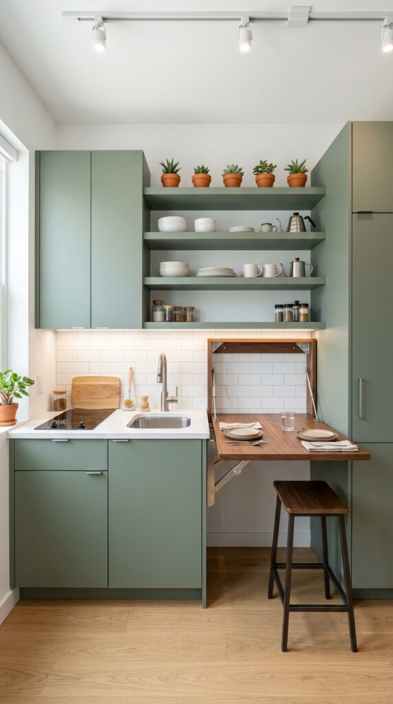
Vibe: Clever and resolved — small because it had to be, not because it gave up.
Small kitchen design is fundamentally about vertical real estate — when floor space is limited, every inch of wall height becomes storage or surface. Sage green in a small kitchen works specifically because its warm, slightly gray character doesn’t demand attention the way brighter greens would; it allows the room to read as a resolved whole rather than a collection of small objects competing for importance. The fold-down counter extension is the single highest-value addition to a small kitchen: when folded up, it’s effectively invisible; when unfolded, it creates a dining or prep surface from nothing.
💡 Quick Win: A wall-mounted fold-down table bracket set in raw pine costs under $40 and creates a functional 24×36-inch surface from a single wall mount. Paint it to match the cabinets and it reads as built-in.
🛍️ Shop the Look — Amazon Product Ideas
| # | Product Search Phrase | Why It Fits |
| 1 | Fold down wall mount table bracket murphy | Space-creating solution |
| 2 | Under cabinet LED strip light warm white | Small kitchen task lighting |
| 3 | Slim bar stool 18 inch seat height | Fold-down seating |
| 4 | Full height pantry cabinet freestanding | Vertical storage solution |
| 5 | Compact 2 burner induction cooktop portable | Small kitchen appliance |
24. Green Kitchen with Hand-Painted Mural Behind Glass
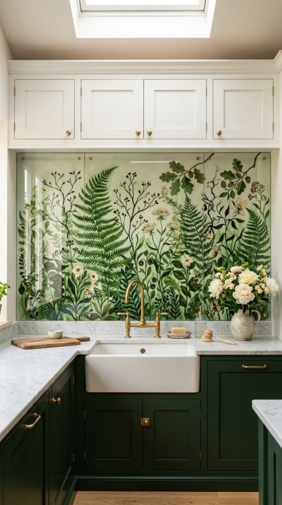
Vibe: Artistic and lush — the kitchen where someone chose to make something instead of buy something.
A hand-painted mural protected by tempered glass is a one-of-a-kind material technique — it introduces something genuinely unique into a room where most elements are by definition mass-produced. The glass protection transforms what might read as a painted wall into something that feels permanent and considered, like a commissioned architectural element. The botanical illustration subject connects directly to the green cabinet palette — the mural is the interior forest that the cabinet color references.
Commission a local artist to paint directly onto the prepared wall using exterior-grade acrylic paint (which withstands moisture under glass) before the glass installation. A 10-square-foot mural from a local art school student typically costs $150–$400 and is entirely original.
🛍️ Shop the Look — Amazon Product Ideas
| # | Product Search Phrase | Why It Fits |
| 1 | Tempered glass backsplash panel custom cut | Mural protection surface |
| 2 | Exterior acrylic paint set botanical colors | Mural medium |
| 3 | Botanical illustration print mural wallpaper | Alternative to painting |
| 4 | Fine artist brush set detail botanical | Mural painting tools |
| 5 | Forest green lower cabinet paint sample | Cabinet color reference |
25. Deep Green Kitchen with Warming Copper Accents
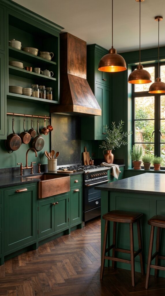
Vibe: Rich and deeply warm — a kitchen that glows from the inside.
Deep green and copper is the most powerful color pairing in kitchen design because they sit in near-perfect complementary opposition — green is the visual complement of red, and copper is a desaturated warm red-orange — which means each color makes the other appear more vivid by contrast. This is simultaneously the most dramatic and the most resolved of the 25 ideas because when a palette has this degree of inherent color logic, everything feels inevitable. The copper elements should not all be the same finish: a mix of hammered copper hood, smooth copper sink, and aged copper pots creates the material depth that makes this genuinely extraordinary.
💡 Quick Win: A copper-finish range hood insert (for existing hoods) costs $150–$250 and is the single element that does the most work in establishing this palette. The copper-on-green read from across the room immediately communicates the entire design intention.
🛍️ Shop the Look — Amazon Product Ideas
| # | Product Search Phrase | Why It Fits |
| 1 | Copper range hood 30 inch hammered finish | Dominant copper element |
| 2 | Copper kitchen sink farmhouse handmade | Material complement |
| 3 | Copper pendant light set kitchen antique | Overhead color accent |
| 4 | Copper pot set hanging kitchen display | Functional warm accent |
| 5 | Honed black granite tile countertop 12×24 | Dark grounding counter |
How to Start Your Green Kitchen Transformation
The single most important first move is to paint just the lower cabinets in your chosen green — not the uppers, not the island, just the lowers. Lower cabinets represent roughly 60% of a kitchen’s visual cabinet mass, and painting only them lets you live with the color, assess it in your specific light conditions morning through evening, and reverse it if needed without having committed the entire kitchen. This specific first move also happens to be the most design-current choice: the two-tone kitchen with colored lowers and white or lighter uppers is the approach used in the majority of professionally designed green kitchens right now.
The most common mistake is choosing a green that tests well on a paint chip but goes gray-green under artificial light. Warm-toned kitchens (with incandescent or warm LED lighting) require a green with enough yellow or brown in its base to hold its read after dark — cool-toned greens like pure sage with a blue base can look like institutional green under warm bulbs. Always test your paint on a 12×12-inch piece of foam board and evaluate it at 8am, 2pm, and 8pm before committing. Farrow & Ball’s “Mizzle” and “Card Room Green” are well-established warm-leaning sages that pass this test reliably.
Three specific items under $50 that create immediate green kitchen impact: First, aged brass cup pulls at $3–$4 each — replacing hardware on 15 white cabinet doors with aged brass pulls creates an expectation of green before a drop of paint is applied. Second, a preserved eucalyptus wreath in deep teal-green hung on a white kitchen wall for $22 — the color reads as an intention statement. Third, three sage green ceramic canisters for $35 as a counter set — they establish the palette and test your commitment to the color in the space.
Realistic expectations: A hardware-only update takes one Saturday and costs $60–$120. Painting lower cabinets with proper prep (deglosser, primer, 2 coats, topcoat) takes a full weekend and costs $80–$150 in materials. A full kitchen cabinet repaint — all cabinets, professional-quality finish — takes 3–5 days and runs $200–$400 DIY or $1,500–$4,000 professionally. New tile backsplash installation typically adds $500–$1,500. A full green kitchen transformation is a months-long project; the approach of starting with hardware and paint is both the most accessible and the most reversible.
Frequently Asked Questions About Green Kitchen Designs
What is the difference between sage green, forest green, and hunter green for kitchens?
These three greens sit at distinctly different value registers and have meaningfully different design personalities. Sage is a light, slightly gray-green — it’s quiet, airy, and pairs with almost any warm neutral. Forest green is mid-to-dark value with an earthy, brown-inflected undertone that reads as organic and grounded. Hunter green is a deep, blue-inflected dark green — more formal, more dramatic, with a traditional English country house quality. For small kitchens, sage expands the space. For kitchens with abundant light, forest green creates warmth. For kitchens where drama is the goal regardless of size, hunter green is the choice.
What hardware color works best with green kitchen cabinets?
Aged or unlacquered brass is the single most successful hardware pairing for green cabinets across every shade from sage to hunter. The warm gold of brass sits in complementary tension with the cool-green of the cabinet without the coldness of chrome or the severity of matte black. That said, matte black is the correct choice for modern flat-panel green kitchens where the aesthetic is clean and graphic rather than warm and layered. Rose gold works specifically with dusty pink–adjacent greens (sage, celadon) and creates a distinctly feminine and warm kitchen character. Avoid polished chrome with green — it reads as bathroom hardware.
How much does it cost to paint kitchen cabinets green?
DIY cabinet painting with proper preparation runs $150–$350 in total materials for an average 20-cabinet kitchen — this includes deglosser, primer, two types of paint (chalk or cabinet-specific formula), a finish topcoat, and new hardware. The labor is entirely your own across 2–3 days of work. Professional cabinet painting by a skilled painter typically costs $1,500–$4,000 depending on cabinet count, finish quality, and region. Factory-finish spraying (where cabinet doors are removed and professionally spray-finished off-site) costs $3,000–$7,000 but produces a result indistinguishable from new custom cabinetry.
Can green kitchen cabinets work with any existing countertop?
Most existing countertops work with green cabinets, but some pairings are significantly stronger than others. White or cream countertops (quartz, laminate, marble) work universally with all green registers and are the easiest starting point. Existing black granite countertops pair particularly well with deep greens (hunter, forest, bottle) and create a sophisticated two-dark combination. The most challenging pairing is an existing beige or medium-brown laminate countertop — the combination reads muddy against most greens. In this case, butcher block end-grain is a cost-effective countertop replacement ($200–$500) that creates immediate warmth and pairs well with every green shade.
What backsplash tile looks best with green kitchen cabinets?
White subway tile with warm gray or charcoal grout is the most versatile and reliably successful backsplash choice for green cabinets — the white provides contrast and grout provides visual texture without competing with the cabinet color. Zellige tile in emerald or deep green creates a tone-on-tone depth that works particularly well with sage or lighter green cabinets. Terracotta or terracotta-glaze tile pairs specifically with sage green in the Mediterranean or bohemian aesthetic direction. Unlacquered copper or brass-finish tile is the most dramatic backsplash choice and works exclusively with deep bottle green or hunter green in an all-metal-accents kitchen.
Ready to Create Your Dream Green Kitchen?
These 25 ideas have covered the full spectrum of what green can do in a kitchen — from the barely-there warmth of celadon in a Japandi space to the full commitment of copper-and-bottle-green drama, from small-space fold-down solutions to maximalist botanical murals and jewel-box lacquered finishes. The right starting point is rarely the most dramatic idea; it’s usually the one that feels closest to what your kitchen already wants to be. The single action you can take today is to order three paint samples — one light, one mid, one deep — in the green register that calls to you, tape them to your cabinet doors, and spend one full day watching how the color shifts from morning to evening light. When you’ve found your green, the kitchen finds itself from there. Save or pin the ideas that made you stop scrolling — especially the material pairings like brass hardware and zellige tile, which are the details that will anchor the entire look.