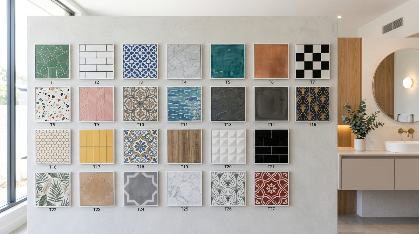
Bathroom tiles are the single design element that most determines the character, mood, and perceived quality of the entire space — functioning as both the floor plan and the artwork simultaneously. This article delivers exactly 27 bathroom tile design ideas spanning color, material, pattern, layout, and small-space techniques so you can find the combination that makes your bathroom feel intentional.
Close your eyes and picture cold marble underfoot warming to your feet as morning light catches the grout lines. Bathroom tile design is where architecture becomes intimate — the place where a 5-foot-square room becomes a composition of light, texture, and surface. The right tile doesn’t just cover a wall; it sets the emotional register of the entire room, from the first moment you flip on the light to the last. Here are 27 ideas worth saving — and stealing.
Why Bathroom Tiles Work So Well as a Design Statement
The history of decorative bathroom tile stretches from ancient Roman thermae through the hand-painted azulejos of 15th-century Portugal to the subway tile revolution of New York City’s early transit system, opened in 1904. What separates bathroom tile design from other interior surfaces is its permanence and precision — unlike a coat of paint or a textile swap, a tiled bathroom represents a committed architectural decision that demands genuine design thinking. This is the room where material choices cannot be improvised.
The core materials of elevated bathroom tile design include glazed ceramic, unglazed porcelain, handmade zellige in warm terracotta and cobalt, honed Carrara marble, unlacquered cement encaustic tile, and fluted stone. The palette ranges from warm chalk white and greige to dusty sage, deep forest teal, warm terracotta blush, slate charcoal, and the luminous veined gray of natural marble. Grout color is equally critical — unsanded grout in warm greige or charcoal reads entirely differently from stark white.
Bathroom tile searches on Pinterest have surged steadily since 2021 as part of a broader cultural move toward home as sanctuary. The pandemic reshaped how people relate to their bathrooms — no longer purely utilitarian, they became personal retreat spaces. Searches for “zellige tile bathroom,” “fluted tile shower,” and “terrazzo floor bathroom” reflect this shift toward materials with texture, history, and artisanal character over the flat, frictionless surfaces of early 2010s minimalism.
Small bathrooms are actually where tile design shines most — and most efficiently. A powder room or a 40-square-foot shower surround requires so little tile that even premium handmade options become budget-accessible. For small spaces, prioritize a single hero tile on the primary wall or floor and keep all other surfaces in a calm, receding tone. Avoid using the same bold tile everywhere — it compresses the space visually.
Style at a Glance
| Element | Core Trait |
| Philosophy | Surface as architecture; beauty earned through material |
| Key Materials | Zellige, honed marble, encaustic cement, glazed ceramic, porcelain |
| Key Colors | Warm chalk, greige, dusty sage, terracotta blush, deep teal, slate charcoal |
27 Bathroom Tile Design Ideas
1. Full-Height Zellige Tile Shower in Warm Terracotta
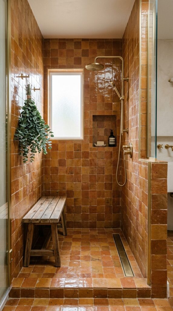
Vibe: The shower reads sun-warmed — like bathing in a riad courtyard where every surface has absorbed years of afternoon light.
Why it works: Zellige tile’s handmade variation means no two tiles catch light identically, creating a surface that reads as alive rather than applied. The principle at play is chromatic texture — warm terracotta zellige generates visual warmth independently of any artificial light source, making even a north-facing shower feel generous. Full-height installation (floor to ceiling) eliminates the horizontal break that makes small showers feel interrupted, extending the vertical dimension of the space.
How to get it: Source authentic Moroccan zellige from specialty importers — Cle Tile and Fireclay Tile both carry genuine handmade options in terracotta tones. Pair with an unsanded grout in “Sahara Beige” (Mapei) rather than white, which creates a tonal relationship with the tile rather than a competing grid. Specify a linear drain rather than a center drain so the floor tile pattern reads unbroken.
💡 Quick Win: A single zellige tile in terracotta used only in the shower niche costs under $40 in materials and introduces the artisanal quality of the style without a full renovation commitment.
🛍️ Shop the Look — Amazon Product Ideas
| # | Product Search Phrase | Why It Fits |
| 1 | Terracotta ceramic tile handmade 4×4 wall | Zellige-look wall tile |
| 2 | Brushed brass linear shower drain square | Warm metal drain accent |
| 3 | Teak shower bench folding wall mount | Natural wood shower seat |
| 4 | Brass wall mount shower niche recessed shelf | Tile-integrated storage |
| 5 | Handmade ceramic soap dish terracotta | Artisanal bath accessory |
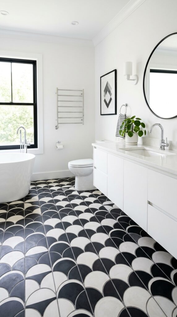
2. Black and White Hexagon Floor with White Subway Walls
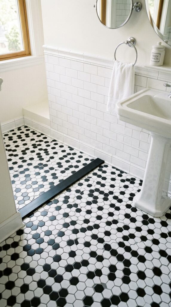
Vibe: The room reads crisp — a fresh-pressed linen shirt translated into tile.
Why it works: The contrast principle between the graphic floor and the clean wall surface creates visual hierarchy — the eye drops to the floor first, which is where the personality lives, then travels up to the calm white walls that allow the floor to star. Black and white hexagon mosaic is a period-appropriate choice dating to early-20th-century residential bathrooms that reads as both historic and timeless rather than trend-dependent. The classic 3×6 subway tile wall keeps the drama focused on the floor without visual competition.
How to get it: Use a 1-inch porcelain hexagon mosaic on a mesh backing (sold in 12×12-inch sheets for easy installation) rather than a larger hex, which loses the traditional delicacy of the pattern. Specify white unsanded grout for the wall subway tile and charcoal sanded grout for the floor hex — the dark grout in the floor emphasizes the pattern while the white wall grout maintains the freshness above.
🛍️ Shop the Look — Amazon Product Ideas
| # | Product Search Phrase | Why It Fits |
| 1 | Black white hexagon mosaic floor tile sheet | Classic pattern floor tile |
| 2 | White subway tile 3×6 glossy ceramic | Wall tile backdrop |
| 3 | Pedestal sink white bathroom freestanding | Period-correct sink form |
| 4 | Round frameless bathroom mirror 24 inch | Clean minimal mirror |
| 5 | White ceramic apothecary jar bathroom set | Classic counter accessory |
3. Fluted Travertine Tile Accent Wall
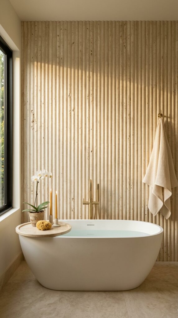
Vibe: The wall reads luminous — as though the stone is generating warmth from within.
Why it works: Fluted stone tile harnesses the design principle of directional texture — the vertical channels create a shadow map that shifts continuously with the angle and quality of natural light, meaning the wall never reads as static. Travertine’s unfilled natural voids (the small holes caused by the stone’s sedimentary formation) add a layer of organic detail that glazed tile cannot replicate. Placed behind a freestanding tub, the fluted wall creates a framing device that turns the entire wall-plus-fixture into a single composed scene.
How to get it: Fluted travertine tile (also sold as “fluted limestone” depending on the quarry) is available in 4×24-inch or 6×24-inch planks from specialty tile suppliers like Mosaic House or Ann Sacks. Install with the channels running vertically to emphasize ceiling height. Leave the natural voids unfilled — they are a feature, not a defect.
💡 Quick Win: A single travertine round tray ($28–45) placed on any bathroom surface immediately introduces the material language of natural stone and signals the entire sensory palette of this look.
🛍️ Shop the Look — Amazon Product Ideas
| # | Product Search Phrase | Why It Fits |
| 1 | Travertine round tray bathroom vanity decor | Natural stone surface accent |
| 2 | Brushed gold freestanding tub filler faucet | Warm metal fixture |
| 3 | Tall tapered beeswax candle set natural | Organic lighting accent |
| 4 | Linen waffle bath sheet towel neutral | Textural textile complement |
| 5 | Fluted ceramic wall tile vertical ribbed | Budget fluted tile option |
4. Sage Green Subway Tile with Dark Grout
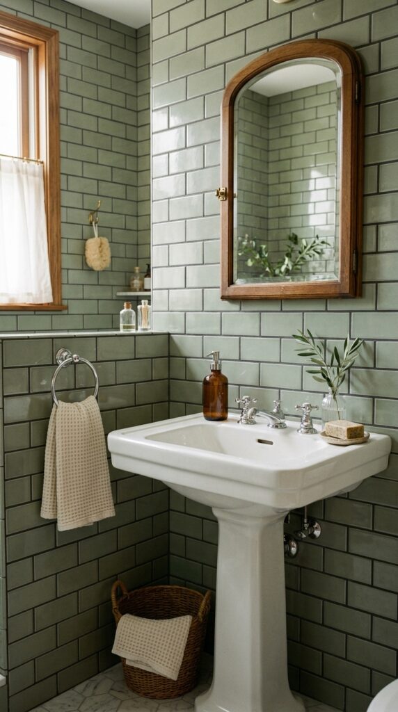
Vibe: The room reads grounded — a color that knows exactly where it comes from and doesn’t try to be anything else.
Why it works: Charcoal grout with a sage tile achieves a counter-intuitive result: the darker grout line makes the tile appear more saturated and the color more deliberate. This is the principle of chromatic amplification through contrast — the dark grid acts as a frame for each individual tile, drawing the eye to the color itself rather than the seam. Sage green specifically functions in north-facing bathrooms because its gray undertones absorb the cool light rather than fighting it, resulting in a room that reads composed rather than cold.
How to get it: Use American Olean’s “Refined Natural Sage” or Fireclay’s “Fern” subway tile in a standard 3×6 inch format. Specify Mapei’s “Charcoal” unsanded grout for joints under 1/8 inch. The offset brick pattern is the correct historic choice for subway tile — diagonal and herringbone patterns are modern interpretations that break the classic period-appropriate character.
🛍️ Shop the Look — Amazon Product Ideas
| # | Product Search Phrase | Why It Fits |
| 1 | Sage green subway tile 3×6 ceramic wall | Signature tile |
| 2 | Charcoal grout unsanded sanded tile joint | Dark grout for contrast |
| 3 | Amber glass soap pump dispenser bathroom | Warm glass counter accent |
| 4 | Chrome cross handle bathroom faucet vintage | Period fixture hardware |
| 5 | Wicker basket under sink storage round | Natural texture storage |
5. Terrazzo Floor Tile with Warm Chips
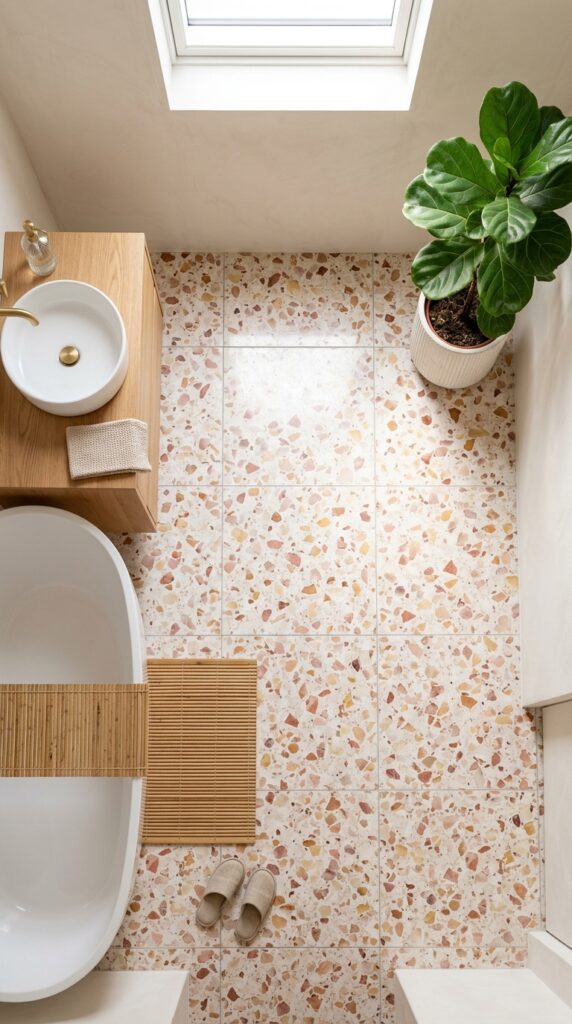
Vibe: The floor reads celebratory without trying — every step lands on a different scatter of color.
Why it works: Terrazzo succeeds in bathrooms because it uses the principle of aggregate variety — within a single monolithic surface, dozens of different tones and materials are present, meaning the floor reads as visually rich regardless of the simplicity of the surrounding walls and fixtures. Choosing warm-toned chips (rose quartz, cream marble, amber onyx) embedded in a white cement base creates a floor that simultaneously reads pale and airy and decoratively complex. Large-format 24×24-inch slabs minimize grout lines and let the terrazzo pattern read at maximum scale.
How to get it: Porcelain terrazzo tile in large format is available from manufacturers like Emser Tile and MSI in warm-chip colorways for $4–12 per square foot — a fraction of poured terrazzo cost. Install with an epoxy grout in a tone matching the base color so joints are nearly invisible, allowing the pattern to read continuously across the floor.
💡 Quick Win: A terrazzo-look bath mat ($25–35) in warm pink and cream tones placed over existing floor tile introduces the material palette completely for under $35 — a zero-commitment test of the look.
🛍️ Shop the Look — Amazon Product Ideas
| # | Product Search Phrase | Why It Fits |
| 1 | Terrazzo look bathroom rug mat pink cream | Soft surface terrazzo echo |
| 2 | White round vessel sink bathroom countertop | Clean modern sink form |
| 3 | Bamboo bath mat non-slip natural | Organic floor texture layer |
| 4 | White ceramic planter pot large indoor | Plant anchor in space |
| 5 | Epoxy grout neutral beige tile joint | Seamless floor installation |
6. Navy Blue Penny Round Mosaic Shower Floor
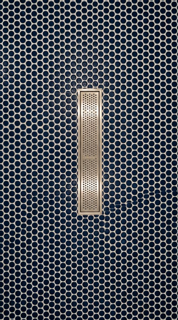
Vibe: The floor reads deep — like looking into still ocean water from above, every grout line a wave-crest of white.
Why it works: Penny round mosaic tile on the shower floor is a traditional slip-resistance solution that doubles as a decorative statement — the high-frequency grout lines created by small-format tiles provide both texture underfoot and a secondary visual pattern through the grout color. Deep navy achieves a color depth that larger-format tiles in the same hue cannot match, because the individual tile scale makes the eye read the color as more saturated. The white grout creates a micro-pattern within the overall navy field that keeps the surface from reading as a single flat color.
How to get it: Source navy penny round tile in porcelain rather than ceramic for shower floor durability and frost resistance — Daltile’s “Keystones” line includes a “Navy Blue” option in the 3/4-inch round format. Specify a bright white unsanded grout (Mapei “Ultra White”) to maximize the contrast of the dot pattern. Install on a pre-sloped shower pan for correct drainage on a flat-bottomed mosaic surface.
🛍️ Shop the Look — Amazon Product Ideas
| # | Product Search Phrase | Why It Fits |
| 1 | Navy blue penny round mosaic tile porcelain | Signature shower floor tile |
| 2 | White unsanded grout bathroom shower | High-contrast grout color |
| 3 | Chrome shower floor drain linear round | Shower drain fixture |
| 4 | White marble threshold bar shower entry | Material transition strip |
| 5 | Turkish cotton bath towel white waffle | Classic white towel pairing |
7. Recessed Shower Niche Tiled in a Contrasting Accent
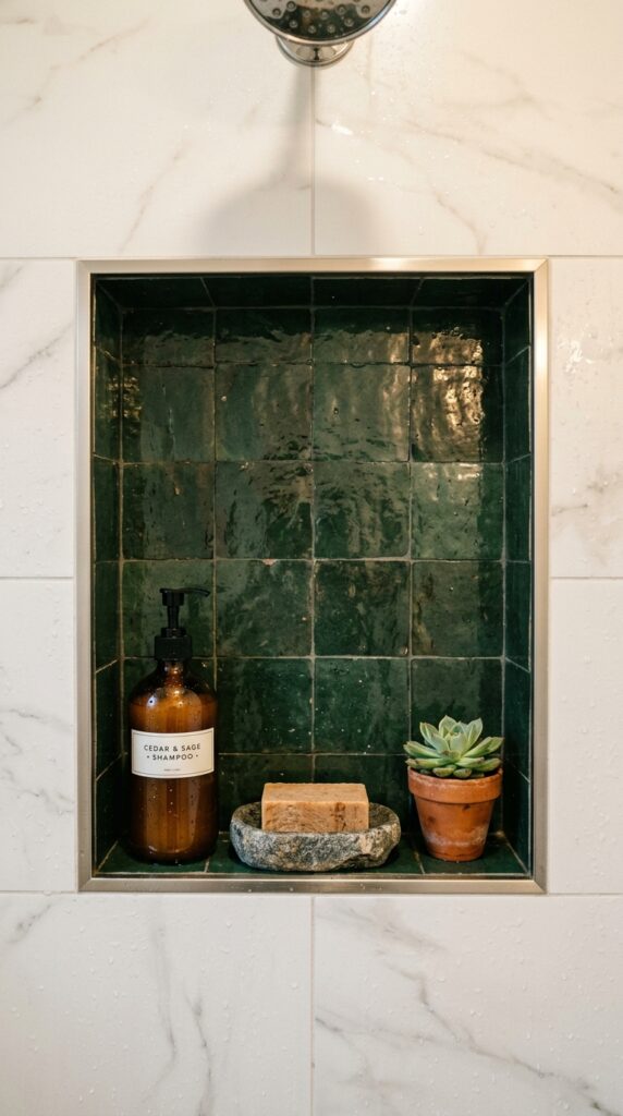
Vibe: The niche reads framed — a jewel box set into an otherwise calm surface.
Why it works: A contrasting tile accent niche uses the design principle of scale contrast — by limiting the bold tile to the small recessed plane, you get all the visual drama of a statement material with none of the risk of visual fatigue. The darker interior of the niche creates a shadow-box effect that makes the products stored inside read as curated and intentional rather than practical. The thin metal edge profile at the niche opening acts as a picture frame, further reinforcing the idea that this is a composed moment within the wall.
How to get it: Tile the niche back wall and both side walls in the contrasting accent tile, but keep the niche ceiling and the floor of the shelf in the same tile as the surrounding shower wall — this subtly integrates the niche into the overall wall plane while the sides create the jewel-box depth. Use a brushed metal schluter edge trim in nickel or gold at the front face opening to cap the transition cleanly.
💡 Quick Win: Regrouting an existing plain shower niche in a contrasting dark grout color ($12 in materials) immediately makes the niche read as a deliberate design moment without retiling anything.
🛍️ Shop the Look — Amazon Product Ideas
| # | Product Search Phrase | Why It Fits |
| 1 | Green glazed ceramic wall tile 4×4 shower | Accent niche tile color |
| 2 | Schluter metal edge trim tile brushed nickel | Niche edge transition |
| 3 | Amber glass pump bottle shampoo conditioner | Curated niche product |
| 4 | Stone soap dish natural travertine | Niche shelf accessory |
| 5 | Mini terracotta succulent pot 2 inch | Tiny niche plant detail |
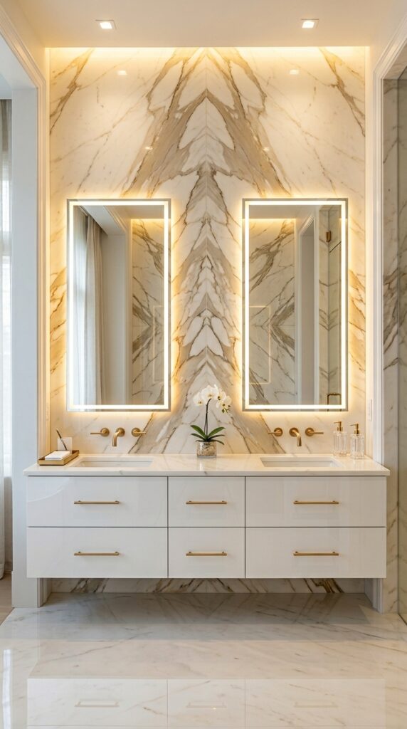
8. Herringbone Marble Tile Feature Wall
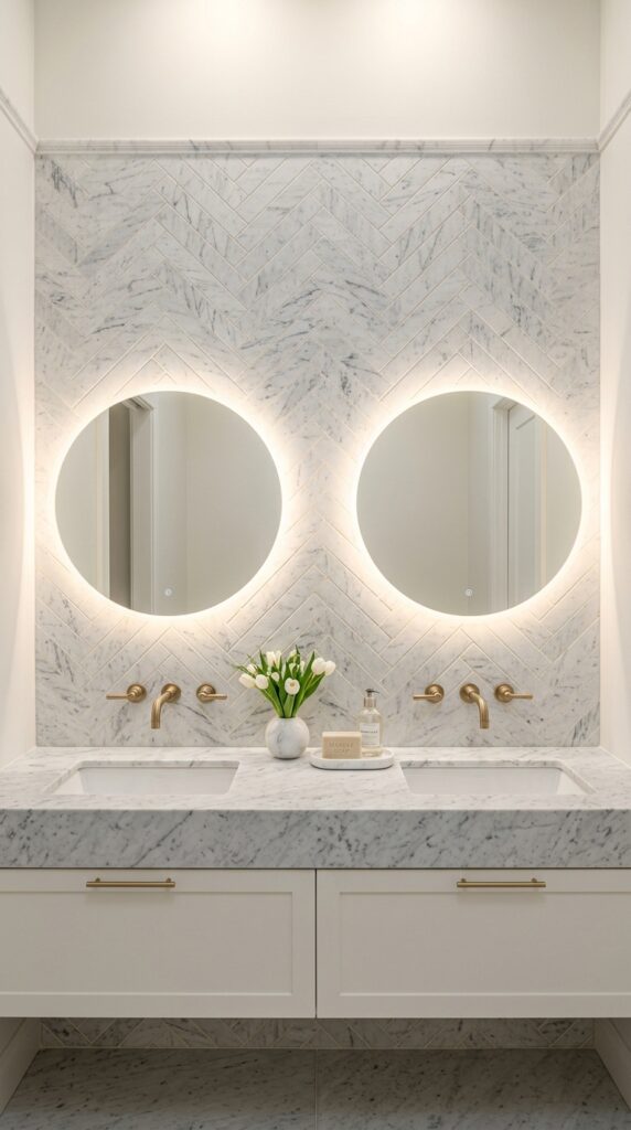
Vibe: The wall reads refined — the herringbone direction creating a constant, gentle visual movement like water over stone.
Why it works: Herringbone pattern generates perceived motion across a static surface because adjacent tile directions create a V-shaped repeat that the eye follows naturally across the field. On marble, this motion effect is amplified because the veining within each tile shifts direction at every joint, creating a secondary pattern within the primary pattern. Honed marble rather than polished is the correct specification for vanity walls — the matte surface absorbs light rather than reflecting it, giving the wall a depth and warmth that polished marble in the same location cannot achieve.
How to get it: Use a 2×6-inch honed Carrara marble finger tile (also called a “brick” or “mini brick” format) for herringbone at a vanity scale — larger tiles make the herringbone pattern too coarse to read elegantly. Have tiles pre-sealed with a penetrating stone sealer (Miracle Sealants 511) before and after grout installation. Specify a warm white non-sanded grout rather than bright white — the slight warmth prevents the grout from competing with the marble’s own warm gray veins.
🛍️ Shop the Look — Amazon Product Ideas
| # | Product Search Phrase | Why It Fits |
| 1 | Carrara marble effect herringbone tile sheet | Marble herringbone wall tile |
| 2 | Backlit round bathroom mirror LED warm | Vanity mirror lighting |
| 3 | Brushed gold bathroom faucet single hole | Warm metal hardware |
| 4 | Marble bud vase small white bathroom | Stone surface accent |
| 5 | Penetrating stone sealer marble tile | Marble protection product |
9. Warm White Plaster-Look Large Format Tile
Vibe: The bathroom reads hushed — a room where the absence of pattern is itself a design decision.
Why it works: Large-format plaster-look tile exploits the design principle of material continuity — when the floor tile, wall tile, and grout are all in the same warm white tonal family, the room’s boundaries dissolve and the space reads as an unbroken volume rather than a box. The subtle texture of the plaster-look surface prevents this from becoming sterile by creating micro-shadows that shift with the light quality throughout the day. This is the maximalist use of minimalism: achieving perceived luxury through restraint.
How to get it: Specify 48×24-inch or larger format porcelain in a warm white with a lappato (semi-polished) or soft-matte finish — avoid bright polished surfaces, which read cold. Match the grout color exactly to the tile using a custom-tinted unsanded grout; most tile suppliers offer color-matching services. Install on a floor-flattened substrate to prevent lippage (tile-edge height variance) which becomes very visible on large-format tiles.
💡 Quick Win: A single tall stone vase ($30–50) holding dried pampas grass on a floating vanity shelf introduces the entire warm organic sensibility of this palette in one zero-installation move.
🛍️ Shop the Look — Amazon Product Ideas
| # | Product Search Phrase | Why It Fits |
| 1 | Pampas grass dried stems natural decor tall | Organic bathroom styling |
| 2 | Stone ceramic tall vase bathroom neutral | Vessel for dried botanicals |
| 3 | Oval freestanding bathtub matte white acrylic | Hero bath fixture |
| 4 | Floating wall mount bathroom vanity white | Spa-style vanity |
| 5 | Linen hand towel bathroom neutral greige | Textured textile accent |
10. Deep Teal Encaustic Cement Tile Floor
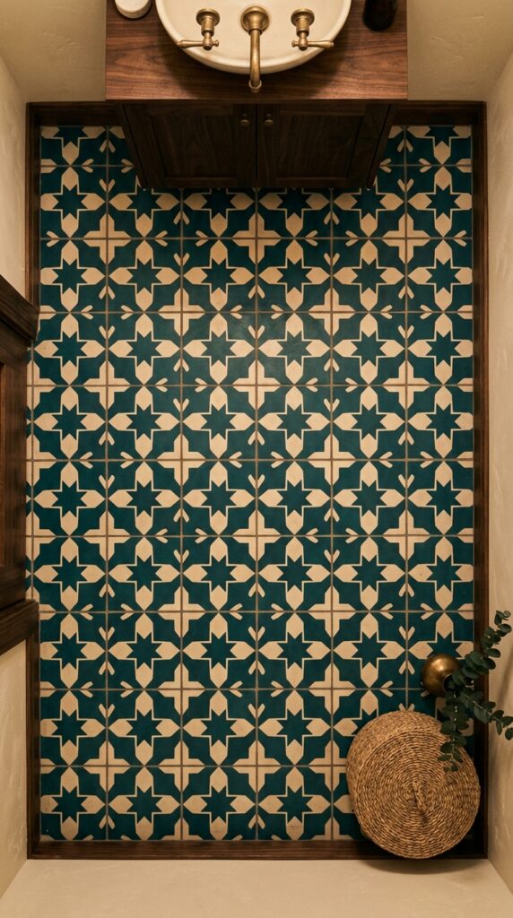
Vibe: The floor reads storied — the kind of pattern that suggests the room arrived from somewhere else entirely.
Why it works: Encaustic cement tile uses the principle of embedded pattern — unlike printed or glazed tiles, the pattern in encaustic tile is composed of differently colored cement pigments pressed into layers, meaning the design is physically part of the tile rather than a surface treatment. This gives the tile a visual depth and an authenticity that printed alternatives cannot replicate. Deep teal grounds a small powder room with unexpected richness, and a geometric two-tone pattern in a small room creates the impression of a much larger space through the energy of the repeat.
How to get it: Seal encaustic cement tile with a penetrating sealer (Aqua Mix Sealer’s Choice Gold) before and after grouting, and apply a topical sealer after curing for bathrooms — cement tile is porous and requires this protection. Source authentic encaustic tile from Cement Tile Shop or Granada Tile for patterns that hold true to the Moroccan original.
🛍️ Shop the Look — Amazon Product Ideas
| # | Product Search Phrase | Why It Fits |
| 1 | Encaustic cement tile patterned teal blue | Geometric floor tile |
| 2 | Cement tile sealer penetrating waterproof | Required tile protection |
| 3 | Dark walnut floating vanity bathroom 24 inch | Rich wood vanity base |
| 4 | Unlacquered brass faucet bathroom vessel sink | Aging metal fixture |
| 5 | Seagrass woven basket bathroom storage | Natural texture basket |
11. Arched Mirror Paired with Mosaic Tile Backsplash
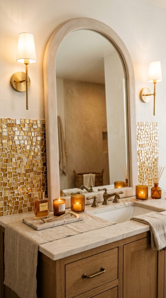
Vibe: The vanity reads romantic — mosaic light bouncing through amber glass as if the whole surface is on the edge of candlelight.
Why it works: Smalti glass mosaic tiles catch and refract light at multiple angles simultaneously because handcut edges are never perfectly flat, creating a shimmer across the backsplash surface that no glazed ceramic tile can achieve. This is the principle of reflected energy — the backsplash becomes a light source in itself under warm sconce lighting, eliminating the cold flatness of a plain painted or tiled wall behind a vanity. An arched mirror introduced at a larger scale above creates a counter-curve that softens the angular tile grid below.
How to get it: Smalti glass mosaic tile is available from Mosaic Arts International and Mosaico+ in gold and amber blends. For a more accessible version, use Oceanside Glasstile’s “Shimmer” series in warm gold. Apply to the backsplash area only (behind the sink and extending 4 inches above the counter) using a white polymer-modified thinset for glass tile.
💡 Quick Win: An arched plaster or limewash-finish mirror ($45–90 on Amazon) placed over any existing vanity immediately shifts the visual register of the entire vanity composition without touching the tile.
🛍️ Shop the Look — Amazon Product Ideas
| # | Product Search Phrase | Why It Fits |
| 1 | Arched plaster finish bathroom mirror large | Signature mirror shape |
| 2 | Gold glass mosaic tile backsplash sheet | Light-catching mosaic tile |
| 3 | Amber glass votive candle holder set | Warm vanity glow accent |
| 4 | Marble tray bathroom vanity organizer | Counter styling base |
| 5 | Linen vanity counter runner ivory | Soft surface layer |
12. Bold Graphic Black and White Encaustic Pattern
Vibe: The floor reads graphic — the kind of pattern that makes the rest of the room’s simplicity look like a deliberate artistic choice.
Why it works: A graphic two-tone pattern floor in an otherwise all-white bathroom applies the principle of intentional visual anchor — when every other surface is calm and recessive, the floor becomes the single statement that carries the entire room’s personality. Black and white in matte finishes (rather than gloss) prevents the pattern from reading as harsh because the matte surface absorbs rather than amplifies the contrast. Fan and fish-scale patterns have a particular advantage over geometric angulars: the curved repeat creates an organic energy that feels handcrafted rather than mechanical.
How to get it: Use cement or porcelain encaustic fan tiles in 6-inch or 8-inch formats — the 8-inch scale is correct for floor areas over 40 square feet, while 6-inch works better in small powder rooms. Specify white grout even if the tile has a white element — matching the grout to the lighter color of the pattern makes the darker element read as the only visible line, simplifying the visual effect.
🛍️ Shop the Look — Amazon Product Ideas
| # | Product Search Phrase | Why It Fits |
| 1 | Fish scale fan tile black white cement | Graphic floor tile pattern |
| 2 | Black frame bathroom wall art print | Graphic accent above tile |
| 3 | White tall pillar candle holder set | Simple vertical decor |
| 4 | Black and white striped hand towel bathroom | Pattern echo in textiles |
| 5 | White ceramic pot plant indoor small | Clean organic accent |
13. Warm Wood-Look Porcelain Tile Floor
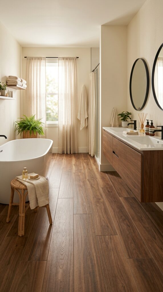
Vibe: The floor reads warm — the sensation of stepping onto wood without a single drop of water damage ever entering the equation.
Why it works: Wood-look porcelain plank tile exploits the cognitive warmth of wood-tone surfaces — research consistently shows that humans perceive spaces with warm-toned floors as literally warmer in temperature than identical spaces with cool-toned floors. The long 6×48-inch plank format creates strong horizontal lines that elongate the perceived length of the room, an effect that is especially pronounced in primary bathrooms where length matters for the freestanding tub-to-vanity journey. Porcelain eliminates every practical objection to real wood in wet areas without sacrificing the visual language.
How to get it: Specify a matte-finish wood-look plank in a warm mid-brown (equivalent to a walnut stain, not a gray-washed “driftwood” — the latter reads cold in most bathroom light conditions). Install planks parallel to the longest wall dimension to maximize the lengthening effect. Use a floor leveling compound before installation to ensure flat substrate — warped planks on an uneven floor are the primary failure mode.
💡 Quick Win: A rattan low stool or side table ($35–55) placed beside any bathtub or shower immediately introduces the organic warmth palette that makes wood-tone floors read as an intentional spa reference rather than a practical substitute.
🛍️ Shop the Look — Amazon Product Ideas
| # | Product Search Phrase | Why It Fits |
| 1 | Wood look porcelain plank tile walnut 6×48 | Signature floor material |
| 2 | Rattan stool low bathroom side table | Organic texture accent |
| 3 | Bamboo essential oil diffuser bathroom | Spa sensory element |
| 4 | Fern artificial plant wicker basket indoor | Low-maintenance green accent |
| 5 | Cream linen shower curtain floor length | Warm textile complement |
14. Vertical Tile Installation for Low-Ceiling Bathrooms
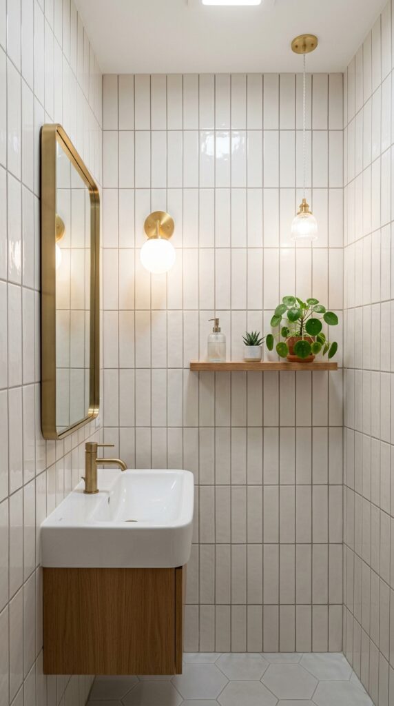
Vibe: The room reads taller than it is — the vertical line working on the eye the way a pinstripe works on a silhouette.
Why it works: Vertical tile installation is one of the most underused and highest-impact layout interventions available in bathroom design. The principle is directional visual loading — when the predominant lines of the tile pattern run vertically, the eye follows them upward and perceives the room as taller than the actual ceiling height. A 3×12-inch subway tile installed vertically creates a very different reading from the same tile installed horizontally: it replaces the horizontal banding of a traditional installation with a column-like cadence that naturally conveys height and refinement.
How to get it: Any rectangular tile can be installed vertically — the technique applies to 3×6, 3×12, 4×16, and 4×24-inch formats equally. The key installation detail is to use a running bond (50% offset on horizontal joints) rather than stacking tiles directly above each other, which can emphasize any wall imperfections. The grout joint between the horizontal spacing lines should be tighter (1/16 inch) than the vertical joint between tiles to minimize the horizontal reading.
🛍️ Shop the Look — Amazon Product Ideas
| # | Product Search Phrase | Why It Fits |
| 1 | White subway tile 3×12 glossy ceramic | Vertical installation tile |
| 2 | Tall narrow wall mirror bathroom gold frame | Height-emphasizing mirror |
| 3 | Wall mount sconce bathroom brass warm light | Eye-level light source |
| 4 | Floating narrow shelf bathroom wall mount | Vertical space organizer |
| 5 | Greige unsanded grout warm beige bathroom | Warm-toned grout color |
15. Slate Gray Tile with Matte Black Fixtures
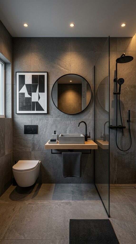
Vibe: The room reads moody — the kind of bathroom that feels like a full stop at the end of a long day.
Why it works: Monochromatic tile-plus-fixture design applies the principle of tonal immersion — when floor, wall, and ceiling share a close tonal family, the room’s architecture dematerializes and attention shifts to the physical quality of the materials rather than their arrangement. Matte black fixtures on a gray tile background function as a design system: each fixture is a graphic mark in a deliberate composition rather than a practical object attached to a wall. The white oak vanity shelf introduces the one warm contrasting element that prevents the monochromaticism from reading as oppressive.
How to get it: Specify a textured porcelain in a warm gray (not a cool blue-gray, which reads clinical) — Porcelanosa’s “Rodano” series or Crossville’s “Plank” series in warm charcoal tone. Keep all fixtures in a single matte black finish — mixing satin black and matte black creates an unintended contrast. Specify warm white recessed lighting (2700K LED) rather than cool white to prevent the gray from shifting blue.
🛍️ Shop the Look — Amazon Product Ideas
| # | Product Search Phrase | Why It Fits |
| 1 | Matte black bathroom faucet single hole | System fixture hardware |
| 2 | Charcoal waffle weave towel set bathroom | Tonal textile layer |
| 3 | White oak floating vanity shelf wall mount | Warm wood contrast element |
| 4 | Concrete geometric soap dish bathroom | Material accent dish |
| 5 | Matte black towel bar 24 inch wall mount | Hardware system component |
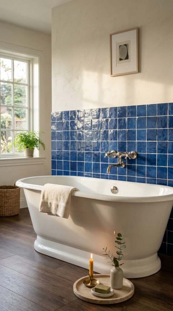
16. Penny Tile Wainscoting with Painted Upper Wall
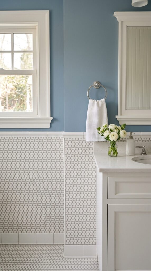
Vibe: The room reads considered — a layered wall treatment that takes the idea of wainscoting seriously without being precious about it.
Why it works: Tile wainscoting applies the classical architectural principle of base-field-cap hierarchy to the bathroom wall — the heavier, textured material at the lower wall creates visual stability (base), the smooth painted surface provides calm above (field), and the cap rail marks the transition as a deliberate horizontal datum. White penny round mosaic has enough visual texture to read as a material rather than simply a white surface, which makes the upper painted wall read as intentionally minimal rather than unfinished.
How to get it: Install the penny tile to a height of 36–48 inches (the taller height is more architecturally formal and works better in rooms with high ceilings). Finish the top edge with a 2-inch bullnose or a pencil liner tile in the same white to cap the installation cleanly. Choose a dusty blue in an eggshell finish (Benjamin Moore “Van Deusen Blue” HC-156 or “Quiet Moments” 1563) for the upper wall — the slight sheen integrates with the tile’s surface without competing.
💡 Quick Win: Extending the penny tile wainscoting only around the tub surround (rather than the whole room) costs approximately 40% less in materials and labor while achieving the same primary visual impact.
🛍️ Shop the Look — Amazon Product Ideas
| # | Product Search Phrase | Why It Fits |
| 1 | White penny round mosaic tile sheet bathroom | Wainscoting tile material |
| 2 | Bullnose tile trim white ceramic edge cap | Wainscot cap rail tile |
| 3 | Dusty blue eggshell paint interior 1 quart | Upper wall paint color |
| 4 | Beadboard panel bathroom mirror white frame | Period-correct mirror style |
| 5 | Glass bud vase clear flower bathroom small | Delicate floral accent |
17. Outdoor-Stone-Look Porcelain in a Shower
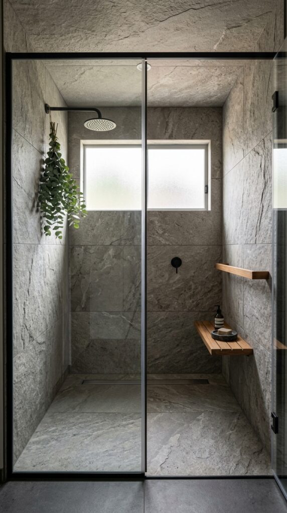
Vibe: The shower reads raw — the sensation of standing in a stone grotto with perfect water pressure.
Why it works: Large-format stone-look porcelain achieves a grotto-like quality in a shower because the minimal grout lines allow the eye to read the wall as a continuous stone face rather than an assembled grid. The textured surface — especially in a split-face or honed quartzite profile — catches light from the shower’s side window in a way that smooth tile cannot, creating shadow relief across the wall that shifts as the light source moves. Dark gray grout matching the tile’s shadow tone makes the joints effectively disappear.
How to get it: Specify rectified porcelain tile (factory-cut to precise dimensions) when using large-format tiles in a shower, as non-rectified tiles have size variation that makes tight joints impossible. Use a mini-grout joint of 1/16 inch maximum with matching-tone grout. Install a horizontal window at shoulder height in a new shower design — this brings natural light across the stone-look surface for maximum texture revelation.
🛍️ Shop the Look — Amazon Product Ideas
| # | Product Search Phrase | Why It Fits |
| 1 | Teak shower shelf rack wall mount wood | Natural wood shower storage |
| 2 | Rainfall shower head wall mount chrome | Minimalist shower fixture |
| 3 | Eucalyptus bundle hanging shower spa | Aromatherapy shower detail |
| 4 | Round stone soap dish travertine natural | Organic shower accessory |
| 5 | Dark gray epoxy grout large format tile | Seamless stone-look joint |
18. Candy-Stripe Tile Border for a Playful Powder Room
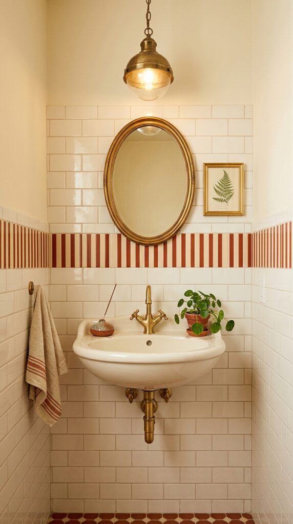
Vibe: The room reads playful — the single stripe doing all the work of a full pattern without any of the commitment.
Why it works: A decorative tile border at chair-rail height uses the same classical proportional principle as architectural chair rails — dividing the wall horizontally into lower and upper zones and assigning different visual weight to each. A stripe border takes just 2–4 inches of wall height to communicate a complete design personality, which makes it one of the most cost-effective pattern statements available in tile. The warm cream and terracotta palette is a specifically Italian reference — Vietri-style striped tiles have been produced in the Campania region since the 17th century and carry immediate period authenticity.
How to get it: Source authentic Vietri-style listello tiles or ceramic stripe border tiles from Italian tile importers such as Tiles of Ezra or Mosaicos Riviera. Install the border at 36 inches from the finished floor — the classical chair rail height — as a single row, using a level to ensure it reads as a datum line rather than a wavy accent.
🛍️ Shop the Look — Amazon Product Ideas
| # | Product Search Phrase | Why It Fits |
| 1 | Ceramic border tile stripe terracotta cream | Decorative listello border |
| 2 | Gold frame oval mirror bathroom wall | Period-appropriate mirror |
| 3 | Botanical art print framed small bathroom | Wall art companion |
| 4 | Ceramic incense holder bathroom small | Artisanal counter accent |
| 5 | Mini trailing pothos plant bathroom shelf | Cascading green accent |
19. Matte White Brick-Format Tile with Raw Plaster Effect
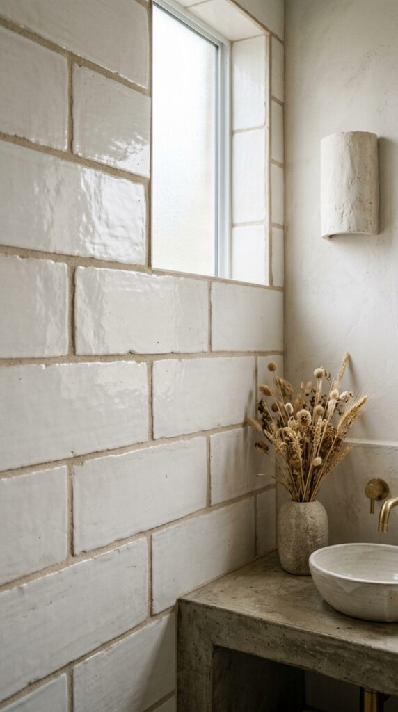
Vibe: The wall reads handmade — the kind of surface you want to run your hand along to verify it’s tile and not plaster.
Why it works: Handmade-edge brick-format tiles exploit the same visual principle as artisanal ceramics: controlled imperfection as evidence of human craft. Each tile’s slightly irregular edge creates a shadow line at every joint that functions as an embedded bas-relief pattern — the wall reads as deeply textured even though each tile is individually flat. A thick putty-tone grout (rather than standard 1/8-inch white grout) amplifies this effect by making the joint itself a dimensional element. This is the tactile opposite of the large-format seamless tile look — and the two approaches should never share a room.
How to get it: Fireclay Tile’s “Debris” and “Cloe” series include handmade-edge 3×9-inch tiles in warm off-white glazes with controlled variation. Install with a 3/16-inch to 1/4-inch grout joint (wider than standard) in an unsanded grout tinted to warm putty (Mapei “Warm Gray 112”). The wider joint is correct for handmade tiles and reinforces the artisanal character.
💡 Quick Win: Replacing standard chrome bathroom hardware with an unlacquered or oil-rubbed bronze version ($15–30 per piece) immediately shifts the material register of any white tile bathroom toward the handcrafted, raw palette of this look.
🛍️ Shop the Look — Amazon Product Ideas
| # | Product Search Phrase | Why It Fits |
| 1 | Handmade look white ceramic wall tile 3×9 | Artisanal texture tile |
| 2 | Raw plaster wall sconce light bathroom | Material echo in lighting |
| 3 | Handmade ceramic sink basin bathroom | Artisanal vanity element |
| 4 | Concrete vanity countertop bathroom | Raw material vanity base |
| 5 | Dried wheat grass seed head bundle vase | Organic styling material |
20. Tiny Bathroom Transformed by a Statement Floor Tile
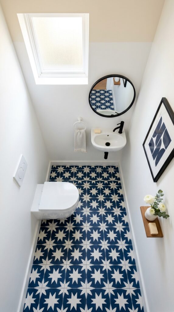
Vibe: The room reads bold without apology — the floor doing the work of a whole design concept in 25 square feet.
Why it works: Small powder rooms are the ideal context for maximalist floor tile because the limited square footage means the entire pattern is always visible and readable as a composition — unlike a large bathroom where a bold floor pattern is partially covered by furniture and fixtures. Wall-hung fixtures are essential to this approach: a wall-hung toilet and wall-mount sink remove all obstructions from the floor, allowing the full pattern to read. White walls above the pattern provide the visual silence that makes the floor’s voice carry without competition.
How to get it: For rooms under 30 square feet, use a tile with a repeat pattern where the full motif fits within a single 8×8 or 12×12-inch tile — larger-repeat patterns require significant floor area to read correctly. Install tiles starting from the center of the room working outward so the cut tiles at each wall are equal in size, which gives the pattern a balanced and deliberate appearance.
🛍️ Shop the Look — Amazon Product Ideas
| # | Product Search Phrase | Why It Fits |
| 1 | Star cross pattern cement tile navy white | Bold powder room floor |
| 2 | Wall hung toilet elongated modern | Floor-clearing fixture |
| 3 | Wall mount sink bathroom small space | Floor-clearing vanity |
| 4 | Round brass mirror bathroom wall mount | Overhead small space mirror |
| 5 | White ceramic wall hook single bathroom | Minimal wall accent |
21. Limewash-Painted Tile for a Budget Refresh
Vibe: The room reads aged and calm — like a bathroom in a Provençal farmhouse that’s been gently lived in for decades.
Why it works: Limewash paint applied to existing bathroom tile exploits the tile’s surface texture and grout lines to create a layered, cloudlike variation that no flat paint application can achieve. This is the principle of substrate integration — the paint becomes part of the existing surface rather than covering it, using the grout lines and tile texture as an integral element of the decorative result. The technique works because limewash dries to a highly matte, chalky finish that has no association with the shiny, clearly-painted surface that makes painted tile look like a compromise.
How to get it: Clean tile thoroughly with TSP (trisodium phosphate) degreaser. Apply Portola Paints Lime Wash or Roman Clay in “Antique White” using a natural bristle brush in short, overlapping strokes, working the paint into the grout lines and then dragging it lightly to create variation. Apply a second coat in opposing brush directions after 24 hours of drying. No sealing is necessary — limewash is naturally breathable.
🛍️ Shop the Look — Amazon Product Ideas
| # | Product Search Phrase | Why It Fits |
| 1 | Limewash paint interior wall white chalk | Tile refresh paint product |
| 2 | Natural bristle paintbrush set lime wash | Limewash application tool |
| 3 | Rattan mirror round bathroom wall 24 inch | Organic texture mirror |
| 4 | Terracotta planter trailing ivy small | Warm ceramic plant holder |
| 5 | Cotton bath rug warm sand neutral | Soft floor layer |
22. Cobalt Blue Mosaic Tile in a Powder Room
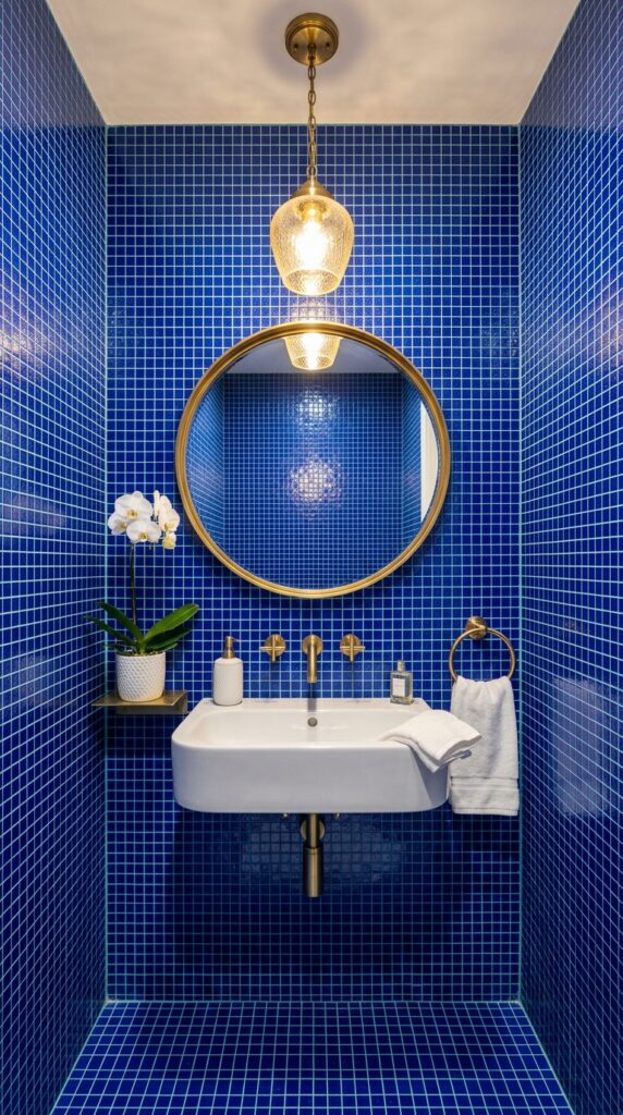
Vibe: The room reads immersive — a space you step into rather than simply enter, like being inside a lit aquarium.
Why it works: Full-room glass mosaic tile creates the rare effect of a space where every surface is a light source — glass mosaic reflects and refracts overhead light from all angles simultaneously, meaning the room generates its own luminosity independent of natural light. This is why the treatment is reserved almost exclusively for powder rooms and small accent spaces: a full room of reflective mosaic would be overwhelming in a larger space but creates an intentional jewel-box experience in a 25–40-square-foot room. The cobalt specifically references Byzantine mosaic art — a tradition where deep blue glass tile was considered more precious than painted surface.
How to get it: Source glass mosaic tile for wet-area applications in an ANSI A137.2-rated glass tile — this specification ensures the glass has appropriate thermal expansion ratings for the humidity cycling of bathrooms. Specify a light aqua or pale blue grout rather than white, which creates a slightly tonal grout relationship that softens the grid and prevents it from looking like graph paper.
💡 Quick Win: Tiling just the back wall of a powder room in cobalt mosaic — rather than all four walls — costs approximately one-quarter of a full-room installation and creates a similar jewel-box focal effect when viewed from the entry.
🛍️ Shop the Look — Amazon Product Ideas
| # | Product Search Phrase | Why It Fits |
| 1 | Cobalt blue glass mosaic tile 1 inch sheet | Immersive wall tile |
| 2 | Brass pendant light bathroom round globe | Warm light activator |
| 3 | Gold round mirror bathroom 20 inch wall | Brass-tone contrast |
| 4 | White ceramic soap dispenser pump bathroom | Clean counter accent |
| 5 | Aqua blue unsanded grout tile joint | Tonal grout complement |
23. Mix-and-Match Tile Patterns for an Eclectic Bathroom
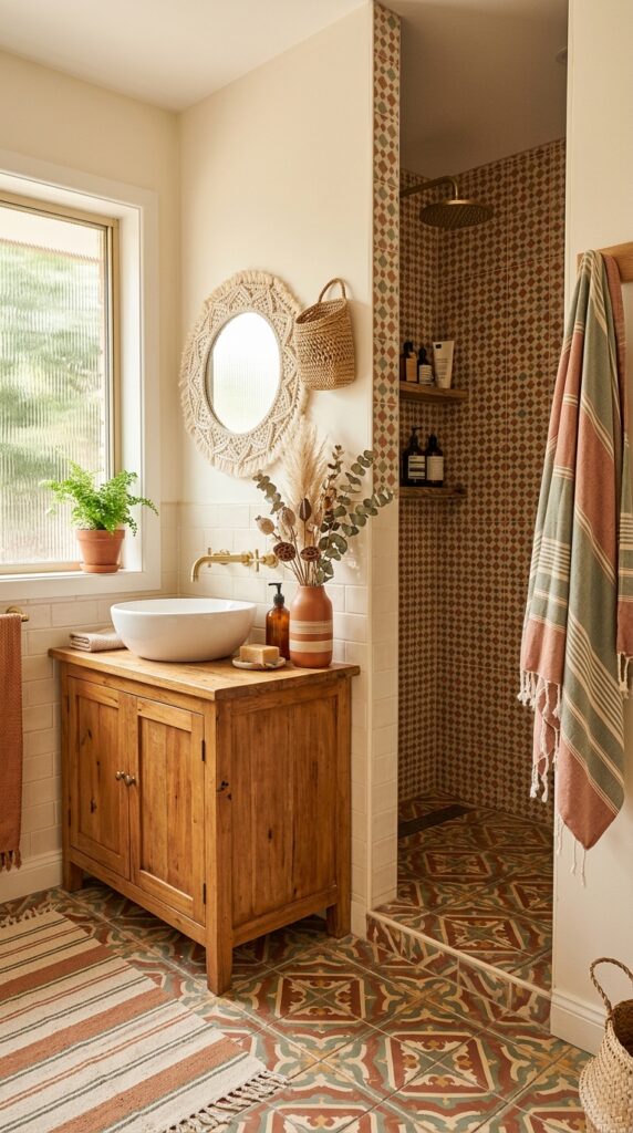
Vibe: The room reads layered — like a curated collection rather than a single decision, each pattern enriching the others.
Why it works: Pattern mixing in bathroom tile design succeeds when it follows the principle of palette unification — using three or more distinct patterns becomes cohesive when all patterns share a common two or three-color family. Each pattern can have a different scale, motif, and material as long as the colors create a through-line. The key technical detail is the transition management: a simple pencil liner tile or a color-matched grout joint in a neutral tone acts as a visual full stop between pattern zones, preventing them from competing.
How to get it: Establish your palette first (in this example: terracotta, sage, and cream) and then find tiles in those colors separately — the patterns don’t need to coordinate, only the colors. Keep the most complex, small-scale pattern in the smallest area (niche or backsplash) and use simpler or larger-scale patterns in the larger areas (floor, full shower wall). This creates a visual hierarchy where the eye isn’t overwhelmed.
🛍️ Shop the Look — Amazon Product Ideas
| # | Product Search Phrase | Why It Fits |
| 1 | Moroccan pattern wall tile terracotta 4×4 | Small-pattern accent tile |
| 2 | Macrame mirror round bohemian wall | Eclectic mirror style |
| 3 | Striped Turkish cotton towel bathroom | Textile pattern layer |
| 4 | Woven wall basket natural fiber decor | Boho wall texture accent |
| 5 | Cream pencil liner tile border 1×12 | Pattern transition tile |
24. Polished Marble Tile for a High-Gloss Vanity Wall
Vibe: The wall reads deliberate and luminous — a composed gesture that turns a vanity into an architectural statement.
Why it works: Book-matched marble slabs (where two slabs from the same block are opened like a book and placed mirror-image against each other) create a bilateral symmetry in the veining that reads as actively designed rather than naturally random. This is the principle of controlled natural variation — harnessing the stone’s inherent pattern and amplifying it into a deliberate composition. Polished rather than honed marble is the correct specification here because the high-gloss surface reflects the overhead light downward, adding a luminosity to the vanity area that complements rather than competes with vanity lighting.
How to get it: For a budget-accessible version, use large-format porcelain with a printed Calacatta Gold vein pattern in polished finish (Bedrosians and MSI both offer convincing options at $8–15 per square foot) installed with a bookmatch layout by flipping alternating tiles on the horizontal axis. True marble book-matching requires a stone fabricator; porcelain can be book-matched DIY with careful planning at the tile store.
🛍️ Shop the Look — Amazon Product Ideas
| # | Product Search Phrase | Why It Fits |
| 1 | Calacatta gold marble look porcelain tile 24×48 | Book-match vanity tile |
| 2 | Brushed gold cabinet pull handle 5 inch | Warm hardware accent |
| 3 | LED backlit bathroom mirror rectangular | Vanity lighting mirror |
| 4 | Crystal glass soap dispenser pump clear | Luxe counter accessory |
| 5 | White lacquer bathroom vanity floating 60 inch | Clean vanity foundation |
25. Zellige Tile Backsplash Behind a Freestanding Tub
Vibe: The tub alcove reads still — a place where the light and the tile surface are in a constant slow conversation.
Why it works: A partial tile backsplash behind a freestanding tub creates a defined zone that treats the tub as furniture within a framed setting rather than a fixture attached to a wall. This is the principle of focal framing — the tile panel acts as a wainscot that grounds the tub visually and gives the entire wall composition a clear horizontal organization. Cobalt zellige behind a cream linen and natural travertine accessory palette creates a material tension between the cool, deep blue and the warm stone and textile tones that reads as sophisticated and internationally referenced.
How to get it: The backsplash height should align with the top of the tub’s back rim plus 6–8 inches for splash protection — typically 30–40 inches total from the finished floor. Waterproofing this zone (Schluter Kerdi membrane or RedGard liquid membrane applied to the wall surface before tile) is essential even for freestanding tubs where the backsplash is not a shower surround. The transition from tile to plaster above should be finished with a narrow bullnose edge tile in the same zellige for a clean horizontal line.
💡 Quick Win: A single zellige tile used as a trivet or wall catch-all tray ($18–30) introduces the tactile ripple glaze of the material in a zero-commitment, zero-installation format.
🛍️ Shop the Look — Amazon Product Ideas
| # | Product Search Phrase | Why It Fits |
| 1 | Cobalt blue zellige tile 4×4 handmade | Tub backsplash statement tile |
| 2 | Wall mount tub filler faucet polished nickel | Tub fixture complement |
| 3 | Waterproofing membrane tile redgard liquid | Wet area tile prep |
| 4 | Travertine round tray natural stone | Organic tub ledge styling |
| 5 | Rolled linen towel bathroom natural color | Textural tub ledge accent |
26. Ribbed Glass Shower Screen Instead of Tile Partition
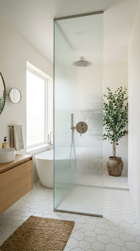
Vibe: The room reads expansive — the glass holding space without dividing it, light moving through as though the wall itself is made of water.
Why it works: A ribbed glass shower panel used in place of a tile partition applies the principle of permeability — maintaining the visual continuity of the bathroom while still defining the shower zone functionally. The fluted pattern in the glass creates visual interest and privacy simultaneously through the optical diffusion of vertical channels, without the visual heaviness of a tiled half-wall or a framed glass enclosure with horizontal rail bars. This technique is especially effective in smaller primary bathrooms where a tile partition would create a visual barrier that cuts the room’s perceived width.
How to get it: Specify 3/8-inch tempered fluted glass in a standard shower panel frame from companies like Ove Decors or Delta (both offer frameless pivot options that accept fluted glass inserts). The glass panel should run floor to ceiling for maximum visual height, with a brushed nickel or chrome pivot hinge at the floor and header. No tile is needed on the partition itself — the glass is the partition.
🛍️ Shop the Look — Amazon Product Ideas
| # | Product Search Phrase | Why It Fits |
| 1 | Fluted ribbed glass shower door panel frameless | Statement glass partition |
| 2 | Brushed nickel pivot shower door hinge | Hardware for glass panel |
| 3 | White hex mosaic shower floor tile sheet | Simple shower floor tile |
| 4 | Eucalyptus tree potted tall indoor plant | Height anchor in bathroom |
| 5 | Jute natural bath mat floor bathroom | Organic floor texture |
27. Cement Tile Bathroom Floor in Earth-Tone Stripe
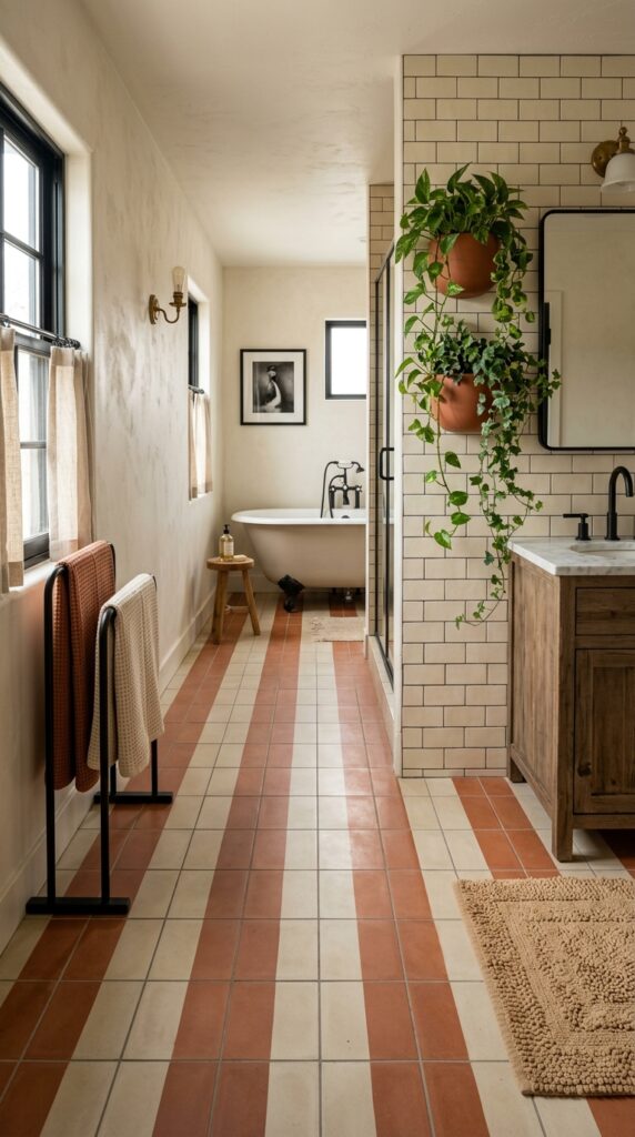
Vibe: The floor reads directional — the stripes carrying you down the length of the room like a slow, warm current.
Why it works: A wide-stripe cement tile floor applies the design principle of vector movement — strong horizontal or vertical lines in a floor pattern create a perceived direction of travel that the eye and body naturally follow. Running the stripes parallel to the longest room dimension elongates the space significantly, making a standard rectangular bathroom feel more linear and purposeful. Terracotta and cream is a particularly strong stripe combination because the two tones sit in the same warm earth family, creating visual harmony between the bands rather than high-contrast graphic tension.
How to get it: Stripe cement tiles are available from Cement Tile Shop and Villa Lagoon Tile in custom color combinations. Specify the stripe running parallel to the entry door so the pattern draws visitors into the room. Apply Aqua Mix Sealer’s Choice Gold before grouting and again after grouting — two sealing sessions are non-negotiable for stripe cement tiles where any grout haze in the terracotta band will read permanently as a color-contamination.
🛍️ Shop the Look — Amazon Product Ideas
| # | Product Search Phrase | Why It Fits |
| 1 | Stripe cement tile terracotta cream floor | Directional floor tile |
| 2 | Black freestanding towel rack bathroom | Dark fixture anchor |
| 3 | Terracotta wall planter bathroom mount | Wall material echo |
| 4 | Aqua mix tile sealer cement tile protector | Cement tile sealing product |
| 5 | Beige cotton bath rug bathroom warm tone | Floor comfort accent layer |
How to Start Your Bathroom Tile Transformation
The single first move is choosing your grout color before choosing your tile — not the other way around. Grout color is the most underestimated variable in tile design: the same white subway tile paired with a white grout reads as seamless and calm, while the identical tile paired with charcoal grout reads as graphic and architectural. Making this decision first forces every subsequent tile choice to relate to a concrete design intention rather than being made in isolation.
The most common beginner mistake is choosing a polished tile for a floor. Polished porcelain and marble become dangerously slippery when wet and show every water mark, soap streak, and footprint. The fix is simple: specify any floor tile with a coefficient of friction (COF) rating of 0.60 or higher — all reputable tile suppliers list this — and choose a honed, matte, or textured finish for any horizontal surface that will get wet.
For under $50: a sample-size quart of grout in your target color ($12) to test on your actual tile, a zellige tile trivet used as a soap dish ($20), and a bottle of penetrating stone sealer ($18) to properly prep any natural stone or cement tile surface before installation.
A weekend can accomplish: removing and replacing a vanity backsplash tile (15–20 square feet), regrouting an existing shower, or painting existing tile with limewash technique. A full bathroom retile — floor plus shower surround — realistically takes 2–4 weeks including prep, installation, curing, and grouting and runs $3,000–$12,000 depending on tile selection and labor market.
Frequently Asked Questions About Bathroom Tiles
What is the difference between ceramic and porcelain bathroom tile?
Porcelain tile is fired at a higher temperature than ceramic, making it denser, harder, and less porous — with a water absorption rate under 0.5% compared to ceramic’s 3%. This makes porcelain the better choice for wet areas (shower floors, bathroom floors with frequent water exposure) while ceramic is sufficient and more affordable for wall applications where it won’t contact standing water. For most bathroom walls, a glazed ceramic tile is perfectly appropriate; for shower floors and any floor tile, always specify porcelain.
What grout color should I use for white subway tile in a bathroom?
The three most-used options each read entirely differently: bright white grout reads clean and seamless (the tiles almost disappear), warm greige grout (Mapei “Warm Gray 112”) reads classic and period-appropriate, and charcoal grout reads graphic and architectural. The choice should be driven by whether you want the tile pattern or the tile color to be the dominant visual element. If you want the wall to read as textured white plaster, choose matching white; if you want the grid to read as a design feature, choose contrast.
How much does it cost to tile a bathroom shower?
A standard 40-square-foot shower surround tiled in mid-range porcelain costs $800–$2,000 in materials and $1,500–$3,000 in labor for a total of $2,300–$5,000 in most US markets. Premium materials (zellige, natural marble, handmade encaustic) add $1,500–$6,000 in materials above that baseline. The single biggest cost variable is waterproofing: a properly waterproofed shower with a Schluter or Wedi board substrate adds $300–$600 to the project and is non-negotiable for shower longevity.
Can I use floor tile on shower walls?
Yes — and it is often a good design decision. Floor-rated porcelain has a higher density and durability rating than wall tile, meaning it will never be inadequate on a wall surface. The design advantage is material continuity: using the same tile on the floor and walls of a shower creates a seamless grotto-like effect that reads as more intentional than mixing floor and wall products. The practical consideration is weight — very large format floor tiles (24×48 inches and larger) require specific thinset and support backing on vertical walls.
What type of tile is best for a small bathroom to make it feel larger?
Large-format tile in a light neutral tone consistently outperforms smaller-format tile in making a bathroom feel larger, because fewer grout lines mean less visual fragmentation of the surface. A 24×24-inch or 24×48-inch tile in warm white or greige on both the floor and walls, with matching grout, creates a near-seamless surface that extends the perceived volume of the room. The one exception: if the existing bathroom has low ceilings, vertical tile installation in a 4×16 or 4×24-inch format creates upward eye movement that compensates more effectively for ceiling height than large-format horizontal tiles.
Ready to Create Your Dream Bathroom Tiles?
These 27 bathroom tile ideas cover the full spectrum of what makes a tiled bathroom sing — from color moves like cobalt and sage and terracotta, to material decisions in zellige, marble, cement, and glass, to layout techniques like vertical installation, wainscoting, and pattern mixing. Starting with one tile change — a new shower floor, a backsplash retile, a limewash refresh — is not the compromise version of a bathroom transformation; it is the intelligent version, because each change teaches you more about your bathroom’s specific light, proportion, and palette than any mood board can. Today’s concrete action: hold a tile sample against your existing grout color in both morning and evening light and notice how it shifts — that observation alone is the beginning of your real design decision. When the tiles are finally set and grouted and sealed, the bathroom becomes a different kind of room: one that rewards lingering, one whose surfaces are genuinely worth looking at. Save the ideas that made you pause the longest — in bathroom tile design, your gut response to texture and color is usually the most accurate compass.