Fall table decor is the art of layering seasonal textures, warm tones, and natural elements to transform an everyday dining surface into an immersive autumnal scene. This article gives you 27 distinct fall tablescape ideas — from moody harvest spreads to minimalist earthy vignettes — with actionable styling tips and product picks for every look.
Think amber candlelight catching the glint of a bronze charger. The weight of a linen napkin, still slightly rumpled. A sprig of dried eucalyptus resting against a terracotta bowl, releasing something faintly herbal. Fall table decor doesn’t announce itself — it settles into you. Here are 27 ideas worth saving — and stealing.
Why Fall Table Decor Works So Well
¶1 — What Is It? Fall tablescape styling draws from a long tradition of harvest celebration, rooted in European and American seasonal table customs where the dinner table became a vehicle for abundance, gratitude, and warmth. Unlike holiday decorating — which tends toward the symbolic — fall table decor is fundamentally sensory. It borrows from the Arts and Crafts movement’s reverence for natural materials, mid-century Scandinavian hygge principles, and contemporary cottagecore’s love of imperfection. The result is an aesthetic that feels simultaneously ancient and effortlessly current.
¶2 — Core Materials and Colors The fall palette centers on warm terracotta, burnt sienna, dusty sage, deep burgundy, and caramel brown — punctuated by matte black or aged brass for grounding. Materials are tactile by design: unbleached linen, raw-edge wood slices, hand-thrown ceramic in speckled stoneware glazes, dried botanicals, beeswax tapers, and woven natural-fiber runners. Pumpkins — both heirloom gourds and ornamental varieties — function as sculptural objects rather than novelty props.
¶3 — Why It’s Trending Now Post-pandemic nesting drove a sustained surge in home entertaining, and Pinterest reports that searches for “fall tablescapes” spike every August — earlier each year. The turn toward slow living and seasonal intentionality has made elaborate table styling less performative and more personal. People want their homes to feel lived in beautifully, and a layered autumnal table achieves that in a single afternoon.
¶4 — Small Spaces Compact dining spaces can absolutely achieve fall tablescape magic — prioritize vertical layering (taper candles, elevated cake stands) over sprawling centerpieces that eat real estate. A round two-person table benefits most from a single hero element — one sculptural gourd cluster or a trio of bud vases — rather than a full runner spread.
Style at a Glance
| Element | Detail |
| Philosophy | Seasonal abundance, tactile warmth, intentional gathering |
| Key Materials | Linen, stoneware, beeswax tapers, dried botanicals, raw wood |
| Key Colors | Terracotta, burnt sienna, dusty sage, caramel, matte black |
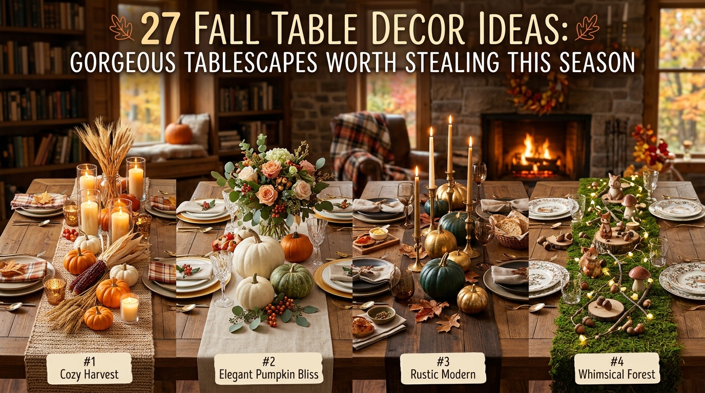
27 Fall Table Decor Ideas: Gorgeous Tablescapes for Every Style
1. The Burnt Orange Citrus and Clove Centerpiece
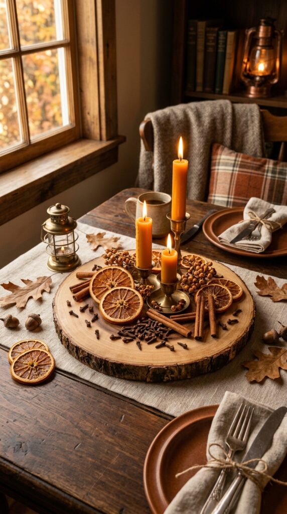
Vibe: Sun-warmed. This tablescape smells as good as it looks — spiced citrus and clove create an olfactory layer that makes guests slow down the moment they sit.
Why it works: The dried orange slices introduce organic geometry — their radial pattern draws the eye inward while the irregular edges keep things feeling handmade rather than manufactured. Contrast between the matte terracotta tones of the citrus and the warm gloss of the beeswax candles creates visual tension that reads as effortlessly curated. The raw wood slice acts as a visual anchor, giving the arrangement a defined perimeter without formality.
How to get it: Dry your own orange slices at 200°F for 4–5 hours for a fraction of the cost of craft store versions, then press them into a ring around two or three pillar candles of varying heights — the height variation (4″, 6″, 8″) creates the illusion of a more elaborate setup than it actually is.
💡 Quick Win: A bag of whole cloves and cinnamon sticks from the grocery spice aisle doubles as both tablescape material and natural room fragrance — scatter them directly on the table runner for an immediate fall effect under $5.
🛍️ Shop the Look — Amazon Product Ideas
| # | Product Search Phrase | Why It Fits |
| 1 | Dried orange slices fall decor bag | Natural citrus centerpiece element |
| 2 | Beeswax pillar candles set | Warm amber glow |
| 3 | Raw wood slice centerpiece board | Organic anchor piece |
| 4 | Antique brass candleholder trio | Warm metallic contrast |
| 5 | Oatmeal linen table runner | Neutral textural base |
2. The Sage and Ivory Minimalist Harvest Table
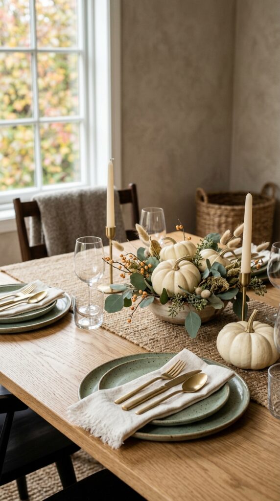
Vibe: Hushed. This is fall for the person who gravitates toward quiet beauty — no orange, no plaid, no harvest script signs.
Why it works: The restrained palette — dusty sage against warm ivory — relies on tonal layering rather than contrast, which reads as sophisticated in interior photography. White and cream pumpkins function as sculptural objects when stripped of the traditional orange-and-black visual cues, allowing their organic shapes to speak for themselves. The absence of color noise forces the eye to notice texture: the dimpled skin of the gourd, the nubby weave of the linen.
How to get it: Source “Casper” or “Lumina” variety pumpkins for the purest white flesh — these hold their color longer than painted alternatives. Pair with dried bunny tail grass (Lagurus ovatus) in a matte white ceramic bud vase for a centerpiece that requires zero rearranging from week to week.
🛍️ Shop the Look — Amazon Product Ideas
| # | Product Search Phrase | Why It Fits |
| 1 | White heirloom decorative pumpkins faux | Long-lasting sculptural element |
| 2 | Sage green stoneware dinner plates set | Grounding tonal color |
| 3 | Dried bunny tail grass bunch decor | Feathery textural accent |
| 4 | Matte gold flatware set | Warm without brightness |
| 5 | Ivory organic linen napkins set 6 | Soft, raw-hemmed texture |
3. Layered Candlelight: The Taper-Heavy Fall Tablescape
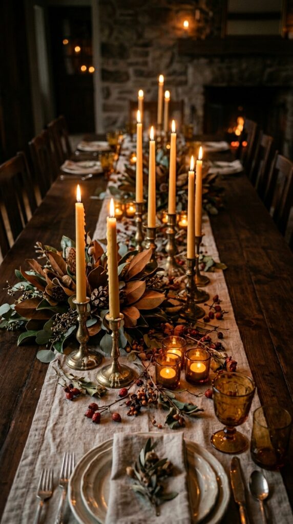
Vibe: Romantic. A taper-heavy table feels like a private dining room in a centuries-old estate — all flickering amber and long shadows.
Why it works: The clustering principle — grouping candleholders in odd numbers (threes, fives, sevens) rather than spacing them evenly — mimics the visual logic of professional floral arranging, where asymmetry reads as organic rather than accidental. Varied candleholder heights establish a natural topography along the table’s center axis, guiding the eye from one end to the other. The dried magnolia leaves, with their deep brown backs and lighter tan fronts, contribute a two-tone element that enriches the palette without adding a new color.
How to get it: Collect mismatched brass candleholders from thrift stores or estate sales — the lack of a matching set is the point. Vary the patina from polished to dark antiqued for depth. Beeswax tapers (not paraffin) drip more slowly and produce the warm amber flame color that photographs dramatically.
💡 Quick Win: Amber glass votive holders from a dollar store, scattered between your taper clusters, multiply the candlelight without adding height — a crucial consideration for tables where guests need to see each other across the centerpiece.
🛍️ Shop the Look — Amazon Product Ideas
| # | Product Search Phrase | Why It Fits |
| 1 | Antique brass taper candleholder set mixed heights | Mismatched vintage effect |
| 2 | Beeswax taper candles ivory set 12 | Slow-drip warm flame |
| 3 | Dried magnolia leaves bulk fall decor | Two-tone textural element |
| 4 | Amber glass votive candle holders set | Light-multiplying accent |
| 5 | Dried rose hips stem bunch | Tiny textural scatter detail |
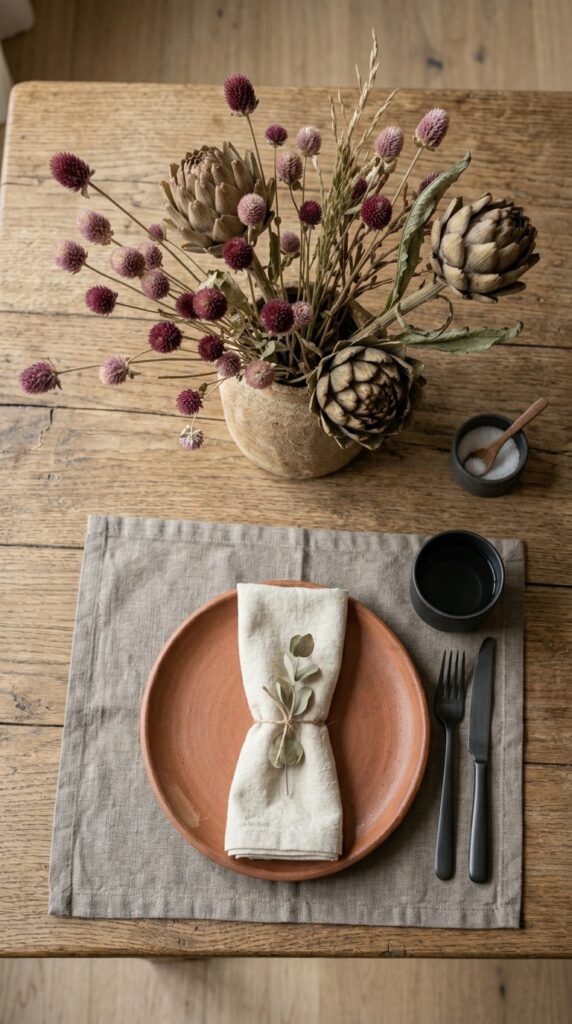
4. The Terracotta and Linen Place Setting
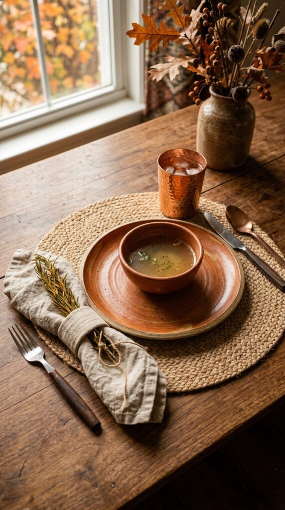
Vibe: Grounded. Each element in this place setting earns its presence — nothing decorative exists that isn’t also functional.
Why it works: The terracotta glaze grounds the place setting in the fall palette without requiring a seasonal centerpiece — meaning this table reads as autumnal through material choice alone, not through props. The principle at play is material coherence: jute, linen, copper, and clay all share an earthy, artisanal origin story that makes them feel like a family. The dried rosemary sprig tucked into the napkin fold acts as a natural napkin ring while delivering an unexpected aromatic detail.
How to get it: Seek out stoneware with visible “throwing marks” — the concentric ridges left by a potter’s hands — rather than perfectly smooth glazes. These imperfections are what make machine-made stoneware feel handcrafted. McGee & Co. and Crate & Barrel’s seasonal lines typically stock terracotta stoneware in September; thrift stores often have similar pieces year-round.
🛍️ Shop the Look — Amazon Product Ideas
| # | Product Search Phrase | Why It Fits |
| 1 | Terracotta stoneware dinner plates set 4 | Core earthy element |
| 2 | Woven jute placemats set 6 | Natural fiber base layer |
| 3 | Hammered copper drinking glasses set | Warm metallic vessel |
| 4 | Linen napkins raw hem natural set | Organic, unfinished textile |
| 5 | Dried rosemary bunch kitchen decor | Aromatic napkin accent |
5. The Statement Gourd Arrangement: Sculptural Centerpiece
Vibe: Layered. A sculptural gourd grouping achieves something fresh flowers can’t — it improves over weeks as stems and skins develop character.
Why it works: Heirloom gourd varieties (“Fairytale,” “Cinderella,” “Knucklehead”) offer an extraordinary range of sculptural profiles that standard orange pumpkins lack. The design principle here is negative space: by placing gourds directly on the table runner without a vessel or tray, the eye reads the grouping as intentional rather than casually tossed. Varying the scale — one large focal piece flanked by progressively smaller gourds — mirrors the natural visual hierarchy found in professionally designed floral arrangements.
How to get it: Visit a farmers market in early October for the widest heirloom selection. Lay your runner first, then position the largest gourd off-center (roughly one-third from one end of the table rather than dead center), and build outward from there — this asymmetry is what separates a styled tablescape from a Halloween display.
💡 Quick Win: Faux heirloom gourds in velvet and foam materials now read nearly identical to the real thing in photography and from across a dining table — and they store flat between seasons.
🛍️ Shop the Look — Amazon Product Ideas
| # | Product Search Phrase | Why It Fits |
| 1 | Faux heirloom pumpkin set mixed sizes | Multi-variety gourd grouping |
| 2 | Wide linen table runner neutral | Generous base for arrangement |
| 3 | Decorative acorns bowl filler bag | Natural scatter accent |
| 4 | Dried fall leaves bunch assorted | Color and movement accent |
| 5 | Taper candle holder spike brass | Minimal candlelight addition |
6. Moody Dark Academia Fall Table
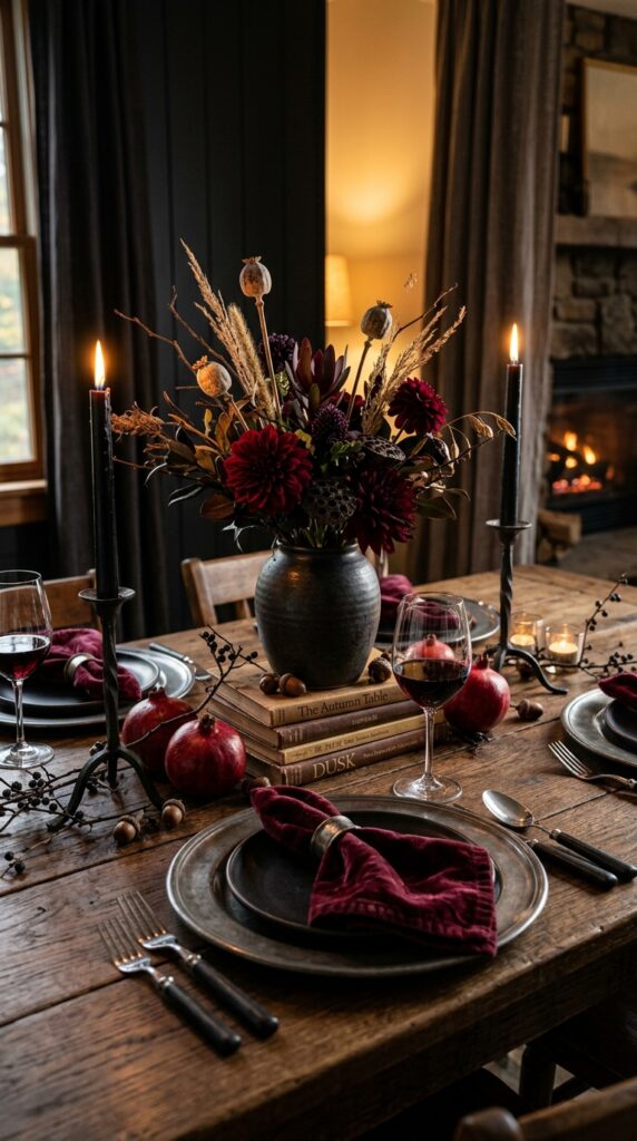
Vibe: Still. This table feels like a private dinner in a Victorian study — dark, deliberate, and entirely its own.
Why it works: Dark academia tablescape styling works through tonal depth — stacking values (deep burgundy, matte black, aged pewter) rather than introducing contrasting brights. The color principle in play is analogous harmony: burgundy, chocolate brown, and charcoal share the same warm undertone, so the table reads as a single cohesive mood rather than a collection of dark things thrown together. Deep red pomegranates (both whole and halved, when food-safe) introduce a high-contrast surface next to the matte velvet.
How to get it: Swap standard white dinner candles for near-black or dark burgundy tapers — this single change instantly shifts a table from “fall harvest” to moody maximalism. Pair with a dark stoneware vase in espresso or midnight blue glaze, and look for dried branches with architectural interest (blackthorn, contorted filbert) rather than traditional floral stems.
🛍️ Shop the Look — Amazon Product Ideas
| # | Product Search Phrase | Why It Fits |
| 1 | Deep burgundy velvet napkins set | Rich tactile moody element |
| 2 | Black taper candles long set | Dark atmosphere anchor |
| 3 | Wrought iron taper candleholder gothic | Architectural candlelight |
| 4 | Midnight blue stoneware vase | Dark vessel contrast |
| 5 | Pewter charger plates set of 4 | Aged metallic base layer |
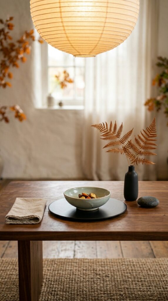
7. The Wabi-Sabi Tablescape: Celebrating Imperfection
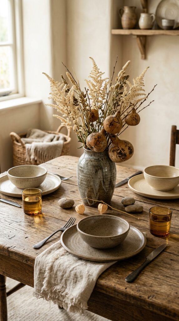
Vibe: Raw. This table has never tried to impress anyone, and that is precisely what makes it so quietly compelling.
Why it works: Wabi-sabi styling applies the Japanese aesthetic philosophy that finds beauty in impermanence, incompleteness, and imperfection — an ideal framework for fall, a season defined by things letting go. The design principle at play is intentional mismatch: pairing plates that share a material (stoneware) but differ in glaze creates cohesion without uniformity. River stones placed directly on the table as objets introduce the geological weight and permanence that balance the dried, ephemeral botanicals.
How to get it: Don’t wash handmade ceramics until they show a natural mineral bloom — the slight cloudiness that develops on unglazed stoneware edges is a feature. Source mismatched pieces from different potters at farmers markets, or use MUJI’s plain-fired stoneware as a neutral foundation that accepts any pairing.
💡 Quick Win: A single stem of Physalis (Chinese lantern plant) in a bud vase — the papery orange husks are architectural, fall-perfect, and cost under $4 at a florist or grocery store flower section.
🛍️ Shop the Look — Amazon Product Ideas
| # | Product Search Phrase | Why It Fits |
| 1 | Speckled stoneware plates mixed set | Wabi-sabi imperfect ceramics |
| 2 | Undyed raw linen napkins bulk | Unprocessed natural texture |
| 3 | Smooth river stones decorative large | Natural weight contrast |
| 4 | Chinese lantern plant dried stems | Architectural fall botanical |
| 5 | Ash glaze ceramic vase handmade | Running glaze natural finish |
8. Warm White Linen + Gold: The Elegant Fall Table
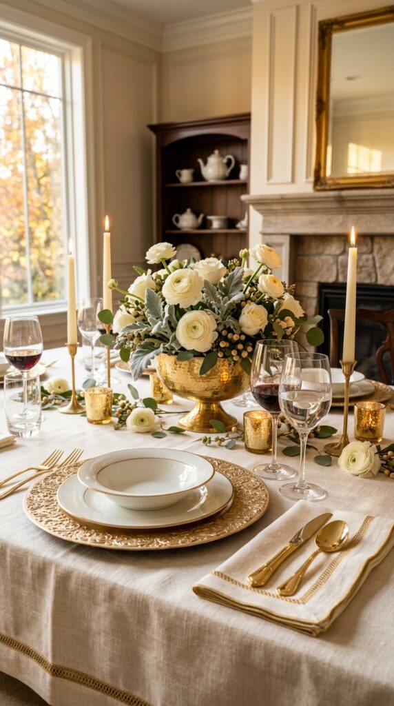
Vibe: Luminous. This is fall without the orange — a table that could live on the cover of a November bridal magazine.
Why it works: The warm white and champagne gold pairing works because both tones share the same warm yellow undertone — neither reads as cool or stark. The design principle is tonal monochromacy: by keeping the entire table within one temperature family (warm), the eye relaxes rather than bouncing between competing hues. The hammered gold compote bowl introduces texture to the metallic element, preventing the gold from reading as flat or corporate.
How to get it: A linen tablecloth with a gold thread border — available from Anthropologie or Williams-Sonoma in their fall seasonal line — instantly formalizes a table that otherwise uses casual elements. The key is that the tablecloth does the heavy lifting, so the centerpiece can remain minimal: ranunculus and dusty miller in a single compote vessel is enough.
🛍️ Shop the Look — Amazon Product Ideas
| # | Product Search Phrase | Why It Fits |
| 1 | Gold embossed charger plates round set 4 | Formal metallic base layer |
| 2 | Hammered gold compote bowl decorative | Textural centerpiece vessel |
| 3 | Warm white linen tablecloth rectangle | Core table foundation |
| 4 | Crystal wine glasses clear stem set 4 | Elegant transparent height |
| 5 | Ivory pillar taper candles set 6 | Warm glow without color |
9. The Harvest Table Runner: Abundance in a Strip
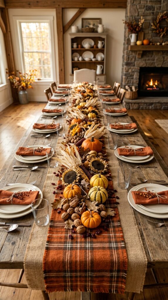
Vibe: Abundant. A full-length harvest runner communicates generosity — the table is practically offering you something before anyone has been seated.
Why it works: The layered runner technique — burlap underneath, flannel plaid on top — creates visual depth through material contrast: rough-textured versus soft-textured, neutral versus patterned. Running the centerpiece elements as a continuous trail (rather than clustering them at the center) proportionally connects the length of the table to the scale of the arrangement, making a standard six-seat table feel intentionally designed rather than table-decorated. The white plates on either side act as visual breathing room that prevents the runner from overwhelming the place settings.
How to get it: Start with the runner foundation, then lay elements from largest to smallest — dried corn husks first, then mini pumpkins, then walnut clusters, then the fine scatter details (cranberries, seeds, small leaves). Working large-to-small ensures the arrangement has structural anchors before the detail layer is applied.
💡 Quick Win: A bag of raw shelled walnuts from the grocery store baking aisle makes a perfect scatter element — they’re uniform, naturally beautiful, and cost under $6 for enough to run an entire table.
🛍️ Shop the Look — Amazon Product Ideas
| # | Product Search Phrase | Why It Fits |
| 1 | Burlap table runner wide natural | Textural base foundation |
| 2 | Plaid flannel table runner fall | Layered pattern element |
| 3 | Dried corn husks bulk fall decor | Harvest primary material |
| 4 | Dried sunflower heads decorative | Warm yellow focal element |
| 5 | Mini orange pumpkins faux set | Small-scale gourd accent |
10. Pottery Barn-Style Neutral Tablescape
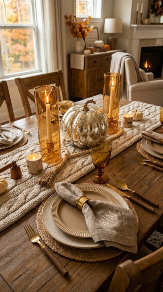
Vibe: Sun-warmed. This table exists in the comfort zone between aspirational and achievable — it looks like something that took two hours but feels effortless.
Why it works: The “Pottery Barn aesthetic” in fall tablescape terms relies on a tightly curated neutral foundation that makes every individual element pop through material contrast rather than color contrast. The cable-knit runner introduces tactile interest that elevates the simplest dinnerware. The mercury glass pumpkin sits at the visual center and functions as both a reflective surface and a sculptural focal point — its silver-toned finish bridges the warm oatmeal tones below with the amber glass beside it.
How to get it: A wooden bead garland draped loosely around the base of a centerpiece vessel is one of the fastest ways to add the layered, styled quality to a tablescape that reads as “collected over time.” Use unfinished natural bead garlands and avoid pre-colored versions, which read as craft-store rather than curated.
🛍️ Shop the Look — Amazon Product Ideas
| # | Product Search Phrase | Why It Fits |
| 1 | Chunky knit table runner oatmeal cream | Textural neutral foundation |
| 2 | Mercury glass pumpkin centerpiece large | Reflective focal element |
| 3 | Amber glass hurricane candle holder | Warm-glow vessel |
| 4 | Natural wood bead garland decor | Styling depth accent |
| 5 | Faux birch bark votive candle holder | Nature-inspired light element |
11. Ambient Uplighting: Floor-to-Table Glow
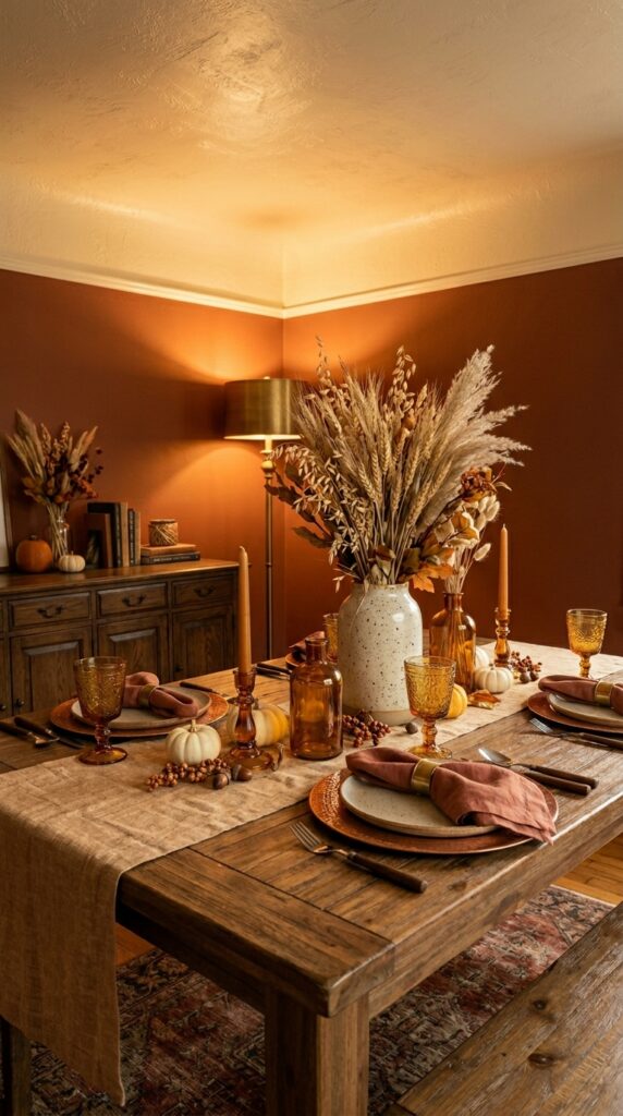
Vibe: Warm. Good lighting at a dinner table is felt before it’s noticed — guests relax their shoulders and reach for another glass.
Why it works: Uplighting from a floor lamp positioned adjacent to (not directly above) a dining table bounces warm light off the ceiling and creates a halo effect that softens every face and surface in the room. The table decor itself becomes part of the lighting scheme: amber glass goblets and copper chargers don’t just reflect light — they transmit and scatter it, multiplying the warmth of a single light source across the entire surface. The tall ceramic vase holding dried wheat creates a vertical element that interrupts the ambient glow and adds shadow depth.
How to get it: Replace your dining room overhead fixture’s bulb with a 2700K LED (the warmest commercially available without crossing into orange) and add a secondary floor lamp with an Edison-style visible-filament bulb behind the room’s focal wall. The two-source approach eliminates the flat, institutional feeling of single-source overhead dining lighting.
💡 Quick Win: Amber glass votive and goblet sets from HomeGoods or IKEA’s BEGÄR collection cost under $15 and, when clustered, create the look of an intentionally designed lighting scheme from purely decorative objects.
🛍️ Shop the Look — Amazon Product Ideas
| # | Product Search Phrase | Why It Fits |
| 1 | Amber glass goblets set 4 dining | Light-transmitting warm vessel |
| 2 | Edison bulb floor lamp warm | Secondary ambient light source |
| 3 | Copper charger plates set of 4 | Warm light-reflective base |
| 4 | Dried wheat sheaves bunch fall | Tall vertical centerpiece element |
| 5 | 2700K LED dimmable candelabra bulb | Warm overhead light swap |
12. The Farmhouse Plaid and Pumpkin Setting
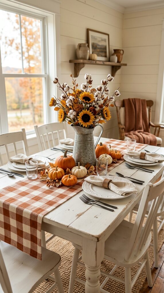
Vibe: Homey. This is the table your grandmother would approve of and your Instagram following would save — genuinely warm rather than aesthetically performed.
Why it works: Buffalo check — a scale-up of traditional plaid with squares large enough to read at table distance — is farmhouse tablescape shorthand for a reason: its two-tone structure (rust and cream) automatically limits the color palette while the bold graphic pattern adds visual energy that prevents a neutral table from reading as bland. The galvanized metal pitcher introduces an industrial-farmhouse tension that keeps the look from becoming overly precious. Cotton stems, with their architectural seed heads, elongate the arrangement without adding weight.
How to get it: Use wooden napkin rings (unfinished or lightly stained) rather than metallic or decorative rings with this setting — the natural wood bridges the organic cotton stems with the rustic galvanized metal pitcher, maintaining the farmhouse material story across every element of the place setting.
🛍️ Shop the Look — Amazon Product Ideas
| # | Product Search Phrase | Why It Fits |
| 1 | Buffalo check table runner rust cream | Farmhouse pattern foundation |
| 2 | White stoneware dinner plates embossed rim | Classic farmhouse ceramic |
| 3 | Galvanized metal pitcher vase large | Industrial-farmhouse vessel |
| 4 | Cotton stem branches artificial fall | Architectural height element |
| 5 | Wood napkin rings unfinished set 6 | Natural bridge material |
13. The Foliage Garland Runner: Nature as Architecture
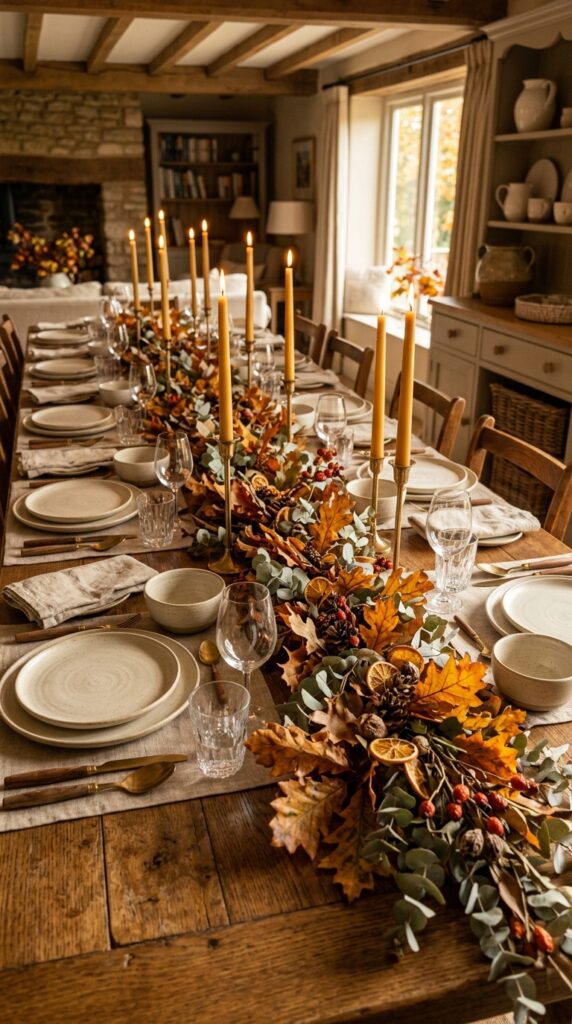
Vibe: Layered. A foliage garland runner transforms the table surface from a platform for objects into an experience of walking through a forest floor.
Why it works: The principle at play is texture gradient — by combining elements with different surface qualities (waxy preserved leaves, powdery dried eucalyptus, hard rose hip berries, rough-textured dried citrus peel), the garland creates visual complexity that reads as natural rather than designed. This is the same principle that makes forest floors visually interesting: no single uniform texture, constant variation of scale and surface. Brass taper candles inserted directly into the garland (in small clay spike holders) add light at the lowest point of the table, which is the most flattering angle for candlelight on a dinner table.
How to get it: Preserved leaves (glycerin-treated) hold their color and remain pliable for 3–4 weeks, making them the professional florist’s choice for table garlands. Build the garland on a strip of brown kraft paper first, then transfer to the table — this protects the table surface and makes repositioning easy.
🛍️ Shop the Look — Amazon Product Ideas
| # | Product Search Phrase | Why It Fits |
| 1 | Preserved eucalyptus stem bunch silver | Long-lasting silver-green botanical |
| 2 | Preserved fall leaves bulk assorted | Maintained color over weeks |
| 3 | Candle spike holder clay small | In-garland taper candle solution |
| 4 | Dried rosehip branches fall decor | Berry accent in garland |
| 5 | Kraft paper roll table lining | Protective garland building base |
14. Small Table, Big Impact: Apartment Fall Tablescape
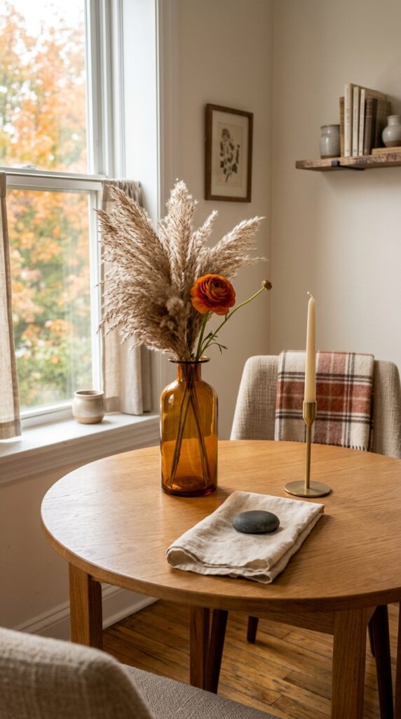
Vibe: Quiet. Small space styling is an exercise in restraint — every element carries the full weight of the look because there are so few of them.
Why it works: The “single tall vessel” approach solves the small table problem elegantly: one tall amber glass vase creates vertical drama without occupying the lateral space that a spread-out centerpiece would steal from the place settings. The visual weight principle is inverted here — tall and narrow reads as less space-consuming than short and wide, even when the actual footprint is identical. A smooth river stone used as a napkin weight eliminates the need for a napkin ring and adds a natural object of surprising beauty to each place setting.
How to get it: On a table smaller than 36 inches in diameter, position your single centerpiece vessel at the exact center and never exceed the height of 18 inches (roughly seated eye level) — taller arrangements force conversation to happen around an obstacle. Dried pampas grass in a tall amber vase is the easiest way to achieve height with minimal visual weight.
💡 Quick Win: One $3 smooth river stone from a craft store replaces a napkin ring while doubling as a decorative object with real material presence — a two-for-one styling swap.
🛍️ Shop the Look — Amazon Product Ideas
| # | Product Search Phrase | Why It Fits |
| 1 | Tall amber glass vase floor decor | Vertical drama, minimal footprint |
| 2 | Dried pampas grass stems natural | Light height without weight |
| 3 | Smooth river stones large flat | Natural napkin weight object |
| 4 | Minimal brass taper candleholder single | Clean architectural candlelight |
| 5 | Linen napkins set 2 natural unbleached | Minimal place setting textile |
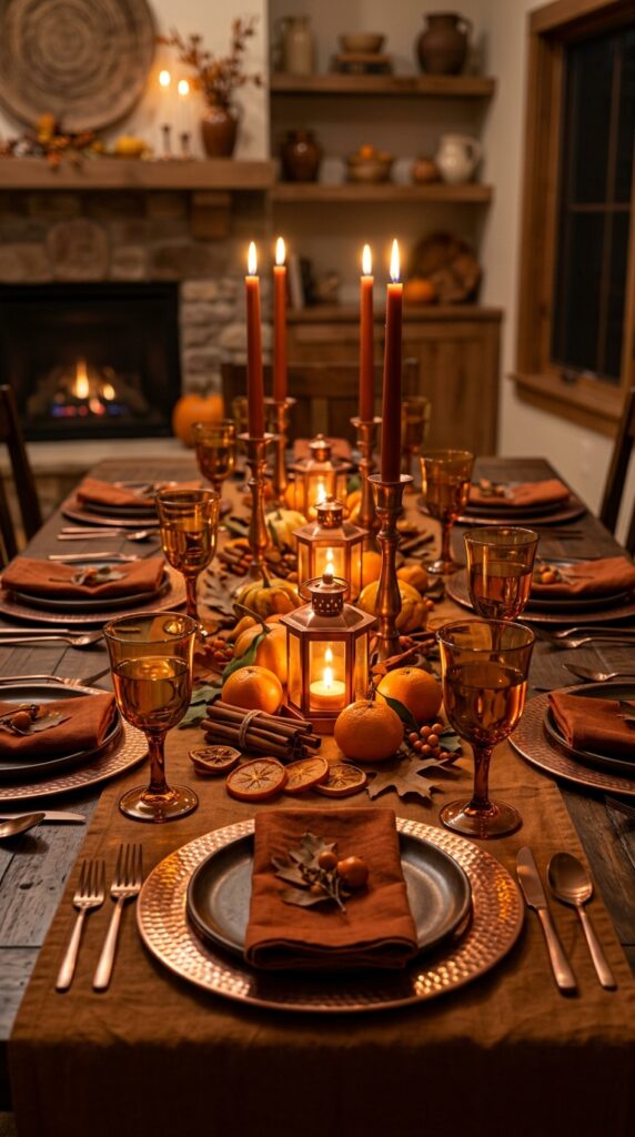
15. The Thanksgiving-Ready Grand Table
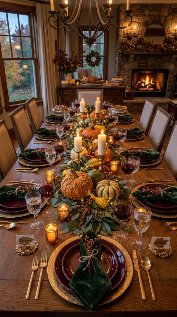
Vibe: Celebratory. This table doesn’t ask its guests to be impressed — it simply creates an atmosphere worthy of the occasion.
Why it works: A grand holiday table succeeds through the principle of repetition at scale: the same amber votive at each setting, the same pressed leaf place card, the same arrangement of fork-knife-spoon — this uniformity across 10 settings creates a sense of considered care that reads as elevated hospitality. The centerpiece runner works as a spine, but the place setting details at each chair are what guests actually remember. Gold name card holders do double duty as functional place markers and decorative metallic accents that reinforce the warm tone at table level.
How to get it: Place one amber votive at each setting (slightly above and to the right of the water glass) before your guests arrive. The individual candle at each chair personalizes the experience in a way that a shared centerpiece alone cannot — guests feel the table was dressed for them specifically.
🛍️ Shop the Look — Amazon Product Ideas
| # | Product Search Phrase | Why It Fits |
| 1 | Deep burgundy dinner plates set 8 | Grand table color anchor |
| 2 | Gold name card holder place card set | Personalized place marker |
| 3 | Dark green velvet napkins holiday | Luxe textural contrast |
| 4 | Gold charger plates embossed set 8 | Formal setting base layer |
| 5 | Amber glass votive holders set 12 | Individual per-setting glow |
16. The Muted Earth Tone Capsule Table
Vibe: Serene. A muted earth tone table is the visual equivalent of a deep exhale.
Why it works: Reducing the palette to four tones within one temperature family (warm, not cool) creates a visual quiet that most tables don’t achieve because there are too many competing elements. The design term is “color fatigue reduction” — fewer hues means the eye can rest on the textures rather than processing competing colors. Dried globe amaranth, with its papery rounded heads, and dried artichokes, with their layered architectural scale structure, provide all the visual complexity needed without introducing any new color.
How to get it: Limit your shopping list to four materials: one plate, one napkin, one runner, one vessel — and choose each in a slightly different value of warm earth (the lightest for the largest area, the darkest as a small accent). This prevents the all-same-tone flatness that can make earth-tone tables feel unfinished.
💡 Quick Win: Dried artichoke heads are available year-round at most floral wholesale markets and many Trader Joe’s locations for under $3 each — they’re the most architecturally interesting dried botanical available at that price point.
🛍️ Shop the Look — Amazon Product Ideas
| # | Product Search Phrase | Why It Fits |
| 1 | Matte clay ceramic dinner plates set | Core earth tone foundation |
| 2 | Undyed cotton napkins natural slub | Unprocessed textile accent |
| 3 | Warm gray linen placemats set 4 | Neutral grounding layer |
| 4 | Dried artichoke heads decor bunch | Architectural botanical accent |
| 5 | Sandstone ceramic vase small | Earth-toned organic vessel |
17. Dried Botanicals Display: The Living Centerpiece
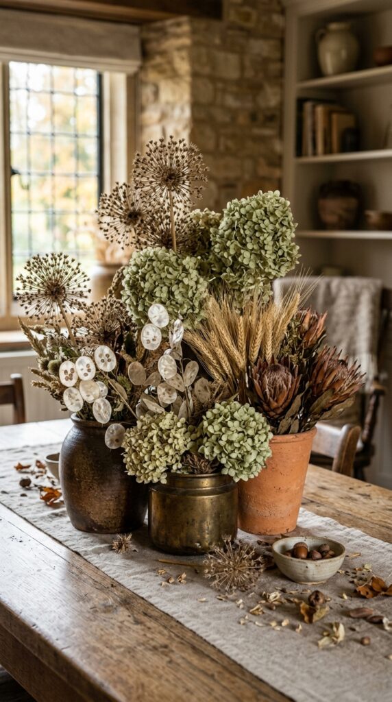
Vibe: Raw. A dried botanical centerpiece looks better in October than it did in September — a rare quality for table decor.
Why it works: The clustering of three vessels of different materials (terracotta, brass, dark stoneware) at varying heights creates a centerpiece that has internal visual tension — the eye moves between the vessels — while the dried botanicals unify the grouping through a shared warm, dusty color palette. The design principle is the “Rule of Three”: odd-numbered groupings feel more natural and dynamic than pairs or evenly numbered arrangements, because they resist the symmetry that reads as artificial in organic contexts.
How to get it: Build your three-vessel cluster in a triangle formation rather than a straight line — one vessel forward, two behind — and vary the heights by at least 4 inches between each. Dried allium heads are the most structurally dramatic botanical available in this category; their spherical geometry contrasts with the feathery hydrangea and the flat disc shape of lunaria pods.
🛍️ Shop the Look — Amazon Product Ideas
| # | Product Search Phrase | Why It Fits |
| 1 | Dried allium flowers bunch decor | Dramatic spherical botanical |
| 2 | Dried hydrangea heads preserved dusty | Papery textural puff |
| 3 | Dried lunaria silver dollar plant | Translucent pod accent |
| 4 | Mixed dried botanical bundle fall | Ready-made botanical assortment |
| 5 | Three mismatched vase set terracotta | Multi-vessel centerpiece system |
18. The Place Card Moment: Personalized Fall Settings
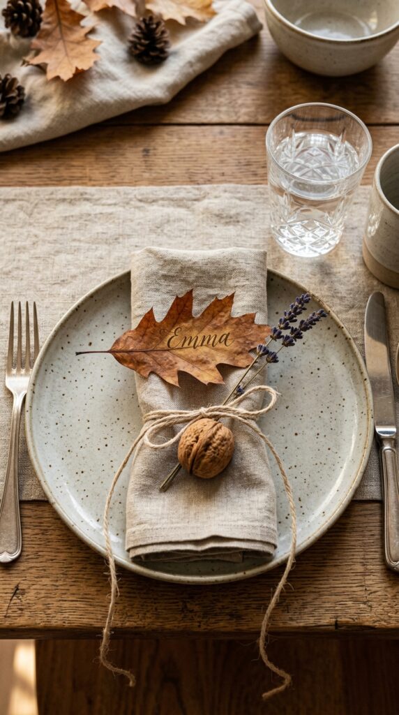
Vibe: Still. A place card tells a guest that the host thought specifically about them — that simple act changes how a meal is experienced before the first dish arrives.
Why it works: The accessory design principle here is “story in the hand” — each guest receives a small object (the leaf card, the lavender sprig, the walnut) that creates a tactile connection to the season. This is different from purely decorative place settings: guests pick up the napkin detail and experience the texture of raw linen twine, the weight of the walnut, the dry floral scent of lavender. These micro-sensory moments are what guests describe when they tell someone the meal “felt special,” even if they can’t name why.
How to get it: Press fresh oak or maple leaves between heavy books for 48 hours, then use a gold paint marker (Uni Posca in metallic gold, specifically) to write names in simple block letters directly on the leaf surface. No calligraphy experience needed — the organic imperfections in leaf lettering look deliberate rather than amateur.
🛍️ Shop the Look — Amazon Product Ideas
| # | Product Search Phrase | Why It Fits |
| 1 | Gold paint marker set fine tip Posca | Leaf place card writing tool |
| 2 | Raw linen twine natural roll | Napkin detail tying element |
| 3 | Dried lavender bunches bulk | Fragrant napkin accent |
| 4 | Pressed fall leaves bulk artificial | Ready-made place card base |
| 5 | Unshelled walnuts decorative natural | Natural tied napkin detail |
19. The Centerpiece Tower: Cake Stand Fall Styling
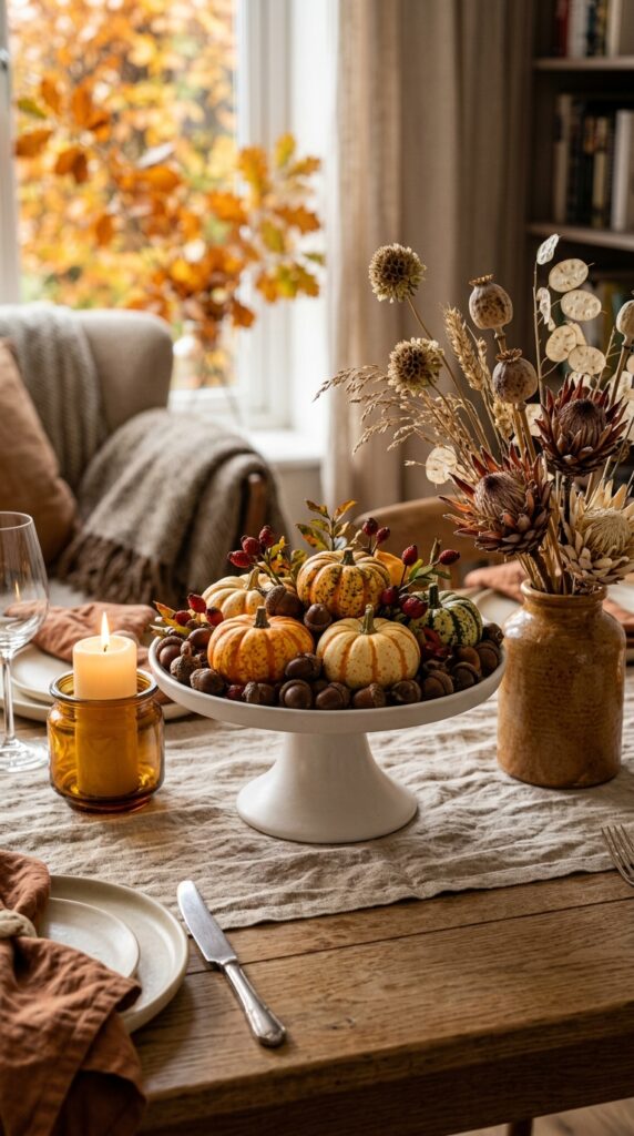
Vibe: Composed. Height variation is the designer’s primary tool for preventing a flat, underwhelming tablescape — and a cake stand is its most accessible delivery vehicle.
Why it works: A pedestal cake stand introduces the vertical layer that makes a table feel intentionally designed versus casually arranged. The design principle is visual topography — the eye naturally travels from the highest point to the lowest, and when that journey is interesting (varied materials, varied textures), the table holds attention. A white matte ceramic stand at 5–6 inches of height is sufficient to create a clear tier difference without blocking across-table sight lines.
How to get it: Limit the cake stand to small-scale objects only — acorns, baby gourds, rose hip clusters — that fit comfortably within the stand’s perimeter. Overloading the stand or extending elements beyond its edges makes the arrangement look precarious rather than curated. Two flanking vessels should always sit lower than the cake stand; heights of 2 inches and 4 inches, respectively, create a clean three-tier composition.
💡 Quick Win: A $12 matte white ceramic cake stand from HomeGoods or TJ Maxx instantly adds the professional “styled by a designer” height tier that most DIY tablescapes lack — it’s the single cheapest per-impact purchase in fall table decor.
🛍️ Shop the Look — Amazon Product Ideas
| # | Product Search Phrase | Why It Fits |
| 1 | Matte white ceramic cake stand large | Central height tier piece |
| 2 | Decorative acorns faux bulk bowl filler | Small-scale stand fill |
| 3 | Dried protea flower stem bunch | Architectural lateral element |
| 4 | Pillar candle holder low ceramic | Second-tier flanking element |
| 5 | Dried seed pod branches assorted | Third-tier flanking element |
20. The Japandi-Meets-Autumn Table
Vibe: Hushed. This is autumn distilled to its essential quality — the moment of a single leaf turning, not the full riot of color.
Why it works: Japandi styling applies “ma” — the Japanese concept of negative space as an active design element — to the dining table. By leaving the majority of the table surface empty and directing all attention to a few precisely chosen objects, each element gains significance it couldn’t hold in a crowded arrangement. The dried autumn fern frond contributes its copper-to-russet color transition (a perfect fall palette in a single object) in a format that requires only one bud vase and one stem.
How to get it: Collect and press fresh fern fronds in late September as they begin to turn — they dry to a copper-brown that’s impossible to replicate with purchased dried botanicals. Press flat between two heavy cutting boards, weighted overnight. The resulting shape retains the natural curl and movement of the living frond.
🛍️ Shop the Look — Amazon Product Ideas
| # | Product Search Phrase | Why It Fits |
| 1 | Matte black lacquer charger plates round | Japandi grounding base layer |
| 2 | Celadon ceramic bowl set handmade | Calm Japanese-inspired vessel |
| 3 | Narrow black bud vase tall ceramic | Minimal botanical vessel |
| 4 | Natural cotton dinner napkins set | Undyed calm textile |
| 5 | Smooth black river stones decorative | Single natural object accent |
21. Candlelight and Copper: A Metallic Fall Table
Vibe: Glowing. A copper-centered table doesn’t just reflect candlelight — it amplifies it, making even a single taper feel like a dozen.
Why it works: Copper’s warm orange-red metallic tone is the only metal that shares a color temperature with fall’s natural palette — where brass leans yellow and silver leans cool, copper reads as a direct extension of terracotta, burnt orange, and persimmon. The design principle is material echo: by using copper at multiple scales (charger, flatware, candlestick, small lantern), the metallic warmth recurs throughout the setting without any single piece having to carry the full visual weight. Clementines and dried persimmons, as food-safe decor elements, bridge the boundary between centerpiece and table setting.
How to get it: Small copper lanterns (4–6 inches tall) with a battery-operated flickering candle inside are a practical alternative to open-flame lanterns on a dinner table — they deliver the warm copper glow without risk, and their scale integrates naturally with fruit and botanical elements at table level.
🛍️ Shop the Look — Amazon Product Ideas
| # | Product Search Phrase | Why It Fits |
| 1 | Hammered copper charger plates set 4 | Core metallic table element |
| 2 | Copper taper candlestick holders set | Metallic candlelight vessel |
| 3 | Small copper lantern with LED candle | Safe warm metallic glow |
| 4 | Copper flatware set dinner service | Warm-toned utensil detail |
| 5 | Dried persimmon slices decor bulk | Seasonal organic metallic-toned fruit |
22. The Cocktail-Table Tablescape: A Living Room Bar Cart Moment
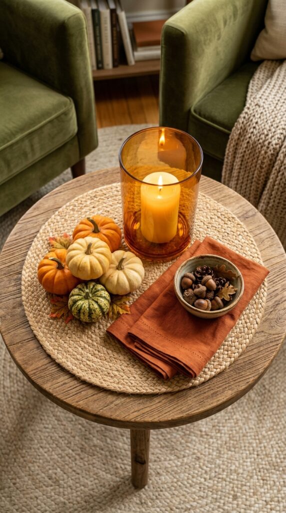
Vibe: Cozy. Fall table decor doesn’t begin and end at the dining table — a cocktail table vignette extends the season into the room where guests actually spend most of their time.
Why it works: A round jute charger (intended for plates) used as a base for a small vignette on a coffee or cocktail table provides a defined perimeter that prevents the arrangement from reading as “objects placed on a table” — instead, the contained footprint reads as a composed vignette. The scale is key: a cocktail table arrangement should be small enough to leave two-thirds of the surface clear for drinks and function. Three elements maximum — one taller, one medium, one low scatter — creates the necessary hierarchy in a small format.
How to get it: Use the same design logic as a full centerpiece, but compress it: one hurricane (tall), one mini pumpkin cluster (medium), one small ceramic bowl of acorns (low). The three-tier height principle holds at any scale — it’s the proportional relationship that matters, not the absolute size.
💡 Quick Win: A round jute placemat used as a tray creates an instant, contained “tablescape footprint” on any surface — coffee table, side table, console — for under $8 and in about 90 seconds.
🛍️ Shop the Look — Amazon Product Ideas
| # | Product Search Phrase | Why It Fits |
| 1 | Round jute placemats large natural | Vignette container base |
| 2 | Mini pumpkins faux set 6 small | Compact fall element |
| 3 | Amber glass hurricane candle holder | Warm glow focal piece |
| 4 | Small ceramic bowl white acorn bowl | Low scatter element vessel |
| 5 | Burnt orange cocktail napkins linen set | Seasonal color accent |
23. The Blue-and-Orange Unexpected Fall Palette
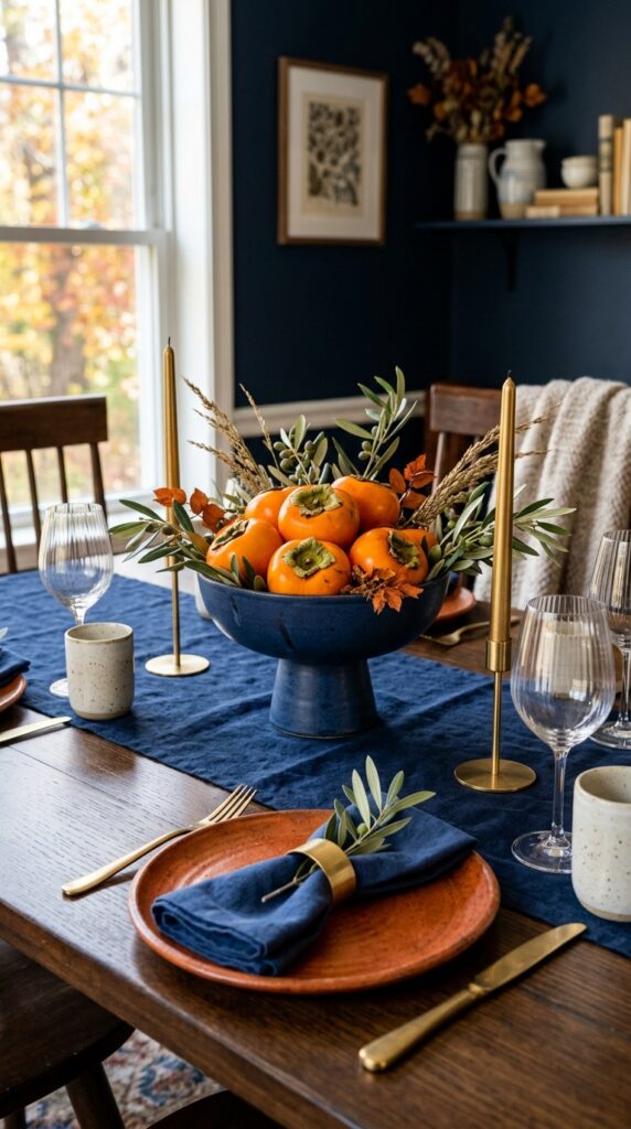
Vibe: Bold. This is the fall palette for someone who finds the conventional harvest orange-and-brown combination too obvious.
Why it works: Blue and orange are complementary colors — directly opposite on the color wheel — which means they amplify each other’s intensity when placed side by side. The deep navy absorbs light and recedes, which makes the rust orange plates and bright orange persimmons advance visually, appearing even more vivid and saturated than they would on a neutral background. The brass taper candles function as the neutral bridge between the two saturated hues, preventing the complementary contrast from becoming combative.
How to get it: Limit the blue to one surface (the runner) and let orange dominate the remaining elements — this 20/80 split gives you the complementary punch without the optical vibration that occurs when the two colors appear in equal proportions. Fresh persimmons, available at Asian grocery stores in October and November, are the most naturally beautiful orange object available at any price point.
🛍️ Shop the Look — Amazon Product Ideas
| # | Product Search Phrase | Why It Fits |
| 1 | Deep navy linen table runner | Complementary color foundation |
| 2 | Rust orange stoneware plates set 4 | Fall orange ceramic element |
| 3 | Indigo blue linen napkins set 6 | Supporting complementary hue |
| 4 | Matte navy blue compote bowl ceramic | Dark vessel centerpiece |
| 5 | Slim brass taper candles 12 inch | Neutral bridge element |
24. The Textural Mix: Velvet, Leather, and Stone
Vibe: Layered. When every material on a table is texturally distinct, the eye continues to find new surfaces to rest on — the mark of a truly rich tablescape.
Why it works: Texture contrast is the primary design strategy when working with a limited color palette — deep green, tan, and gray are all quiet colors, but their surface qualities (velvet’s soft pile, leather’s matte grain, slate’s mineral coolness, alabaster’s warm translucence) create complexity that color alone couldn’t deliver. Alabaster spheres introduce an unexpected material: smooth, warm-toned, and naturally luminous under candlelight. The raw stone slab as a centerpiece platform has both structural weight and geological scale that grounds everything above it.
How to get it: Source a raw stone serving slab (slate or sandstone) from a kitchen supply or stone tile store — a 12-inch piece costs $15–25 and serves equally well as a cheese board. Pair with 2–3 alabaster spheres in varied sizes (4″, 3″, 2″) sourced from home decor stores or online.
🛍️ Shop the Look — Amazon Product Ideas
| # | Product Search Phrase | Why It Fits |
| 1 | Deep green velvet table runner | Rich tactile foundation |
| 2 | Slate stone serving board large | Raw mineral centerpiece base |
| 3 | Alabaster stone sphere set decorative | Warm translucent focal object |
| 4 | Slate round coasters set 4 | Material story at each setting |
| 5 | Dried protea stems bunch large | Architectural bold botanical |
25. The Floating Candle Tablescape
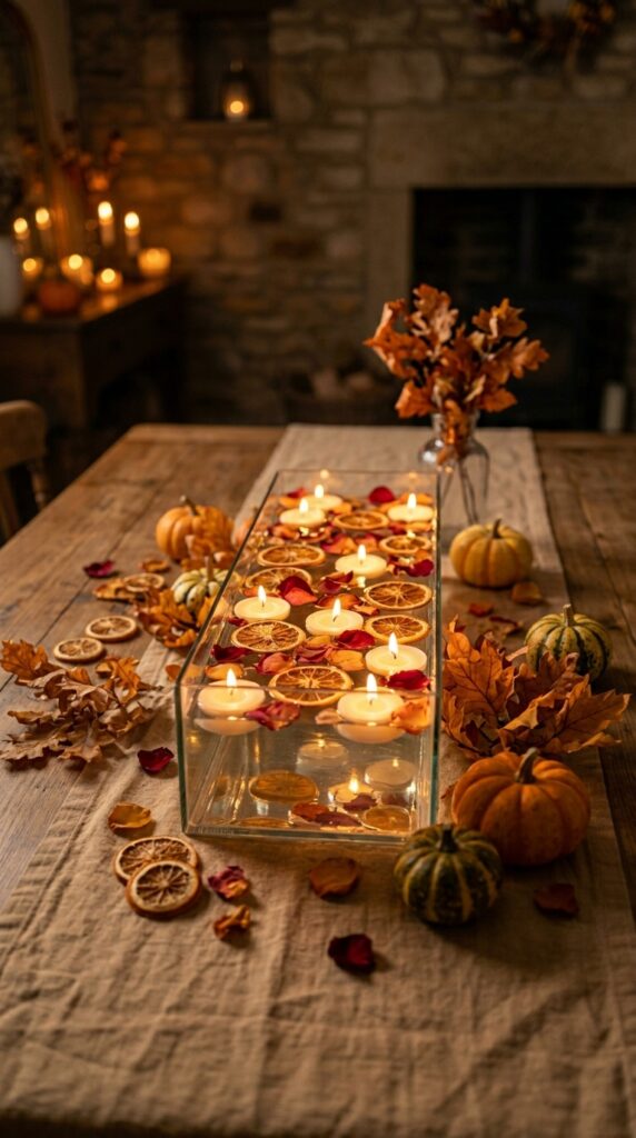
Vibe: Still. A floating candle arrangement introduces something no other table element can: the visual quality of still water at candlelight.
Why it works: Water as a design element in a tablescape introduces specular reflection — the candlelight bounces off the surface, doubling its apparent intensity and creating movement even in a completely still room. The dried orange slices floating in the vessel look like stained glass when backlit by the tea lights, their internal citrus segments illuminated in amber and gold. The low profile of the vessel ensures zero interference with across-table sight lines.
How to get it: Use a rectangular glass flower box (available at craft stores for under $10) filled with 2–3 inches of water. Add your orange slices and petals first, then float unscented tea lights last — scented tea lights near a dinner table can compete with food aromas. Swap the water and botanical elements between courses for a fresh arrangement.
💡 Quick Win: Unscented floating tea lights in bulk (50 for under $10 on Amazon) are the most cost-effective candlelight solution in table decor — they deliver maximum atmospheric impact at the lowest cost per unit of any candle format.
🛍️ Shop the Look — Amazon Product Ideas
| # | Product Search Phrase | Why It Fits |
| 1 | Rectangular glass floral vessel low | Floating candle water vessel |
| 2 | Unscented floating tea light candles bulk | Core floating light element |
| 3 | Dried orange slices decor large bag | Floating citrus accent |
| 4 | Dried rose petals bulk natural | Water surface scatter element |
| 5 | Low rectangular tray wooden linen liner | Vessel placement base |
26. The Outdoor Fall Table: Alfresco Autumn Dining
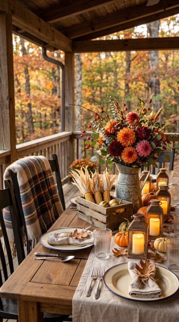
Vibe: Sun-warmed. An outdoor fall table catches the qualities that make autumn beautiful in the world outside — the golden hour light, the cooling air, the last warmth before the season turns.
Why it works: Outdoor tablescape styling must account for wind, uneven surfaces, and variable lighting — which is why weighted elements (a galvanized pitcher, a wooden crate, a ceramic vessel) are preferable to lightweight cut-flower arrangements or loose scatter elements that can blow. Enamelware plates are both weather-appropriate and visually aligned with the farmhouse outdoor aesthetic, their rolled rim detail adding design interest to a plate that’s inherently casual. Battery-operated LED harvest lanterns in hurricane format provide safe, wind-stable candlelight that renders photographically nearly identical to real flame.
How to get it: An autumn-proof outdoor table depends on a weighted centerpiece anchor — the galvanized pitcher is ideal because its mass holds it in place even in wind. Fill with dahlias (cut very short, 6–8 inches) for maximum longevity; longer stems in outdoor conditions wilt faster in fluctuating temperatures.
🛍️ Shop the Look — Amazon Product Ideas
| # | Product Search Phrase | Why It Fits |
| 1 | Cream enamelware dinner plates set 4 | Weather-appropriate casual plate |
| 2 | Galvanized metal pitcher large outdoor | Wind-resistant centerpiece vessel |
| 3 | Harvest lantern LED candle hurricane | Wind-safe outdoor candlelight |
| 4 | Plaid wool throw blanket rust | Chair accent, warmth element |
| 5 | Decorative dried corn cobs display | Outdoor harvest structural element |
27. The Maximalist Fall Feast Table
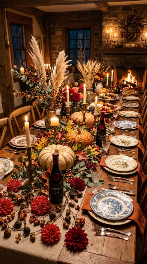
Vibe: Abundant. A maximalist fall table is a love letter written in seasonal materials — nothing held back, nothing restrained.
Why it works: Maximalism in table design succeeds not through random abundance but through controlled profusion: everything present belongs to the same material and color family (warm, earthy, natural), so the accumulated richness reads as intentional rather than chaotic. The principle is coherent excess — high quantity, low variety. Mismatched antique-pattern plates work in this context because the pattern variety is contained within one material (ceramic) and one era (antique), creating visual complexity without design incoherence. Flowers scattered directly on the table surface (rather than in vessels) is the defining move of the maximalist tablescape — it commits fully to the abundant sensibility.
How to get it: Source mismatched plates from estate sales and thrift stores in the weeks before Thanksgiving — individual plates from antique sets are often priced at $1–4 each, making a maximalist setting of 8–10 genuinely unique plates achievable for under $40. The variation in pattern actually benefits the look: a slight randomness between plates reads as “curated collection” rather than “mismatched set.”
💡 Quick Win: Scattering fresh or dried dahlia heads directly on the table runner — no vessel, no stems — is the single most impactful maximalist technique available. Five dahlia heads scattered along a six-foot table runner transforms the entire scale and sensibility of the arrangement in under two minutes.
🛍️ Shop the Look — Amazon Product Ideas
| # | Product Search Phrase | Why It Fits |
| 1 | Faux dahlia flowers open head red orange | Scatter-ready table florals |
| 2 | Mismatched vintage style dinner plates set | Curated eclectic place settings |
| 3 | Large cream decorative pumpkin faux | Maximalist centerpiece anchor |
| 4 | Dried pampas grass tall plumes natural | Dramatic height element |
| 5 | Wax seal stamp set candle sealing wax | Bottled accent decorative detail |
How to Start Your Fall Table Decor Transformation
¶1 — The One First Move Begin with a wide, textured table runner in unbleached oatmeal linen — not a seasonal print, not a pattern. A plain linen runner is the single element that anchors every other fall table decor decision you’ll make, because its neutral, organic warmth is compatible with every palette and aesthetic direction covered in this guide. It’s the commitment-free foundation that lets you experiment freely with centerpieces, place settings, and color without starting over.
¶2 — The Most Common Mistake The most prevalent fall tablescape mistake is using a runner that is too narrow. A runner should span at least 50% of the table width — on a standard 36-inch-wide dining table, this means a minimum of 14 inches wide, ideally 18–20. A narrow runner looks tentative and undersized, preventing the centerpiece from reading as grounded. This single proportion error makes even a well-designed centerpiece look like it’s floating on the wrong surface.
¶3 — Budget Entry Points Under $50 Three purchases create immediate seasonal impact: (1) a bundle of three beeswax taper candles in warm ivory in mismatched thrifted candleholders (total under $15); (2) two “Fairytale” or “Cinderella” variety gourds from a farmers market, placed directly on your existing runner (under $12); (3) a bunch of dried bunny tail grass in a matte black ceramic bud vase (under $10, both pieces combined from HomeGoods).
¶4 — Realistic Expectations A surface-level fall table refresh — runner, centerpiece, candles — takes one Saturday morning and costs $40–80. A fully styled seasonal tablescape with new place settings, chargers, and custom elements runs $150–350. A complete transformation takes three to five weekends of intentional shopping and layering; the best-looking tablescapes are built incrementally, not purchased all at once.
Frequently Asked Questions About Fall Table Decor Tablescapes
What is a fall tablescape, and how is it different from regular table decor?
A fall tablescape is a styled, seasonal table composition that treats the dining surface as a designed space rather than just a platform for dinnerware. The difference from regular table decor lies in intentionality — a tablescape uses layered elements (runner, centerpiece, place settings, lighting) that work together as a cohesive visual environment, rather than individual decorative objects placed without a unifying framework. Fall tablescapes specifically draw from autumn’s material vocabulary: dried botanicals, natural gourds, warm-toned ceramics, and seasonal candle warmth.
What colors work best for a fall table decor palette?
The most effective fall table decor palettes stay within one temperature family. Classic warm palettes use terracotta, burnt sienna, caramel brown, and dusty sage together — the McGee & Co. “Golden Hour” collection is a useful commercial reference. Moody palettes use deep burgundy, hunter green, matte black, and aged brass. Unexpected palettes pair deep navy blue with rust orange (complementary contrast) for a more graphic, design-forward approach. The one rule: avoid cool-toned colors (slate blue, lavender, cool gray) in combination with warm autumn elements — the temperature mismatch reads as seasonal confusion.
How much does it cost to create a fall tablescape?
A well-executed entry-level fall tablescape costs $40–80 using a mix of existing dinnerware, a new runner (around $20–30), and $15–25 in seasonal botanicals and candles from a farmers market or HomeGoods. A mid-range version with new stoneware, chargers, and a layered centerpiece runs $150–250. A fully styled holiday tablescape with custom linens, matching ceramic sets, and professional-quality dried botanicals can reach $400–600 for a 6–8 person table. Faux/reusable elements (fake gourds, artificial botanicals, durable linens) amortize the cost over multiple seasons.
Can I use fresh fruit and vegetables as fall table decor?
Yes — fresh persimmons, pomegranates, clementines, figs, and small gourds are all food-safe, non-toxic, and visually effective fall table elements. The practical consideration is longevity: fresh whole fruits last 1–2 weeks on a table in a cool room before beginning to show age. Avoid cut fruit near fabric runners (juice staining). Whole dried citrus slices (oven-dried at 200°F) last indefinitely and look identical to fresh in photography — they’re the professional’s choice for month-long seasonal table styling.
What are the most impactful single purchases for a fall tablescape?
The highest impact-per-dollar purchases in fall table decor are: (1) a wide oatmeal linen runner (transforms the table immediately); (2) beeswax taper candles in mismatched brass holders (adds warmth and atmosphere that no daytime decor element can match); (3) a set of four terracotta stoneware dinner plates (grounds the entire place setting in the fall palette at roughly $40–60 per set from brands like HAY or Crate & Barrel’s seasonal collection). The most impactful single technique — not purchase — is the scatter of dried or faux dahlia heads directly on the runner surface, which signals a maximalist intentionality that changes the entire register of a table.
Ready to Create Your Dream Fall Table Decor?
These 27 fall table decor ideas have moved through the full range of seasonal tablescaping — from moody dark academia to sun-warmed farmhouse abundance, from muted Japandi minimalism to maximalist dahlia-covered feast tables, and from the individual place setting detail to the grand holiday spread. Fall table transformations work best when they happen one layer at a time — starting with a runner and a candle is not a compromise, it’s the correct first step. Today, pull your widest table runner from a drawer or order a simple oatmeal linen one, set it on the table, and place one object on it — a gourd, a candle, a stone — and notice how immediately the space changes. When this season’s table finally comes together exactly the way you imagined it, you’ll feel it the moment you sit down: that particular fall warmth that makes dinner feel like something worth lingering over. Save your favorites from these 27 ideas — especially those foliage garland runners and the velvet-and-stone texture combinations — because they’re the ones you’ll be searching for again come September.